

In the previous article, we learnt how to change the gradient colors used in the U.S. Geographic State Heat Map Excel Template. In this article, we will edit the colors used in the ‘Colors by Data Range’ option in the same template.
The template allows control over the color used for a range of data values. In order to enable that option, choose YES in the drop down menu for ‘USE DATA RANGES?”.
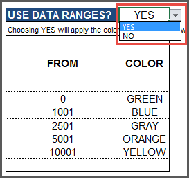
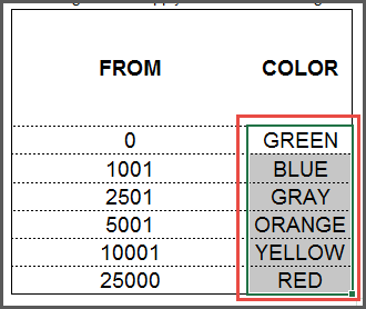
The map will update now to reflect the data range table. For example, states with data value from 0 to less than 1001 will be colored Green, while states from 1001 to less than 2501 will be colored blue.
You can have up to 6 data ranges (in the image above, we have used 5 ranges). To fill those 6 ranges, the template provides seven colors to choose from: Green, Blue, Gray, Orange, Yellow, Red and White.
It is natural for each of us to have different preferences when it comes to colors. If you would prefer to change one of the available colors, it is easy to do. Let’s see how to do that step by step. In this tutorial, we will replace Blue color with Purple.
VIDEO DEMO
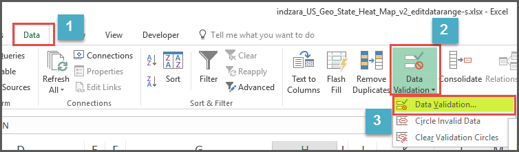
- Select cells H8 to H13. These are six cells where we choose the colors for the 6 data ranges.
U.S. State Heat Map – Select 6 cells - Click on ‘Data’ ribbon and then choose Data Validation –> Data Validation..
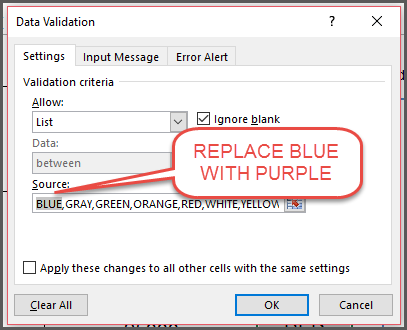
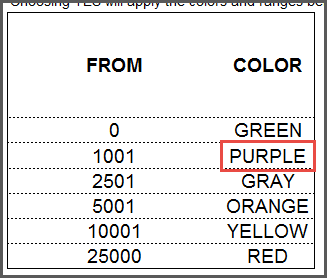
U.S. State Heat Map – Data Validation Menu - Let’s edit the ‘Source’ field and replace BLUE with PURPLE (or any other color name you would prefer). Then, click OK. This step makes PURPLE one of the colors in the drop down.
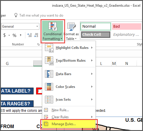
U.S. State Heat Map – Replace color in Data Validation - From the ‘Home’ ribbon, choose Conditional Formatting menu and choose ‘Manage Rules’
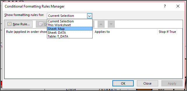
U.S. State Heat Map – Conditional Formatting menu - Choose Sheet Map
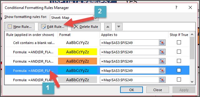
U.S. State Heat Map – Choose Sheet Map - Click on the rule that has ‘Blue’ Color, as we are trying to replace Blue with Purple.
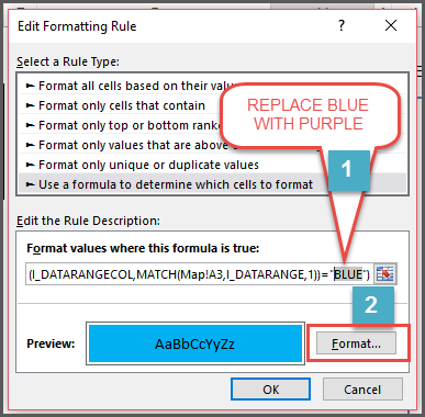
U.S. State Heat Map – Select Conditional Formatting Rule - Edit the formula and replace ‘BLUE’ with ‘PURPLE’. After that, click on the ‘Format’ button.
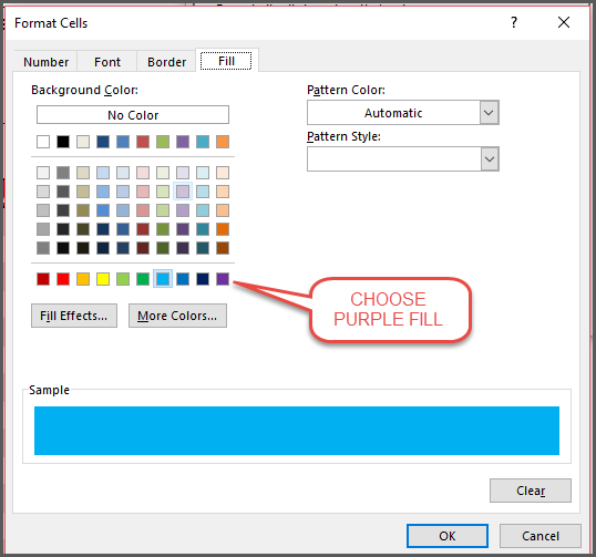
U.S. State Heat Map – Change Formula - Choose the Purple color in the Fill section. Then click OK and OK in the next 2 windows that pop up.
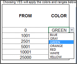
U.S. State Heat Map – Choose Purple Fill color - Now we have implemented the new Purple color. In order to see this in action, choose PURPLE for one of the ranges.
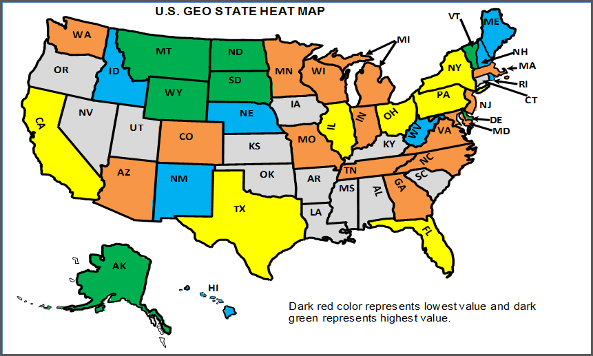
U.S. State Heat Map – Use the new color - The map will appear like this now, with all the states with data value from 1001 to less than 2501 colored in Purple.
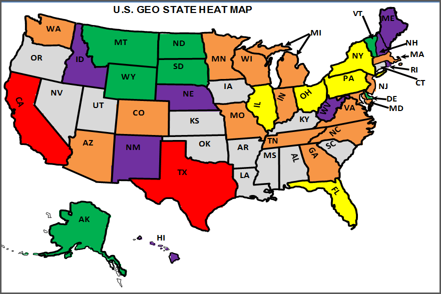
U.S. State Heat Map – Updated Map with Purple
I am sure for many of you, Purple may not be your color of choice. 🙂 Please follow the steps above and use any color of your choice to visualize data on the map as you prefer. If you have any questions or suggestions, please leave them in the comments. I look forward to hearing from you.