

In this blog post, we will discuss the Kerala State Heat Map by District Excel template. This is a free Excel template that you can use to create heat maps instantly. You will learn how you can enter your own data in the template to create heat maps. You will also learn the features and options available within the template to customize and extend.
What is a Heat Map?
A heat map (Wikipedia – What is a Heat Map?) is a form of data visualization, where the data is presented in the form of varying levels of colors. We use colors to understand the data easily and quickly.
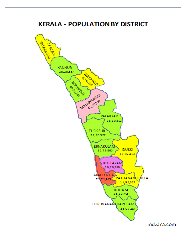
Here we will be creating a geographical heat map where the area we will be coloring is a geographic division (by district) of the state of Kerela. Each district can have a different color based on the data value for that specific district. For example, we can visualize the population distribution by district, literacy rate by district, or any numeric data we have at the district level. There are other types of use cases too, which we will discuss later.
Our Excel Template allows you to enter your own data and visualize that instantly.
FEATURES
- Enter your own data by district and visualize in a heat map instantly
- Turn district names on or off
- Turn data values on or off
- Choose default gradient color scale
- Option to choose custom colors by data ranges (7 data ranges and 10 colors)
- Supports various types of data
- Enter title and notes to go on the map
- Readily printable or export to PDF
- Copy image and paste in any application such as PowerPoint
- Data can be entered in any order
- Open for editing and customizing for your needs
ABOUT THE DATA
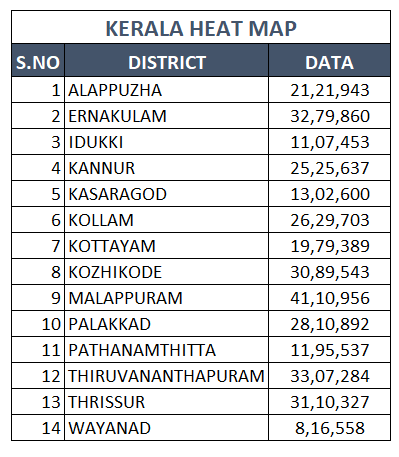
There are currently 14 districts in Kerela (as of March 2018). The names in English are sometimes different depending on which source you choose. We have used Wikipedia – List of Districts as the source for the names of districts in English.
Kasaragod, Kannur, Wayanad, Kozhikode,Malappuram, Palakkad, Thrissur, Ernakulam, Idukki Kottayam, Alappuzha, Pathanamthitta, Kollam, Thiruvananthapuram.
Disclaimer: We have done our best to create the map outlines as accurately as we can. However, doing it in Excel has its limitations. The map is just for illustrations and is not expected to be 100% accurate with respect to the exact size and outlines of district and state.
FREE TEMPLATE DOWNLOAD
How to use the template?
The template is very simple to use with just three steps.
1. Enter district level data in the data table
- You can type in just the data column and replace the data that is in the template by default.
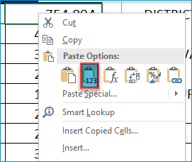
- If you have data already in a digital (from some website or spreadsheet) form, then you can copy and paste the district names and data values. Please make sure that you are pasting as values.
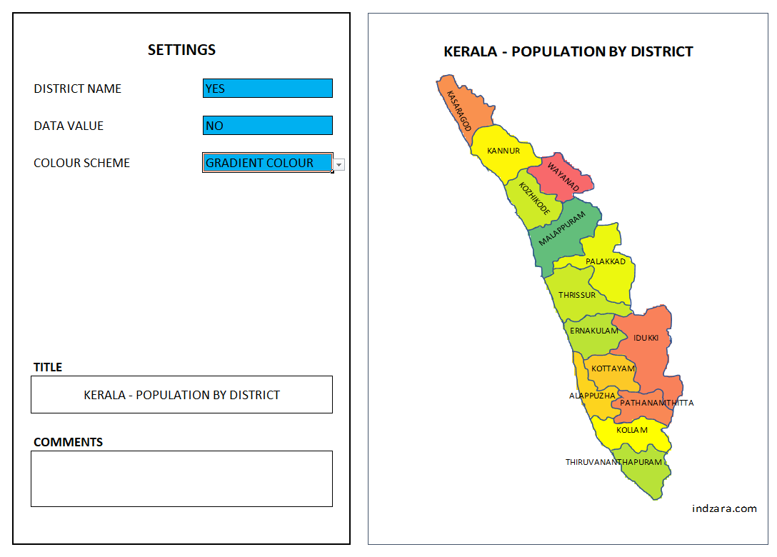
2. Edit the Settings to customize the heat map
- Choose to display the district name (YES or NO)
- Choose whether to display the data value (YES or NO)
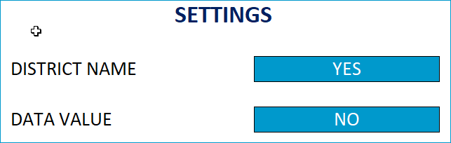
- Choose which color scheme to use.
- There are two options here.
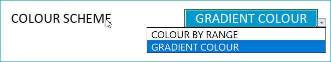
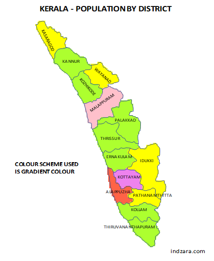
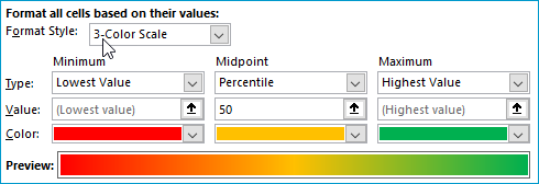
Gradient Colour scheme will apply the 3-color scale with lowest value being Red and mid-point being Gold and highest value being Green.
Colour by Range scheme will allow you to enter data ranges and choose color for each range.
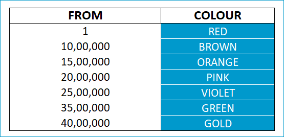
In the table above, we are setting the districts with data values from 1 to less than 10,00,000 to be Red. From 10,00,000 to less than 15,00,000 to be Brown and so on. Any district with value from 40,00,000 will be colored in Gold.
You can customize the ranges as well as the colors. You can create up to 7 ranges and choose from 10 color options.
In your case, let us assume that you want to create a data range from 1 to 1000 as Red and 1001 to 2000 as Blue and anything from 2001 as Orange. The following is the data we should enter in the table.
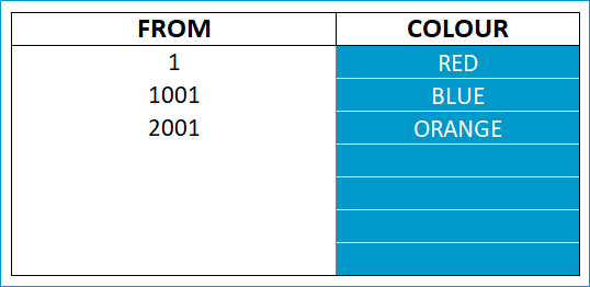
To enter the data ranges, just type over the default numbers. Also, if you don’t need all the seven ranges, then just click on the cell and press Delete key to clear contents. Do not delete the row.
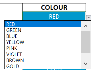
You can change colors by selecting from the drop down. The 10 color choices available are Red, Green, Blue, Yellow, Pink, Violet, Brown, Gold, Orange & Gray. (In a separate post, I will explain how to change or add colors).
Any district with value less than the first value will use the gradient color scheme by default. In our examples here, we started with 1. So, any negative value will use the gradient color scheme. But you are not limited to only positive values.
Here is how you can also use negative values in the data ranges.
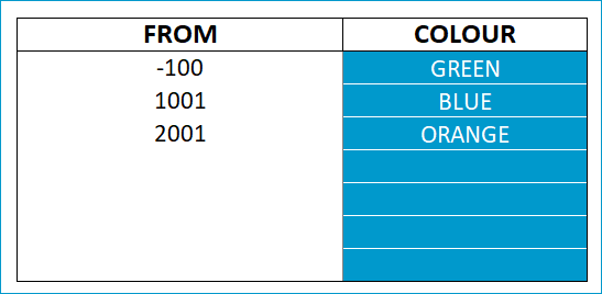
Values from -100 to 1000 will be Green and 1001 to 2000 will be Blue.
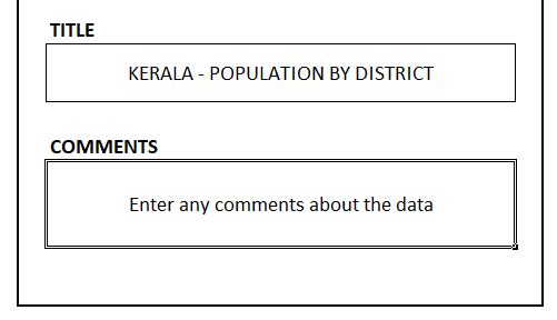
You can also enter Title and Comments that will be displayed on the Map. You can choose to leave them as blank if you want to not have Title and comments.
3. View/Print/Export Screenshots of Heat Maps
After changing the settings, you should be able to view the updated map instantly. If the calculations do not refresh, please press ‘Calculate Sheet’ in Formulas Ribbon or press Shift+F9.
Let’s look at the screenshots of heat maps with different options in the settings we discussed in Step 2.
Screenshots of Heat Maps with different settings
In the first set of examples, we will be using the Gradient color scheme option.
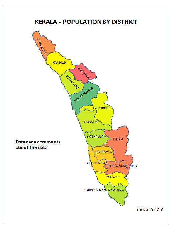
1. If we choose only the district name to be displayed
2. If we choose only the data value to be displayed
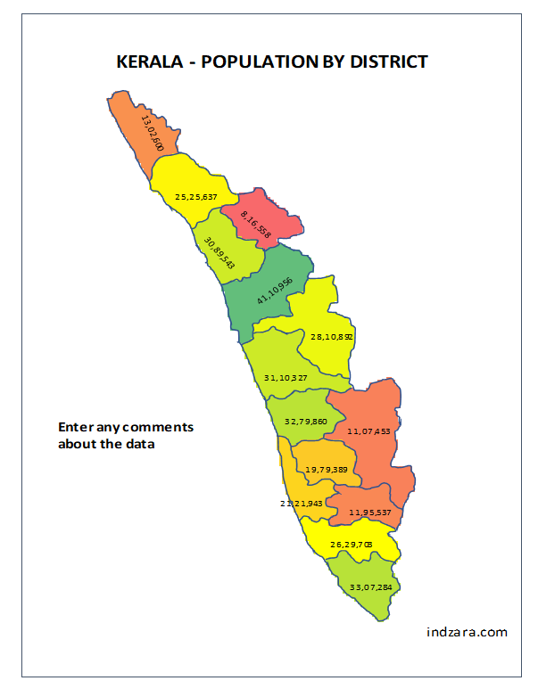
3. If we choose both district name and data value to be displayed

The map will look busy with this option, especially since we have large numbers. However, you can convert the numbers to be shorter in length and that would make it more readable. You can also change the font size, which we will cover later in a separate post.
Now with the ‘Colour by Data Ranges’ option,
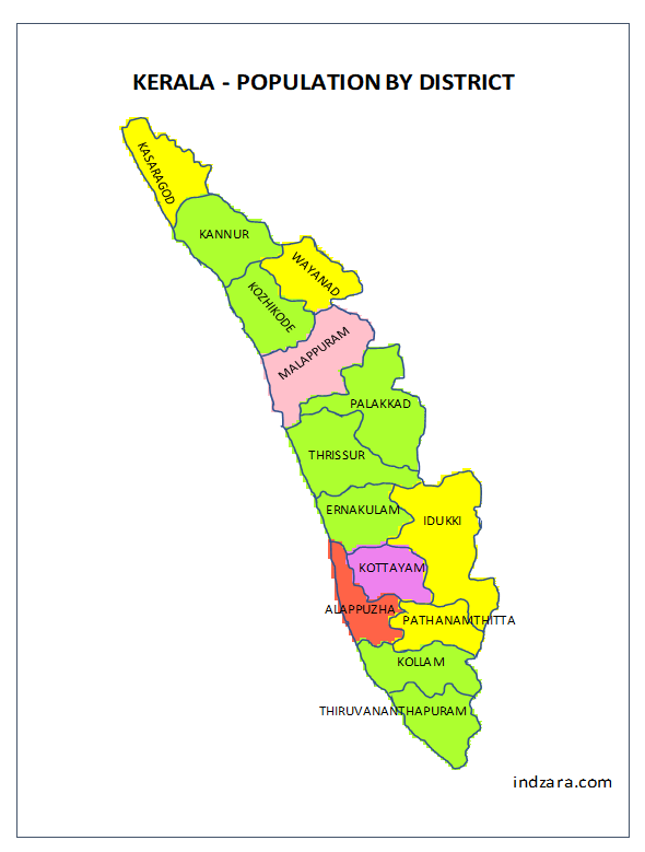
4. If we choose only the district name to be displayed
5. If we choose only the data values to be displayed
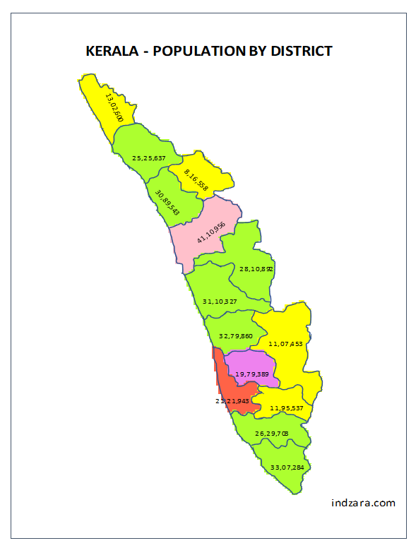
6. Now when we choose both names and data values
Now that we know how the heat map will look, let’s talk about printing..
PRINTING
In Excel, when you try to print, the print area in the file is already pre-set to print the map and the settings section.
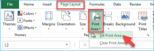
If you would like to print only the map image, then please select the area around the map image and then click on Set Print Area from the Page Layout ribbon.
Now, when you print, you will print only the map image.
Export the heat map image as PDF
Similarly, you can save as PDF.
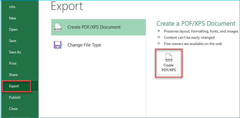
What is in the print area will now be saved as a PDF.
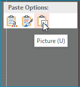
Copy-Paste Image
Instead of printing or exporting, you can also copy the image and paste in other applications directly as needed. You can copy the image by right clicking on the map and choosing ‘Copy’.
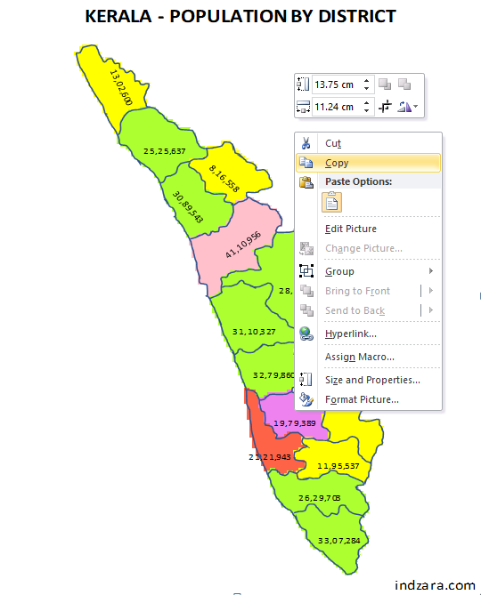
You can then paste in other applications such as PowerPoint and Word.
In addition to creating heat maps, this template can be used for other purposes too. In the next article, we will discuss some of those special use cases of this template.
If you find the template useful, please share this post with your friends. If you have any feedback or suggestions, please post in comments section below.