
We have already published some Geographic Excel heat map templates on indzara.com. The primary purpose of the templates is to visualize data by geographical region. For example, we have country templates (India, United States, Canada, Australia) which allow visualizing data by state in that country. We have state templates (Tamil Nadu) which allow visualizing data by district in that state. There are also several options and settings that the user can customize to create the heat maps.
In this blog post, we will see some of the uses of our heat map templates for purposes other than visualizing state/district level data.
Specifically, we will learn the following
- How to make the entire map single color and change color
- How to group some regions together and color them
- How to play ‘Find the District’ or ‘Find the State’ game
We will use the Tamil Nadu heat map to illustrate. The concept is applicable to all heat map templates available on indzara.com
VIDEO DEMO

1. Make entire map single color
This is quite straight forward. We want to show the entire map in a single color and to be able to change the color.
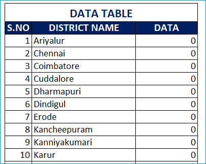
Enter 1 as data value for all the districts.
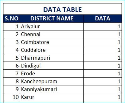
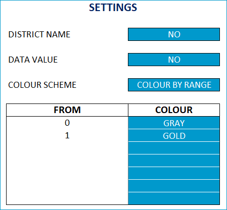
Choose Colour by Range for Colour Scheme
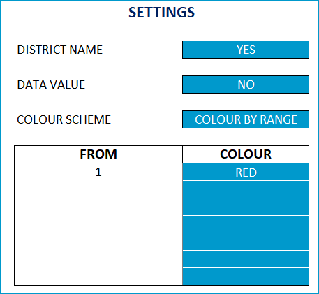
In the data ranges table, enter only one range as shown. This means that all the districts with values from 1 will be shown in red color. Now, the entire map will be Red.
To change the color, change the red to another color from the drop down.
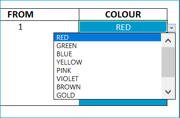
If I choose BLUE from the drop down, the map image changes to blue as shown below.
2. How to group districts together into regions?
Sometimes, we would want to group certain districts together in same color.
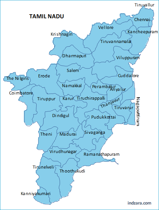
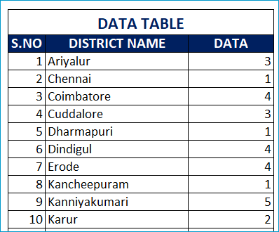
Enter data such that the districts in a group will have same value. For example, Northern districts are given 1, Central districts as 2, Eastern districts as 3, Western districts as 4 and Southern districts as 5.
In the Settings, choose Colour by Range scheme and then enter data ranges as shown below.
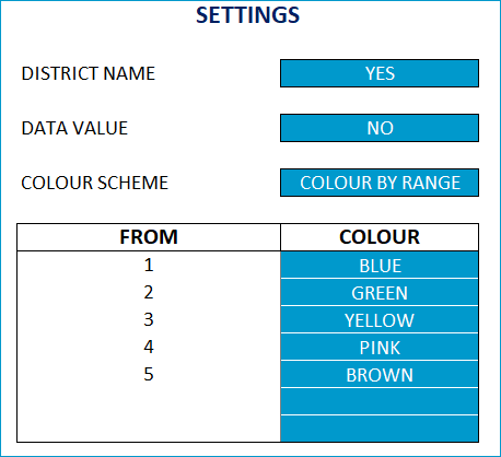
This will apply colors such that districts with 1 will be Blue color, 2 will be Green, 3 will be Yellow, 4 will be Pink and 5 will be Brown.
And the map will appear as below.
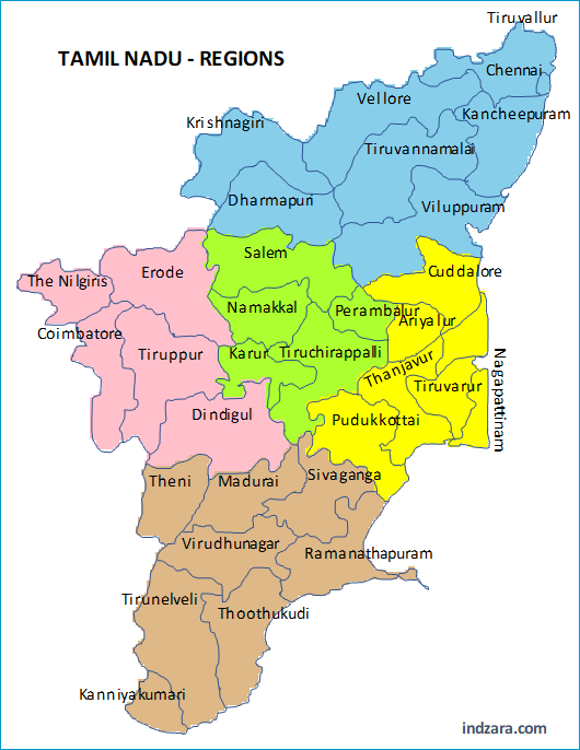
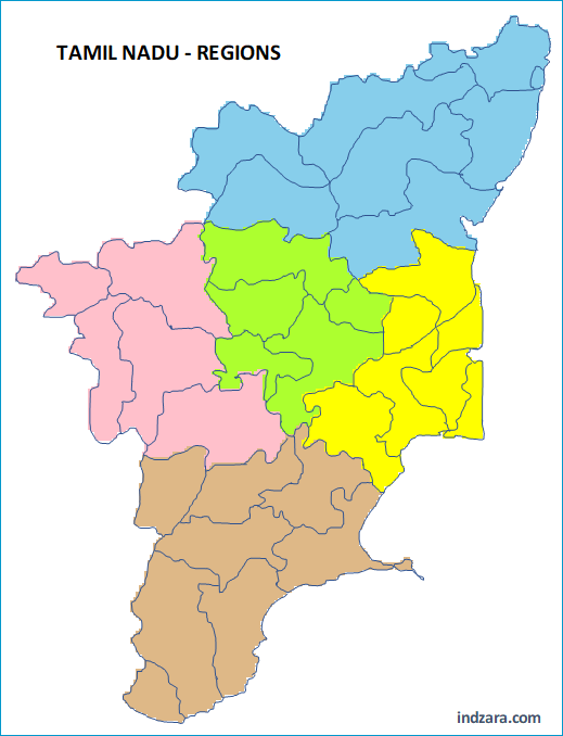
If we choose not to display District Names, then the map will appear as below.
You can, of course, change colors as needed.
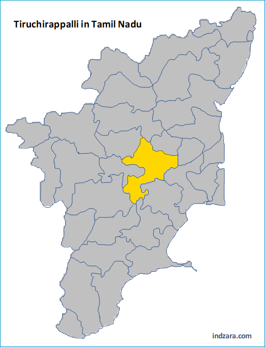
3. Find a district
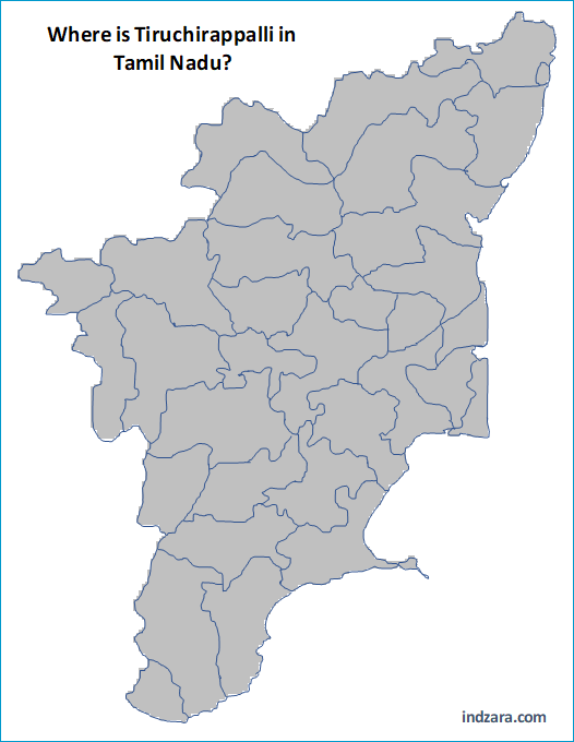
First, we should make the entire map in one color. Enter 0 as data for all districts.
Let’s remove the district names from display. Then, enter the data ranges as shown below.
Give the name of a district to your friend and ask to guess where that district is. For example, let’s say Tiruchirappalli district.
Then, you can reveal the correct location by typing 1 as data for that one district.
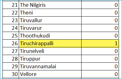
The map will display the district of Tiruchirappalli in Gold color as that is the color we chose for data values from 1.
You can even play this by yourself. It will be a good learning tool.
You can also play the game in reverse if you are playing with a friend. You can first show one district location on map and then ask friend to guess the name.
It is a good tool to use in schools teaching the location of a district in the state.
If you have used the heat map templates in other interesting ways, please share in the comments section below.