
Description
If you have been given a raw dataset and you are looking to gain business insights, you need an effective tool that makes the data instantly useful. You need to be able to ask business questions/hypotheses and get answers immediately. Also, you would need to be able to present those insights with supporting data in a presentable form.
The goal of this template is to reduce the time it takes from raw data to meaningful business insights.
About Column Charts
Column Charts are effective in analyzing categorical variables in two common ways
1) Ranking: identifying the order or position in which each category contributes compared to the other categories.
2) Part-to-whole: what % of the whole is contributed by each category.
To further elaborate, let’s use a simple example where we are measuring sales by product. Here Sales is the quantitative measure and Product is the categorical variable (or dimension). Here are some questions to which a Column Chart will be good method to determine and present the information.
- Ranking
- What are the top 3 products with Sales?
- What are the bottom 3 products with Sales?
- Which product has the highest sales?
- Which product has the lowest sales?
- Part-to-Whole
- What % of the sales comes from each product?
- How many and which products contribute to 80% of the Sales?
Features of Data Visualization Column Chart Excel Template
- Ready-to-use for instant insights
- Can handle any dataset
- 3 simple steps to insights
- Effective analysis techniques
- Pareto, Comparison with thresholds/targets, Min/Max, Stacked Bar, 100% Stacked Bar
- Grouping long tail values automatically
- Sorting by Dimension or Measure – ascending or descending
- Highlighting values with different colors automatically
- Dynamic Slicers
- Automated calculations
- Automated Count of rows calculation
- Automated % calculations
- Customized Average calculations
- Cumulative % and values are calculated for Pareto analysis automatically
- Customize to your needs
-
- Any currency
- Formatting options
- Customize dimension, measure and date fields
- Number of columns to display (Grouping into Others)
- Threshold line
- Customize Pareto %
- Labels on/off
Highlights of Data Visualization Column Chart Excel Template
Ready to use
The Data Visualization Column Chart Excel Template makes it easy to accommodate any dataset. You can bring any dataset of yours and paste that in the template.
Three simple steps: Paste your data, Configure & Get Insights
- Paste your data: Please paste as values
- Configure: Choose your fields for analysis
- Get Insights: View, Print or Export Column Chart

Effective Analysis techniques
Though Charts in Excel, in default form, are very useful, we end up spending time modifying it to meet our needs often. The Data Visualization Column Chart Excel Template takes those steps out of the way. The template employs effective analysis and presentation techniques that are automatic.
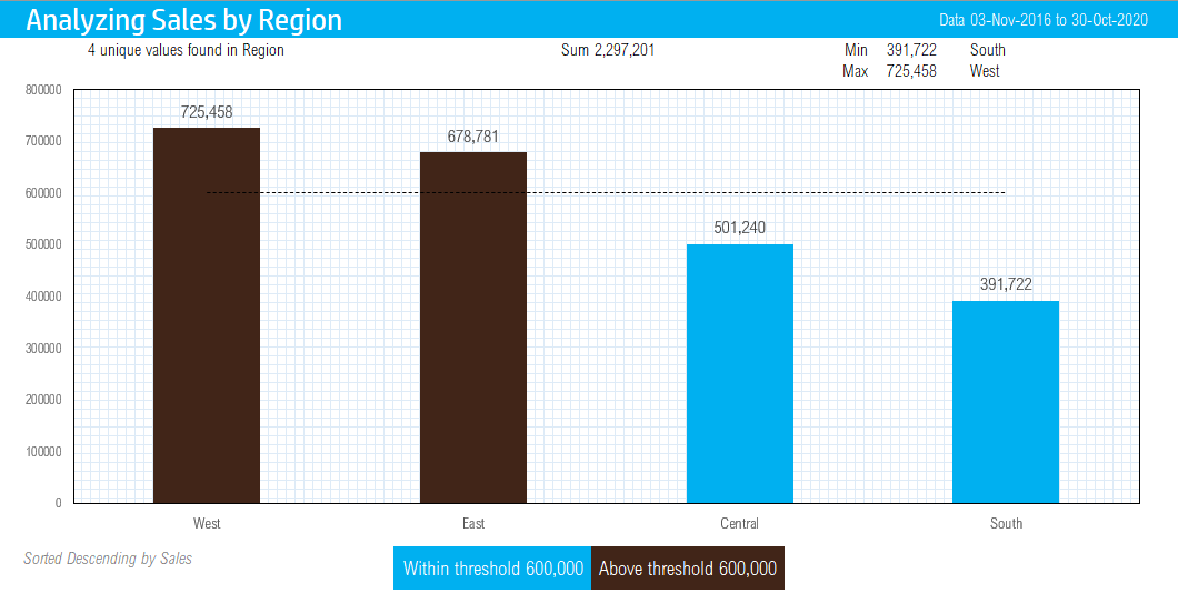
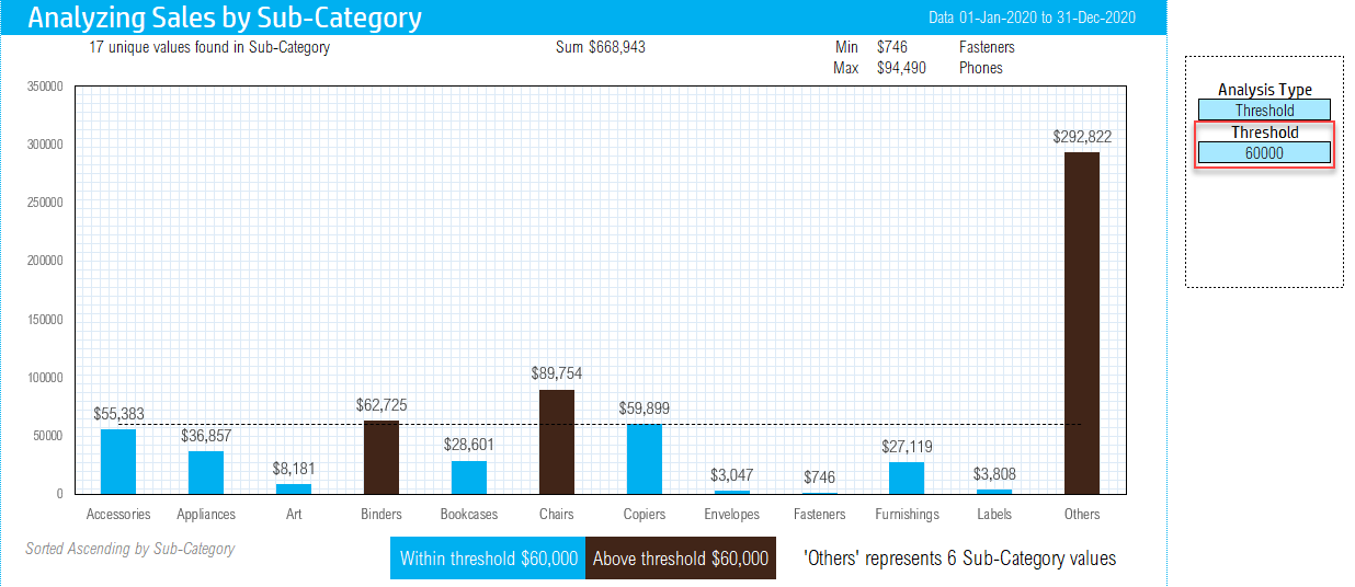
Highlighting categories that exceeded a threshold
A very common analysis technique is to compare the actual results against a target / goal / threshold. In this template, you can type in any threshold and the categories that exceed the threshold are immediately highlighted along with a threshold line.
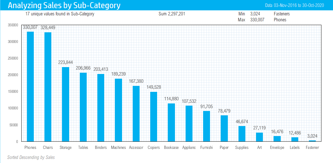
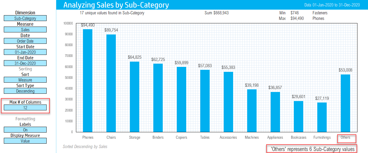
Grouping category values automatically to improve presentation
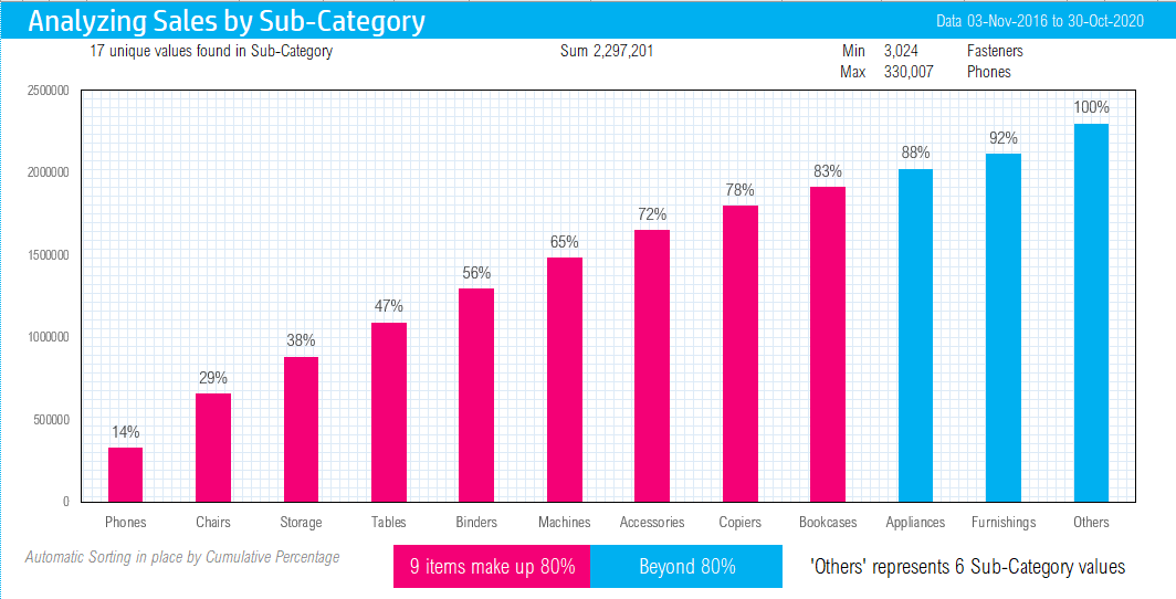
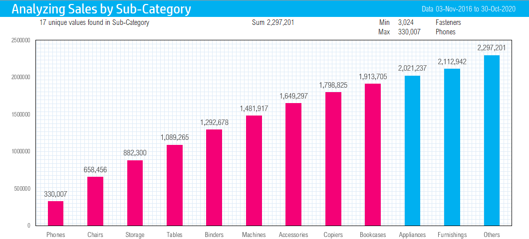
Very often I have found that when the category has more than 10 values the chart looks less presentable with too many categories which don’t contribute much to the overall measure. The template allows you to automatically group categories into an ‘Others’ bucket.
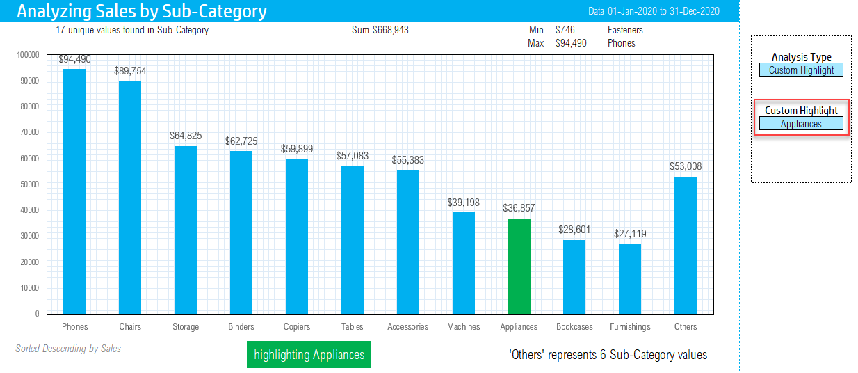
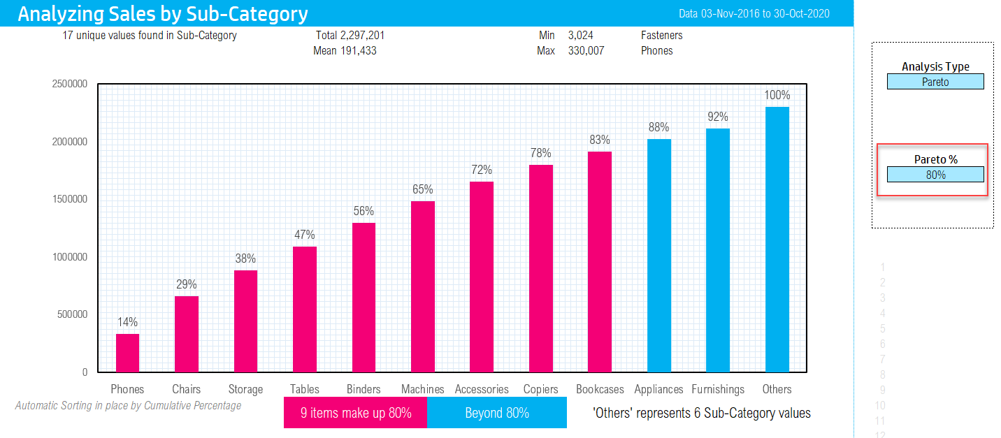
In the screenshot above, though there are 17 values in ‘Sub-Category’, the template groups the last 8 into the ‘Others’ category. This charge is a lot more presentable now without 17 columns crammed into the chart area.
Pareto Analysis automated
A common phenomenon noticed is that a large portion (eg. 80%) of a measure is driven by a small portion (eg. 20%) of categories. In order to tell such a story, we employ Pareto analysis. In our template, you can choose Pareto analysis in one click.
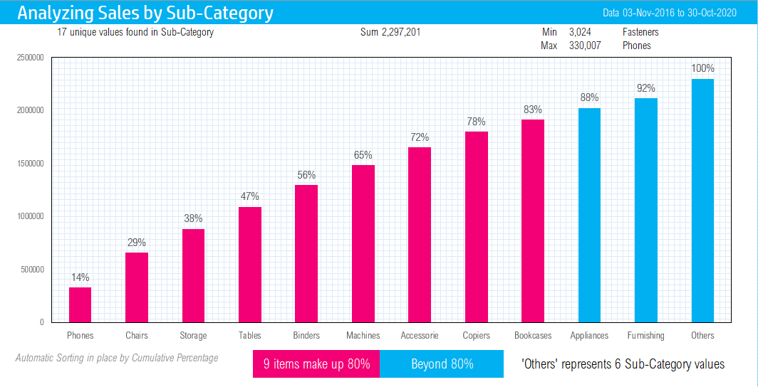
In the screenshot above, 9 product sub-categories make up 80% of the Sales.
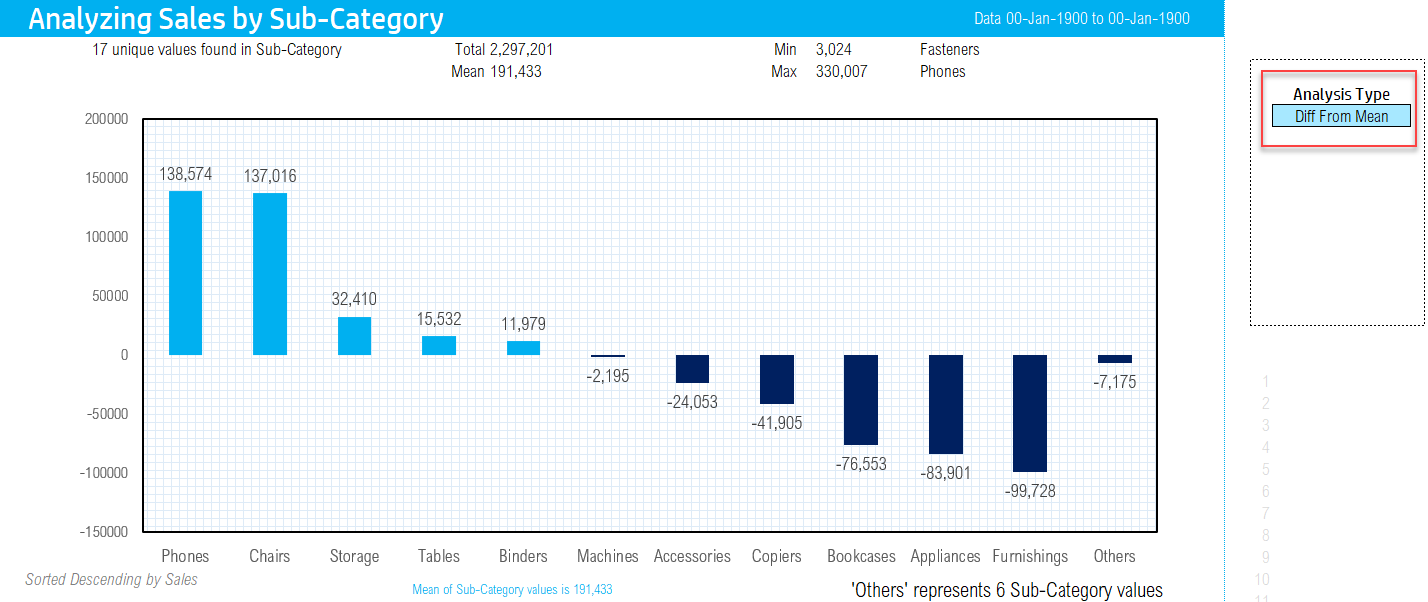
Difference from Mean
If we need to highlight the categories that are above and those that are below the mean, you can do that instantly. The following chart is created with 1 click.
Stacked Column Chart
So far, all the above analysis techniques used one measure and one dimension. To get deeper understanding of our data, we can use the Stacked bar or column chart which uses two dimensions and a measure.
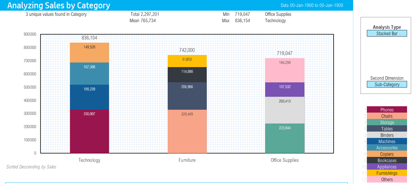
In the above screenshot, we are measuring sales by Category. Within each Category, we can see the sales broken down by Sub-Category.
100% Stacked Column chart
While the Stacked bar chart allows viewing the actual measures (eg. Sales), in some cases we need to view the normalized values. That is where 100% stacked bar chart comes in.
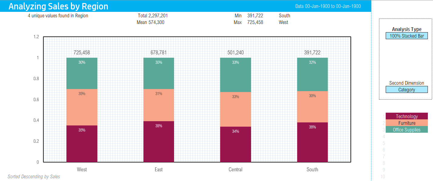
In the above screenshot, we can see that 35% of sales in West region is driven by Office Supplies. 38% of the sales in South region is driven by Office Supplies. This takes out the fact that Sales in West and South are not the same. However, what we are interested is the % distribution within each region.
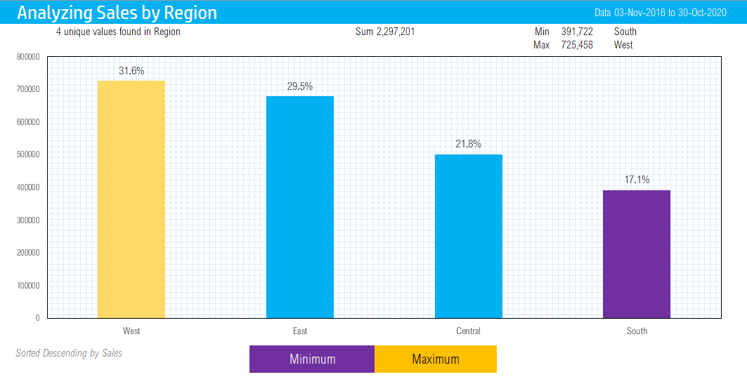
Highlighting minimum and maximum categories
Often, we need to tell a story about the most and the least among the categories. This analysis method immediately highlights the minimum and maximum categories in different colors.
Highlighting a specific category for effective story presentation
If our analysis is focused on a specific category and we need to highlight it to show the position/rank of that category among all categories, we can use the ‘Custom Highlight’ option in the template.
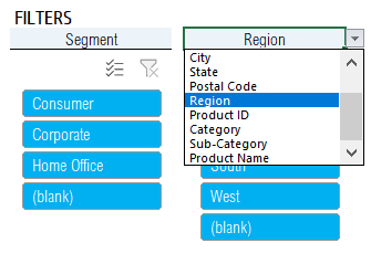
Dynamic Slicers (or Filters)
When doing data analysis, having the ability to filter to segments of the data is essential. The template allows customizable filters (Excel terminology Slicers).
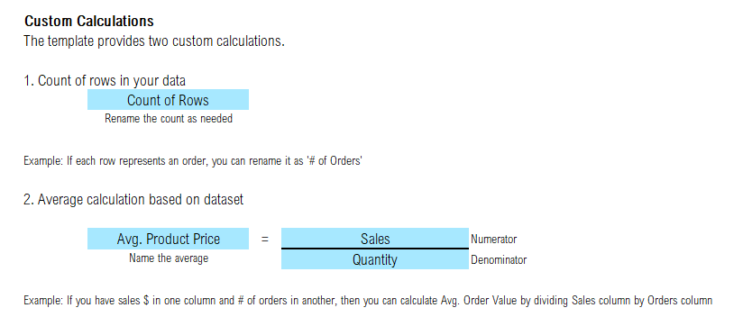
Automated calculations
An area where time is usually spent is to add aggregation calculations on top of the raw data. The template automates some of the commonly needed aggregation calculations.
Automated Count of rows calculation and customized Average calculation
Count of rows is one of the available calculations. For example, if your data set is a set of orders, then Count calculation will provide # of orders.
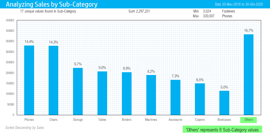
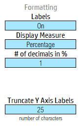
Percentage calculation automated
By default the column chart shows the value as it is. However, we may want to represent the % of total as the value of each bar.
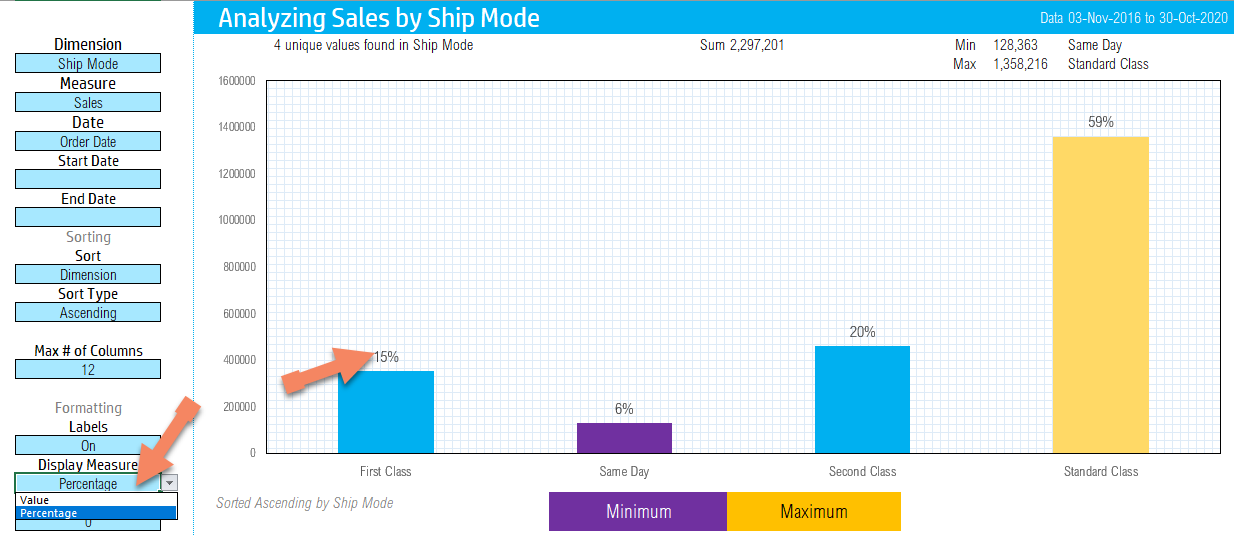
The template allows the option to display value or Percentage. Again, a single-click change.
Cumulative % and values are calculated for Pareto analysis automatically
When doing Pareto analysis, we need to calculate Cumulative or running total. The template will automatically do that when you choose ‘Pareto’.
You can choose either % of absolute value.
Customize to your needs
Any currency
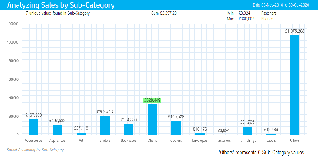
Though the default is $, you can customize it to any currency by just typing in any symbol.
Here is an example of a different currency £.
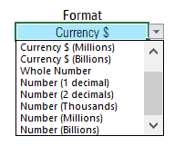
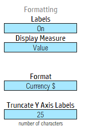
Formatting options for data labels
Labels can be formatted from a variety of choices. You can choose from Currency, Whole number and Number with decimals.
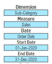
Customize dimension, measure, date and date filters
As we were discussing the different analysis techniques, it involved a measure and one or two dimensions. You can change the measure or dimensions anytime and they are one-click away. You can also choose from different date fields. If you need to filter on dates to narrow down your dataset, just type in the start and end dates.
Number of columns to display (Grouping into others)
You can control the number of columns to display from 5 to 25. The last column will automatically group the rest and label it as ‘Others’.
Threshold line
You can enter any threshold amount to draw the line.
Labels on/off
Labels on the columns in the chart can be turned on or off when needed. Labels can be either the value or the %.
Customizing Pareto %
Limits of Data Visualization Column Chart Excel Template
- Dataset size (max 25 columns in dataset, max 25,000 rows by default)
- 25 columns (distinct values) in column chart
- Max number of unique values in a dimension: 100

Reviews
There are no reviews yet