A column chart, or vertical bar chart, displays data in vertical bars whose heights reflect their values. Commonly used in Excel, it excels at illustrating comparisons across categories and showing trends over time.
Key Components
essentials for a column chart
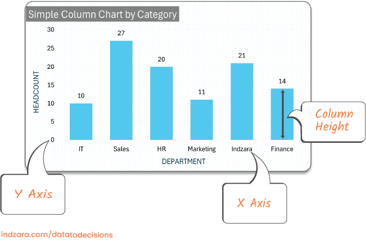
X Axis
Represents the category. In the above example, Department is the category. We can also call this a dimension. In other words, it is typically a text variable and not numeric.
A special case is a date field/dimension. We can represent dates (months, weeks, years) in the X axis.
Y Axis
Represents the scale of our measure value. In the above example, Count of employees is the measure.
In advanced versions of column chart, we can have 2 Y-axes, one on the left and one on the right.
Column Height
The value for each category determines the height of that corresponding column.
The height of the Sales department column is taller than the Marketing department column.
Also, the Sales department column is twice as tall as Finance department column (since Sales’ value is 28 which is twice as Finance’s value of 14)
Why is aColumn Chart Effective ?
let's do a simple experiment
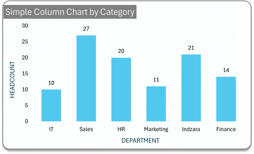
Take this simple table where we have a category column (Department) and a Measure column (count of Employees).
If you could only glance at this table for 1 or 2 seconds, can you quickly determine the department with most employees or least employees.
Do not worry if you didn’t. For most people, it is not easy.
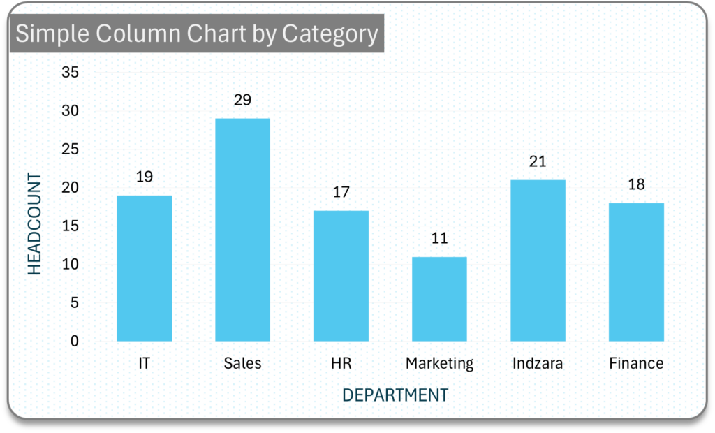
Now, let’s try the same experiment, this time viewing data using a chart.
Column charts utilize the pre-attentive attribute – object height, allowing quick interpretation of data such as employee counts by department.For instance, Sales, with the tallest column, is immediately noticeable as having the most employees. Learn more about how visual analytics enhance data processing in Why Visual Analytics? – Tableau
When to use a Column Chart?
Most effective scenarios
Simple Comparison
Compare values (metrics or measures) across different categories.
Column chart for single category
Column chart for multiple categories
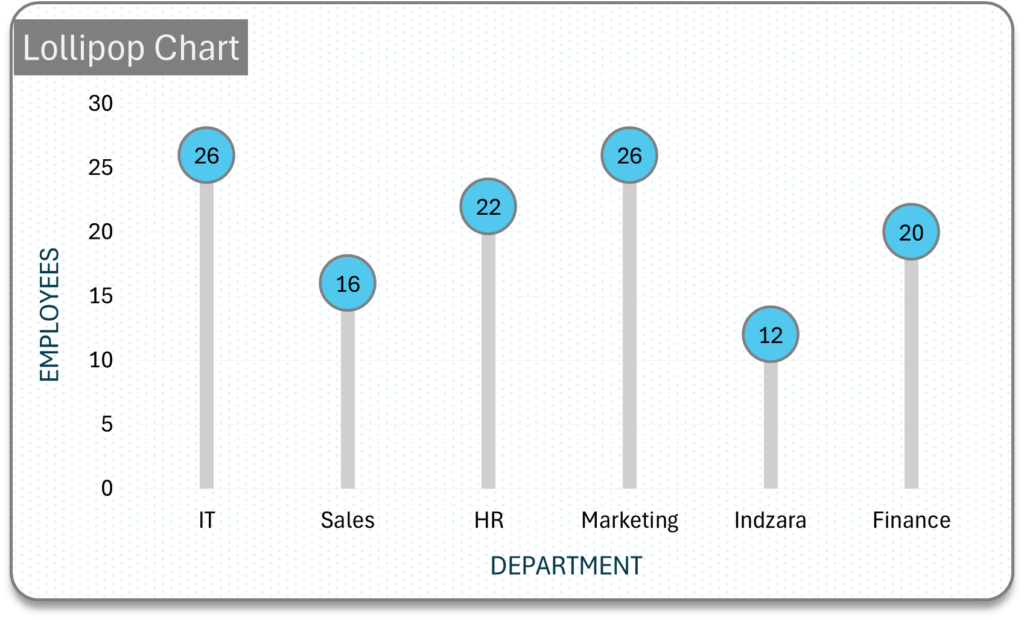
Lollipop as an alternate for simple column chart
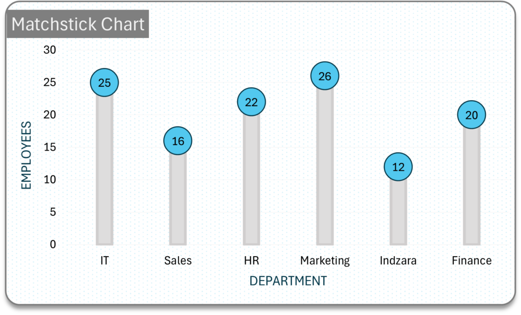
Matchstick as an alternate for simple column chart
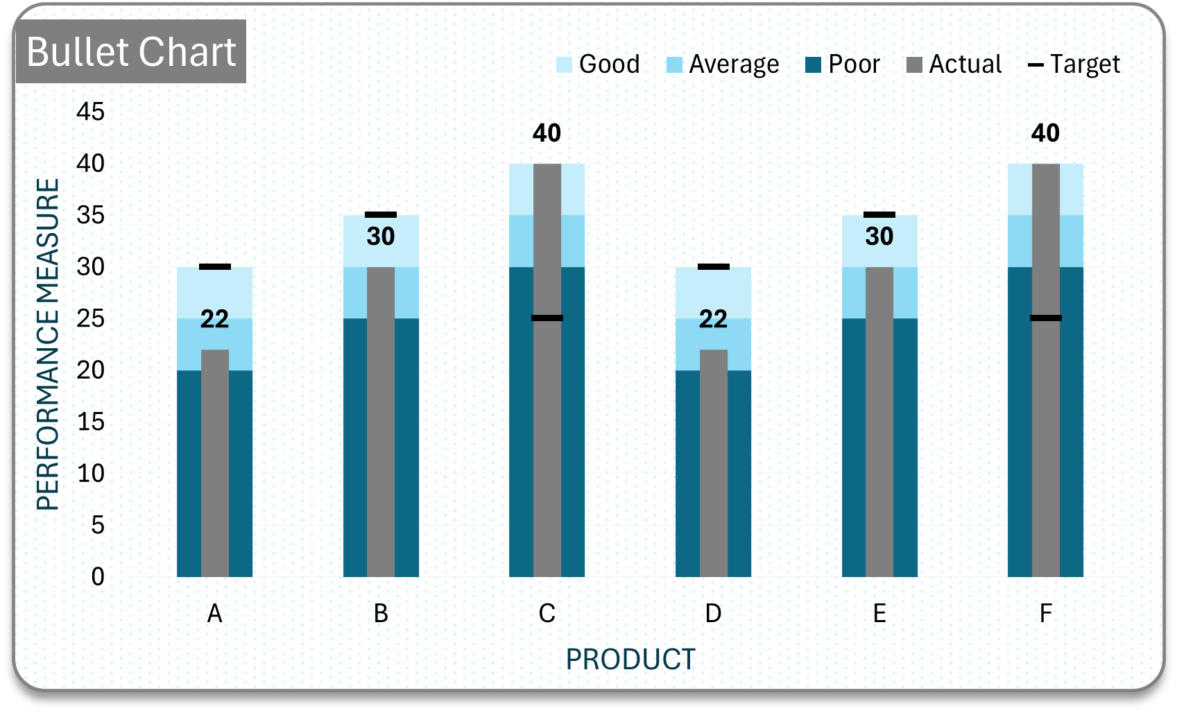
Benchmark
Compare performance against target, standard, or benchmark.
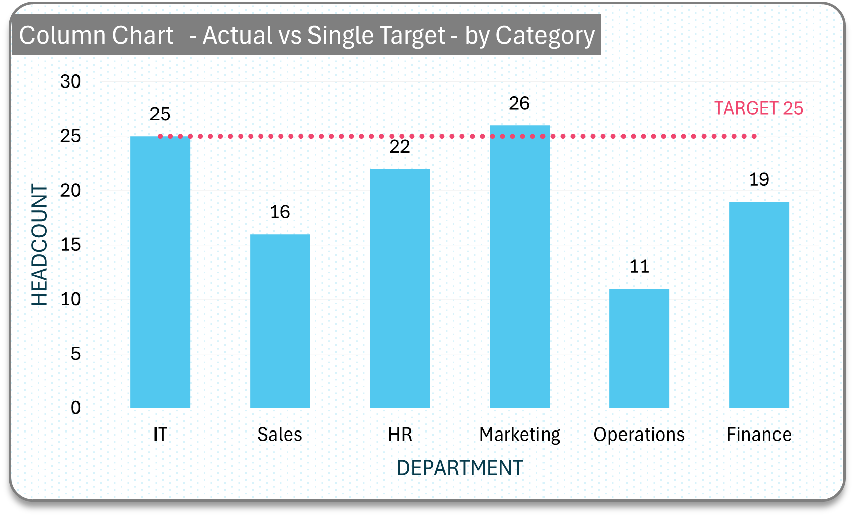
Column with single target line
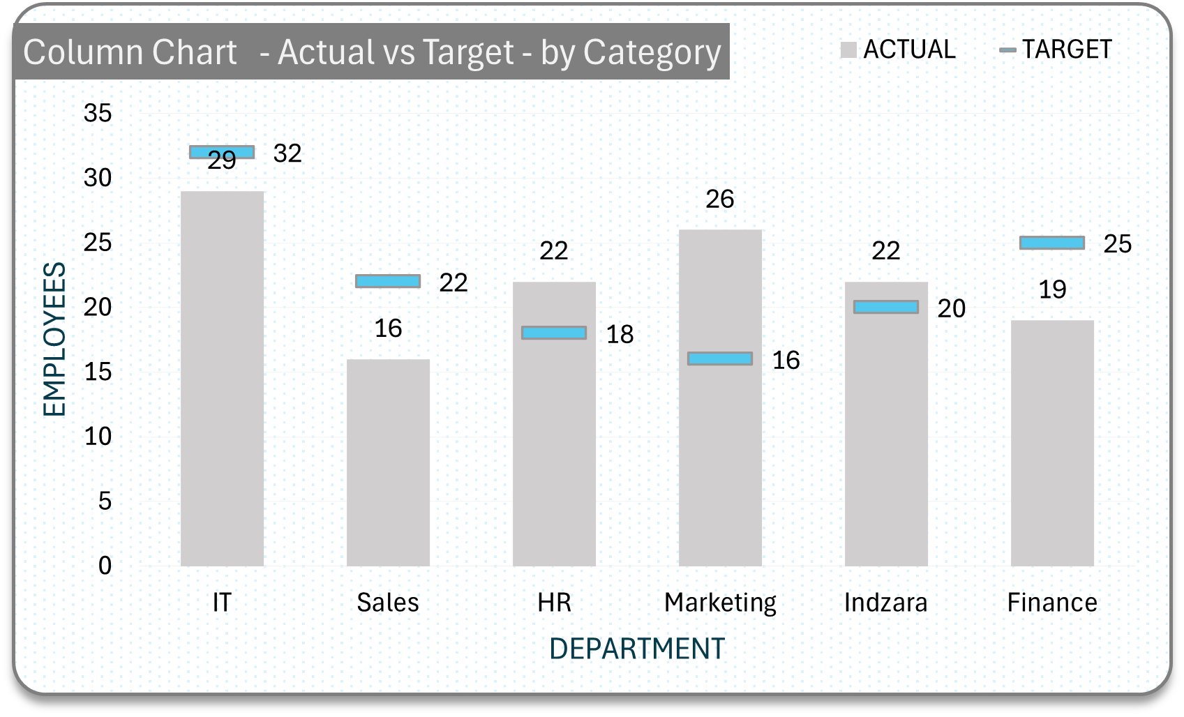
Column with multiple targets
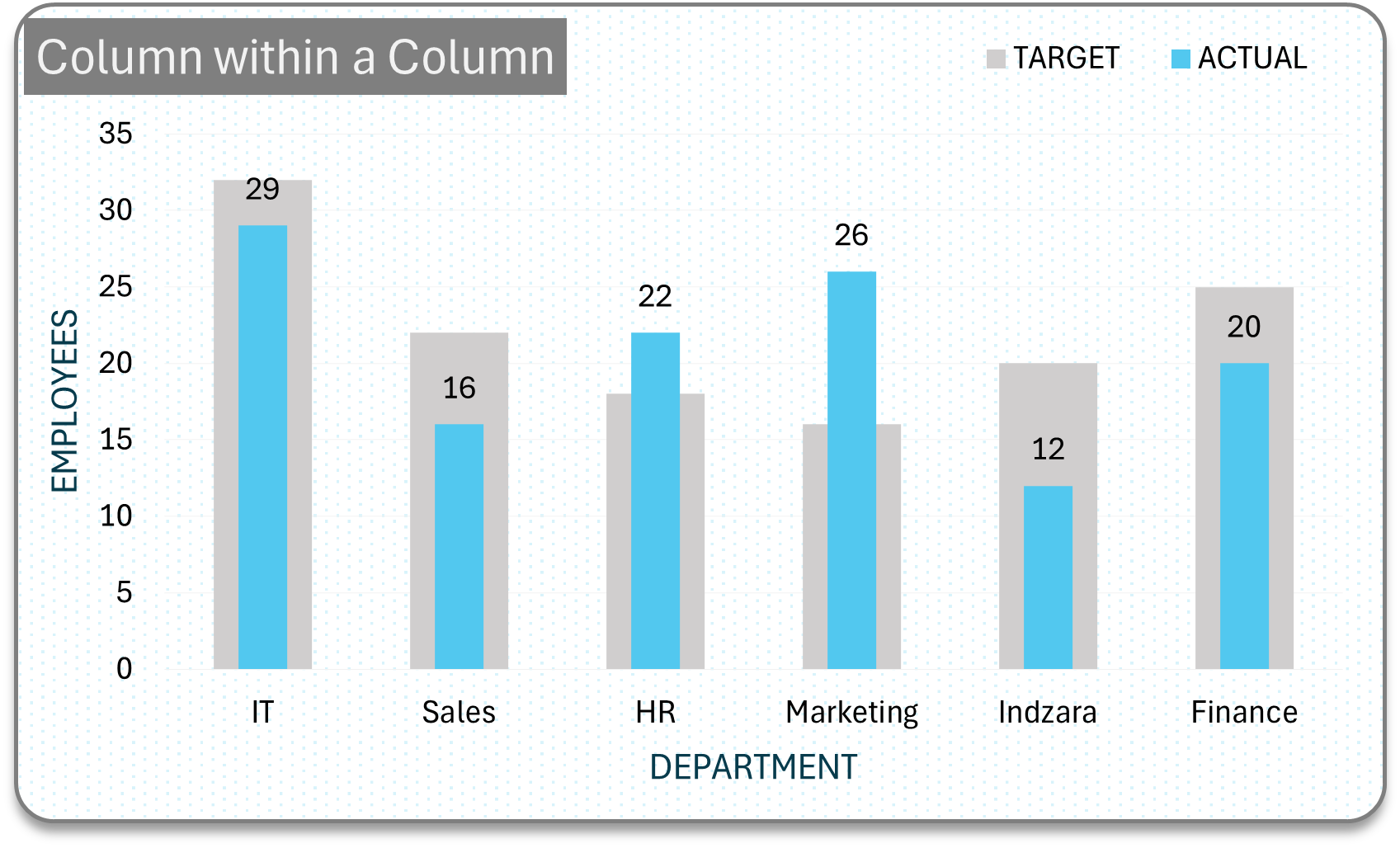
Actual columns inside the target columnc chart
A filler chart for progress tracking
Benchmarking chart with targets and actuals as categories
Benchmarking chart with three series
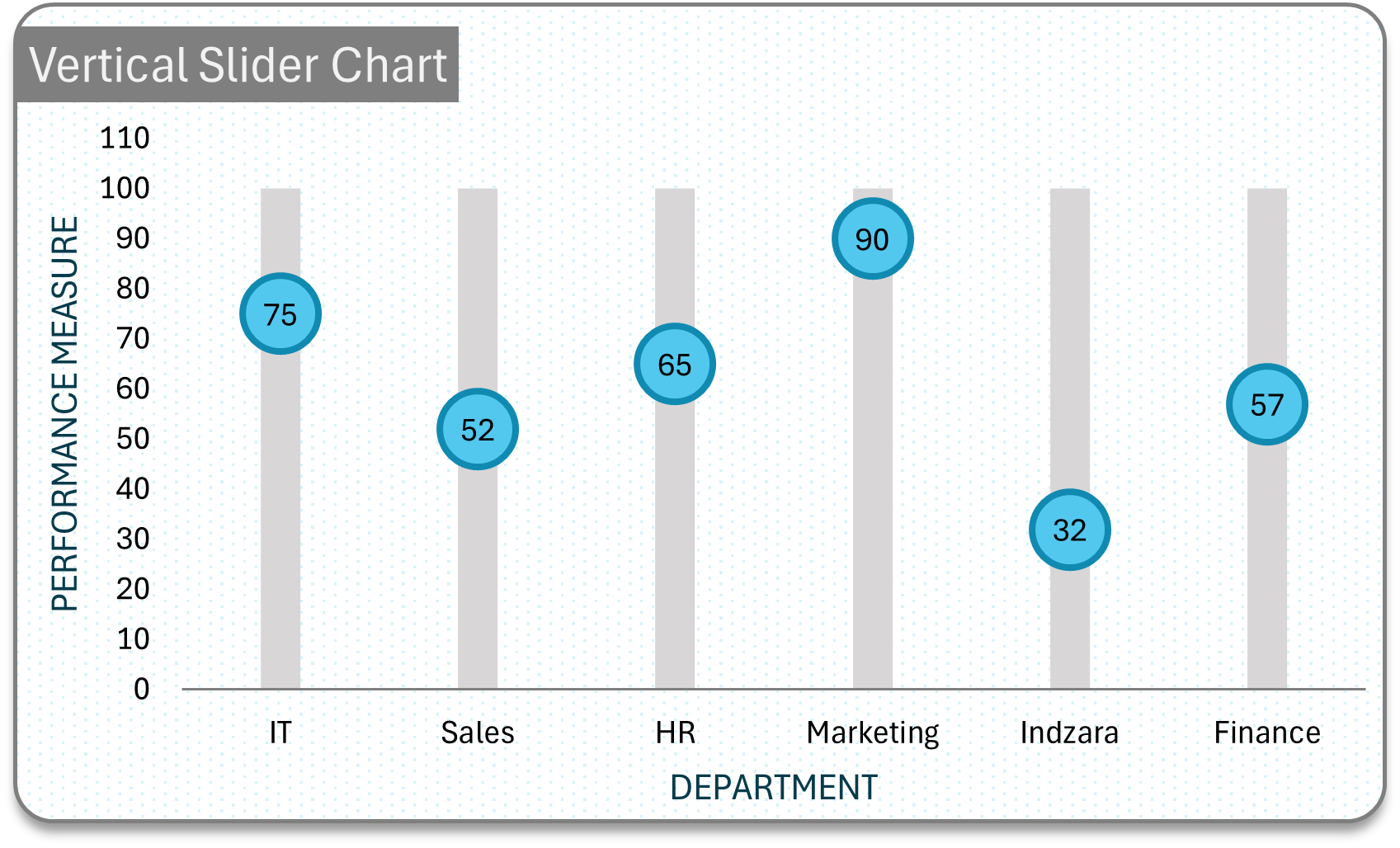
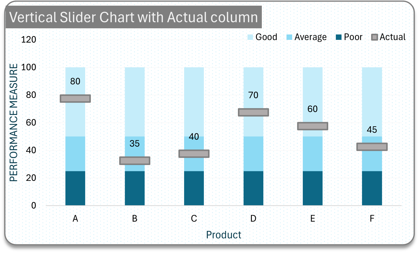
Vertical slider chart
Vertical slider chart with actuals as categories
Progress tracker with stacked columns as bins
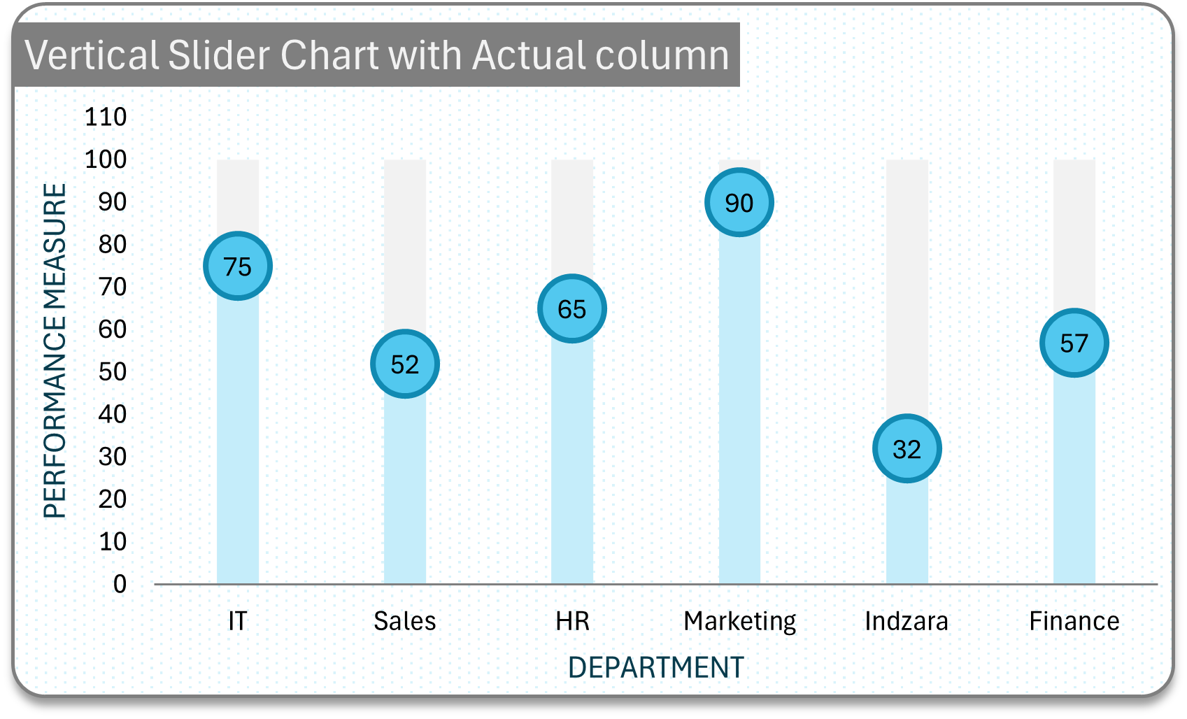
Vertical slider to depict progress
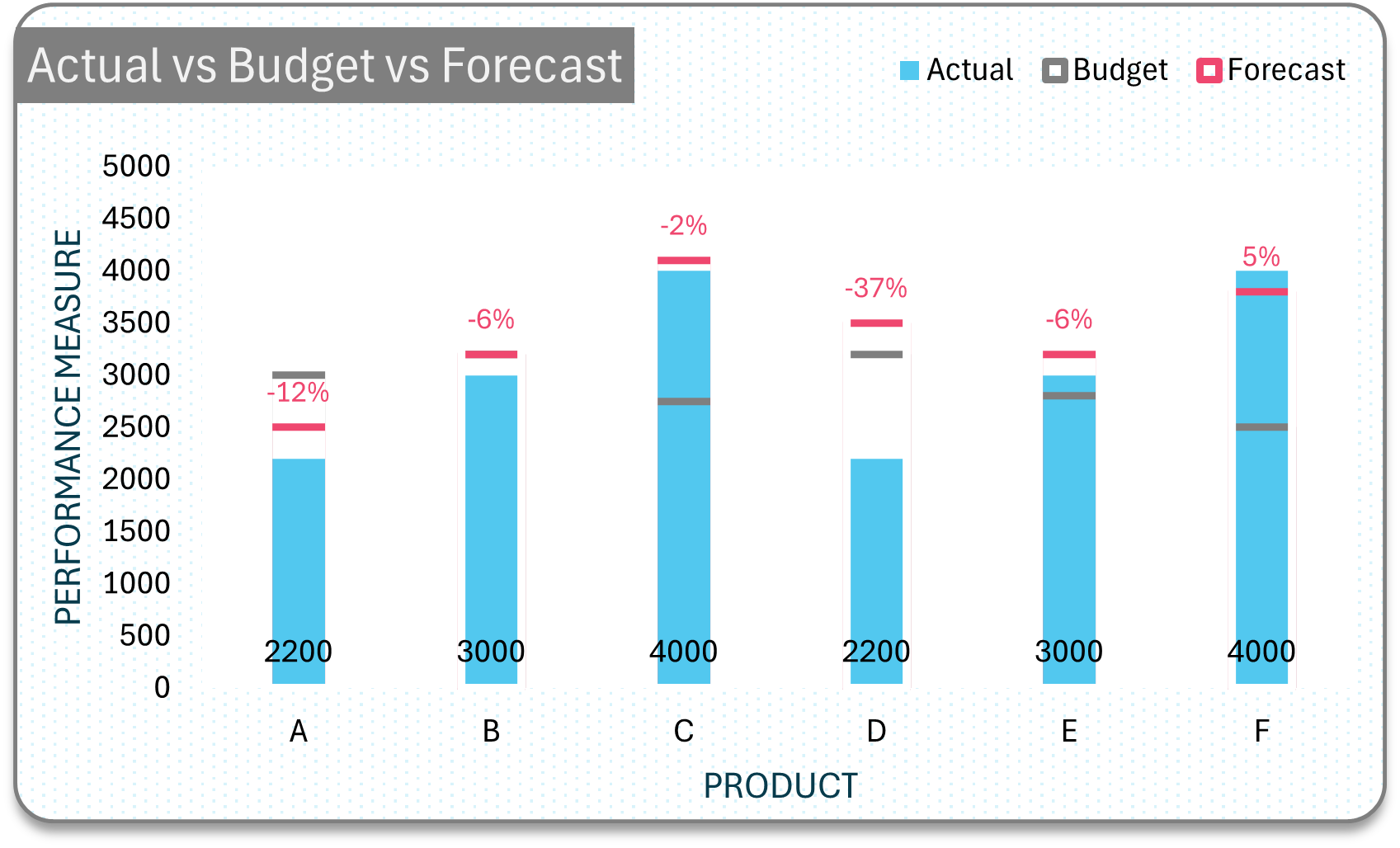
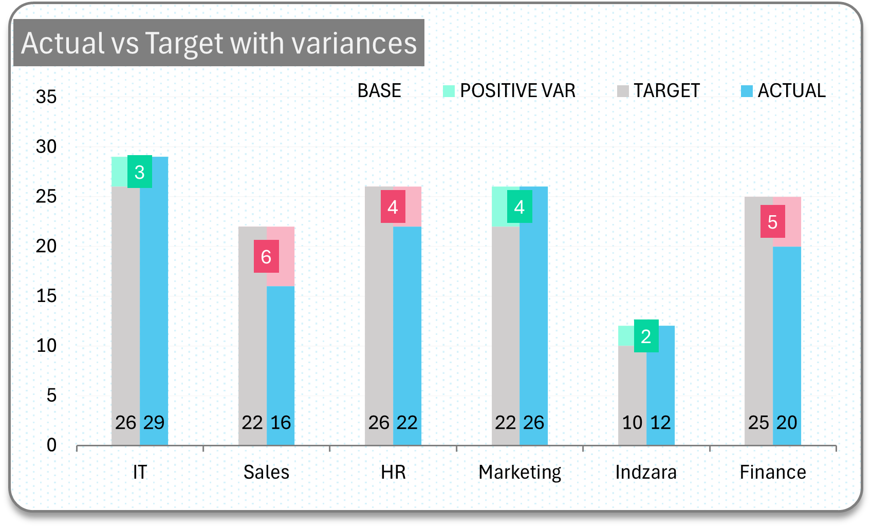
Deviation
Illustrate deviation/variations of actuals from targets.
Positive Negative variances tracker
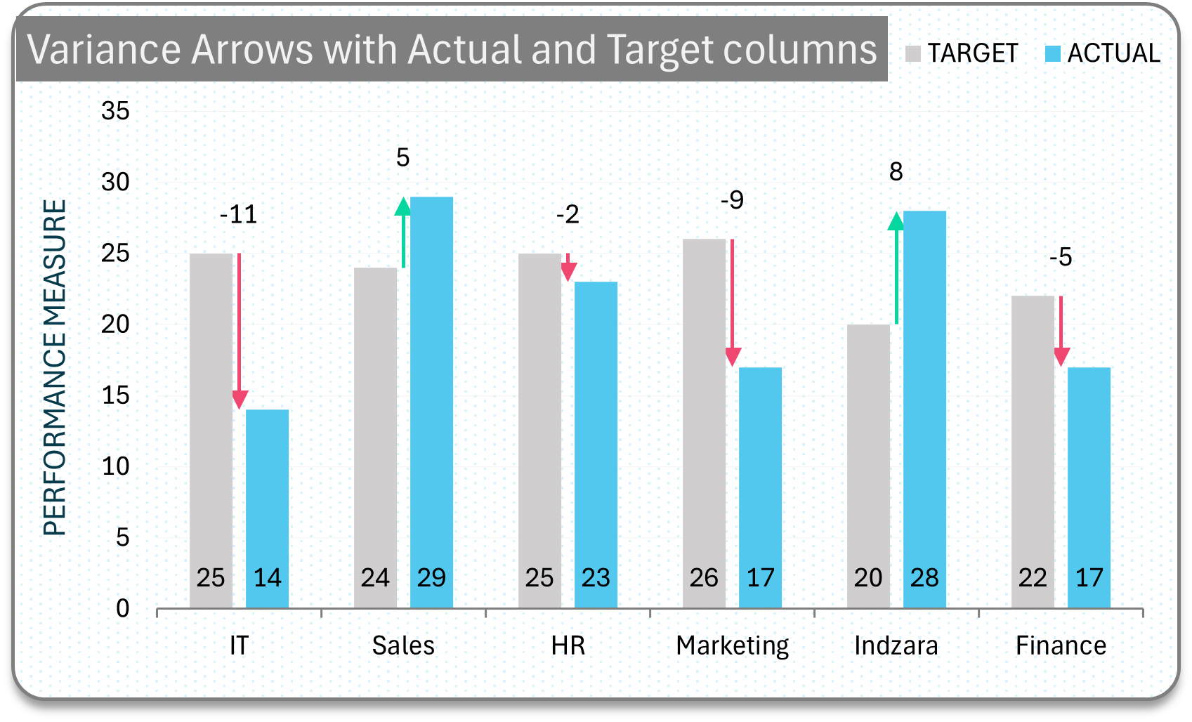
Variances as arrows in actual target column chart
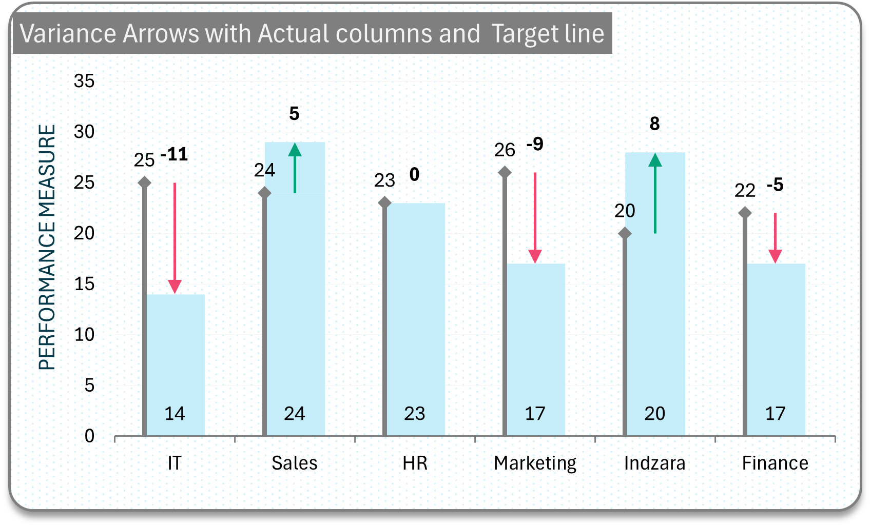
Variances as arrows with actual columns and target lines chart
Variances in colors with actual target columns chart
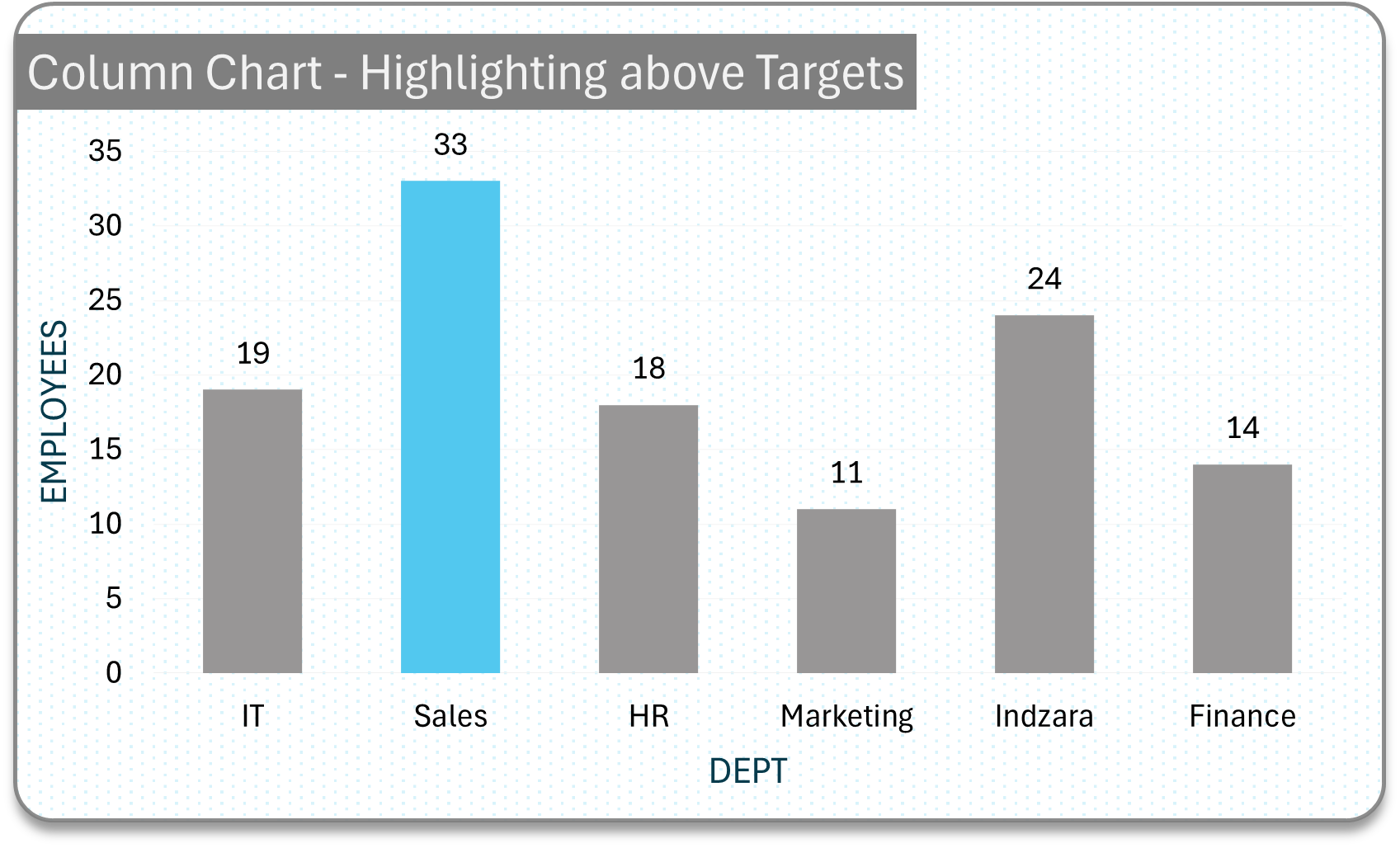
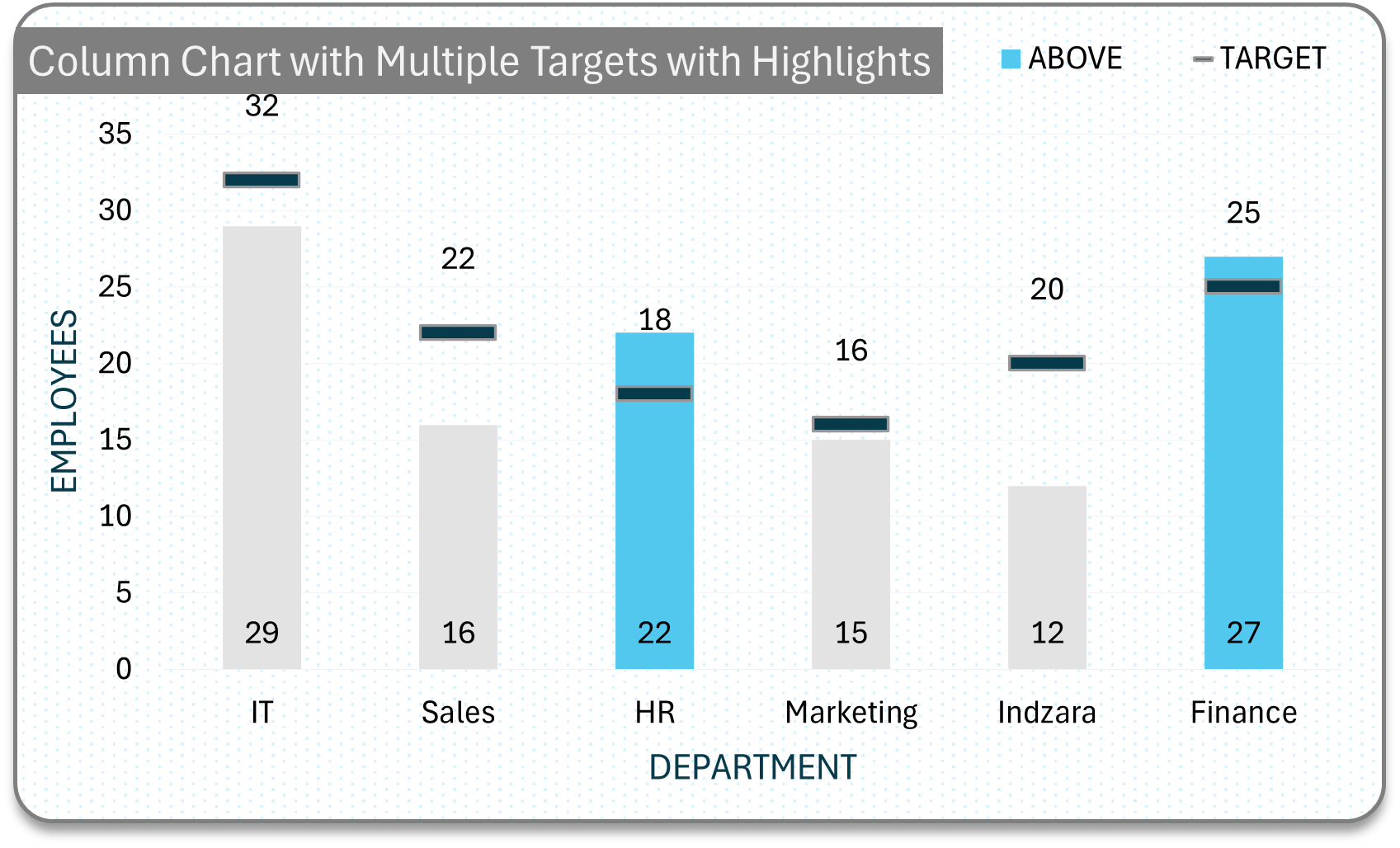
Highlights
Highlight with color, only specific column(s) to paint a picture of your data.
Simple column chart with highlighted achieved columns.
Column chart with multiple targets with highlights
Simple column chart with highlighted achieved columns and a target line
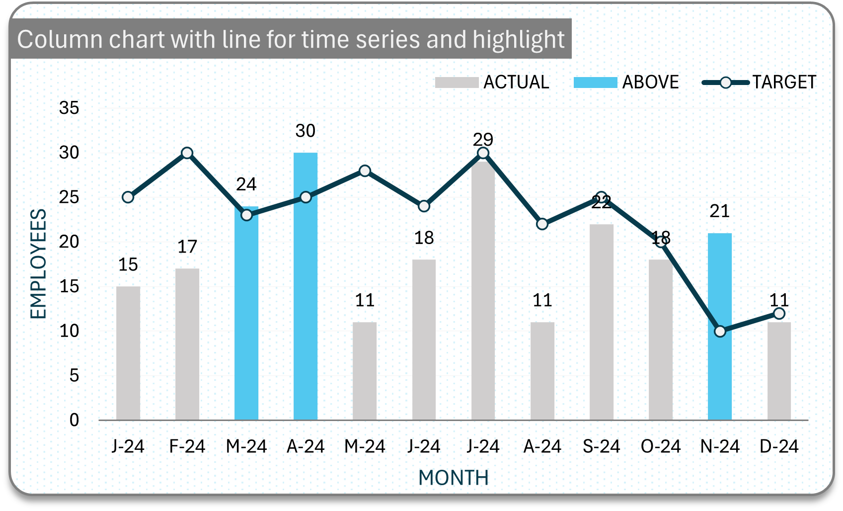
Trends
Show trends or changes over time.
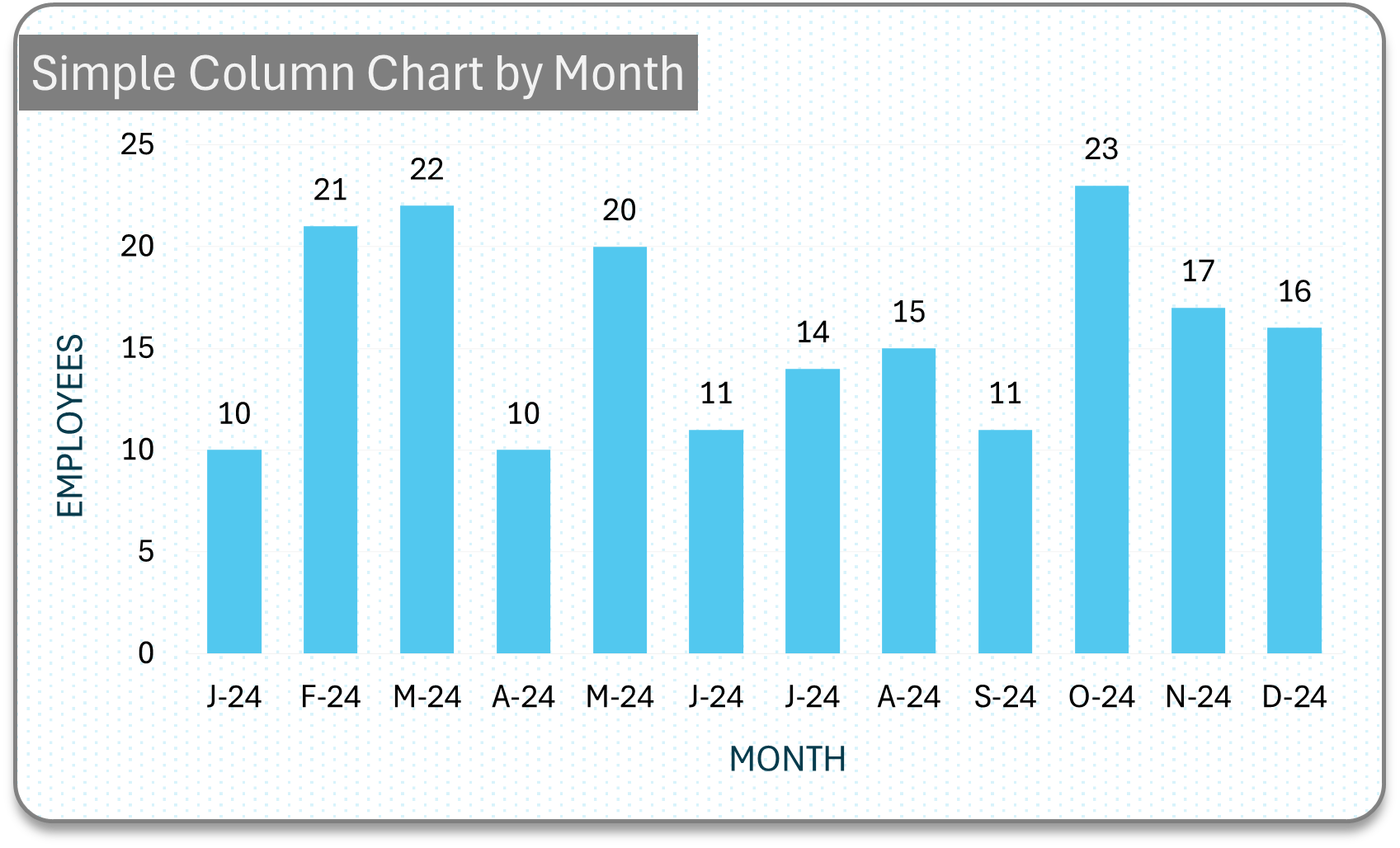
Simple column chart for changes over time
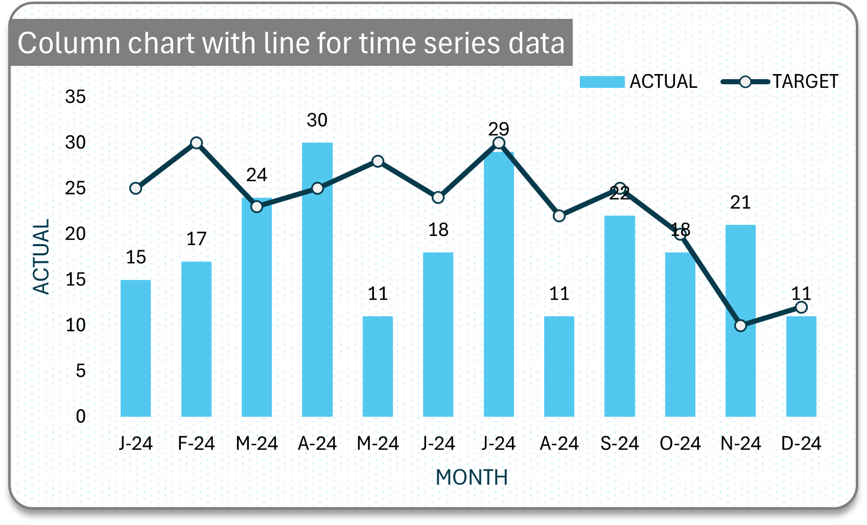
Column chart with a single target line for changes over time
Distribution
Visualize the range of data across two related categories.
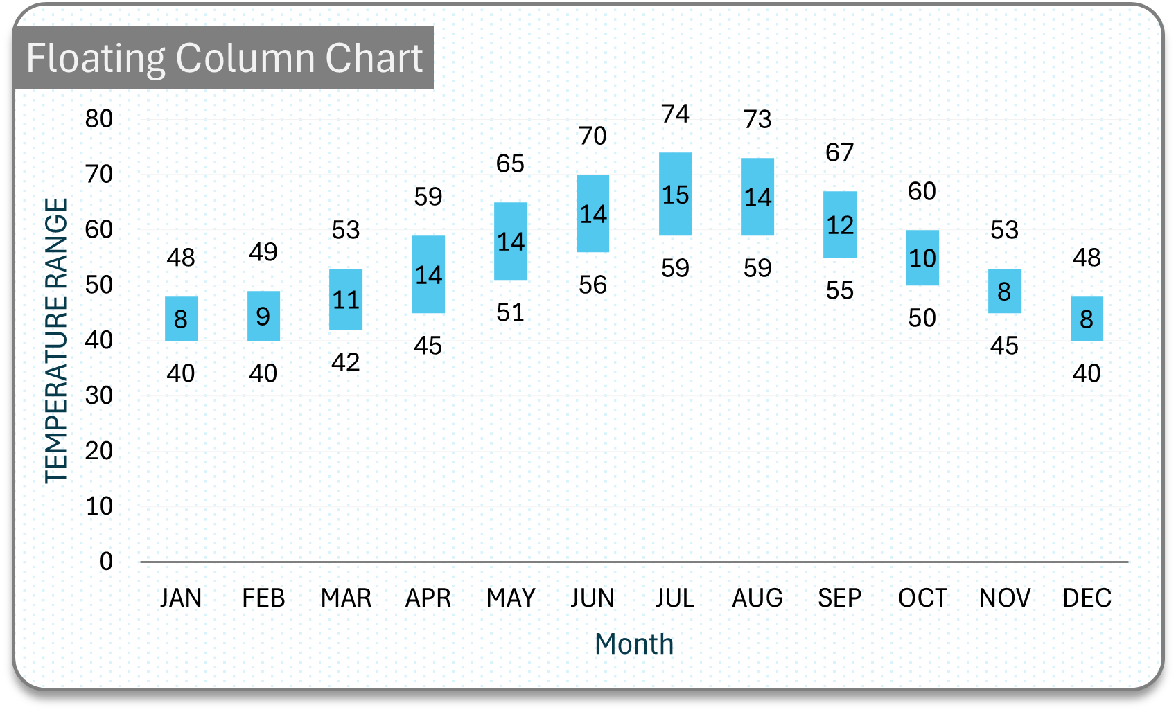
Floating column to visualize ranges
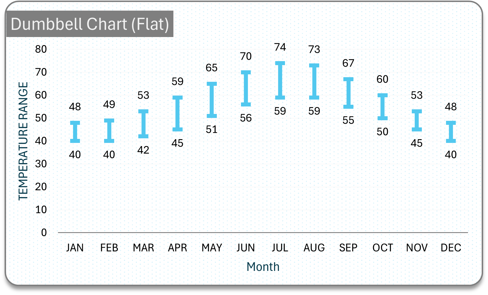
Dumbbell with flat ends for ranges
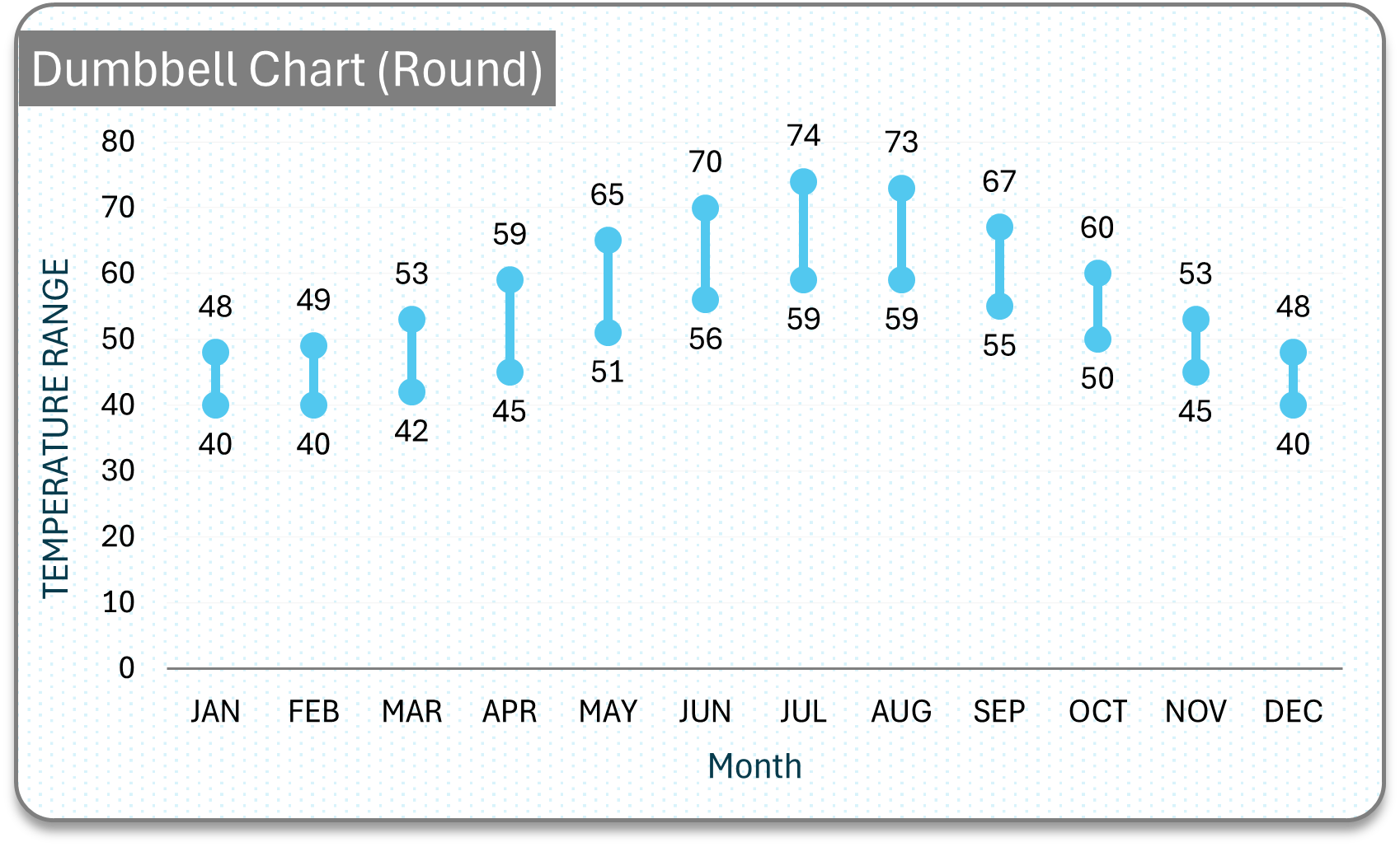
Dumbbell with round ends for ranges
Composition
Illustrate the composition of a whole, comparing relative proportions across categories.
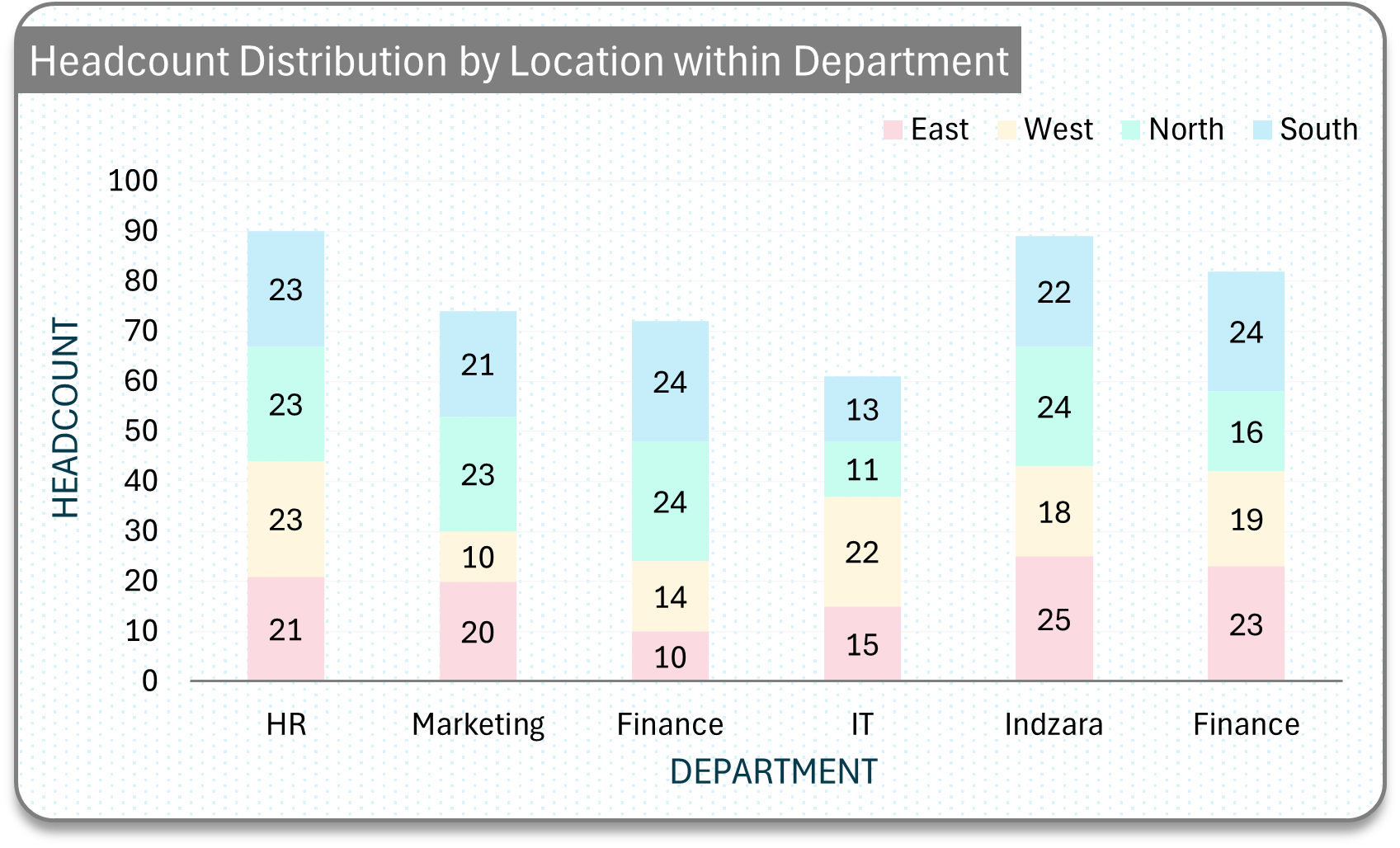
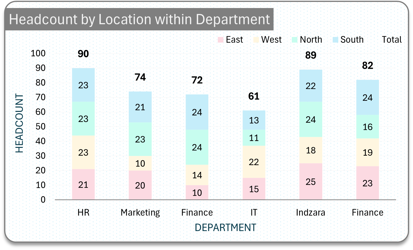
Simple stacked column chart for composition analysis
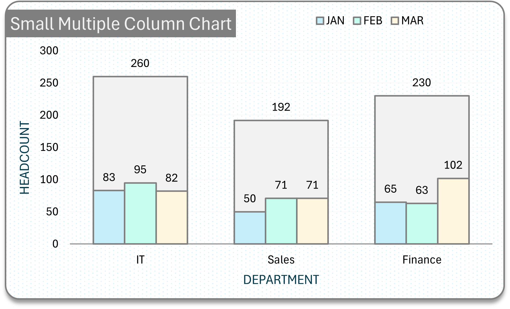
Column chart for multiple series with small multiples
100 stacked column chart with totals of each category
Stacked columns with totals for each category
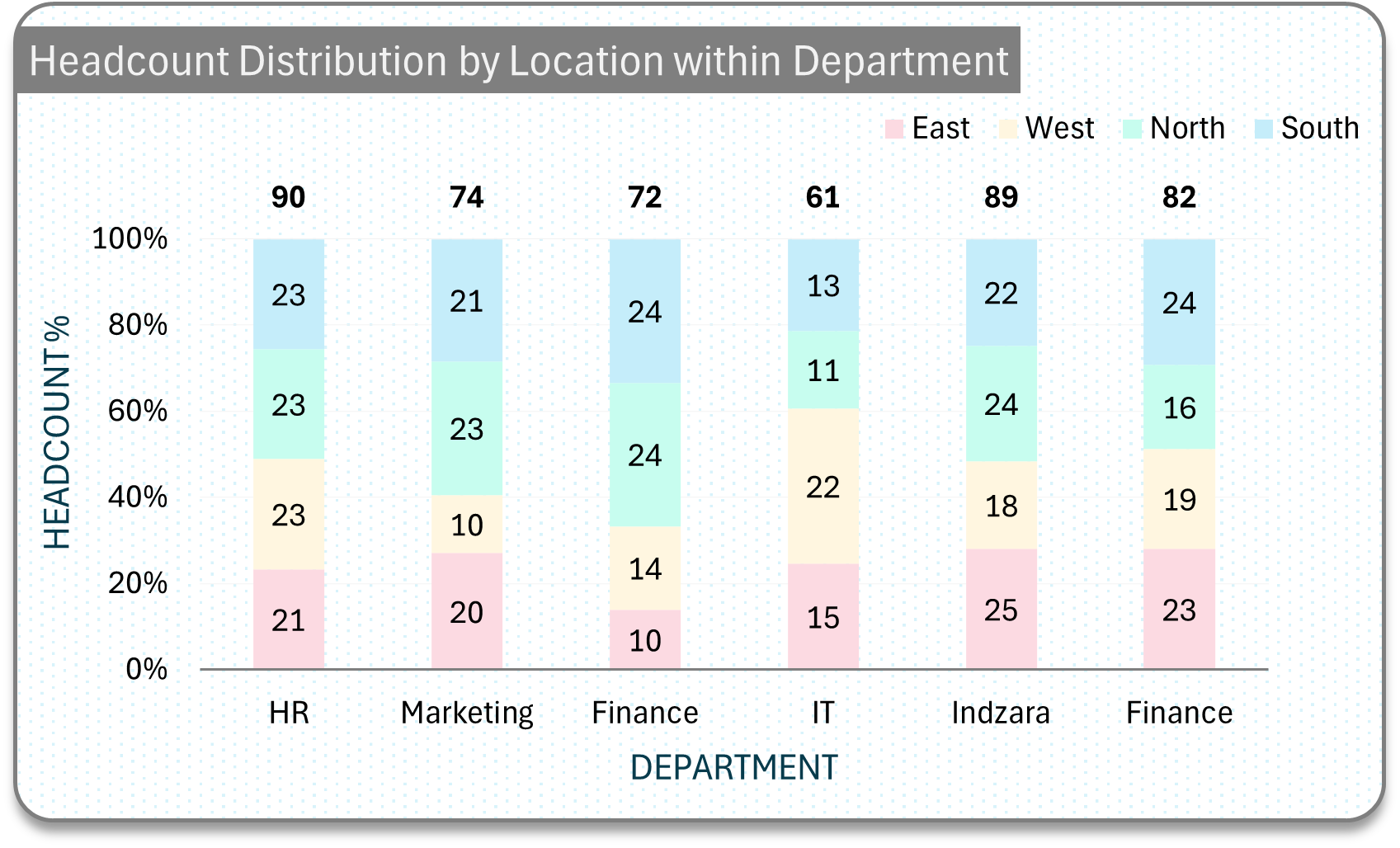
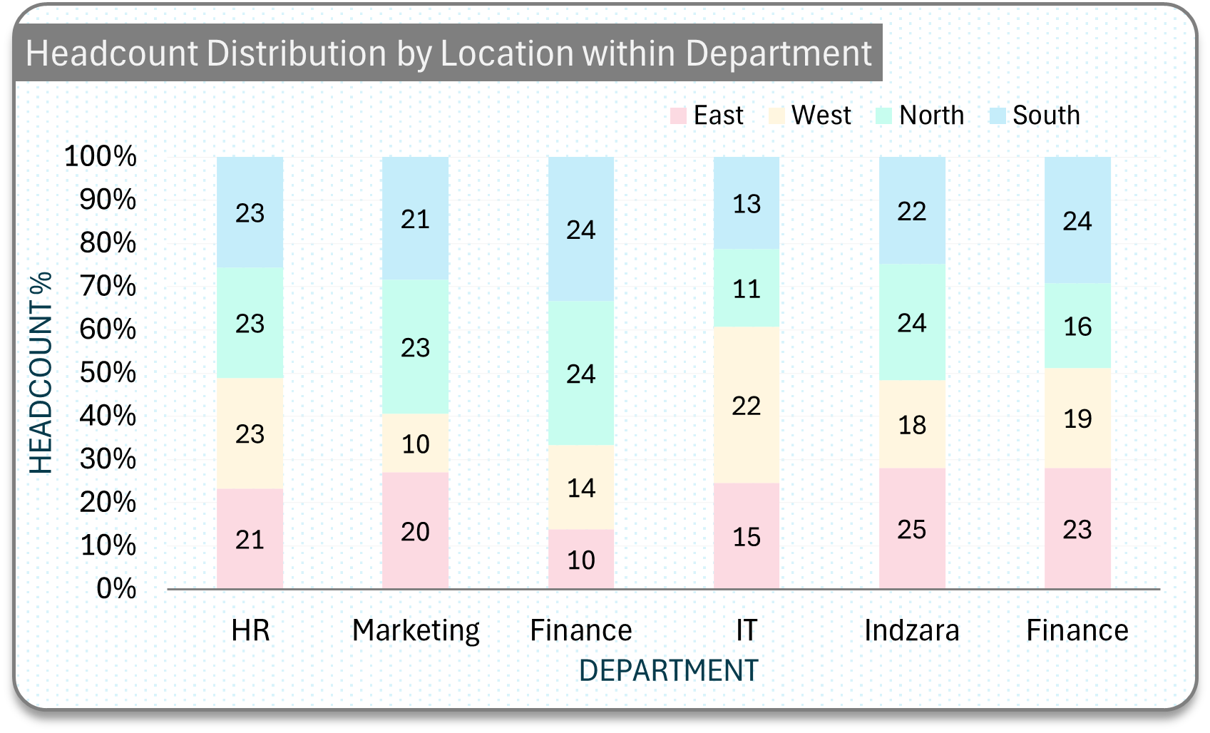
Simple 100 stacked column chart
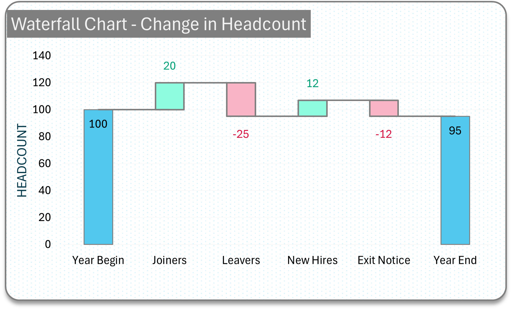
Waterfall chart to analyse changes in composition
How to Format a Column Chart?
tailor it for your need
The choice of chart formatting should depend on the audience, aimed at clearly communicating data findings. In business, charts facilitate recommendations, helping decision-makers choose appropriate actions based on the visualized data. The key is to tailor the presentation effectively.
Avoid Clutter
Too much information can be overwhelming! Keep the chart simple. Too many columns or categories can make the chart difficult to read.
Label Clearly
Ensure that all axes are clearly labeled. Include a descriptive title and a legend if the chart includes multiple data sets.
Consistent Colors
Use colors consistently to avoid confusion
Choose the right type of chart
Choosing the right type of chart goes a long way in ensuring there is no misleading of conclusions. Column charts are best for specific scenarios outlined earlier. If there is a better chart type, choose that.
Check for Accuracy
Ensure all data represented is accurate and up to date.
Choose Appropriate Scales:
The y-axis scale should be set to reflect the range of your data accurately. Watch out for non-zero starts, as they can lead to incorrect conclusions.
Cater to the audience’ needs
Ensure the audience does not have to work very hard to understand the message. If data labels are important for the audience, include it. If gridlines are important, include it.
Keep it simple
If there is a simpler way to communicate the same message, choose that method.
Most commonly used elements
Formatting a column chart
How to Create Column Charts?
a closer look at the diverse range of column charts
In this section, we’ll take a closer look at the diverse range of column charts featured in our blog posts. Each chart is a visual masterpiece, crafted to convey insights and enhance your data-driven decision-making process.
The Instant Chart Maker
Discover the power of visualization
Discover the power of visualization with our Instant Chart Maker – your simple and effective solution for seamless chart creation. Instantly transform your data into stunning visuals with just a few clicks!
Instantly create professional charts by simply entering your data.
Customize charts with ease, adjusting colors, fonts, and more.
Access a comprehensive library of 32+ charts, with regular updates.
Seamlessly integrate charts into your existing Excel files.
Enjoy dedicated support for a hassle-free experience.