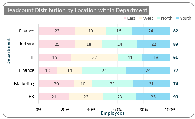
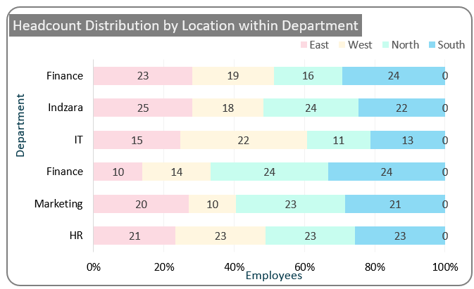
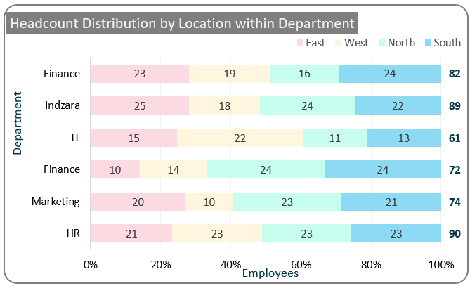
This post walks you through all the steps required to create a 100% stacked bar chart that displays each bar’s totals, as shown below.

Using a regular stacked bar chart, the width of the bar is used to analyze which department has the highest and the lowest employee count based on a third dimension, here by the region, not only that, we’ll look at how to add the department wise total value above each bar.
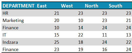
Let’s look at the steps required to create this chart in Excel. Consider a sample data as shown:
Ready to save time on your next presentation? Explore our Data Visualization Toolkit featuring multiple pre-designed charts, ready to use in Excel. Buy now, create charts instantly, and save time! Click here to visit the product page.
Step 01: Create the chart
i. Select all data, press CTRL+T to convert it to table.
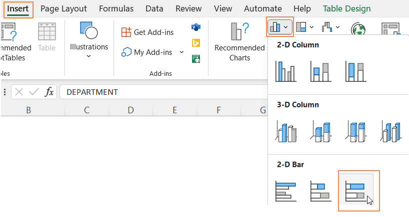
ii.Select all data and insert a 100% stacked bar chart.
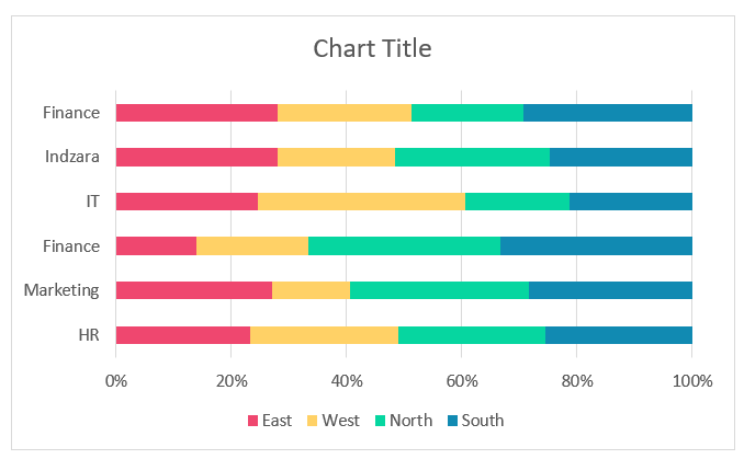
This creates a 100% stacked bar chart as shown:
Step 02: Format the chart
Before adding the total values on top, let us first format this chart.
i. Click on the chart, and press CTRL+1 to open the format pane.
ii. From the drop-down, choose one of the series and format the fill color as shown.
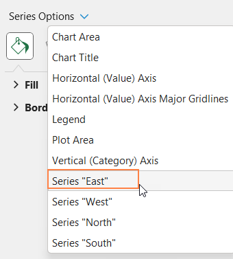
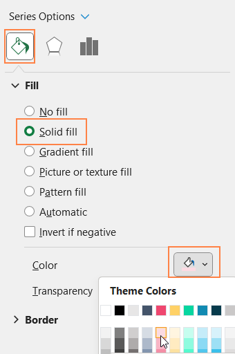
Repeat the same steps for all series (as need be)
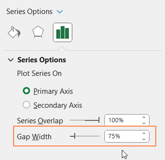
If need be, you can also adjust the gap width from the series options: the lesser the gap width, the broader (thicker) your bars will be.
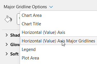
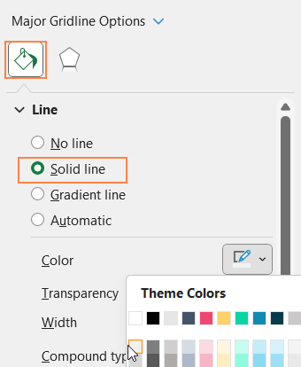
iii. From the drop-down, choose the “Horizontal (Value) Axis Major Gridlines” and format it to make this less apparent.
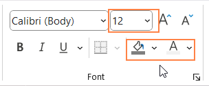
iv. Now, add a suitable chart title and format it with options available in the Home Ribbon.
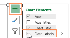
v. Click on the chart and use the “+” icon to add data labels, format the labels if needed
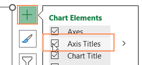
vi, Similarly, add the axis titles too.
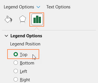
vii. Click on the legend, use the format pane legend options to reposition them to top.
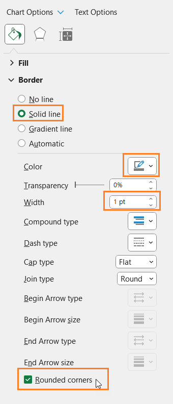
viii. Click on the chart, go to Chart Area from the format pane, and format the chart border as shown.
With this, the 100% stacked bar chart looks something like this:

Step 03:
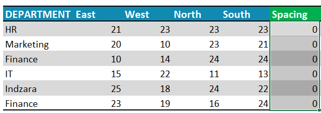
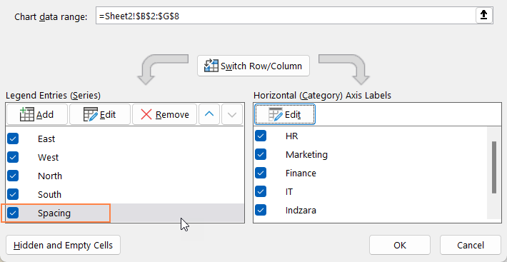
Now to add the total values to the 100% stacked bar chart, let us add a “Spacing” column to the table with zeroes as the values, this is just to create an additional stack to add the data labels.
Now, add a Total column to the table with the formula as shown:
=[@East]+[@West]+[@North]+[@South]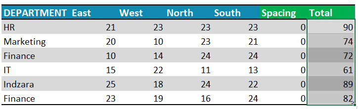
Step 04: Add the Total Value to chart
This adds both the series to the chart, we need only the “Spacing” to be present.
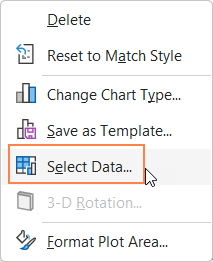
i. Right-click on the chart, go to Select Data
ii. Remove Total series as shown here:
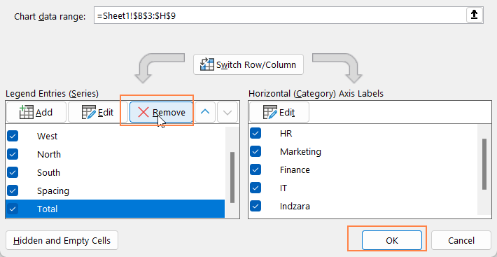
Ensure “Spacing’ series stays at the bottom of all the series
Click on the “Spacing” legend from chart and delete the same.
With this, the chart should look like this:
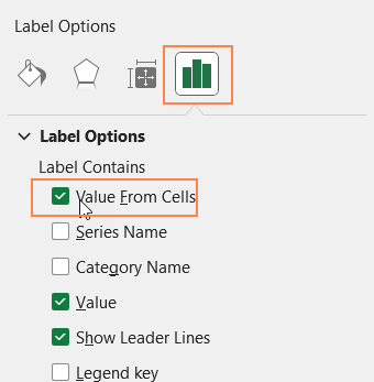
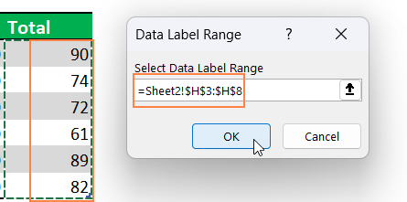
iii. Now, click on the “0” labels, and from the format pane go to Label Options.
From here, check the “Value from Cells” option and choose the Total series values as shown. (Uncheck other options)
iv. Click on the Total labels, position it at inside base and format them as needed.

With this step the total label gets added to the 100% stacked column chart:
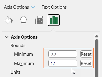
Step 05: Format X-Axis
The above chart looks fine but to include more space for the total labels, we need to format the horizontal axis.
To do this:
i. Right-click on the horizontal-axis, go to Format Axis:
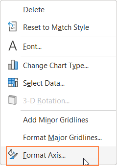
ii. In the Axis Options, reset the minimum and maximum bounds to 0.0 and 1.1 respectively.
With this, the 100% stacked bar chart with totals is ready to be included in your next presentation!