In this post, we’ll look at creating a unique type of Bar chart called the “Floating Bar Chart”. These type of charts have bars that seem to “float” without necessarily stemming out from the vertical category axis, hence the name. A sample chart is shown below:
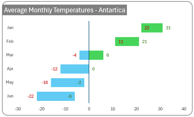
Consider a sample data of minimum and maximum temperatures of a region in Antarctica:
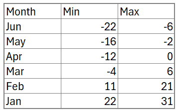
Such data, where we have a range of values can be uniquely and effectively represented using the floating bar chart.
With this data, let us look at the steps required to create this chart in Microsoft Excel.
If you are looking for a detailed explainer video, please check our YouTube tutorial, as shared here:
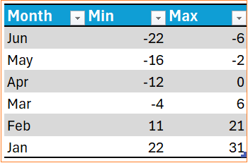
Step 01: Convert raw data into a table
As a best practice, always consider converting your raw data into an Excel table format. This ensures flexibility and any new data added will get automatically added to the chart. To convert the data to a table, select all the data including headers, and press CTRL+T.
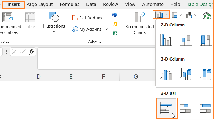
Step 02: Insert a clustered bar chart
Now, select all the data and insert a clustered bar chart.
This inserts a default bar chart as shown here:
Step 03: Format the vertical axis and series
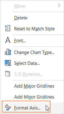
Now, right-click on the vertical axis, and go to the Format Axis option.
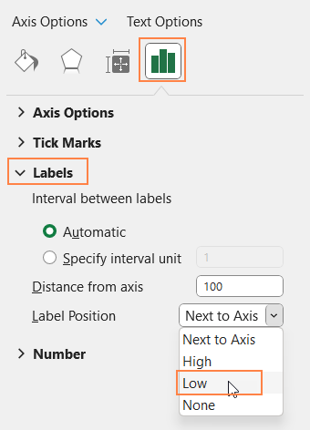
This opens up the format pane to the right. From here, under the Labels, choose the Label Position to be “Low”. This moves the vertical axis to the far left, which is clearer to view.
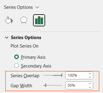
As a next step, click on any of the series, and from the Series Option increase the overlap to 100% and adjust the gap width to 50%.
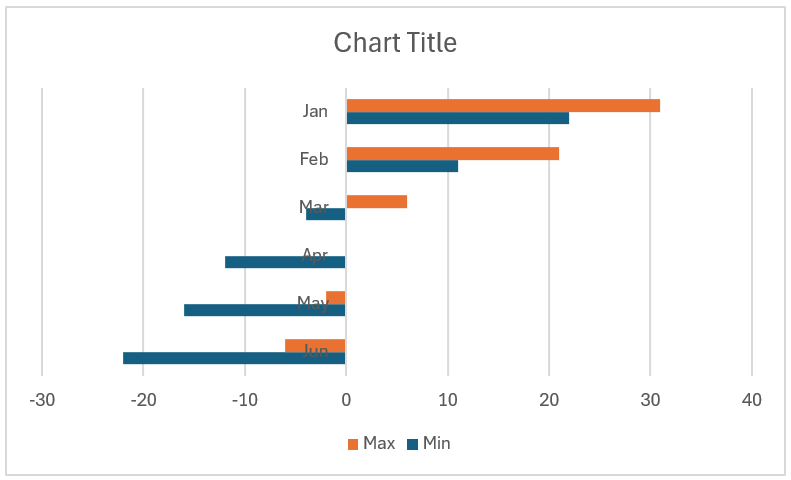
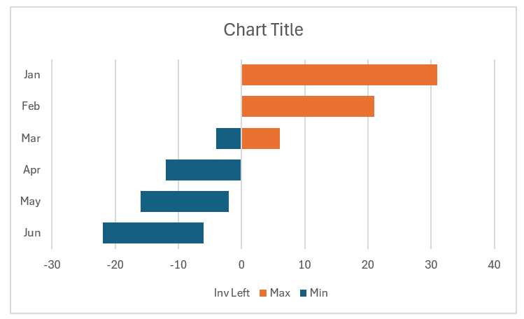
With these tweaks, we get the following chart.
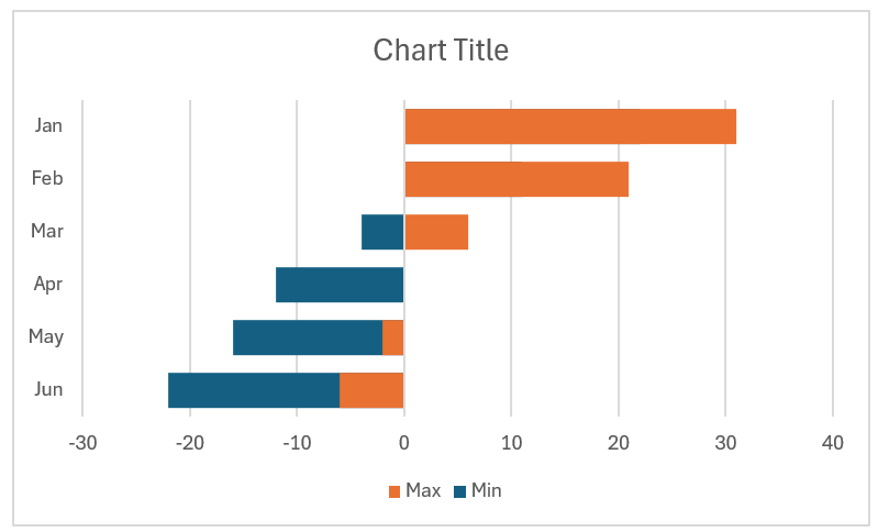
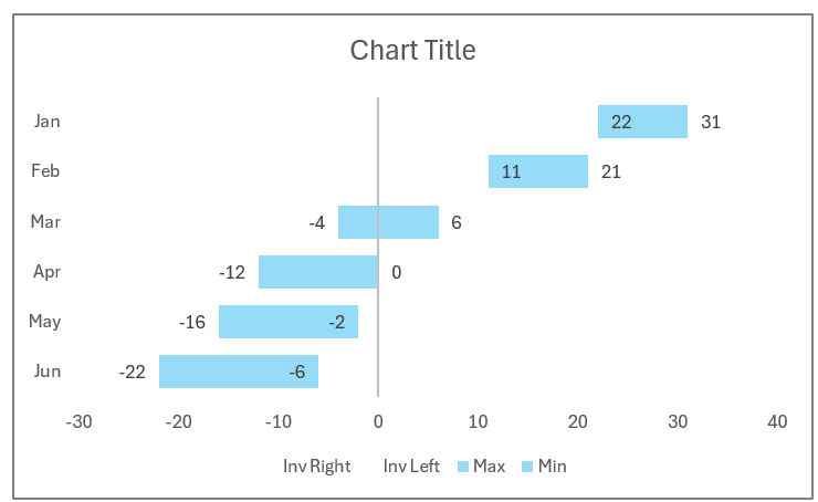
At a quick glance, we can see that the ranges of the data are not correctly represented in the bars. For example, June data should only range from -22 to -6 but in the chart above, we can see that the bar varies from -22 to 0.
The next steps detail the process of making this chart a floating bar chart where the ranges of data are clearly represented.
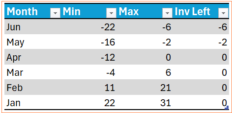
Step 04: Add additional columns to the data
Let us add two more columns to the data.
a. The invisible left series “Inv Left” will be used to remove or hide the orange bar to the left of the vertical axis. The formula for this would be:
=IF(AND([@Max]<0,[@Min]<0),[@Max],0)Here, the formula checks the values of both Max and Min temperatures, and if both the values are less than zero, it would return the maximum value else returns zero.
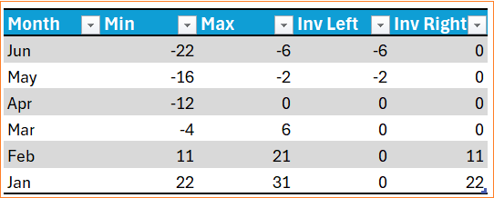
With this addition, the data looks as shown here:
As we have converted the raw data into a table, the addition of this new column will automatically update the chart as shown below:
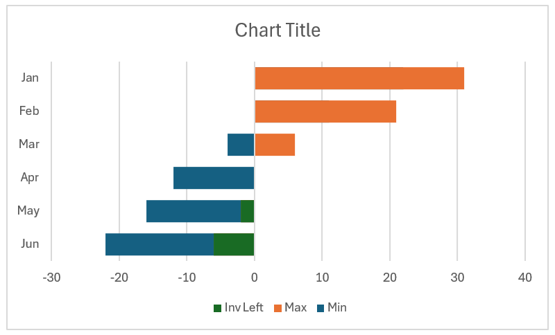
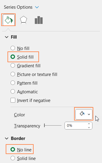
Now, click on the Inv Left bars from the chart, use the formatting pane to give a white fill color (that is, the same color as that of your chart’s background), and remove the borders.
With this, the chart looks something like this:
b. Similar to this, add an “Inv Right” column with the following formula:
=IF(AND([@Max]>0,[@Min]>0),[@Min],0)Like the Inv Left column, this column will check if both the max and min values are greater than zero and returns the min value if true, else returns zero. With this added column, the new data looks something like this:
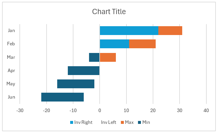
Adding this new column within the tabular data impacts the chart as shown:
Similar to the Inv Left column, remove the fill color of the Inv Right columns as well.
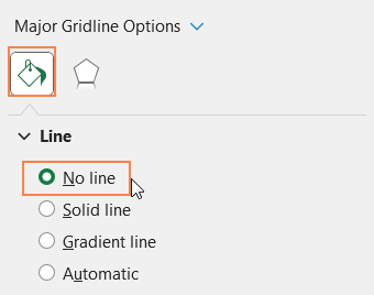
Along with this, from the drop-down, choose the “Horizontal Axis Major Gridlines as shown.
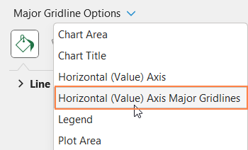
And remove the gridlines by choosing the no-line option.
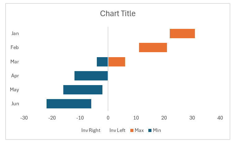
At the end of this step, our chart with floating bars looks as shown here:
Step 05a: Format the chart – Labels, Series Colors
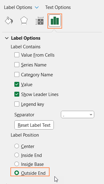
Let us now focus on adding data labels to clearly see the ranges in our floating bar chart.
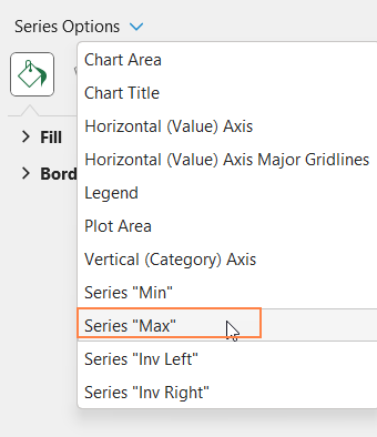
a. First include the data labels, and to do so from the drop-down in the format pane, choose the “Max” series
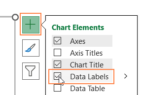
and use the “+” icon on top of the chart to include data labels.
Now, click on the labels and from label options, choose Outside end (the placement of labels can be made as per your requirement).
b. Similarly, choose the “Min” series, add the data labels, and format them as well.
c. Now, choose the “Max” series again and choose a lighter fill color so that the data labels are visible more vividly.
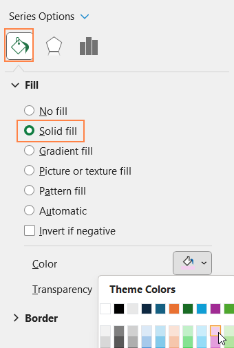
d. Repeat the same steps for the “Min” series and choose an apt fill color. You can either choose the same color as that of the Max series or a different color based on the analysis or requirement. With this, the chart looks as shown here:
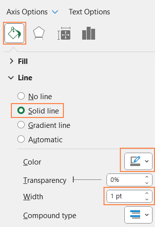
Step 05b: Format the chart – Vertical Axis, Border
Let us now focus on formatting the chart for a visually engaging floating bar chart.
a. Click on the vertical axis, from the format pane and edit the line color and thickness as shown:
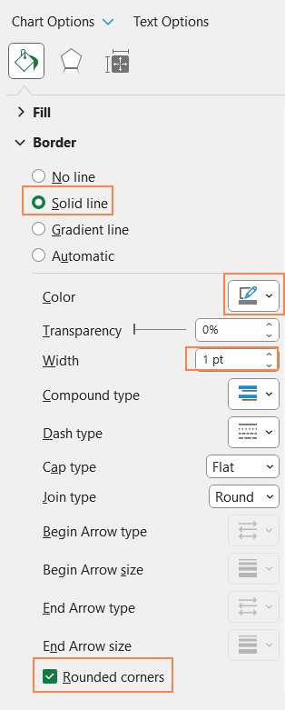
b. From the format pane drop-down, choose the “Chart Area” option and modify the chart border:
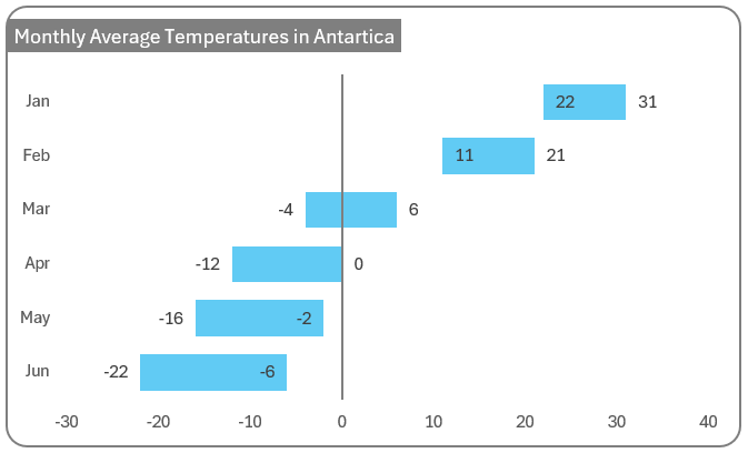
c. Click and remove the legends as they add no new meaning to this chart. Also, add a suitable chart title. With this, the floating bar chart representing temperature ranges in Antarctica is ready.
If you have any feedback or suggestions, please post them in the comments below.


