Bubble charts are an excellent way to visually represent three-dimensional data on a two-dimensional plane. In this blog, you’ll learn how to create a bubble chart in Excel, enabling you to compare and analyze data points effectively.
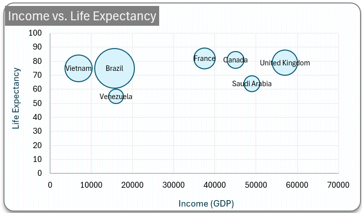
By following our step-by-step guide, you can recreate the chart shown above, which illustrates the relationship between Income (GDP) and Life Expectancy across various countries.
This can be extended to other real-life scenarios line In human resources, bubble charts can be used to compare employee performance, tenure, and salary. For project management, they can visualize the relationship between project costs, timelines, and resource allocation, aiding in better decision-making and resource planning.
This powerful visualization tool will help you uncover insights and present data in a clear, impactful way. Let’s dive in and start creating your bubble chart in Excel!
Ready to save time on your next presentation? Explore our Data Visualization Toolkit featuring multiple pre-designed charts, ready to use in Excel. Buy now, create charts instantly, and save time! Click here to visit the product page.
Step 01: Create the chart
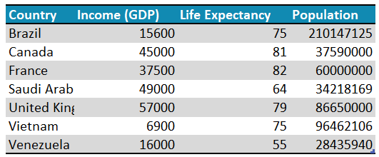
Consider sample data from various countries and their income (GDP), life expectancy, and population as shown here:
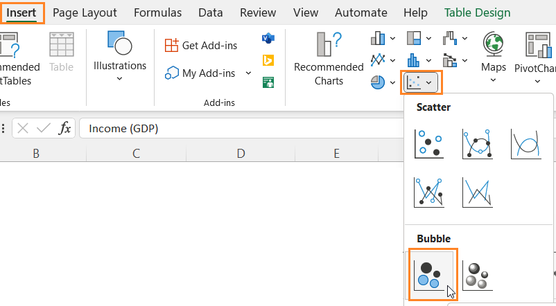
Select all three series (i.e., except the Country column) and insert a bubble chart as shown.
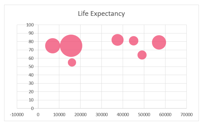
This inserts a bubble chart with the Income and Life expectancy in the X and Y axis respectively, whereas the bubble size is based on the population of each country.
Note that these colors may vary based on the theme of Excel in your file.
Step 03: Format the chart
If you have been following our blogs from the Data to Decision series, we always insist on formatting your chart to get a visually appealing chart that will grab your audience’s full attention.
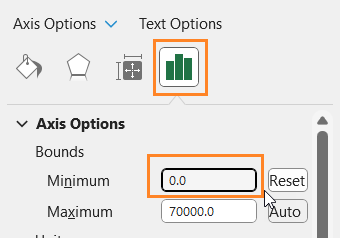
i. Firstly, let us format the axis of the chart. For this, click on the horizontal axis and go to Format Axis.
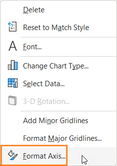
This opens a format pane to the right, under axis options, modify the minimum bounds to 0.0 as shown here:
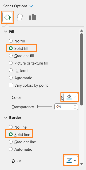
ii. Now, click on the bubbles, and in the Fill & Line option from the format pane modify the bubble’s fill and border as shown:
iii. From the drop-down, now choose the Horizontal Axis Gridlines and modify the line color to a lighter one, we need the gridlines to be less apparent.

Repeat the same for the Vertical Axis Major Gridlines too.
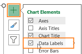
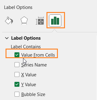
iv. Click on the chart, use the “+” icon from top of the chart and insert data labels
This inserts the Y value, but we need the country name as the label.
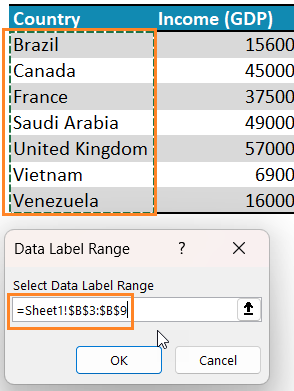
To do this, click on the labels, and from the label options in the format pane, choose the Value from Cells option
The range for the values will be the range of the Country as shown:
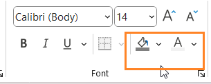
iv. Add a suitable chart title and format it using the options from the Home ribbon.
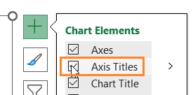
v. Click on the chart, use the “+” icon from top of the chart and insert axis titles (format if needed)
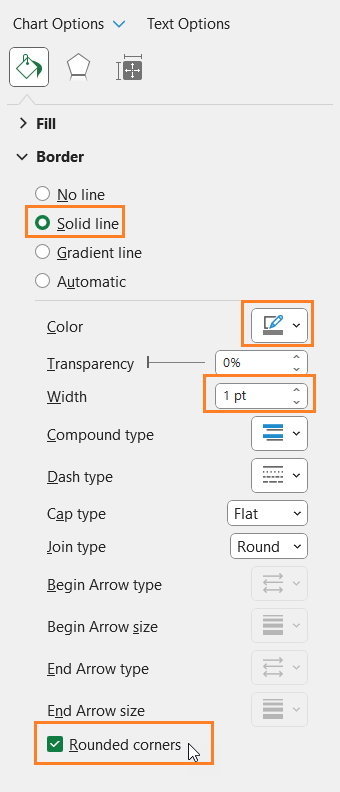
vi. Click on the chart and format the chart border as shown:
With this, your simple bubble chart is ready!


