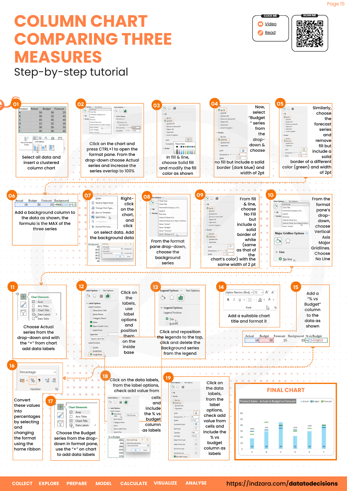
This article in our Data to Decisions series walks you through a step-by-step process to effectively display Actual vs Budget vs Forecast data, complete with percentage variances, to bring clarity to your financial narratives and empower stakeholders with the insights needed for strategic planning and review.
In Excel, with simple modifications to a column chart, this unique visualization can be built within minutes.
The concept for this chart is originally from an article from excelcampus.com.
Let’s get started!
Ready to save time on your next presentation? Explore our Data Visualization Toolkit featuring multiple pre-designed charts, ready to use in Excel. Buy now, create charts instantly, and save time! Click here to visit the product page.
Check our detailed YouTube video on the same here:
Step 01:
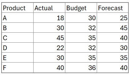
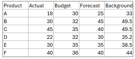
Our sample data contains the list of products, their sales actual, budget, and forecast data.
Select all the data and insert a 2D column chart.
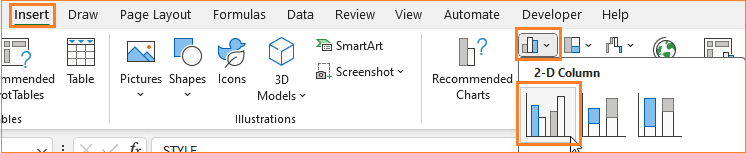
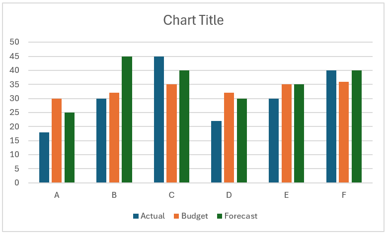
This inserts a default chart based on our data.
Step 02:
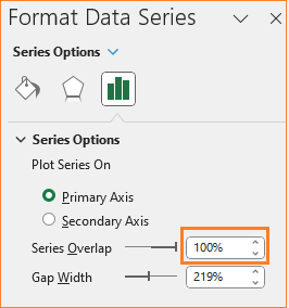
Since our final chart consists of a single column, right-click on any of the series, and go to Format Data series. This opens the format pane.

Under the series options, Adjust the series overlap to 100%.
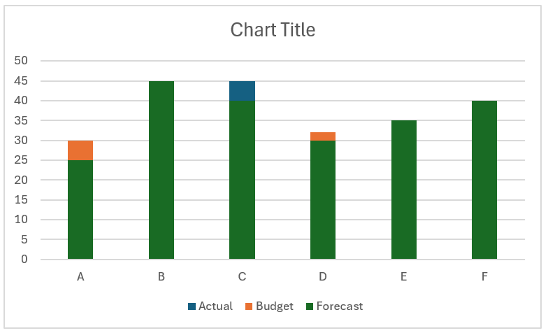
After this, our chart is modified like this:
Step 03:
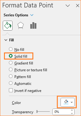
i. Click on the Actual series and modify the fill color to a lighter blue (choose the color based on your theme or the emphasis you want to build) from the format pane.
Note: If the format pane is not present to the right of your screen, click anywhere on the chart and press CTRL+1.
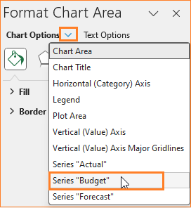
ii. From the format pane, select the budget series:
Remove the fill color while keeping the borders thicker and in a different color (a darker blue).
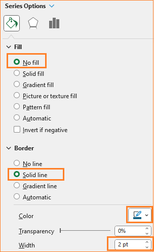
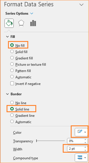
iii. Similarly, choose the Forecast series, remove the fill color, choose a different border color (green), and most importantly, choose the exact width as that of the budget series.
After this step, our chart looks like this:
Step 04:
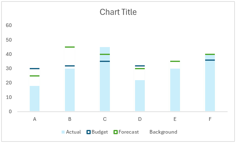
The aim is to only have the horizontal blue and green lines to show the budget and the forecast respectively. We’ll look at the technique to “remove” these vertical lines.
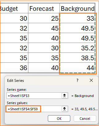
i. Add series to the data which will hide (or superimpose) the vertical border lines. Call it “Background”. This series will have the maximum of the actual, budget, and forecast and increase this value by 10% or any value based on the magnitude of your data.
=MAX(C3:E3)*1.1Cells C, E, and F have the actual, budget, and forecast respectively.
ii. Right-click on the chart, and Select data
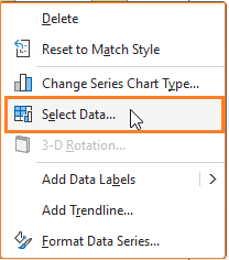
In the pop-up that pens, add a new series
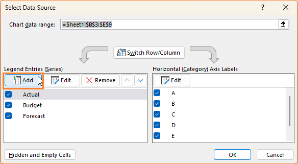
Add the background series, and the horizontal axis remains the same.
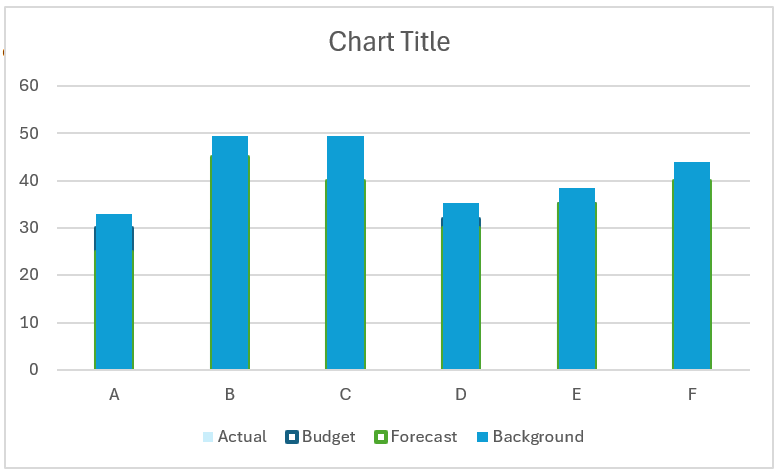
With this addition, our chart gets modified a bit:
Step 05:
Let’s format this Background series in such a way that the vertical border lines from the budget and the forecast series disappear.
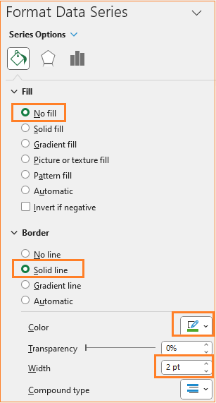
i. Choose the background series from the format pane. In the Fill & line, remove the fill color and include a solid border line with the same thickness as that of the budget and forecast series (i.e. 2), and most importantly, the border color is chosen as white.
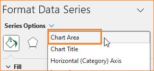
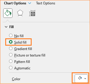
ii. From the format pane, choose Chart area and modify the fill to white color
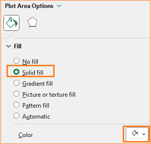
iii. Repeat the above step for the Plot area as well.
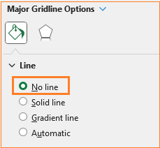
iv. Click on gridlines and remove them
After this step, our chart is getting into shape:
Step 06:
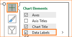
Click on the actual series and from the “+” icon from the top right corner of the chart, choose to add data labels.
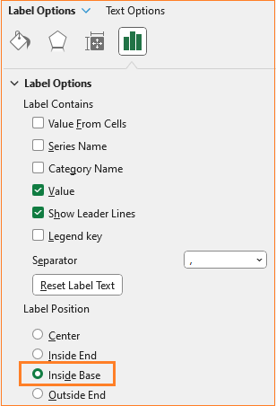
Click and position the labels to the inside base from the format pane.
At this stage, this is our chart:
Step 07:
Before we proceed further, let us format this chart.
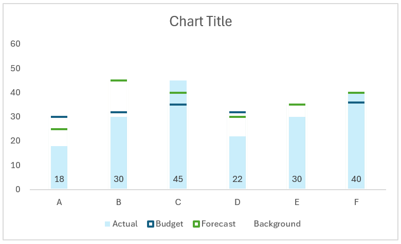
i. Click on the legends and move them to the top.
Click and delete the Background legend as it adds no meaning.
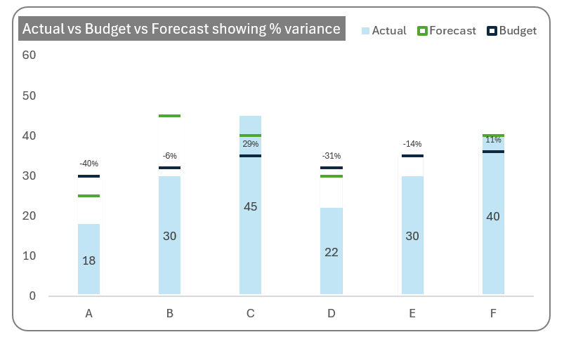
ii. Add a suitable title, say “Product sales – actual vs budget vs forecast” and format the same as well.
Step 08:
Create an additional series for the percentage variance from the budget.
=(C3-D3)/D3That is (Actual-Budget)/Budget
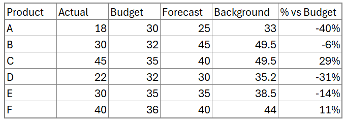
Similarly, we can arrive at the % versus forecast, but the recommendation here is to display only what is the crux of your analysis and hence, not clutter your visual.
To add this as data label, follow the steps:
i. From the format pane drop-down choose Budget series. In the “+” icon from the chart, choose to add data labels.
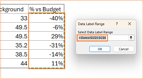
This adds the budget values as the labels, but we need the % vs Budget value. To get this, click on the chart, and from the format pane, select “Values from cells” from the label options.
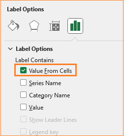
ii. Add the values that we’ve just calculated.
Adjust the font size according to the importance these values carry to your analysis or the emphasis you want to create using this Actual vs Budget vs Forecast chart.
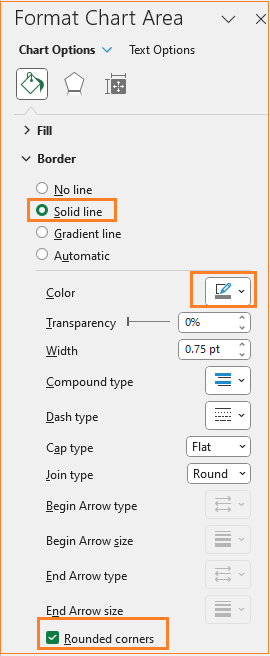
iii. As a final step of formatting, change the chart border by clicking on the chart and modifying the following in the format pane:
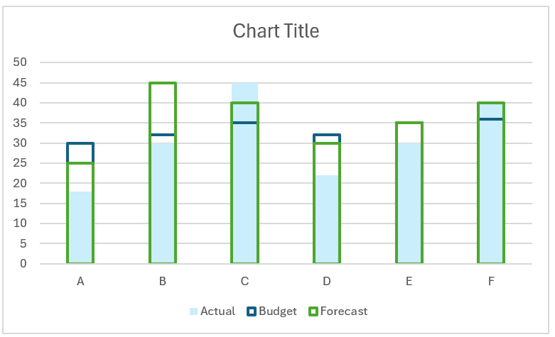
With this, our final chart is ready to be included in your reports!
With this visual, we can quickly analyze like, that product B is about -6% behind the budget value etc.
Check our 1-page, downloadable illustrative guide explaining all the steps for a quick reference.
If you have any feedback or suggestions, please post them in the comments below.


