Let us create an insightful Actual vs. Target chart in Microsoft Excel, complete with variance indicators. A unique and great visualization for your reports to quickly grab the attention of your audience!
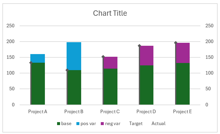
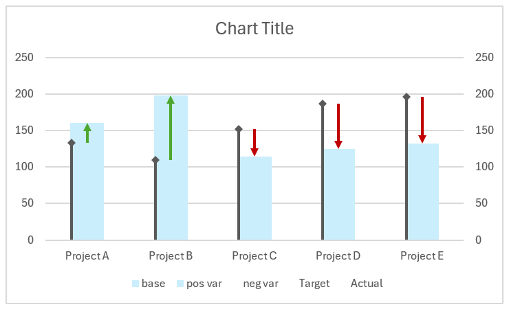
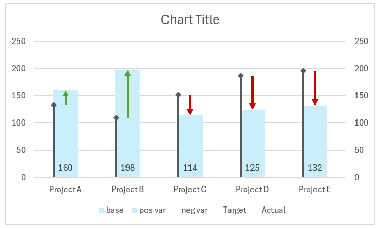
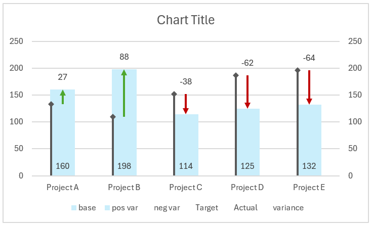
An example chart of what we’ll build is shown below:
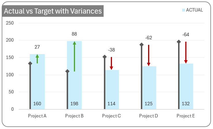
Here, the actual values are columns while the targets are displayed as a diamond-arrowed line to the left. The variances are shown as red or green directional arrows for negative and positive values respectively.
The inspiration for this chart is from pakaccountants.com who have a detailed article on creating this type of variance chart. We have made some changes to this chart in this blog here.
Ready to save time on your next presentation? Explore our Data Visualization Toolkit featuring multiple pre-designed charts, ready to use in Excel. Buy now, create charts instantly, and save time! Click here to visit the product page.
Check our detailed YouTube video on the same here:
This chart can be built using Microsoft Excel in simple steps, follow the steps below.
- Prepare the data
- Insert a stacked column chart
- Modify the series chart type
- Format the actual and target series
- Format the target line
- Format the actual column
- Add error bars to get variance arrows
- Format the chart
- Add “Max” and “Variance” columns
- Add the “Max” series to chart
- Apply standard chart formatting
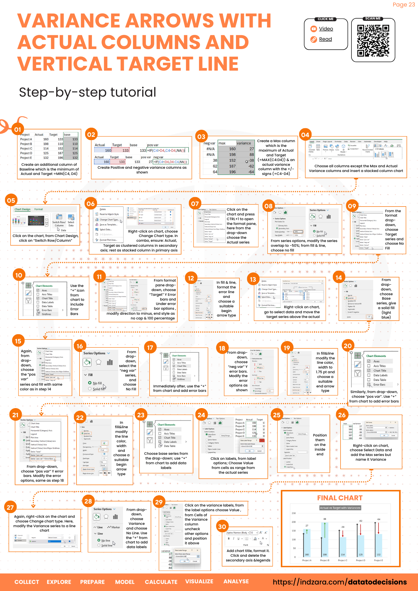
Step 01: Prepare the data
The sample data we’ll use is as follows:
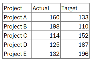
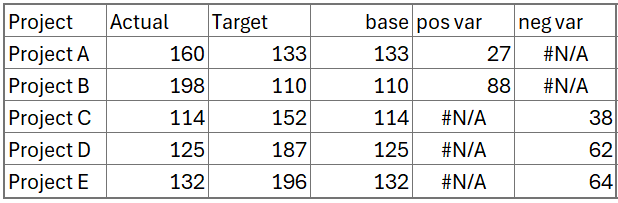
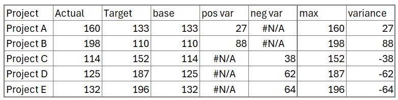
To create this chart, we’ll include some additional columns: (consider the actual and target values start from the cells C4 and D4 respectively)
- Baseline: This is the minimum of the actual and the target value
=MIN(C4:D4)- Positive variance: Variance when the actual is greater than the target
=IF(C4>D4,C4-D4,NA())- Negative variance: Variance when the actual is lesser than the target
=IF(C4<D4,D4-C4,NA())We create two separate columns for the variances to get only the absolute values.
With these columns, our data is ready for now.
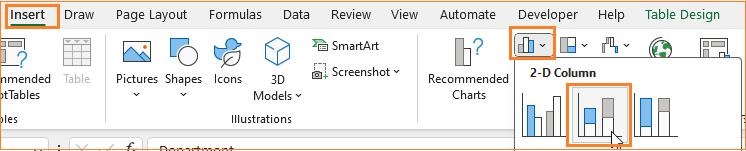
Step 02: Insert a stacked column chart
Select all the columns and insert a stacked column chart.
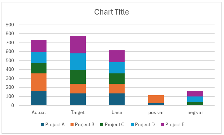
Excel creates a default chart based on our data:
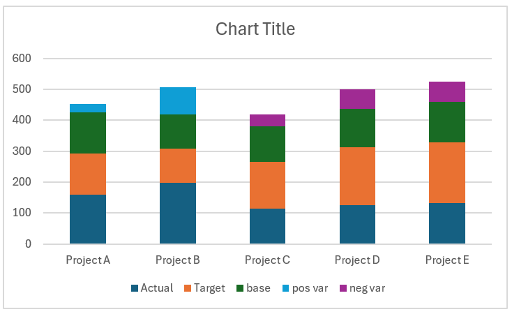
We need the projects along the X-axis, to get this click on the chart, and from the Chart Design ribbon click on “Switch rows/columns”.
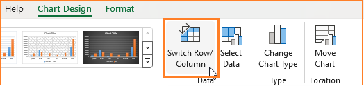
This modifies the chart accordingly.
Step 03: Modify the series chart type
To modify this chart to get the desired format, right-click on the chart and go to “Change Chart Type” which opens up a dialog box.
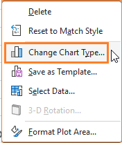
Go to Combo and here do the following,
- The Actual and Target series chart type as Clustered columns and move them to the Secondary axis.
- The Base, positive, and negative variances as Stacked columns and in the primary axis.
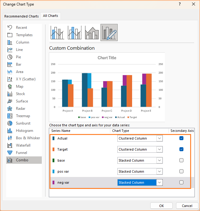
After this, this is the resulting chart:
Step 04: Format the actual and target series
Click on the chart and press CTRL+1 for the format pane. Let’s now format this chart with the below steps:
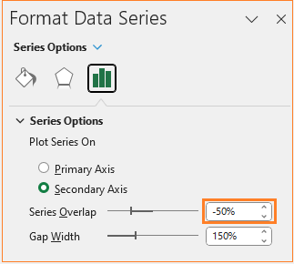
i. Choose the “Actual Series”
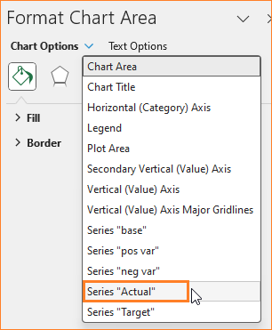
ii. Modify the series with to -50% for this series
iii. For Actual, in the Fill & Line, remove the fill color.
Now for the Target series, follow the steps below:
i. Choose the series:
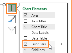
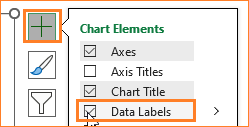
ii. From the “+” icon on the top-right corner of the chart, include Error Bars:
iii. In the Fill & Line, remove the fill color.
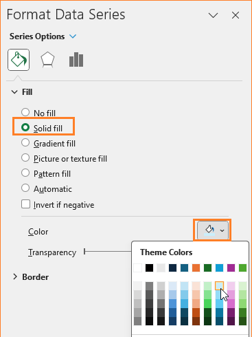
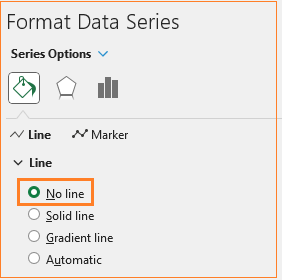
Step 05: Format the target line
Now, from the format pane, choose the Target Y-error bars series.
i. In the Fill and line, choose a solid color, modify the width, and the begin arrow type as shown here:

ii. Go to the error bar options and modify the following accordingly.
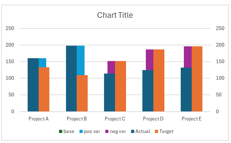
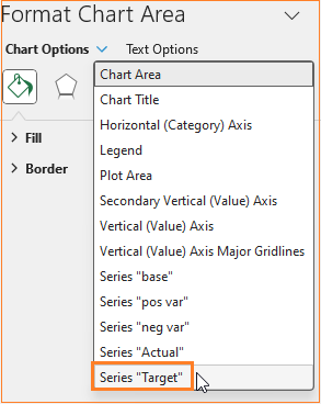
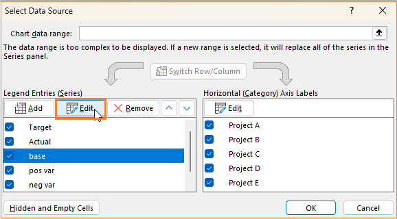
Lastly, right-click on the chart and go to “Select data”. This opens a dialog box, move the Target series to the top.

After this step, the chart looks like the below:
Step 06: Format the actual column
From the format pane, choose the base series and modify the fill color.
Now, go to the “Pos var” series and change the fill color to the same color chosen above.
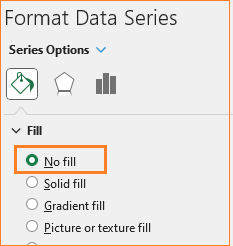
Now, choose the “Neg var” series and choose No fill as we do not need this series for our chart design.
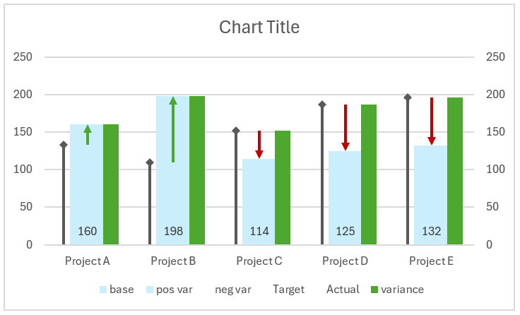
This makes our chart look something like this:
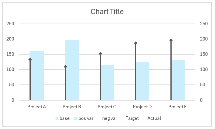
The base and the positive variance together give us the Actual series, hence by modifying the colors we made the chart look like it’s displaying the actual values in Blue color.
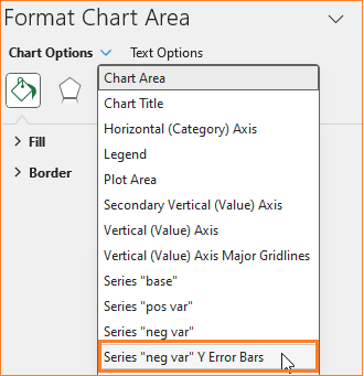
Step 07: Add error bars to get variance arrows
Let’s shift our focus on creating the arrows to display the variances.
i. Choose the “Neg var” series and from the “+” icon on top, choose to add error bars.

Once done, choose the Neg var Y error bars as shown:
ii. In the Error bars option, modify accordingly:
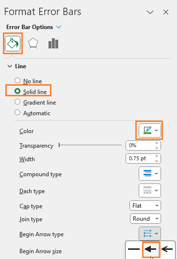
iii. In the Fill & line, modify the fill color and the end arrow type as shown:
Repeat the same steps with the positive variance series:
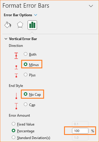
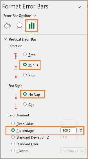
i. Create error bars, choose the “Pos var Y error bars”.
ii. Modify the error options to: Minus, no cap and 100%
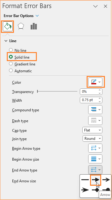
iii. In the fill and color modify the color to green to denote positive change and a begin arrow as shown:
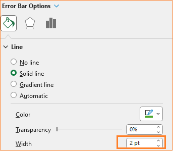
Modify the width to enhance the arrows (do this for both series)
By the end of this step, this is our chart:
Step 08: Format the chart
In this step, let’s add the data labels. Click on the base series (or choose from the Format pane) and add data labels:
This adds the base value to the chart as shown:
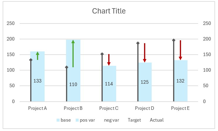
Click on the labels and move them to the inside base:
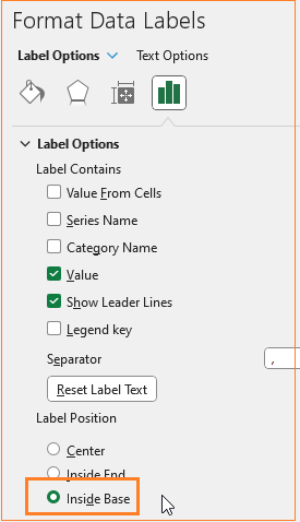
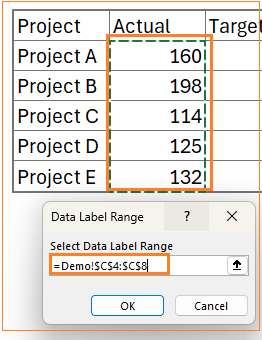
But these are the base values, we need the Actual series values. To change this, from the format pane, choose “Value from cells” and uncheck all other options.
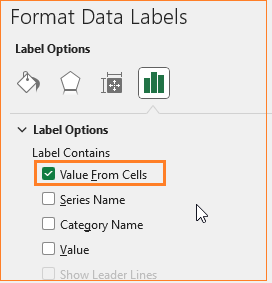
This opens up a pop-up in which you can add the Actual series values as shown here:
At this stage, this is our chart:
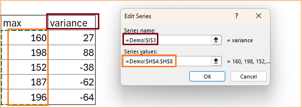
Step 09: Add “Max” and “Variance” columns
The last thing is to include the variance labels at the top of the chart. To position the labels on the top, we’ll include:
- A column called “Max” which is the maximum value of the actual and the target”
=MAX(C4:D4)- The Max column is only for the positioning, the actual label is the variance value, which is the difference between the actual and the target,
=C4-D4With these columns, our data is:
Step 10: Add the “Max” series to chart
Right-click and go to “select data” and add a new series, call it variance but the values will be from the max series.
This addition modifies the chart as shown below.
To fix this, right-click on the chart and Change the chart type which opens up a dialog box. Ensure the new series is a line chart and in the secondary axis.
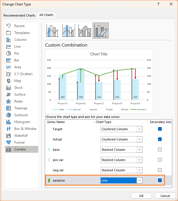
This modification again changes the chart:
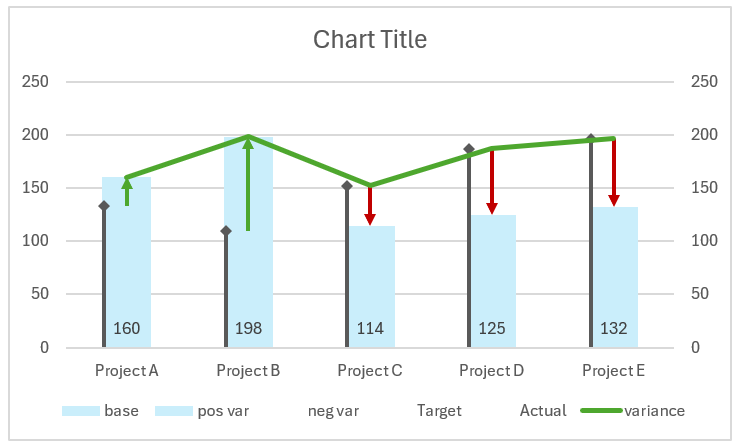
To add the variance values as labels, follow the below steps:
i. Click on the line, and remove the line from the fill & line option.
ii. Add data labels:

iii. Adjust the position to the top:
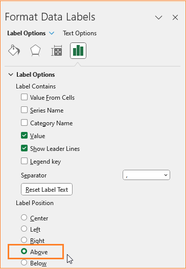
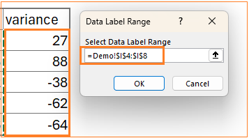
iv. We do not want the Max series labels but rather the Variance values as labels, to add this: from the label options, uncheck all and choose the Value from cells option.

Choose the variance values in the pop-up that appears:
After this step, the chart is:
Step 11: Apply standard chart formatting
Let us apply some formatting to the chart to make it visually appealing.
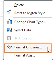
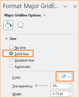
i. Now the gridlines, ensure to have them but not so evidently overpowering chart by modifying the line color.
ii. Add a suitable title, say “Actuals v Targets with variances” and format the same as well.
iii. Click on the secondary axis and delete the same as this serves no purpose to our visual.
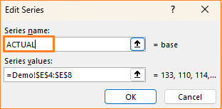
iv. In the legend, we’ll modify the series name in such a way that it is called ACTUAL since the light blue color column here represents our actual series.
To do this, right-click, select data, and modify the base series name as shown:
v. Except the ACTUAL, delete the other legends, and move the legend to the top.
With these formatting changes, our final chart with variances as arrows is ready!
Check our 1-page, downloadable illustrative guide explaining all the steps for a quick reference.
If you have any feedback or suggestions, please post them in the comments below.


2 Comments
In the actual vs target with variance as arrows instructions, I am finding that if the Actual value is below zero the arrow does not work.
It starts the arrow at the negative value and goes to zero, but the actual is negative and does not start at the budget number.
Do you have any instructions on how to correct?
Thank you.
We regret the inconvenience caused.
I just tested creating the chart the arrow did not start from 0. I have sent a sample sheet and below alternate formula to ensure the negative variance arrow does not start above the target to your email ID.D4,D4,D4-C4),NA())
=IF(C4
Best wishes.