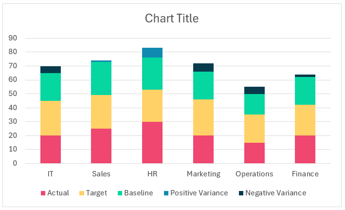
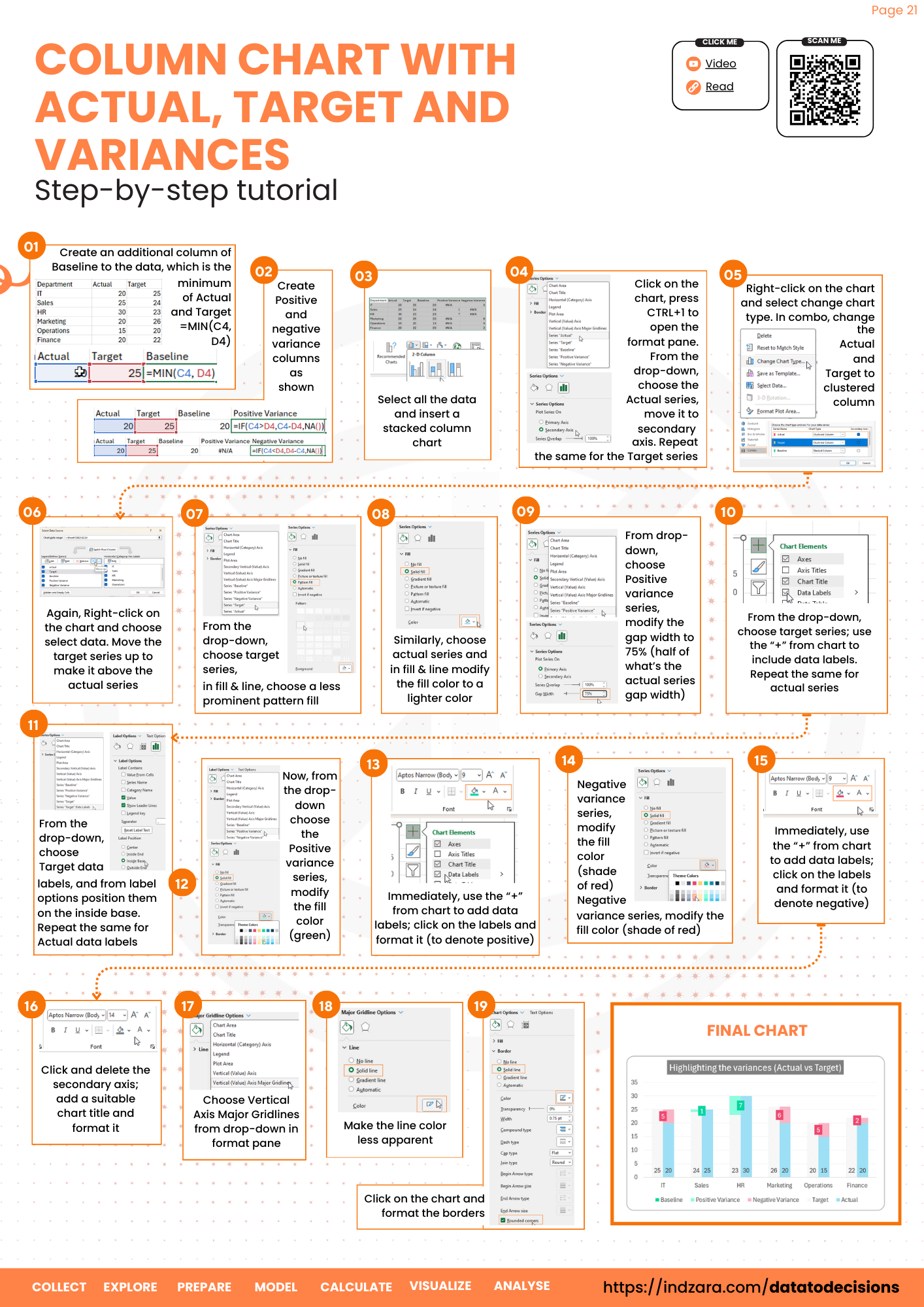
This post from Data to Decisions is about creating a column chart that displays the actual, target, and positive and negative variances. A truly unique visual representation of the variances in your data.
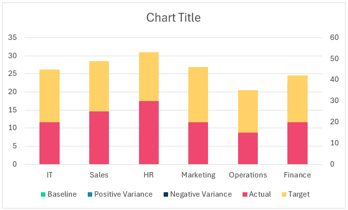
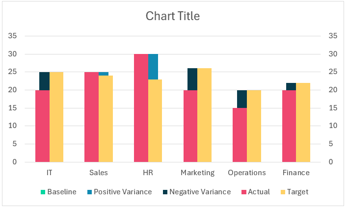
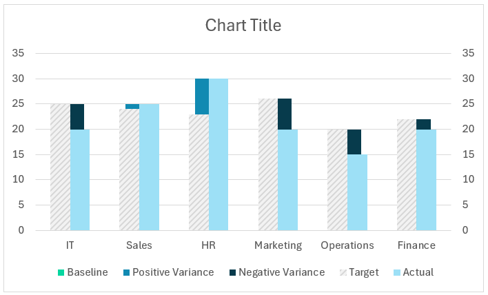
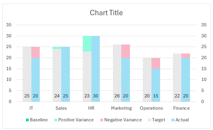
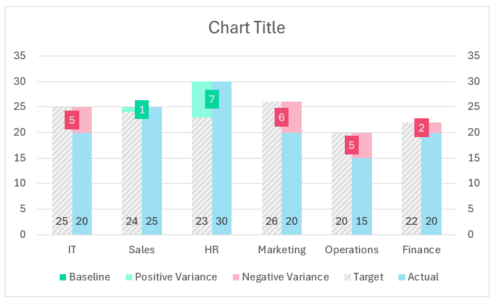
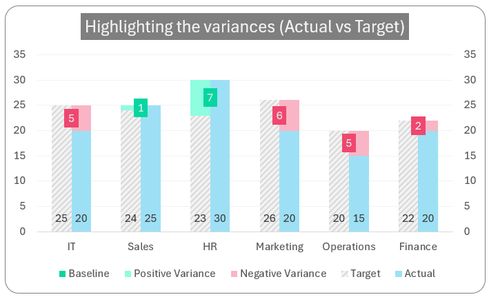
A sample chart is shown below:
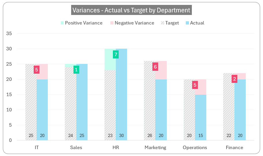
At a glance, we can see that the HR and Sales departments have positive variances that is, their targets are achieved. For the other departments, the negative variances mean that the actual is less than the targets set for them.
Let’s build this simple yet powerful visual in Excel, let’s get started!
Ready to save time on your next presentation? Explore our Data Visualization Toolkit featuring multiple pre-designed charts, ready to use in Excel. Buy now, create charts instantly, and save time! Click here to visit the product page.
Please check our dedicated YouTube video explaining how to create this column chart here:
The following are the steps we’d follow in creating this chart:
- Convert raw data to table
- Add additional columns to data
- Insert a stacked column chart
- Reposition the Actual and Target columns
- Modify the chart type for Actual/Target series
- Re-order the Actual/Target series
- Format the Target/Actual columns
- Format the Pos/Neg variance series
- Add data labels to Actual/Target series
- Format the Pos/Neg variance series
- Add data labels to Pos/Neg series
- Format the chart
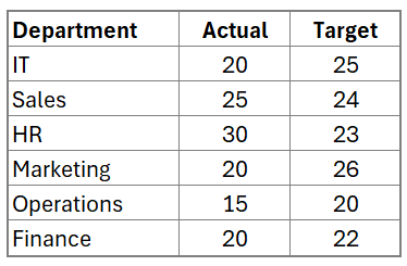
Step 01: Convert raw data to table
Consider our sample dataset with the department names, and the actual and target values of a certain metric.
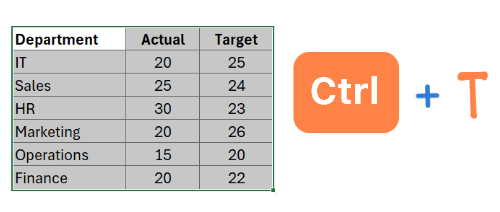
Before we proceed, convert this data to a table by selecting all the data and press CTRL + T.
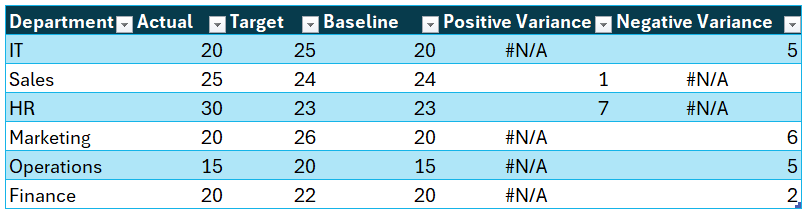
Step 02: Add additional columns to data
To this table, add additional columns that are required in building the chart. For this, we’ll need the following:
- The Baseline Value: this is the minimum of the actual and the target. This is needed because our actual value can be less or more than the target. This can be obtained by the formula:
=MIN(Table2[@[Actual]:[Target]])- Positive Variance: This is used to get variance as an absolute difference in cases where the actual exceeds the target.
=IF([@Actual]>[@Target],[@Actual]-[@Target],NA())- Negative Variance: Similarly get the negative variance as an absolute value where the actual is less than the target.
=IF([@Actual]<[@Target],[@Target]-[@Actual],NA())These are the three additional columns that our data needs. With the below sample, now we can create our column chart.
Step 03: Insert a stacked column chart
Select all the data, and insert a stacked column chart as shown below:
This creates a default stacked column chart as shown here (note that the color of the chart might vary based on the theme of Excel you are using):
Step 04: Reposition the Actual and Target columns
Let’s move the Actual and Target columns to a secondary axis to get our desired output.
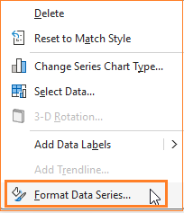
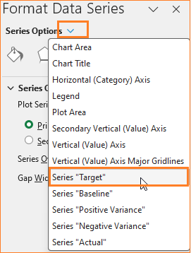
To do this, select the Actual series, right-click, and format the data series:
This opens up the Format pane, where choose the secondary axis as shown here:
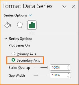
Do the same for the Target column, to choose the column in cases where there are multiple series, always look at the drop-down from the format pane to make the correct selection of series.
With this, our chart looks something like this:
Step 05: Modify the chart type for Actual/Target series
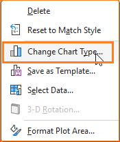
Now, we’ll change the chart type of these two series (Actual and Target) to a clustered column. To do this, right-click anywhere on the chart and go to Change Chart Type:
This opens a dialog box where we’ll modify the chart types as shown below:
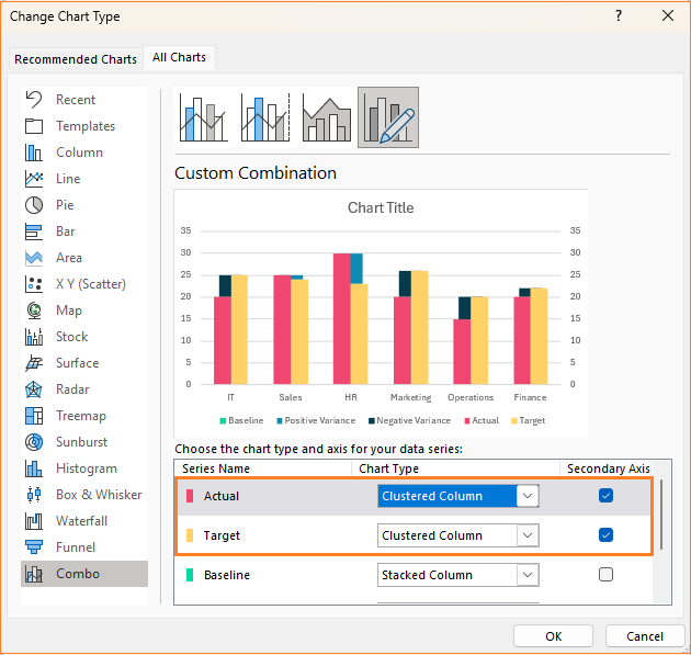
We’re nearing our desired chart, at the end of this step our chart is:
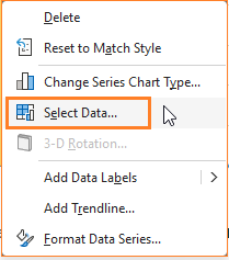
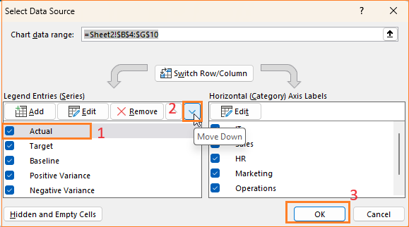
Step 06: Re-order the Actual/Target series
From the previous step, the Actual (in shade red) is to the left and the Target (in yellow) is to the right. We’ll get the target to the left and to do this, right-click inside the chart and go to select data which opens up a pop-up.
Here to change the order of precedence, move the Actual down as shown:
At this stage, this is our chart:
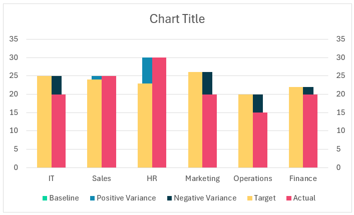
Note how the Actual and Target columns have changed from the chart in our previous step.
Step 07: Format the Target/Actual columns
We’ll apply some formatting over the columns in this step.
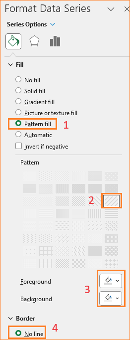
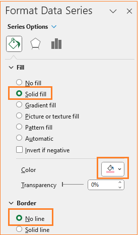
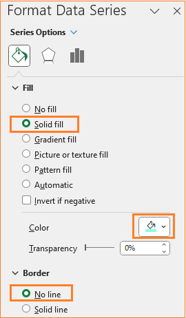
i. Select the Target series, and in the Format pane, apply a pattern-fill with grey color and with no borders: (these formatting can be modified per your need)
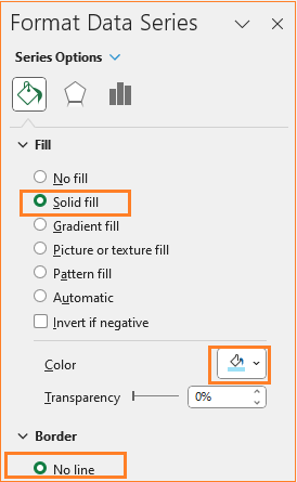
ii. Similarly, for the Actual series too modify the column colors.
With this, our chart is:
Step 08a: Format the Pos/Neg variance series
i. The primary focus of this chart is to show the positive and negative variances, let us format the same.
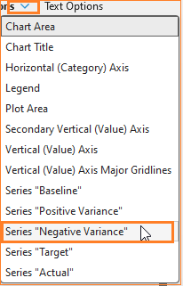
Choose the negative variance from the format pane,
We’ll change the gap width to be HALF of the Actual series (in this case it is 150%).
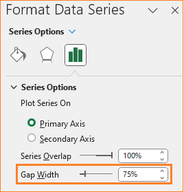
This will ensure the Positive variance also adjusts accordingly.
Step 08b: Add data labels to the Actual/Target series
ii. Add labels to the Actual and Target series at this point. To do this, click on the Actual series, and from the “+” symbol on the top right of the chart, add labels at the inside base as shown:
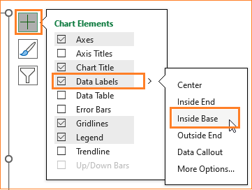
Do this to the Target series as well. At the end of this step, this is our chart:
Step 09: Format the Pos/Neg variance series
Let us also format the negative and positive variances in the same way.
i. Click on the negative variance and in the format pane, modify the color to a shade of red to denote negative (choose colors based on your organizational standards)
ii. Similarly, choose a green color to denote positive variance:
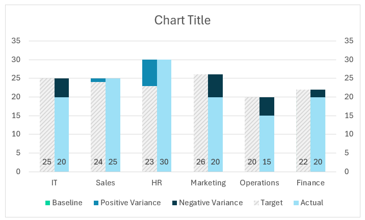
At this point, our chart is:
Note: choose colors based on the metric being measured.
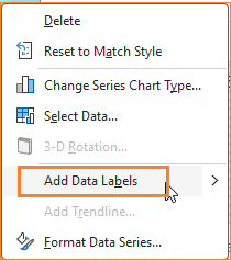
Step 10: Add data labels to Pos/Neg series
i. Let’s add data labels to the variances as well. Right-click on the negative series and add the data label:
Since this is the key to our chart, to make this stand out add a background color and modify the text color to highlight the negative variance.
ii. Similarly, add data labels to the positive variances and modify the background and text colors.
With this, our chart is:
Step 11: Format the chart
To make our chart visually better, let us apply some final formatting to the chart.
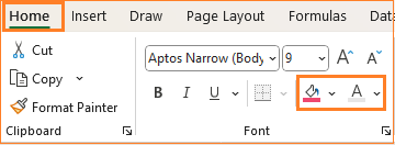
i. Give the chart a suitable, understandable title, say ”Highlighting the variances (Actual vs Target)” and format the color and background of the title in the ribbon on top:
ii. We can add axis labels if and when necessary. In our case these are self-explanatory, hence we are skipping them.
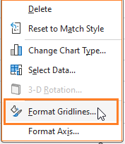
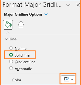
iii. Adjust the gridlines to make it less obviously visible. Right-click the gridlines and open the format pane:
Modify the color to a lighter grey to make it less prominent:
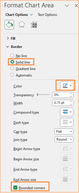
iv. As a final step, adjust the chart border’s color and make it rounded. (All of these formatting are optional and can be modified based on the need at hand)
That’s it! Our final chart that shows actual, target, and variances is ready!
Check our 1-page, downloadable illustrative guide explaining all the steps for a quick reference.
If you have any feedback or suggestions, please post them in the comments below.


