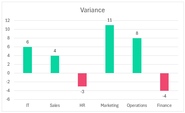
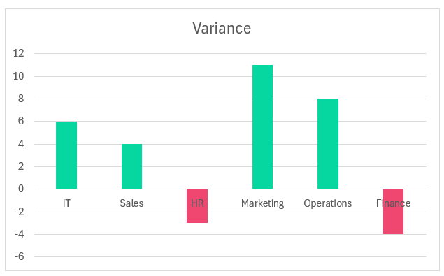
This blog gives you the simplest technique to create a column chart that displays the target variance from the actual values using Excel as shown here:
Ready to save time on your next presentation? Explore our Data Visualization Toolkit featuring multiple pre-designed charts, ready to use in Excel. Buy now, create charts instantly, and save time! Click here to visit the product page.
Let’s get started!
Please check our dedicated YouTube video explaining how to create a column chart to display variance here:
The following are the steps we’d follow in creating this chart:
- Prepare the data
- Insert a clustered column chart
- Format the data series
- Add data labels & format axis
- Apply stand chart formatting
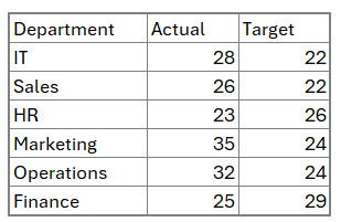
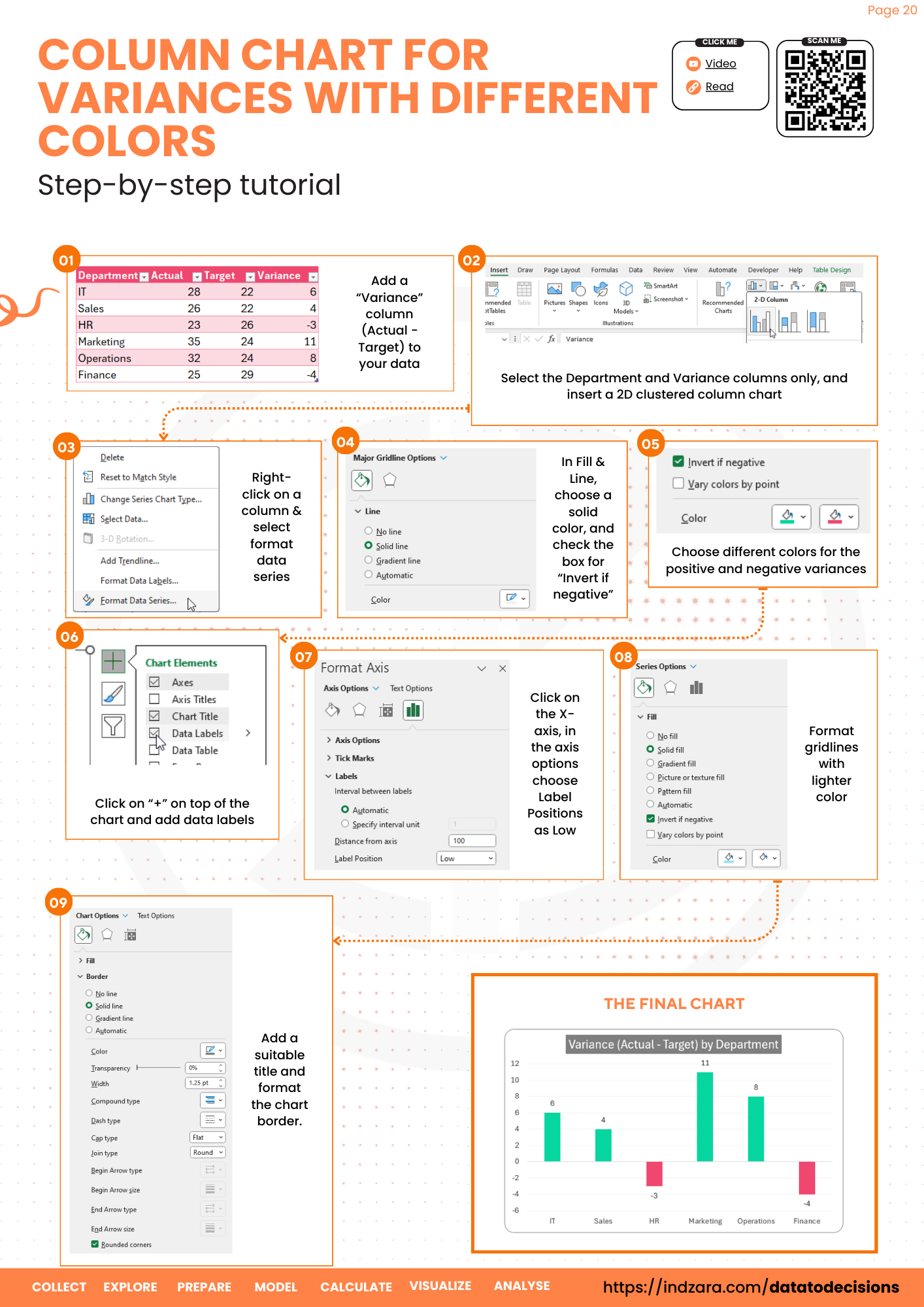
Step 01: Prepare the data
Consider a sample data of different departments in an organization and the actual and the target value of a measure (can be any measure based on your data) as shown:
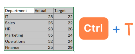
Before we proceed to add additional columns needed for our chart, convert this data into a table by selecting the data entirely and pressing CTRL + T as shown below:
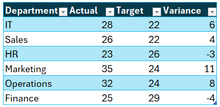
Now, we’ll add our new column “Variance”. Once the header is added, Excel includes this in the table, by default.
This column has the following values:
=[@Actual]-[@Target]With this our updated sample data is,
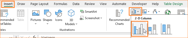
Step 02: Insert a clustered column chart
Select only the Department and Variance columns (do this by selecting one column, and press CTRL while selecting the second column). With these columns insert a 2D column chart:
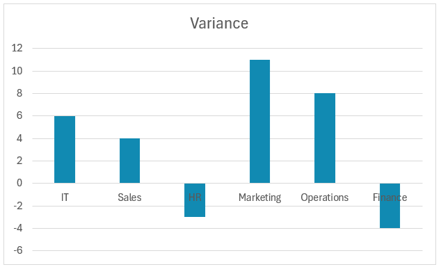
With this step, our chart is generated in Excel:
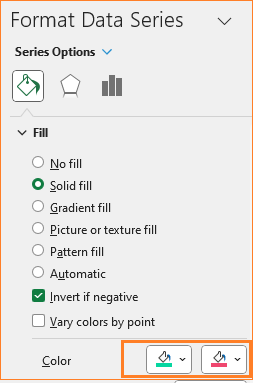
Step 03: Format the data series
Right-click on any column, go to Format Series, change the fill color as needed, and check the box for “Invert if negative” since we may have negative variances in the data.
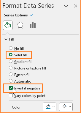
With this, Excel separates the negative variances with a different color, and format both the positive and negative values based on the theme as needed. In this example, we’ll color the positive in green and the negative in red.
At this stage, our chart looks something like this:
Step 04: Add data labels & format axis
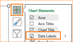
Let’s add data labels to our chart. Click on the chart, and a “+” symbol will appear in the top right corner, enable the “data labels” option as shown:
If we take a closer look at the chart, the negative values are incorporated into the vertical axis (Y-axis) which Excel automatically pulls in from the data. But, the X-axis names overlaps with the columns which have negative values, as shown in our chart below:
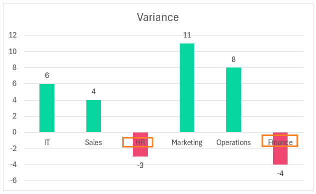
In Excel, this problem can be resolved in simple steps. Click on the X-axis, go to the axis options, and adjust the label position to “low”
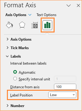
This moves the labels to the bottom of the chart without impacting the visual.
Step 05: Apply stand chart formatting
Our desired chart is taking shape, it’s time for some formatting to make it visually appealing.
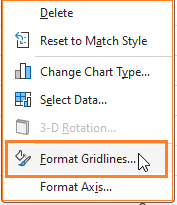
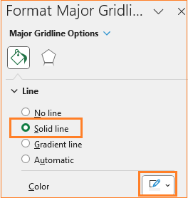
i. Make the gridlines less evident as they add little value to the chart. Right-click the gridlines and open the format pane:
Modify the color to a lighter grey to make it less prominent:
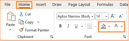
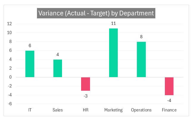
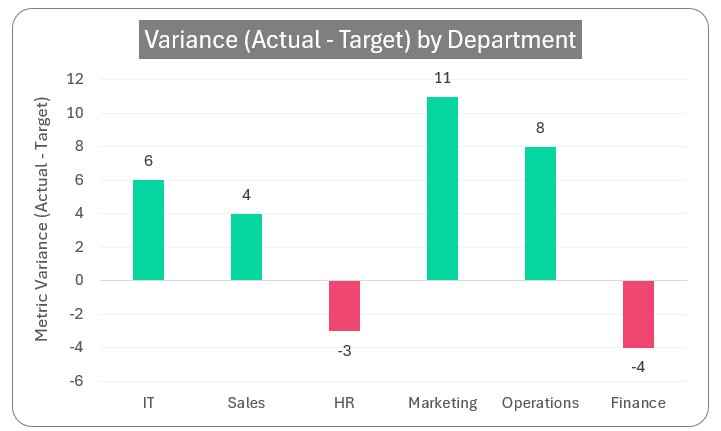
ii. Give the chart a suitable, understandable title, say ” Variance (Actual – Target) by Department” and format the color and background of the title in the ribbon on top:
Our chart looks like this:
iii. We can add axis labels if and when necessary. In our case the horizontal axis is self-explanatory in that it’s the departments from our data, hence this is not needed.
While the Y-axis title can be added to emphasize the chart and what’s key to the chart. So, to add the Y-axis title, click anywhere on the chart for the “+” as seen above and include the axis titles.
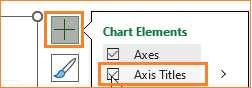
We do not need the X-axis so remove the same by selecting and deleting it. For Y-axis include a suitable title.
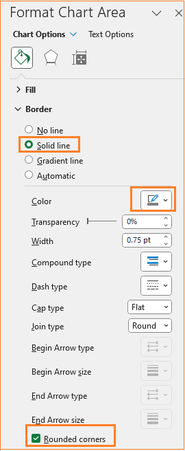
iv. As a final step, adjust the chart border’s color and make it rounded. (All of these formatting are optional and can be modified based on the need at hand)
Our final column chart is ready!
Check our 1-page, downloadable illustrative guide explaining all the steps for a quick reference.
Looking for a short, quick tutorial with just the steps to follow, the 1-minute chart creation video below is for you!
If you have any feedback or suggestions, please post them in the comments below.


