A 100% stacked bar chart is a powerful tool for visualizing the relative proportions of sub-categories within a total, normalizing each bar to 100%. This makes it ideal for comparing the proportional contributions of sub-categories across different categories, analyzing the distribution of components within a whole, and observing changes over time. It is particularly useful in market share analysis, demographic analysis, performance metrics, budget allocation, and survey results.
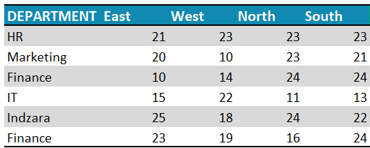
Let’s look at the steps required to create a simple 100% stacked bar chart, which is visually appealing in Excel. Consider a sample data as shown:
Ready to save time on your next presentation? Explore our Data Visualization Toolkit featuring multiple pre-designed charts, ready to use in Excel. Buy now, create charts instantly, and save time! Click here to visit the product page.
Step 01: Create the Chart
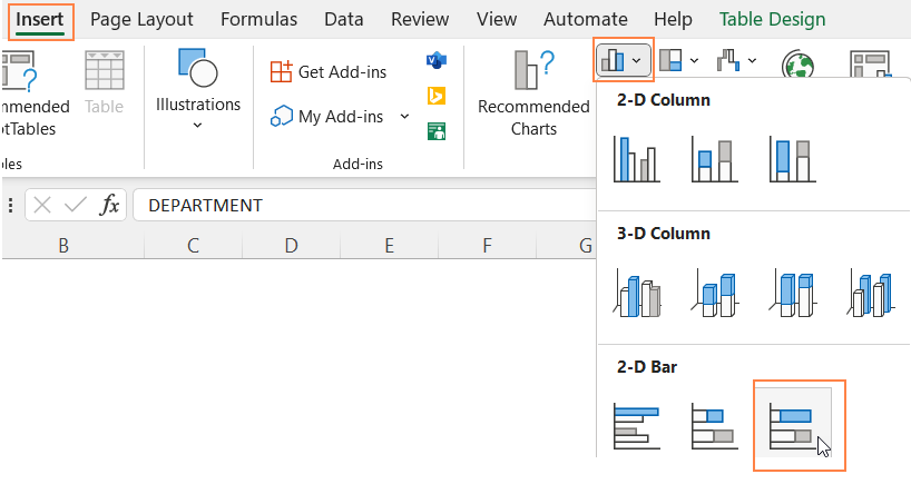
Select all data and insert a 100% stacked bar chart.
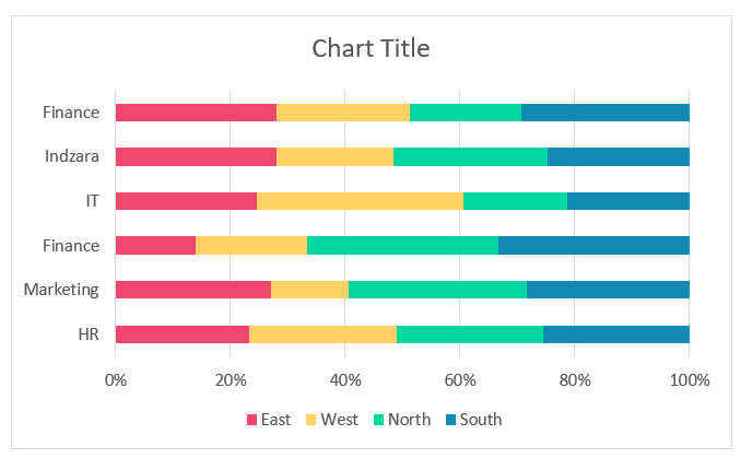
This creates a 100% stacked bar chart as shown:
Step 02: Format the Chart
It’s time to format this chart for a greater visual.
i. Click on the chart, and press CTRL+1 to open the format pane.
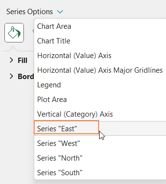
ii. From the drop-down, choose one of the series and format the fill color as shown.
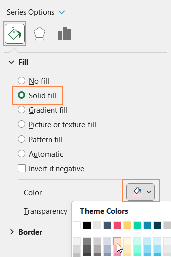
Repeat the same steps for all series (as need be)
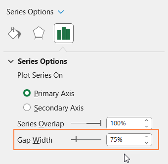
If need be, you can also adjust the gap width from the series options: the lesser the gap width, the broader (thicker) your bars will be.
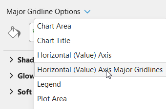
iii. From the drop-down, choose the “Horizontal (Value) Axis Major Gridlines” and format it to make this less apparent.
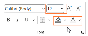
iv. Now, add a suitable chart title and format it with options available in the Home Ribbon.
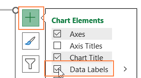
v. Click on the chart and use the “+” icon to add data labels, format the labels if needed
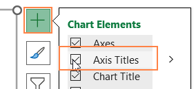
vi, Similarly, add the axis titles too.
vii. Click on the legend, use the format pane legend options to reposition them to top.

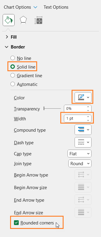
viii. Click on the chart, go to Chart Area from the format pane, and format the chart border as shown.
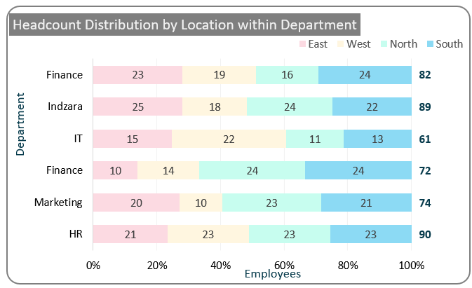
With this, the 100% stacked bar chart looks something like this, and is ready to be added to your next presentation!