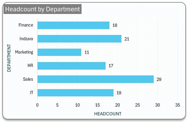
Bar charts are a graphical representation of categorical data using horizontal bars. This is a simple yet great visual for comparing changes in values and observing trends.
In this post, we’ll look at simple categorical data and the steps required to construct a visually appealing bar chart in Excel.
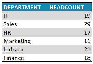
For this exercise, consider sample data of employee headcounts by various departments as shown:
Ready to save time on your next presentation? Explore our Data Visualization Toolkit featuring multiple pre-designed charts, ready to use in Excel. Buy now, create charts instantly, and save time! Click here to visit the product page.
Step 01: Create Chart
Select all the data, go to Insert, and choose a 2D clustered bar chart.
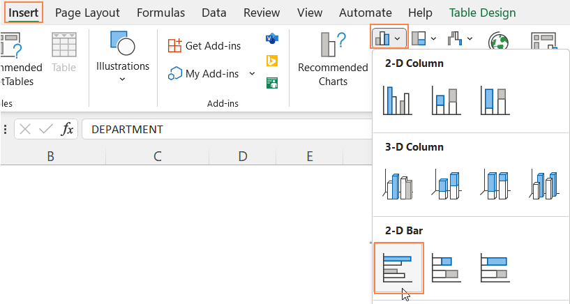
With this, a bar chart for your data gets inserted.
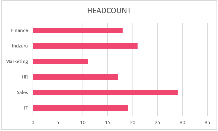
Please note that the colors for the chart are dependent on the theme of your Excel sheet.
Step 02: Formatting the Chart
While the previous step creates a bar chart, let us look at some of the formatting that is available in Excel for a visually appealing and effective chart.
i. Click anywhere on the chart, and press CTRL+1 to open the format pane.
ii. Here, from the drop-down choose the “HEADCOUNT’ series.
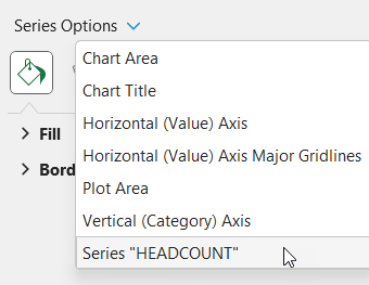
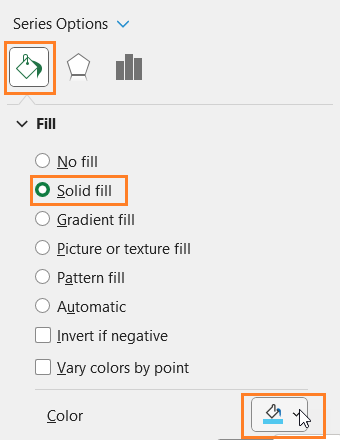
iii. Under Fill & Line, choose a fill color for the bars to match the report where this chart might go.
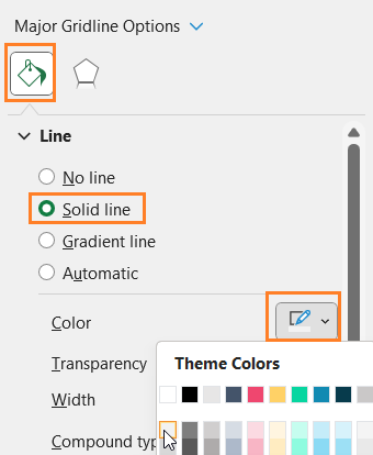
iv. Again, from the drop-down choose the “Horizontal (Value) Axis Major Gridlines” and
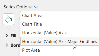
modify the line color to make it less apparent.
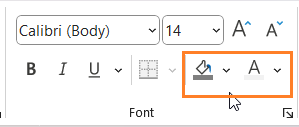
v. Add a suitable chart title and format it using the Home Ribbon as shown:
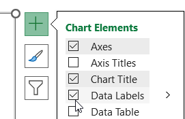
vi. Click on the chart, and use “+” to add data labels, and similar to the previous step format it using the Home Ribbon.
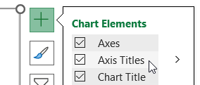
vii. Again, click on the “+” to add the Axis titles, add suitable titles (as and if needed). Format them if needed using the options in the Home Ribbon.
viii. From the drop-down in the format pane now choose the chart area. Now, choose a suitable fill, here I have chosen a pattern fill with a color that goes with my theme and one that doesn’t overpower the chart.
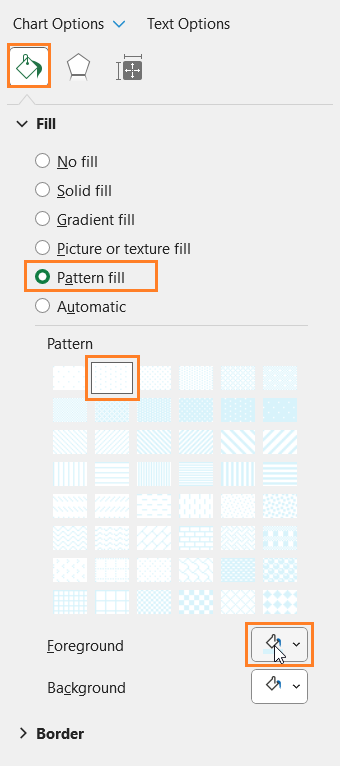
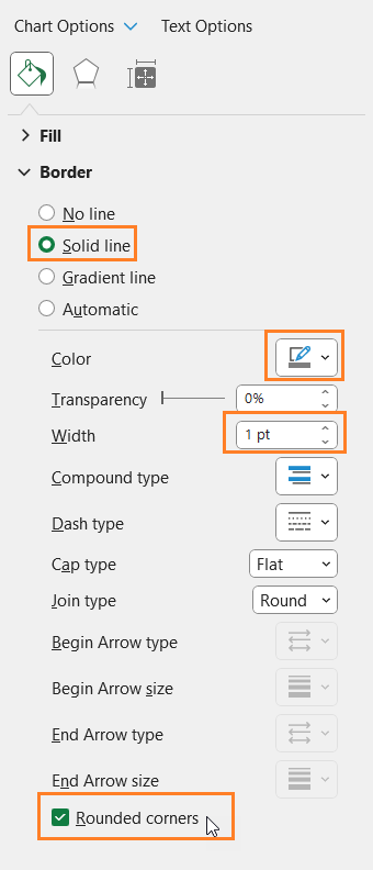
Also, format the chart border as shown:
ix. Choose the Plot Area from the drop-down and apply the same fill color as in the previous step.
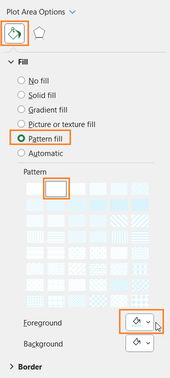
Please note that this is a design preference, you can choose to apply chart and plot area colors as per your preference.
With this, your simple bar chart for categorical data is ready to be added to your reports or presentations, and further analysis.