This post walks you through all the steps required to create a stacked column chart that displays each column’s totals, as shown below.

A regular column chart, for this data, displays the total count of employees in each department. With the height of the column, one can make an analysis like which department has the highest and the lowest employee count, etc.
Whereas, using a stacked column chart, we can introduce another dimension to the chart, in this case, Ethnicity, and analyze the distribution of employee count within each department based on this dimension. We can also compare the distribution with this stacked column chart.
Ready to save time on your next presentation? Explore our Data Visualization Toolkit featuring multiple pre-designed charts, ready to use in Excel. Buy now, create charts instantly, and save time! Click here to visit the product page.
Let’s build this chart in Excel!
Please check our dedicated YouTube video explaining how to create a stacked column chart with total here:
The following are the steps we’d follow in creating this chart:
- Insert a stacked column chart
- Modify the series’s colors
- Format the chart
- Add a total column to the data and chart
- Change total series type to line & format it
Step 01: Insert a stacked column chart
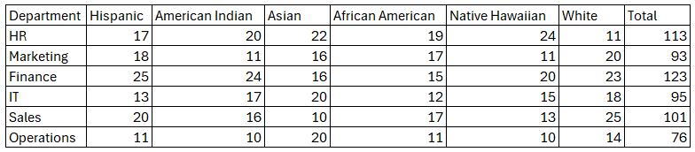
Our raw data is as shown below, with all the departments and their employee count based on Ethnicity.
As the first step, select all the data and create a table (CTRL + T)

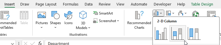
Select all the data and insert a stacked column chart.
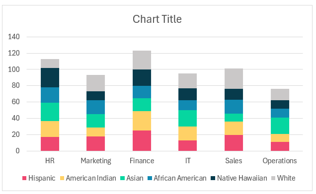
This creates a default stacked column chart as shown below. Note that the colors may vary based on the theme of Excel you are using.
Step 02: Modify the series’s colors
Let’s change the colors of each stack. The reason we are freely able to do this is that our data is “Nominal”.
What does this mean? Nominal data do not have any order of appearance, that is the order in which they appear does not have any impact.
Note: Other types of data have to be ordered or ranked and these are called “Ordinal data”. A simple example would be training survey scores (very easy to very difficult need to be ordered).
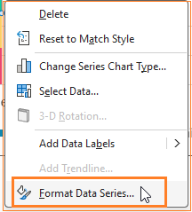
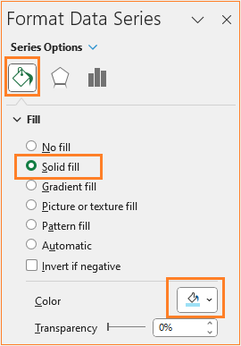
Since we have nominal data, we can color per our needs. To change this, right-click on the series, and go to Format Data Series:
and change the fill color as needed:
This way change the color for all the series (here we are using a combination of blue and grey to differentiate the different series).
After this step, our chart looks like this:

Step 03: Format the chart
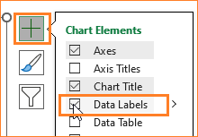
i. Now, include the data labels for the series of data. To do this, click anywhere on the chart,a + symbol appears where do the following:
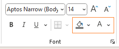
This is the best method to add data labels to all your series. Modify the color of your labels in the Home ribbon where the series is in darker shade (here the Native Hawaiian series has a darker blue shade, hence the labels can have a lighter shade)
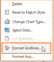
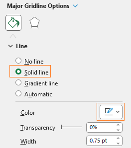
ii. Adjust the gridlines to make them less obviously visible. Right-click the gridlines and open the format pane:
Modify the color to a lighter grey to make it less prominent:
iii. Give the chart a suitable, understandable title, say ”# of Employees by Ethnicity – within Department” and format the color and background of the title in the ribbon on top:
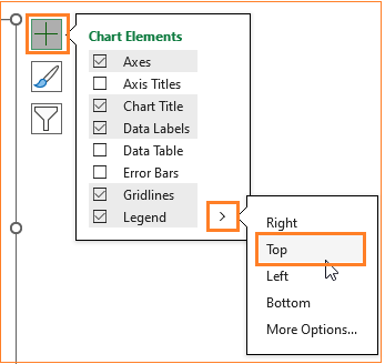
iv. Move the legends to the top:
iv. We can add axis labels if and when necessary. In our case the chart title is self-explanatory, hence we are skipping them.
Note: Always remember to remove/not add redundant data on your chart, having the Y-axis title adds little value to the overall chart, hence do not add the same.
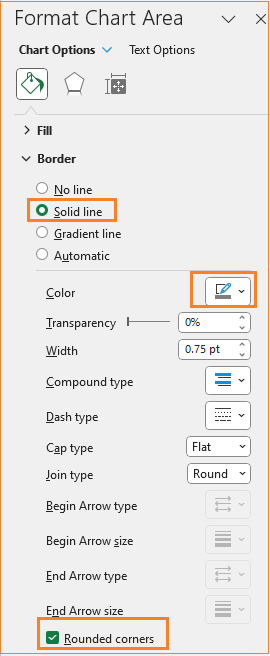
v. Asdjust the chart border’s color and make it rounded. (All of these formatting are optional and can be modified based on the need at hand)
With this, our chart is:

Step 04: Add a total column to the data and chart
Our goal is to create a stacked column chart that displays the totals as well. Let’s look at how to achieve this.
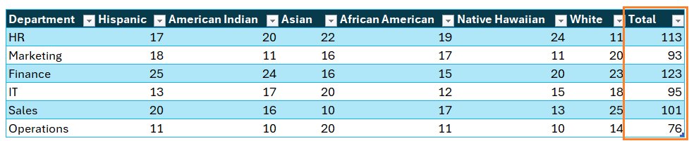
i. Add a column to the sample data called “Total” which is the sum of each department’s total headcount.
=SUM(Table1[@[Hispanic]:[White]]) (Table1 is the name of the table created in step 01)
With this, a new column gets added to the data:
With this, the chart automatically updates as shown:

Step 05: Change total series type to line & format it
Lets “tweak” this new series to get the desired column chart.
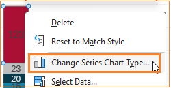
i. Right-click on the Totla series and go to “Change Series Chart Type”
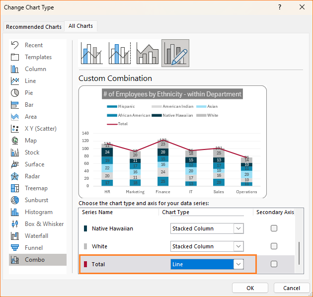
ii. This opens up a dialog box where modify the Total series to a Line chart as shown:
This is the resulting chart:

iii. Click on the labels for this new series and move them to the top:
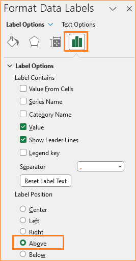
Format the label in the Home ribbon as needed to make the totals stand out (we have made the values Bold here).
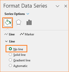
iv. We do not need the list anymore, so click on the line, and in the format pane, go to “Fill & Line” and choose no line:
v. From the legend, remove the Total by clicking on the same and deleting it.
With this, our stacked column chart with totals is ready for analysis!
Check our 1-page, downloadable illustrative guide explaining all the steps for a quick reference.

Running short of time? Check our quick, 1-minute tutorial on creating this chart here:
If you have any feedback or suggestions, please post them in the comments below.


