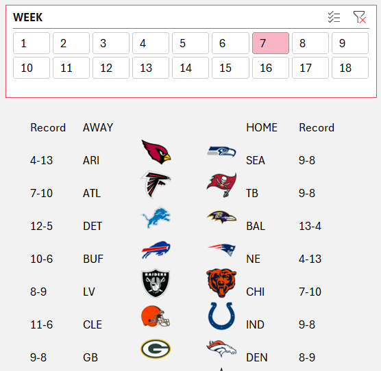
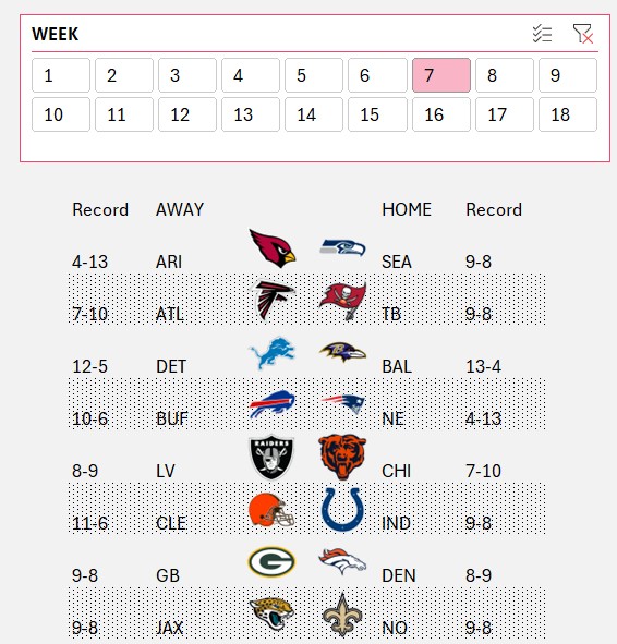
Consider you are building an interactive, dynamic visual of the weekly NFL schedule which looks like this:
Though this visual representation looks complete, we can enhance the visual to be aesthetically pleasing by using simple conditional formatting techniques.
Let’s see how!
Say we’ll do a banded row design on alternate rows.
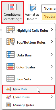
Select all the rows, go to (1) conditional formatting, (2) select a new rule, (3) use a formula to determine which cells to format:
For banded formatting, we’ll choose to format only the even rows using the formula:
=ISEVEN(ROW(C11))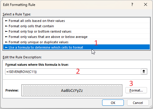
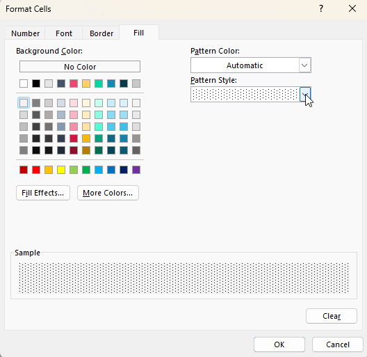
For a banded visual we’ll choose the Fill-pattern accordingly:
With this, our weekly schedule becomes more visually appealing and engaging:
To know more about how to create this visual from scratch, please check YouTube video explaining these steps in detail:
If you have any feedback or suggestions, please post them in the comments below.


