A box and whisker plot, or box plot, is used to display the distribution of a data set by showing its median, quartiles, and potential outliers (the 5-point summary statistics of a box plot).
It provides a visual summary that highlights the spread and skewness of the data. In an HR context, you might use this type of plot to analyze the distribution of salaries across different departments.
A box plot can show the median salary, the interquartile range (IQR), and any unusual values (as outliers), making it easy to compare distributions across different departments.
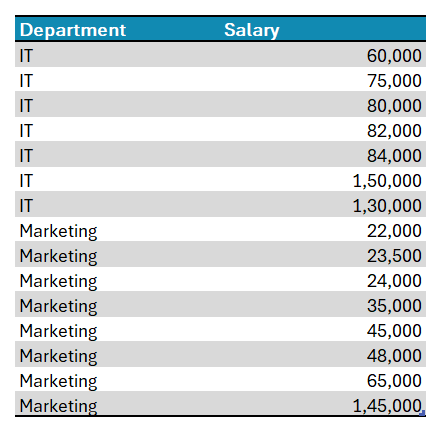
Let us consider the sample data as follows, and build a quick box plot in Excel.
Ready to save time on your next presentation? Explore our Data Visualization Toolkit featuring multiple pre-designed charts, ready to use in Excel. Buy now, create charts instantly, and save time! Click here to visit the product page.
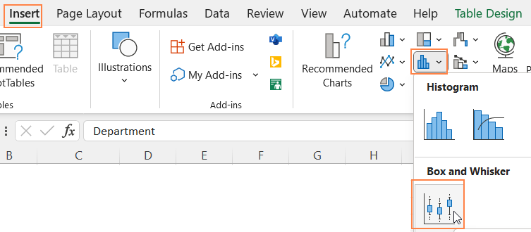
Step 01: Create the Chart
First, select all data, and under the Insert tab, choose a Box and Whisker plot as shown:
This inserts our box plot as shown:
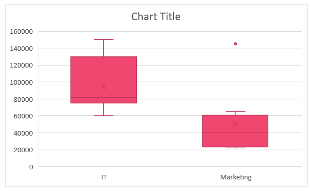
Please note that the colors may vary depending on the theme of your Excel workbook.
Step 02: Format the Chart
To format the chart for a clearer and more visually appealing chart, apply the formatting as shown:
i. Click on the chart, and press CTRL+1 to open the format pane to the right.
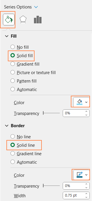
ii. Here, choose the data series,
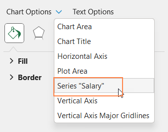
and under Fill & Line format the fill and border (which formats the whiskers too) colors.
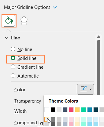
iii. From the drop-down, now choose the “Vertical (Value) Axis Major Gridlines
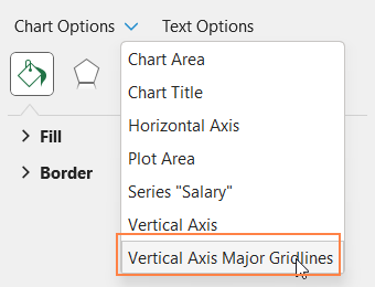

and make the lines less apparent by modifying the line color to a lighter one.
iv. Add a suitable chart title and use the formatting options in the Home Ribbon to format it.

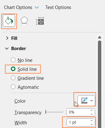
v. Click on the chart and format the chart borders as shown:
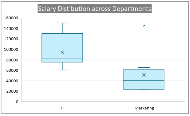
With this, the chart should look like this:
Understanding the box plot:
Let us now look at some key interpretations from this chart:
- Higher Median Salary in IT: The median salary (the line inside the box) in the IT department is significantly higher than in the Marketing department. This suggests that IT professionals generally earn more compared to their Marketing counterparts.
- Greater Salary Range in IT: The IT department shows a wider range of salaries, indicated by the length of the box and whiskers (the lines extending the box). This means there is more variability in salaries within IT, ranging from lower starting salaries to higher top-end salaries.
- Outlier in Marketing: There’s an outlier in the Marketing department, represented by the dot above the box plot. This indicates that at least one salary in Marketing is significantly higher than the rest, possibly an executive-level or exceptional performance-based salary.
- Narrower Salary Range in Marketing: The Marketing department has a narrower interquartile range (IQR) compared to IT, suggesting that most salaries in Marketing are more closely clustered around the median. This indicates less variability in salary distribution within the Marketing department


