Bubble charts are a variation of the scatter plot. The difference is, that bubble charts contain an additional dimension which is represented by the size of the “bubbles”. These charts are used to compare and show relationships between multiple series based on both, the position and proportion (size) of these bubbles in cartesian coordinates.
Let’s create a bubble chart in Excel and analyze the same.
Consider a sample dataset (obtained online) which contains the following details:
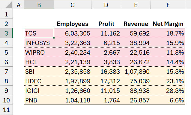
Please note that the Net Margin % is calculated here by dividing the profit by revenue.
Let’s get right into building our chart visual!
Step 01:
Click anywhere outside of the table and (1) go to Insert (2) Select the Bubble chart as shown here:
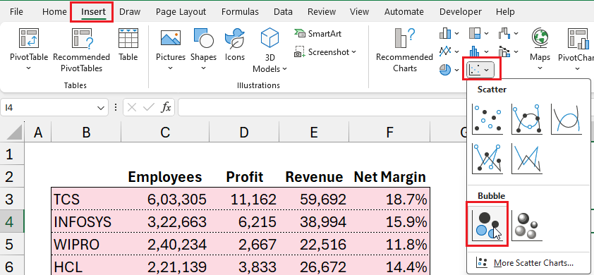
This creates an empty bubble chart. Time to add our data series. In our sample data, we have two categories: banking and tech companies (colored differently). We’ll add both of these series now.
Step 02:
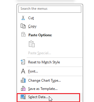
Now right-click anywhere inside the empty chart and Select Data:
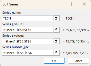
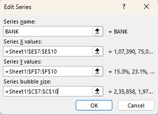
Now, we’ll start adding data (Legend Entries) to our chart by clicking on Add.
- Assign a series name, say TECH
- Series X values are revenue values
- Series Y values are Net margin %
- Bubble size as the number of employees
Once this data is added, Excel creates a simple bubble chart for this series as shown here:
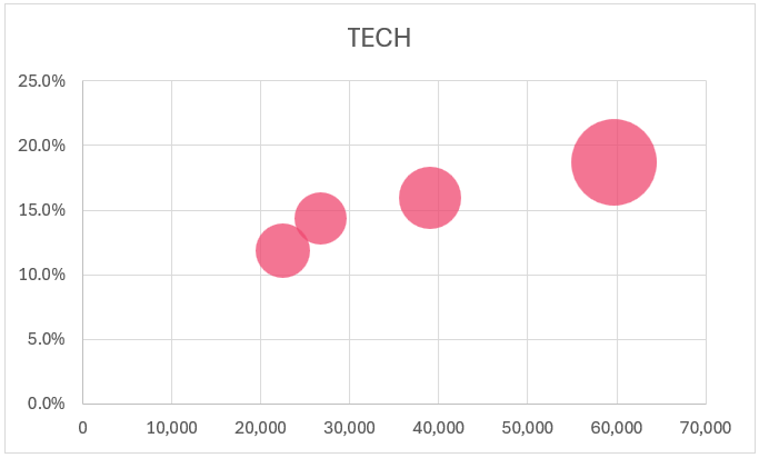
Hover over each bubble to see the values. The sizes differ as they represent the count of employees.
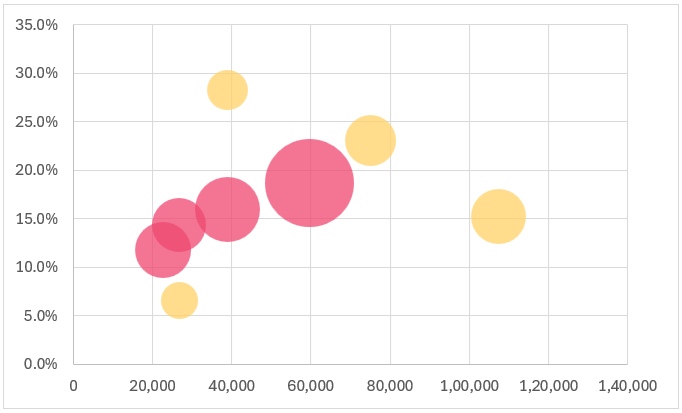
In the same way, add the BANK series:
With this, our bubble chart with multiple series is created:
Before we begin our analysis, let’s do some quick formatting.
Step 03:
Let us format our bubble chart, firstly by including axis titles. This can be done in multiple ways one of which is:
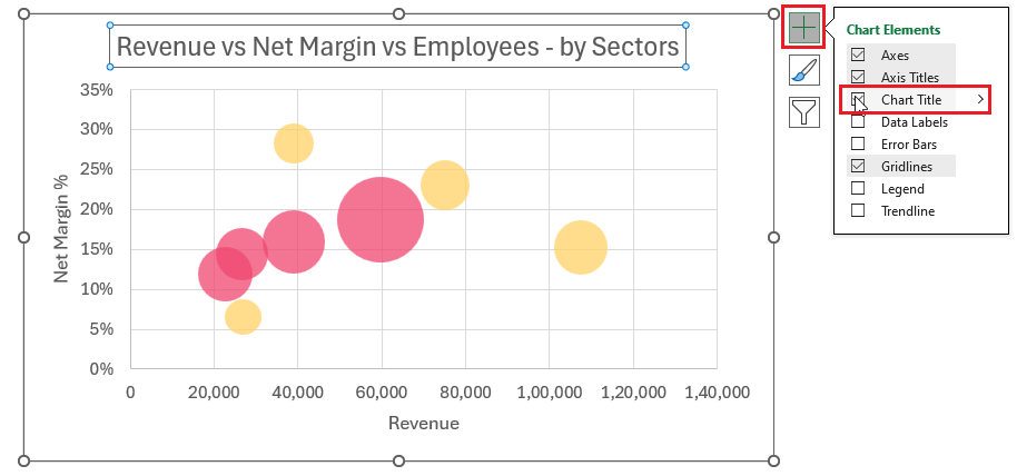
Click on the chart and a + symbol will appear on the top right corner for formatting the chart elements.
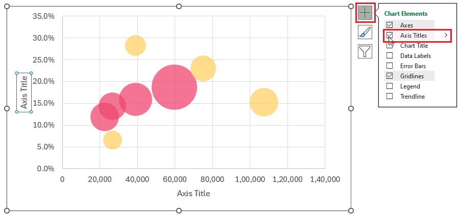
We’ll call the X-axis Revenue and Y-axis Net Margin %.
Step 04:
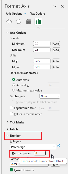
We’ll format the Y-axis by removing the decimal values as they add no meaning to our analysis. Right-click on the axis and go to “Format Axis”:
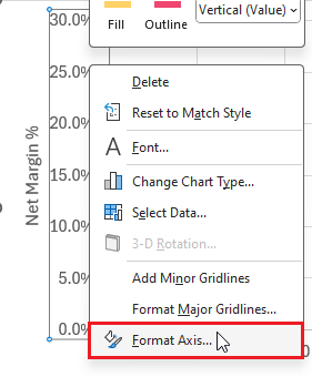
This opens a right-side pane where the chart elements can be formatted. We’ll go to the Number formatting and modify the Decimal places to 0:
Step 05:
To add a chart title, click anywhere on the chart and then on the + symbol:
Similarly, you can add a legend to identify our series of data. Position this information in a manner that won’t affect the visual.
Step 06:
Now, we’ll format the grid lines. The aim here is to have the grid lines but for them to be barely visible for which we’ll modify the Fill & Line option as shown to choose a lighter color:
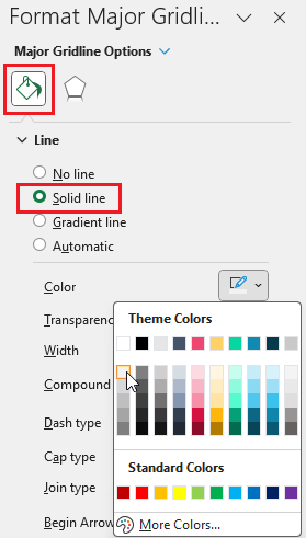
Similar to this, format the vertical axis grid lines as well. With these modifications, our chart is:
Step 07:
Let’s format the data series now. Select the data points of a series, right-click, and go to the Format Data Series option:
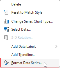
Go to Fill & Line on the right side pane that opens up and from a myriad of options, you can choose to format based on your need, a sample is shown here we adjusted the fill and border of these bubbles:
Similarly, format the TECH series as well.
Step 08:
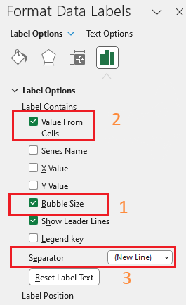
We’ll add the key part required for our analysis now, the data labels.
Click on the + and include Data Labels.
By default Excel includes labels:
We need the bubble size values, so click on the values, go to label options, and modify the settings to show the bubble sizes (do this for both series).
Along with this, let’s also get the names of the companies by the “Value from Cells” option that allows us to manually choose the company names.
Move both the employee count (our bubble size) and the company name labels in to new lines for better readability.
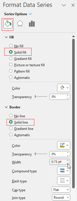
After adjusting the size and font colors our bubble chart is ready for analysis:
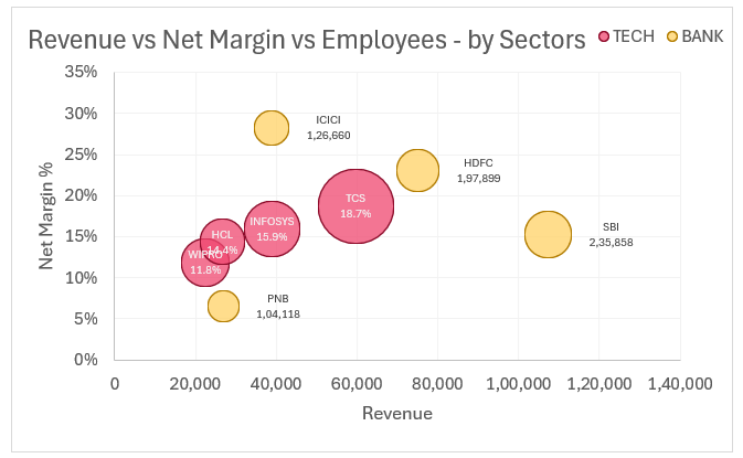
What does this bubble chart tell us about our data?
A bubble chart allows us to visualize the three variables here: the revenue, net margin %, and the employee count.
At a glance, we identified that TCS has the most number of employees.
For the TECH companies, we can see that there is a visible relationship between revenue and net margin %.
On the other hand, in the banking companies, clear PNB seems to be an outlier, whereas the other seems to have an inverse relationship between revenue and net margin %.
With bubble charts, we can analyze not two but three dimensions. By extension, we can create a motion bubble chart that can accommodate larger datasets over periods.
Ready to save time on your next presentation? Explore our Data Visualization Toolkit featuring multiple pre-designed charts, ready to use in Excel. Buy now, create charts instantly, and save time! Click here to visit the product page.
Check our video on motion bubble charts here:
How to create a motion bubble chart in Excel:
Try our free motion bubble chart template in Excel:


