A bullet chart or a bullet graph serves as a compelling alternative to traditional column/bar graphs and gauges for performance tracking. Let’s create a bullet chart in Microsoft Excel, which not only enhances your analytical narrative but also integrates multiple metrics into a single, coherent frame.
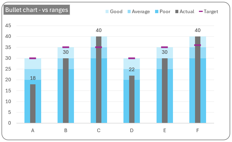
In the above bullet chart, at a glance, one can understand the actual versus the target performance. Along with this, one can identify under which range of performance the actual value falls. That is, in cases where you have an actual versus target and ranges to define your actual performance, this is the ideal chart.
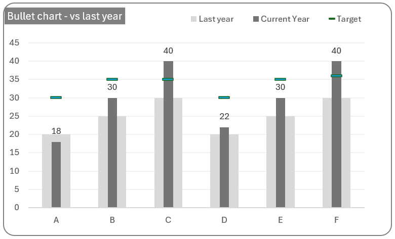
Another use case for the bullet graph is for the comparison of performances over the years, as shown in the sample graph below.
All that it takes is a good few minutes to build this chart in Microsoft Excel, let’s get started!
Ready to save time on your next presentation? Explore our Data Visualization Toolkit featuring multiple pre-designed charts, ready to use in Excel. Buy now, create charts instantly, and save time! Click here to visit the product page.
Check our YouTube video explaining these steps in detail here:
The following are the steps we’d follow in creating this chart:
- Insert a clustered column chart
- Adjust the series overlap
- Order the series
- Format the series colors
- Add the actual series to the chart
- Add target series to the chart
- Format the chart
Step 01: Insert a clustered column chart
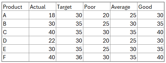
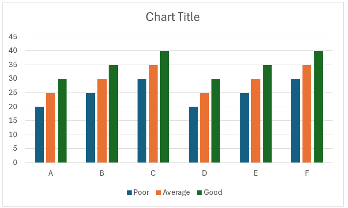
Consider the sample data of product performances along with the performance ranges as shown:
Select the product column along with the three ranges (choose all the ranges except the actual and target values) and insert a 2D clustered column chart.
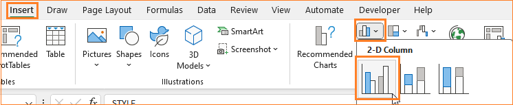
This inserts a default clustered column chart based on the data in hand.
Step 02: Adjust the series overlap
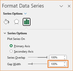
To get the desired chart shape, right-click on any of the series and go to format data series.
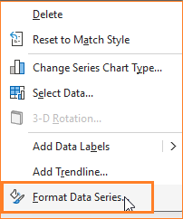
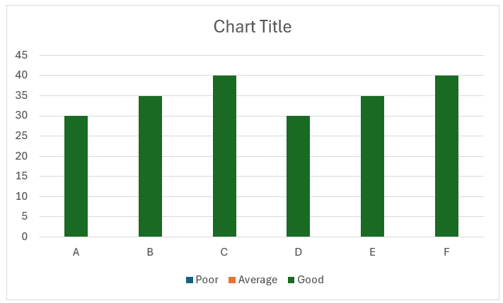
This opens up a format pane, here, adjust the series overlap for all the series to 100%.

After this step, our chart looks like this:
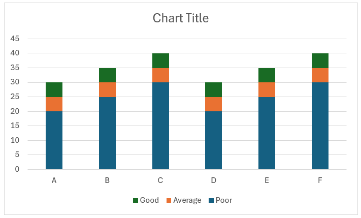
Step 03: Order the series
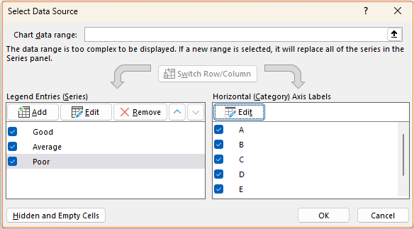
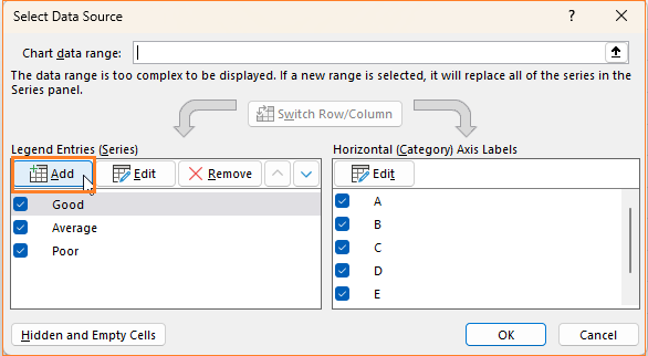
Now, right-click on the chart and go to select data:
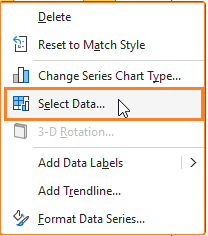
Here, in the pop-up, modify the series order in such a way that the poor series is at the front and the good series is at the back:
With this, our chart takes shape:
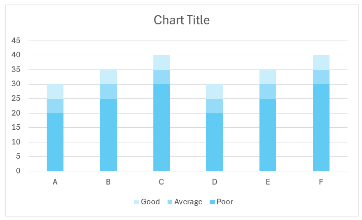
Step 04: Format the series colors
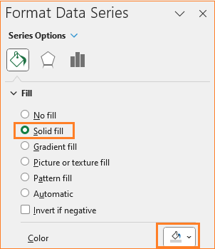
To get the bullet grap effect, it’s time to format the series colors. Click on the Poor series and in the format pane, modify the fill color to a darker shade of blue (choose colors based on the analysis you are making).
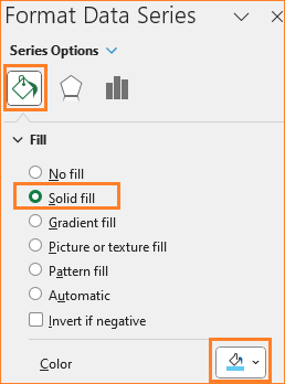
Similarly, choose gradient lighter colors to the other two series (average and poor). Ensure that the colors have noticeable differences.
With this, our chart looks something like this:
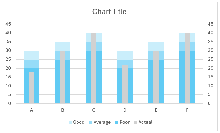
Step 05: Add the actual series to chart
It’s time to add the actual and target series to the chart. Right-click inside the chart, from Select Data, which opens a pop-up to add a new series.
Choose the actual series as shown:
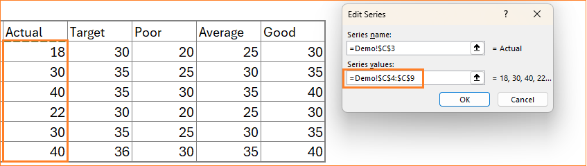
The horizontal axis is the same for this series too.
With this addition, the chart gets modified a little:
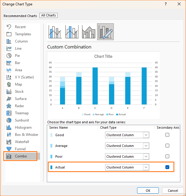
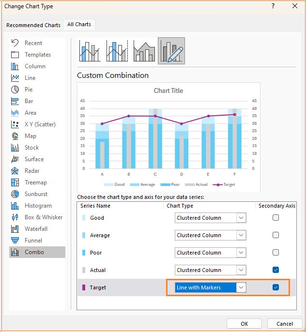
To fix this, right-click on the chart and choose Change chart type which opens a dialog box.
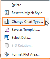
i. Here, ensure that all the chart type remains a Clustered column but move the Actual series to the secondary axis.
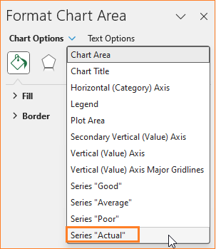
ii. Now from the format pane to the side, choose the actual series as shown here:
iii. In the series option, increase the gap width to a maximum of 500%
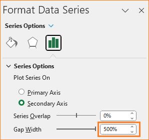
iv. Similarly, choose any other series and reduce the gap width to 100%, since they are all in the primary axis, modifying one affects the others as well.
The idea is to have the gap width of the actual series considerably higher than the others to bring the bullet effect.
v. Click on the actual series and change the fill color to grey.
With this step, our chart is:
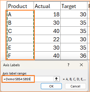
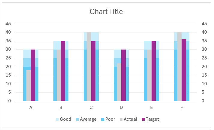
Step 06: Add target series to chart
Similar to step 05, add the target series to the chart by selecting the new series data.
With this, the chart looks like:
Right-click and change the chart type as follows:
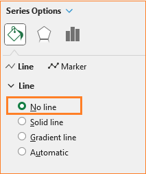
We do not need the line but just the markers to get the desired chart. To achieve this,
i. Click on the line and choose No line option
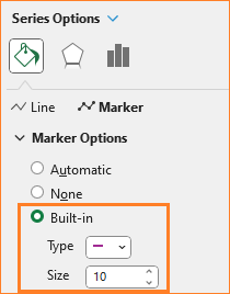
ii. Change the marker type to a dash and increase the size.
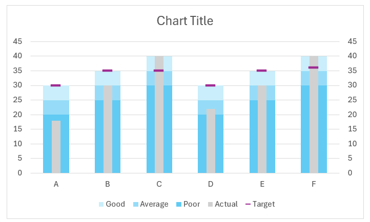
After this step, this is our chart:
Step 07: Format the chart
Our desired chart is almost ready, time for some standard formatting for a greater visual!
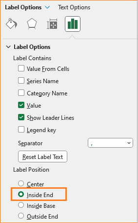
i. Right-click on the actual series and add data labels.
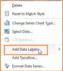
Click on the labels and adjust the position from the format pane.
ii. Click on the secondary axis and press delete as this serves no purpose.
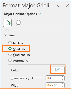
iii. Click on gridlines and change to a lighter color to make it less obvious.
iv. Add a suitable title, say “Product sales – Actual vs Target” and format the same as well.
v. Drag and move the legend to the top
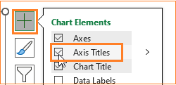
vi. Click on the “+” on the top-right corner of the chart to add axis titles.
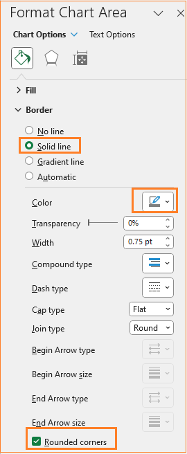
vi. Change the chart border by clicking on the chart and modifying the following in the format pane:
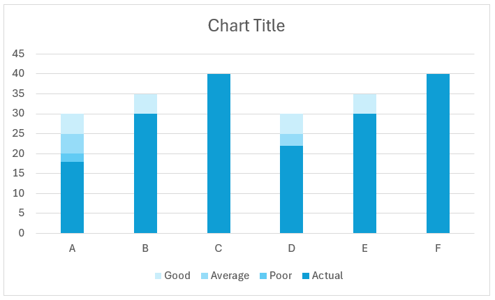
With this, our bullet chart is ready.
If you have any feedback or suggestions, please post them in the comments below.


