The key use of a column chart is to show comparisons among different items, or over time. Each column represents a different item or category, and the height shows the item’s value or size (measure). It’s a visual way to see differences or changes easily. This post is about creating a column chart with multiple series in simple steps.
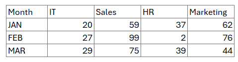
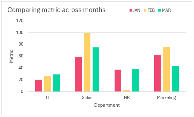
Consider a scenario where you have data of a certain metric across departments AND across months (series) as shown here:
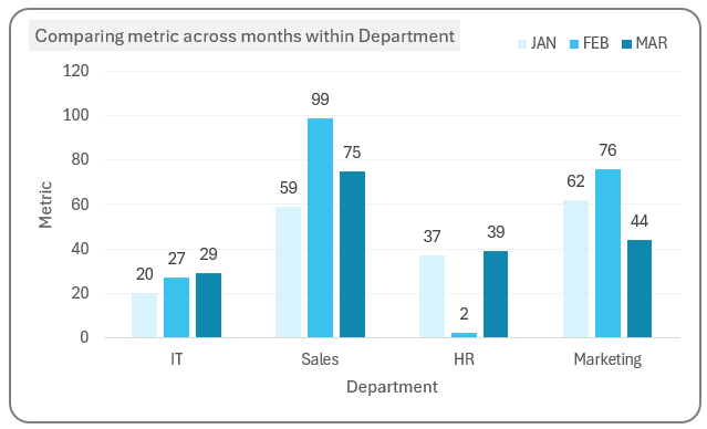
This can be easily represented, visually in a column chart with multiple series that look like this:
Please note: These charts are recommended for only a few series of data.
Ready to save time on your next presentation? Explore our Data Visualization Toolkit featuring multiple pre-designed charts, ready to use in Excel. Buy now, create charts instantly, and save time! Click here to visit the product page.
Check our video on creating column charts with multiple series here:
The following are the steps we’d follow in creating this chart:
- Insert a clustered column chart
- Format the chart
- Format the multiple series’ colors
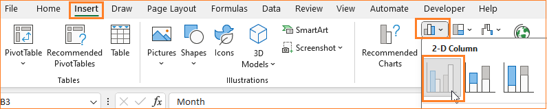
Step 01: Insert a clustered column chart
Select all the data, including the headers and
(1) Go to Insert (2) A 2D Column Chart:
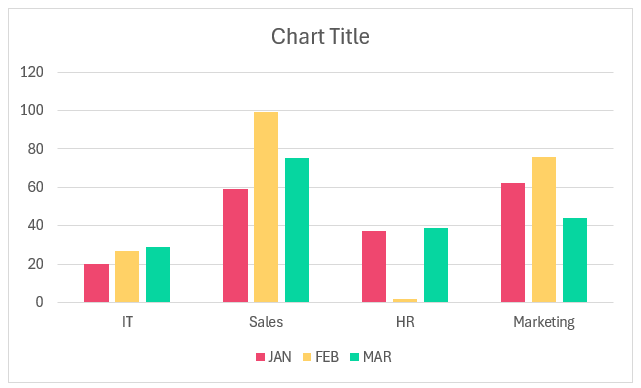
This creates a column chart as shown below (the colors may vary based on the theme of your Excel spreadsheet)
Step 02: Format the chart
Once our chart is created we’ll make the necessary modifications to make it a multiple series chart.
i. Firstly, give the chart a suitable name, and move the legends to the top to get more chart area.
To format elements click anywhere inside the chart and a + icon appears in the top right corner.
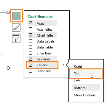
Or open the format pane, by right clicking inside the chart and selecting the Format Legend option.
ii. Along with the chart title, you can also include axis titles, In this case, the X-axis is departments and the Y-axis is the metric. With this, our chart looks like this:

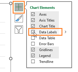
iii. Now, let’s include the Data Labels as shown below:
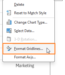
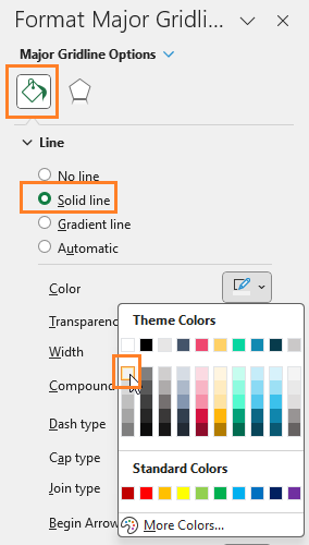
iv. For the grid lines, the aim is to make them lighter in color, achieve this by right-clicking on the grid lines and formatting the same:
Choose a lighter color:
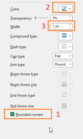
v. Choose the entire chart and give a rounded border, with a different color and width from the format pane:
With this, our chart looks like this:
Step 03: Format the multiple series’ colors
All that’s left to do is to choose a gradient-type color for each series, get this by clicking on any series and going to the format pane, choose a different fill color of choice.
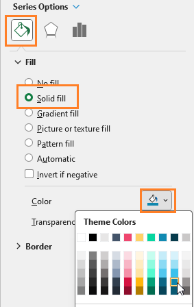
Repeat the same process for all the series with different shades of blue (or the color of your choice) and our final column chart with multiple series is ready:
Alternative Method:
We were able to create this chart with data that was available in a needed format. What if the data is present in different places in your dataset? Can we still create a column chart with multiple series?
Yes, we can!
Follow the steps shown here:
1. Click on an empty cell and insert a 2D column chart (as in step 01), this creates an empty canvas where we can fill with the series of data as needed.
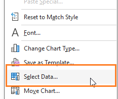
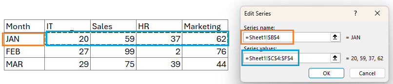
2. Right-click inside the chart and “Select Data”
Add a series, Assign a name, and select the corresponding series of data:
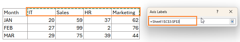
Similarly, add the horizontal axis:
This way add more series, based on your data. This gives the column chart with multiple series as earlier (apply the same format modifications we did in the previous steps)
This is another way of adding data to your chart when the data is spread out.
Check our 1-page, downloadable illustrative guide explaining all the steps for a quick reference

If you have any feedback or suggestions, please post them in the comments below.
To get our FREE downloadable Illustrative Guide for about 32 unique Column Charts, enter your email here!


