Data bars are a simple yet effective way to represent data in a cell in Excel. This blog shares a simple method of creating a data bar.
Consider, you’re building a report on employee performance in Excel. For an employee, this data ranges anywhere from 1 to 100. With data bars, this can be visually represented.
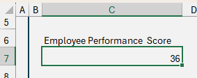
Consider an employee’s performance score of 36.
Enter this value in a cell in your report.
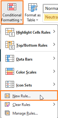
To include a data bar, (1) go to Conditional Formatting and (2) Create a New Rule
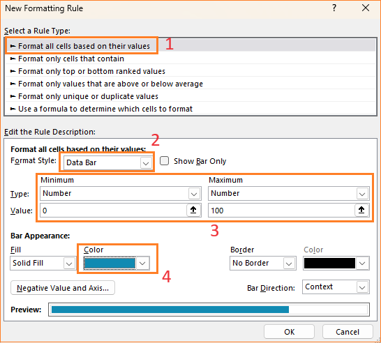
Format based on values and choose the Data bar option with the minimum being 0 and maximum applicable value being 100 (denoting the maximum possible score of 100), assign a color to the bars as shown here:
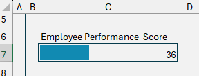
Apply a border to the cell and, this includes a data bar in the cell containing the value as shown:
For metrics that have a singular value, using data bars is a great way to visually include them to a dashboard or report.
Check our video on creating an interactive report incorporating the databars:
If you have any feedback or suggestions, please post them in the comments below.


