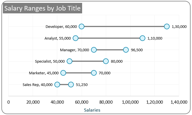
A Dumbbell Chart is perfect for visually representing a range of values, such as minimum and maximum, along with their spread, making it an ideal addition to reports or presentations to capture your audience’s attention instantly.

This post walks you through the steps required to create this chart using Scatter plots in Excel. Follow the steps here, and in a few minutes have this chart created.
Check our blog on creating a vertical dumbbell chart in Excel.
Ready to save time on your next presentation? Explore our Data Visualization Toolkit featuring multiple pre-designed charts, ready to use in Excel. Buy now, create charts instantly, and save time! Click here to visit the product page.
Step 01: Prepare the data
i. Select all the data, and press CTRL+1 to create a table
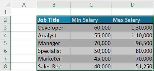
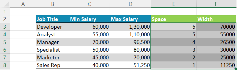
ii. We need to create additional columns to create our dumbbell chart.
For this, the first column is “Space”. This is needed to include a space between each dumbbell and needs to be equidistant from each other.
=COUNTA([Job Title])- (ROW([@[Job Title]])-ROW(Table01[[#Headers],[Job Title]]))+1This formula returns the sequential numbers equal to the count of rows in the table.
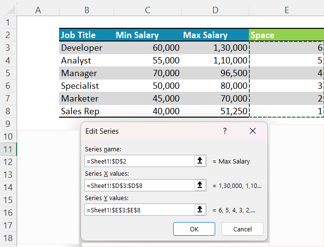
We’ll now add the “Width” column which is the difference between the two numeric values in your table.
=[@[Max Salary]]-[@[Min Salary]]With this, your new data would be:
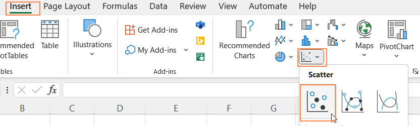
Step 02: Create a scatter plot
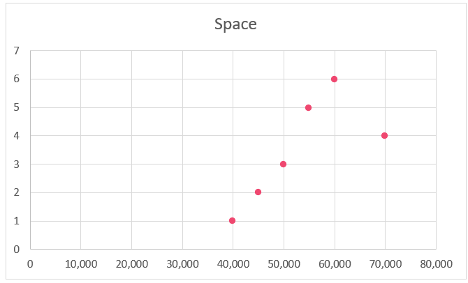
Now, select the Min Salary and the Space columns and insert a scatter plot.
With this, a scatter plot with a single series gets inserted.
Now, insert a second series, the Max Salary into the chart.
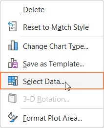
For this, right-click on the chart and go to select data
Now, insert the Max Salary series as shown:
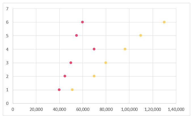
With this, the two-series chart looks as shown:
Step 03: Add second series to the scatter plot
Before we proceed further, let us format the scatter plot arrived from step 02.
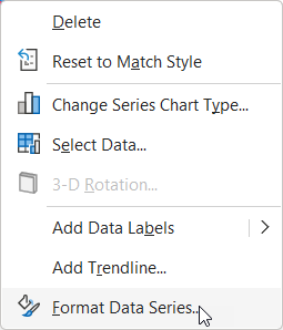
i. Right-click on one of the series, go to Format Data Series
ii. Format the marker as shown:
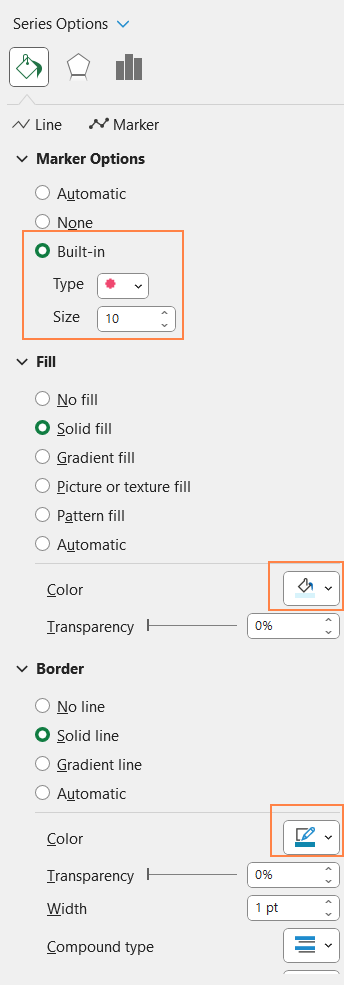
iii. Similarly format the other series as well.
With this, our chart looks something like this:

Step 04: Add error bars
i. Now, click on the series to the LEFT and use the “+” icon that appears on the top of the chart to insert Error Bars
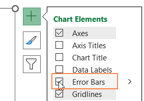
ii. Click on the “Vertical errors” and press delete key
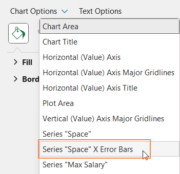
iii. Now, click on the chart, press CTRL+1 to open format pane again.
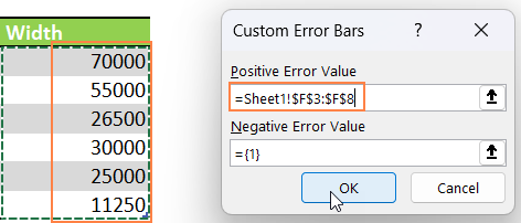
From here, choose the “Space” X Error Bars
and under the Error bar options, format this as shown here:
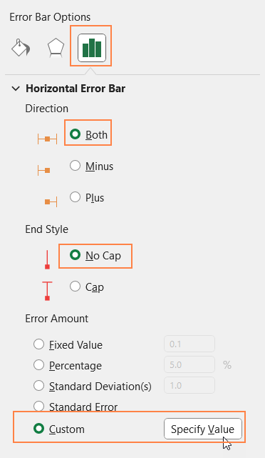
Choose the custom values as the “Width” as shown here:
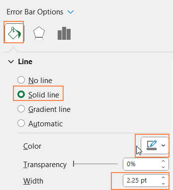
iv. Now go to the Fill & Line option to format the line shape to get the desired dumbbell shape.
Click on the Y-axis and press delete to key to delete the same
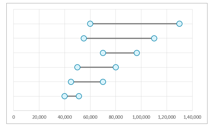
With this, the dumbbell chart looks like this:
Step 05: Add data labels
i. Click on the chart and use the “+” to add data labels.

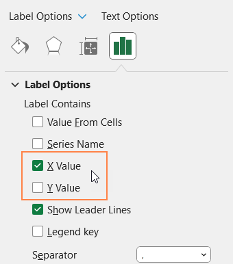
ii. Click on the labels to the left and use the format pane to modify the labels
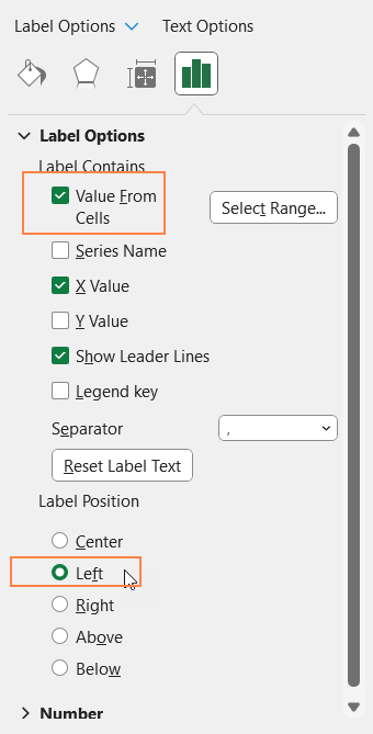
From here, uncheck the Y Value and Check the X value.
Also, since we have deleted the Y-axis, we’ll use the “Value from Cells” option to include the labels to indicate the category values.
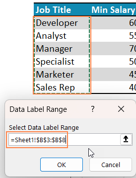
Now, position these labels to the left of the dumbbell.
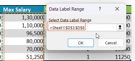
Similarly, modify labels to the right dumbbell as well to represent the Max salary values.
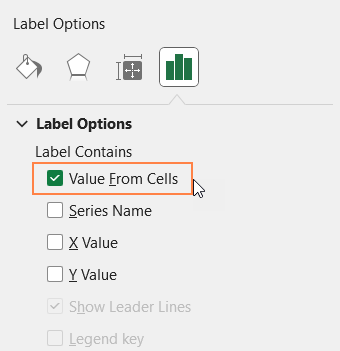
For this, click on the right labels and from the label options, uncheck others and choose only the “Value from cells” option.
The range will be the range of the Max Salary as shown below, also position the labels to the right.
Note that you can click on the labels, and use the home ribbon to format them as needed.
At this stage, the chart looks like below:
Step 06: Format the chart
Now, it’s time for some standard formatting of the chart.
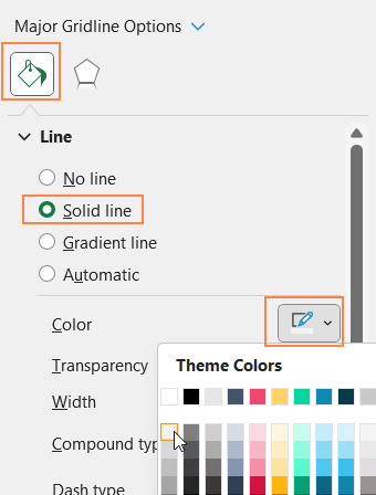
i. From the formatting pane drop-down, choose the “Horizontal (Value) Axis Major Gridlines” and make the line less apparent.
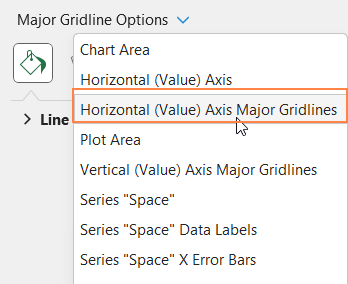
Similarly, format the “Vertical (Value) Axis Major Gridlines” as well.
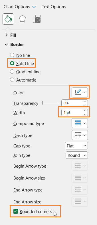
ii. Choose the Chart Area from drop-down and format the chart border as shown:
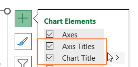
iii. Now, click on the chart, use the “+” from the top-right of the chart and insert suitable chart title and axis titles.
Since we have included the category values in the labels, click on the vertical axis title and click delete.
With this, your dumbbell chart created using a scatter plot is ready!


