When you need to show a range of values like the minimum and maximum and their spread, a Dumbbell Chart offers a clear and concise visual representation. This type of chart is a perfect addition to your reports or presentations grabbing the immediate attention of your audience.
This chart can be quickly built using Microsoft Excel, let get to the steps involved in creating two types of dumbbell charts.
Ready to save time on your next presentation? Explore our Data Visualization Toolkit featuring multiple pre-designed charts, ready to use in Excel. Buy now, create charts instantly, and save time! Click here to visit the product page.
Do check our dedicated video on YouTube explaining these steps in detail.
The following are the steps we’d follow in creating this chart:
- Prepare the Sample data
- Create a clustered column chart
- Format the error bars to get the dumbbell chart
- Format the error cap type
- Format the chart for a great visual
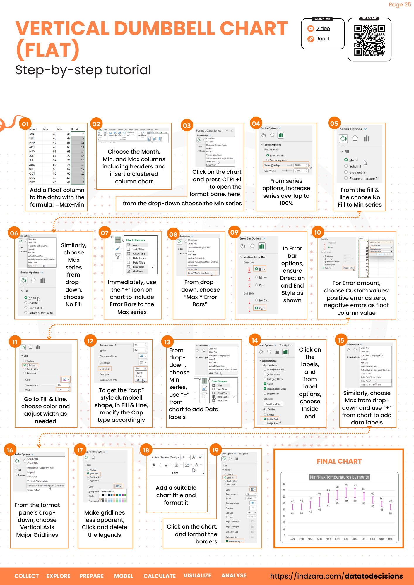
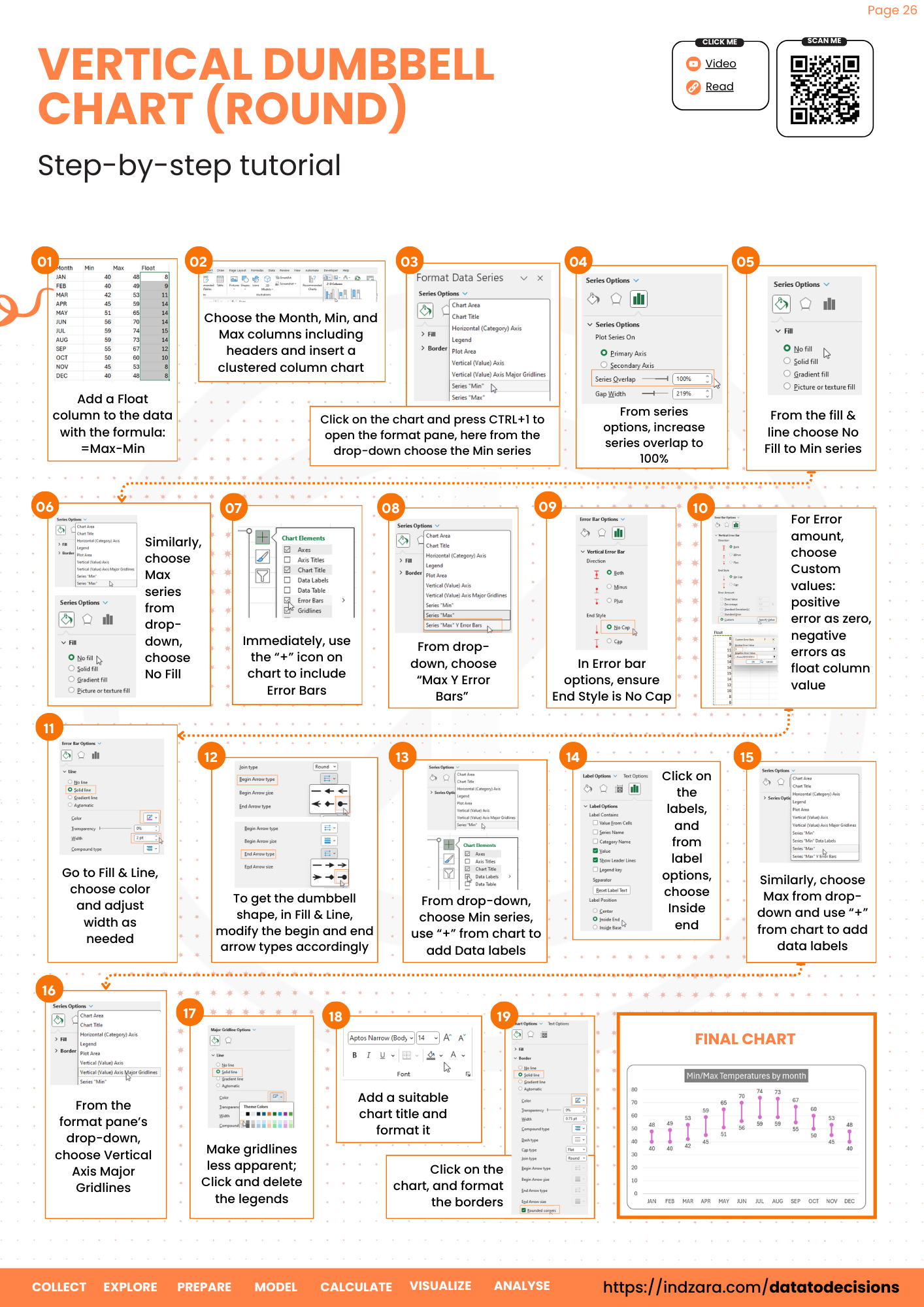
Step 01: Prepare the Sample data
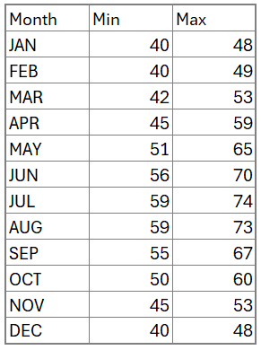
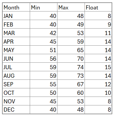
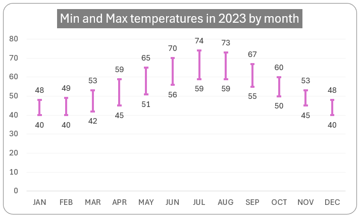
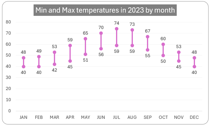
Consider sample data of minimum and maximum temperatures of a city for the year 2023.
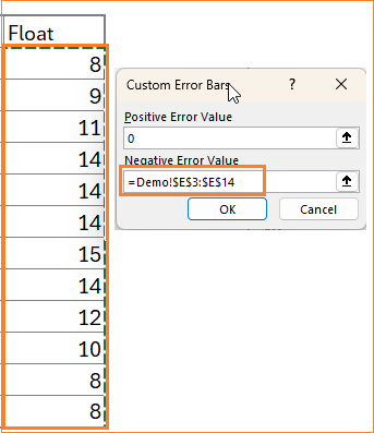
Add a series to this data called Float which will be the size of the dumbbell. This is the difference between the maximum and minimum values. (Assuming our minimum temperature starts from cell C3 and maximum temperature in cell D3)
=D3-C3With this, our sample data will be:
With this data, let’s build our chart!
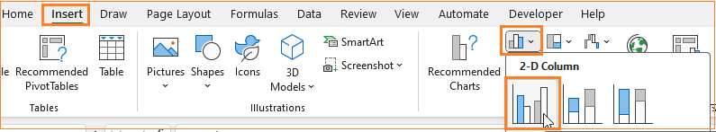
Step 02: Create a clustered column chart
Select the Month, Min, and Max columns only and insert a clustered column chart.
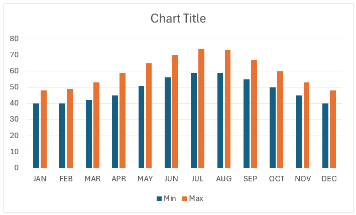
Excel creates a default chart as shown below (note the colors may vary based on the Excel theme in use)
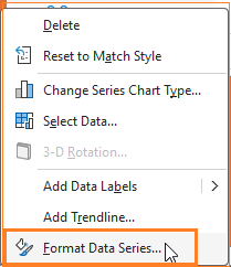
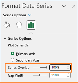
Now, right-click on the Max series and go to Format Series.
Here, adjust the overlap to 100% as shown below.
In the drop-down from the format pane, select the minimum series and remove the fill color.
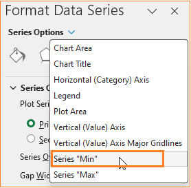
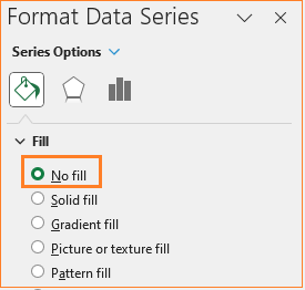
Select the Max series as and remove the fill color here as well.
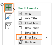
Once this is done, click on the “+” icon that appears at the top right of the chart and add error bars.
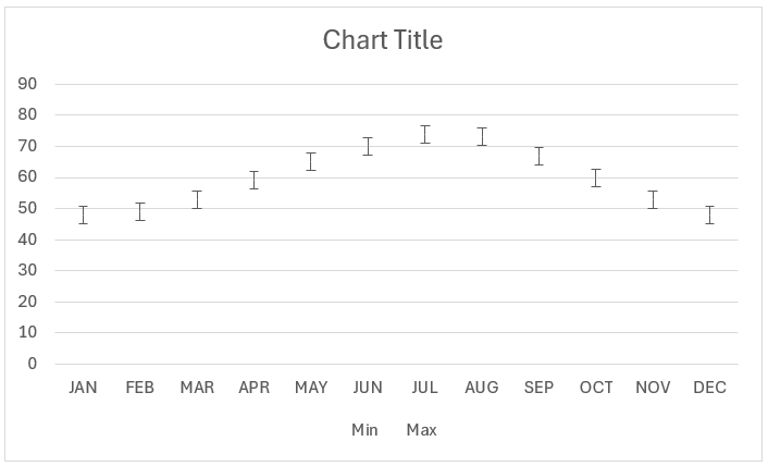
At this point, our chart looks like this:
Step 03: Format the error bars to get the dumbbell chart
We’ll format this error bar to get the dumbbell shape we require for our chart.
For this, do the following steps:
i. Click on the error bar, and in the format pane, in the Error amount, choose a custom value.
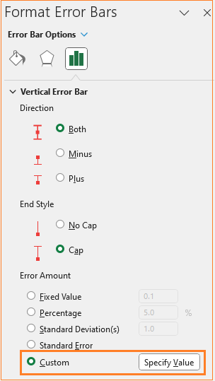
This opens a pop-up where the positive error value is zero and the negative value is the float value created in step 01 since we only need the dumbbell size to be the size of the difference value.
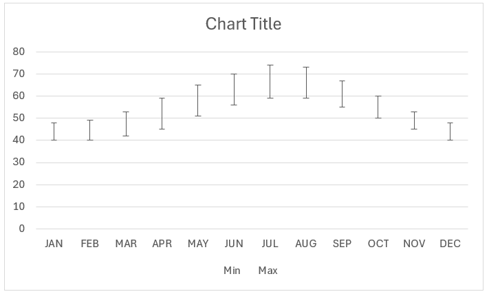
At this stage, this is our chart:
Step 04: Format the error cap type
We’ll now format the error bar to create our dumbbell chart – in two flavors!
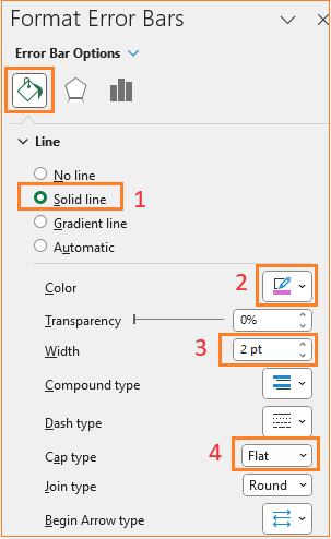
Design style – I (Flat)
Follow the below steps for the same. Click on the error bars and in the Fill & Line we’ll work with the multiple options available to format this error bar to get the desired chart.
For the first option,
i. In the fill & line, choose a desired color, and increase the width of the dumbbell as shown below.
Lastly, there are three options available to display the cap of the error bars: Square, Round, and Flat (explore these options as you build the chart). In our example for the first visual, we’ll choose a round type:
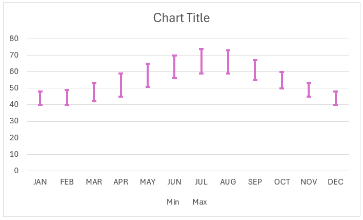
With this, the chart is:
Step 05: Format the chart for a great visual
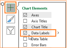
All we need to do is add data labels for the minimum and maximum series and format the chart to get the desired visual.
i. Click on the minimum series (you can choose this from the drop-down in the format pane as well) and in the “+” from the chart, insert the data labels.
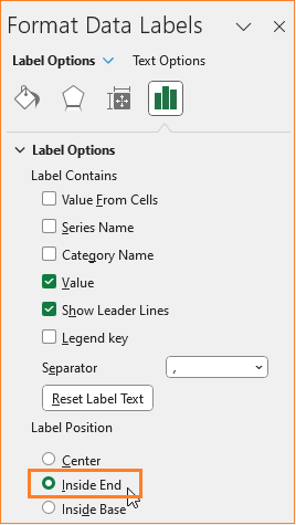
Position this at the inside end as shown below:
Similarly, choose the maximum series and add the data labels.
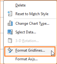
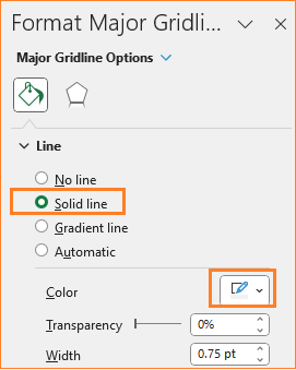
ii. Now the gridlines, ensure to have them but not so evidently overpowering chart by modifying the line color.
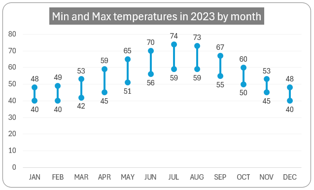
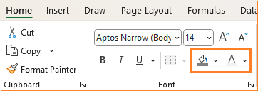
iii. Give a suitable title to the chart, say “Min and Max Temperatures in 2023 by Month” and format the same in the Home ribbon.
iii. The legends here don’t add any meaning as our title is very clear on what the chart displays. Similarly, the axis titles here are also not needed, so we’ll skip those.
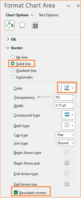
iv. As a final step of formatting, change the chart border by clicking on the chart and modifying the following in the format pane:
With this, the first design of our dumbbell chart is ready!
Check our 1-page, downloadable illustrative guide explaining all the steps for a quick reference.
Let’s get to the second dumbbell chart design.
Design style – II (Round)
i. Copy the final chart from the previous step (CTRL + C) and paste it (CTRL + V) into the same Excel sheet. We’ll modify this chart to get our next design of the dumbbell.
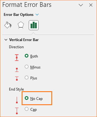
ii. Click on the error bars (the dumbbells) and in the format pane, remove the cap as shown:
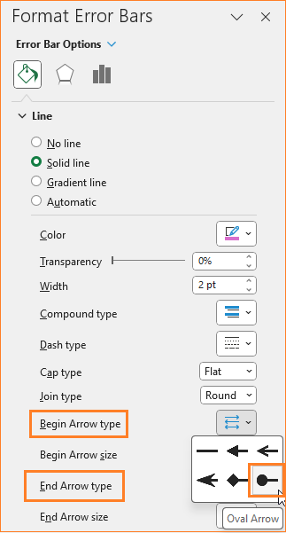
iii. In the Fill & Line option, include a begin and end arrow that looks like a dumbbell ends:
Note: Try the different formatting options available here based on the chart you are building and the story you want your visual to give your audience.
With this, our second dumbbell chart is ready!
Check our 1-page, downloadable illustrative guide explaining all the steps for a quick reference.
Please check our post on creating a similar chart, the floating column chart in Microsoft Excel.
If you have any feedback or suggestions, please post them in the comments below.