This post walks you through the steps required to build a tornado chart for sensitivity analysis in Excel. To understand better, these charts can be used to assess how sensitive the outcome can be to specific input variables.
Check this blog to create a tornado chart for only positive values.
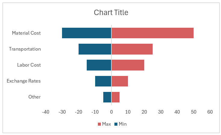
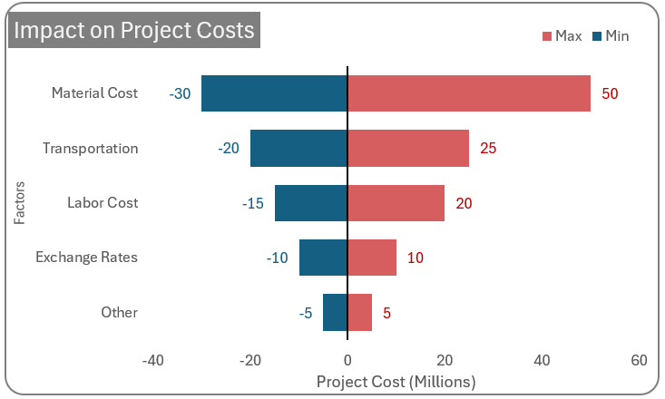
Consider the following tornado chart where multiple factors that might affect the projected project cost:
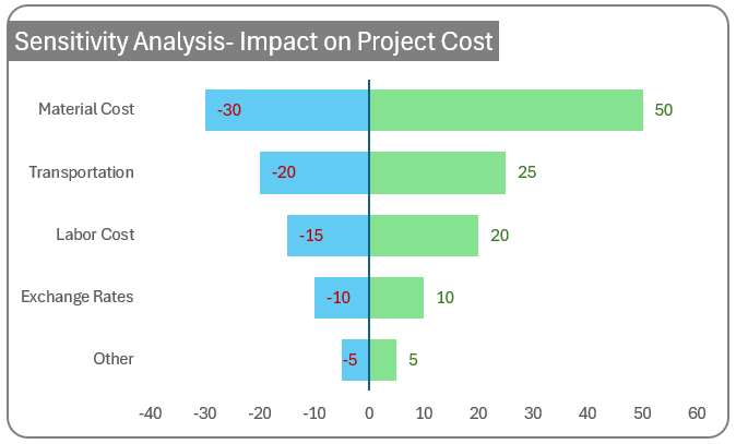
We can observe that changing the material costs will highly impact the overall project cost. Using a tornado chart we can access the different factors contributing to this change as well as identify the most sensitive factor.
To understand better, consider the overall project cost as $100,000. If the material cost increases to the worst-case scenario as depicted in the chart, the project cost is bound to increase by $50,000 to $150,000. In the same way, as a best-case scenario if the material cost comes down, then the project cost comes down by $30,000 to $70,000.
This chart will always be sorted to have the most sensitive factor at the top – hence making for a tornado-like appearance. However, one thing to keep in mind is that, typically multiple variables can change at a time impacting the project but a tornado chart assumes only one variable is changing.
Building this chart in Excel takes just a few steps, follow along to create one yourself!
If you are looking for an explainer video, please check our tutorial:
Step 01: Convert raw data into a table
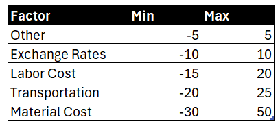
Consider a sample data of the impact of multiple factors on a project as shown:
Select all the data, press CTRL + T to convert this data into a table. This ensures flexibility and adaptability when your data changes.
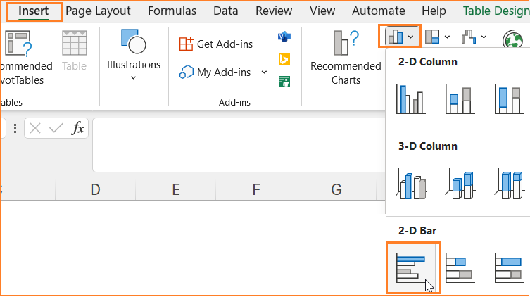
Step 02: Insert a clustered bar chart
Select all the data, and insert a clustered bar chart.
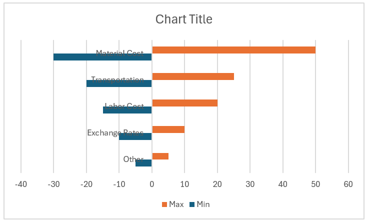
This inserts a default bar chart as shown:
Step 03: Format the vertical axis and series
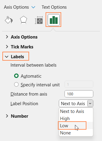
a. Right-click on the vertical axis, go to Format Axis, and position the labels as “Low”:
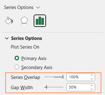
b. Select any of the series and under the series option increase series overlap to 100%, adjust gap width to 50% as shown here:
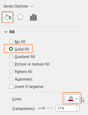
c. Under the fill & line option modify the fill color to suit your need.
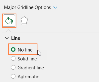
d. From the format-pane drop-down choose the “Horizontal Axis Major Gridlines” :
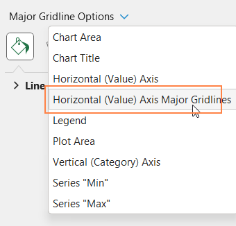
and remove the line as shown here:
At this point, our chart looks as shown here:
Step 04: Apply some standard chart formatting
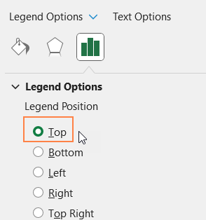
a. In continuation with the formatting, click on the legend and move it to the top.
b. a. Add a suitable chart title and format it using the Home Ribbon.
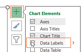
c. It’s time to add data labels. For this, click on the chart, and a “+” icon appears in the top-right corner of the chart. Click on that and check the “Data labels” option as shown:
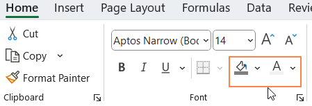
d. Click on the labels from each series, and format them using the options available in the home ribbon.
e. Similarly, use the “+” to add the axis titles as need be.
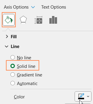
f. From the drop-down in the format pane, choose the Vertical Axis, and adjust the line color as shown:
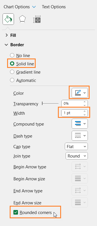
g. Click on the chart border and modify the same as shown:
With this, your tornado chart for sensitivity analysis is ready to be added to your next report!
If you have any feedback or suggestions, please post them in the comments below.


