A tornado chart or a butterfly chart is a special type of chart built by modifying a bar chart. There are two variations to this, this post specifically focuses on creating a tornado chart that handles only positive values.
Read this blog to create tornado charts for sensitivity analysis.
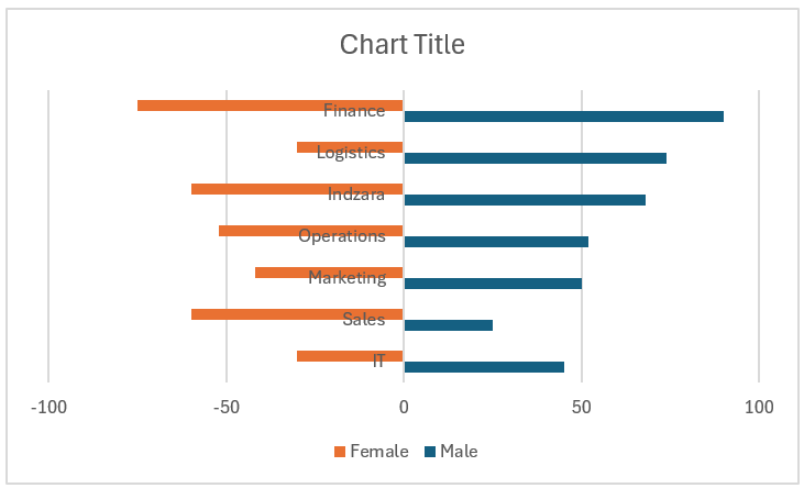
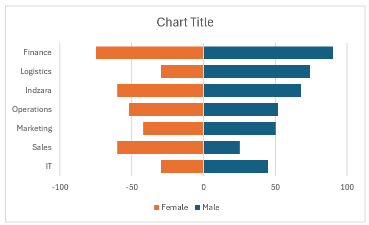
Consider a sample data of employee headcount by department where the headcount values per department are given for both Male and Female employees – in such cases to visually see the employee mix by gender within departments a Tornado chart comes in handy.
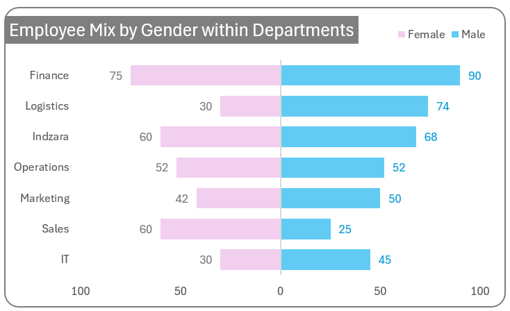
The main objective in using a tornado chart is, from the above example we can compare the headcount of only male employees (or only female) across departments AND also compare male and female employees within a particular department easily.
That is if the sample data is made with two dimensions where one dimension can take two positive values with its measure values – a tornado chart would be your best choice. For example, if you want to view joiners and leavers by department (or) exit pole by the segment of two candidates choose a tornado chart!
If you are looking for an explainer video on the Tornado chart creation, here you have it!
Creating this chart in Excel is a breeze! Let’s take a look at the steps involved now.
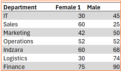
Let us take sample data of headcounts of various departments by gender, as shown below:
Ready to save time on your next presentation? Explore our Data Visualization Toolkit featuring multiple pre-designed charts, ready to use in Excel. Buy now, create charts instantly, and save time! Click here to visit the product page.
Step 01: Prepare the data
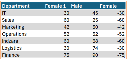
Before we begin with the chart creation, first select all data and press CTRL+T to create a table. Now, we’ll include a new column that gives us the negative values of the Female 1 column with a simple formula:
=-[@[Female 1]]With this, the data should look like this:
Step 02: Insert a clustered bar chart
Now, select the Department column, press the CTRL key, select the Male and Female columns and insert a clustered bar chart.
With this, a default bar chart gets inserted into Excel.
Step 03: Format the vertical axis and both the series
a. Now, right-click on the horizontal axis, go to Format Axis.
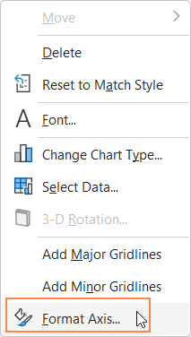
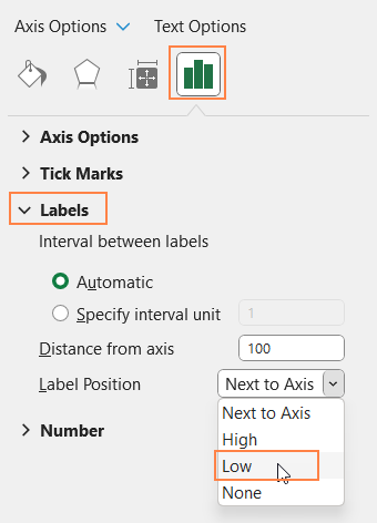
This opens a format pane, under the label options position them as “Low”.
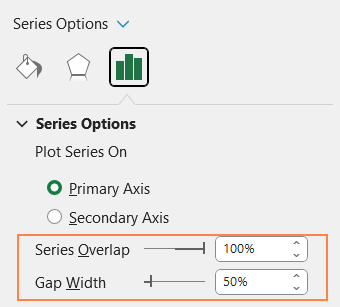
b. Click on any of the bars, from the format pane, under the Series Option, increase series overlap to 100% and adjust the gap width to 50%.
With this, our chart takes the tornado share and should look something like this:
Step 04: Format the series & legends, add data labels
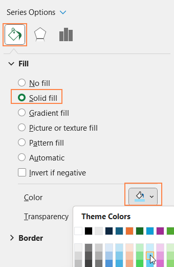
a. From the format pane drop-down choose the “Male” series and
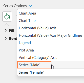
Choose a different fill color as needed.
Similarly, choose the “Female” series and assign a fill color as needed by you.
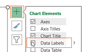
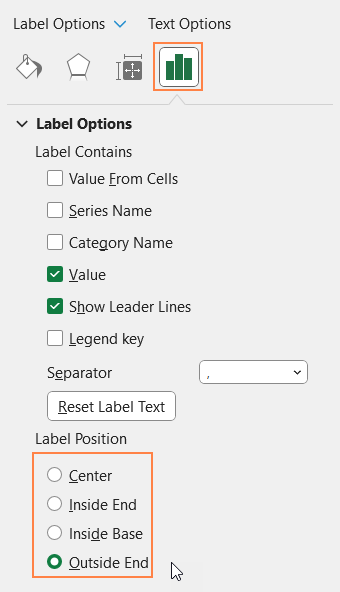
b. It’s time to add data labels. For this, click on the chart, and a “+” icon appears in the top-right corner of the chart. Click on that and check the “Data labels” option as shown:
Click on any of the labels, and you can use the format pane to adjust the position of the labels as shown below. In our example, we’ll keep the labels on the “Outside End”.
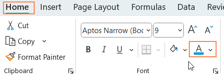
c. Now, use the Home ribbon to format the data labels for an effective visual.
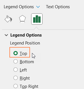
d. Now, in continuation with the formatting: click on the legends and use the format pane to position them on top.
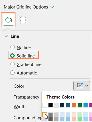
e. Click on the vertical gridlines, and use the format pane to give a very subtle color.
At the end of this step, our chart should look something like this:
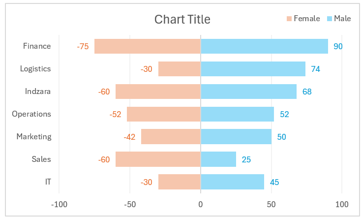
Step 05: Modify the negative labels
The chart from the previous step displays negative values for the Female series. This step shows how to change the data labels and the horizontal axis to display positive values.
a. Click on the Female series data labels. From the label options, uncheck other options in the format pane, and check the “Values from Cells” option.
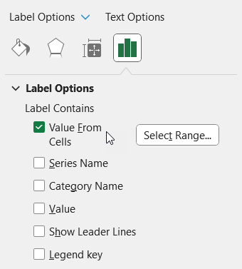
Now, choose the range as the Female 1 series which contains the actual headcount values of female employees.

b. To fix the axis values, click on the horizontal axis, and in the format pane under the Number option – choose the custom category and give a Format code of 0;0 , then click on “Add” as shown.
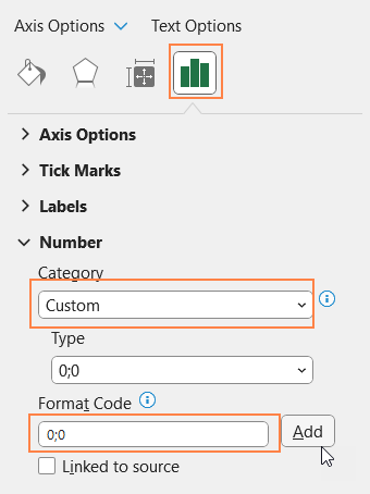
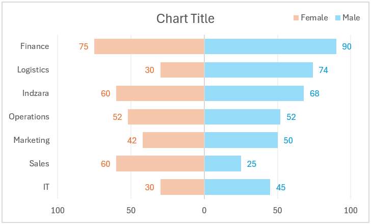
Assigning “0;0” ensures that the axis only displays positive values. With this, the chart should look something like this:
Step 06: Apply standard chart formatting
Let’s apply some standard formatting for a better visual.
a. Add a suitable chart title and format it using the Home Ribbon.
b. Click on the chart, and format the border .
With these 6 steps, our Tornado chart for only positive values is ready!
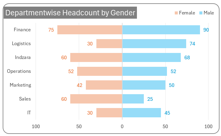
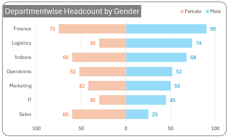
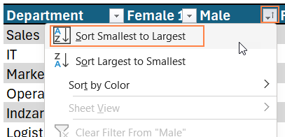
For analysis, you can sort the data based on either of the columns, say here we’ll sort based on the highest male employees count,
The chart gets modified based on this, instantly as shown here: