Though Excel provides a default option to create a Waterfall chart, they are restricted in many formatting options.
This post offers an alternative to default waterfall charts, by using a combination of columns, line charts, and other techniques.
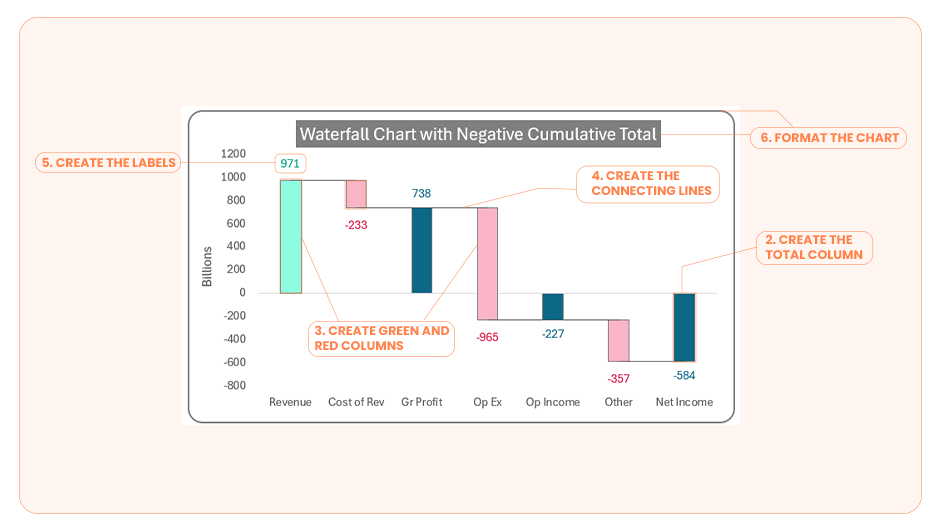
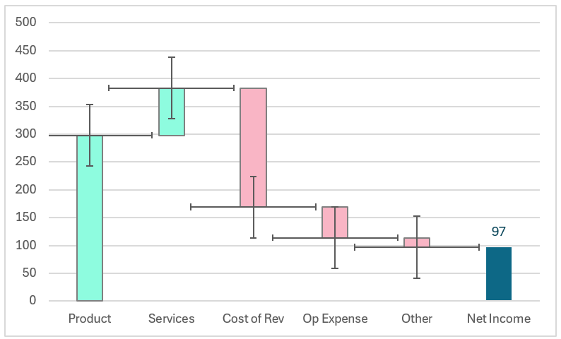
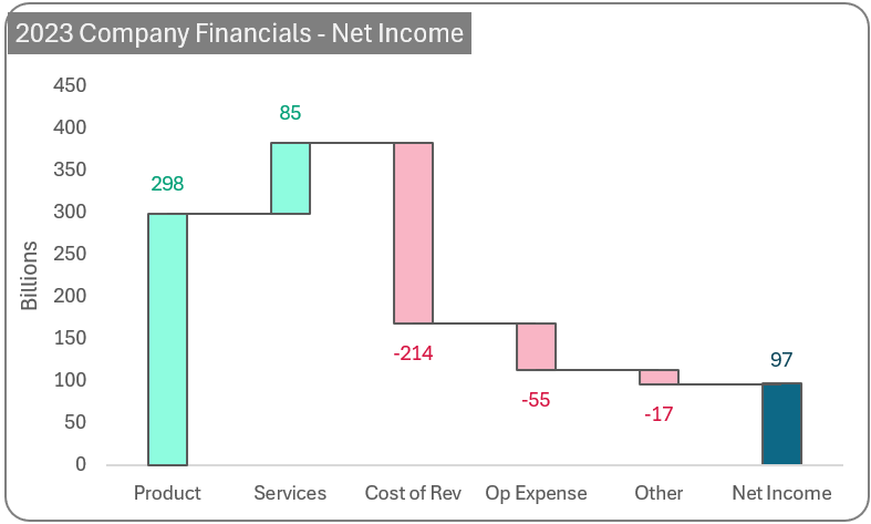
Waterfall charts are an effective way to visualize components of change (both positive and negative) from one point (or period) to another. This blog walks you through the steps required to create a single waterfall chart in such a way that it can handle 4 unique scenarios, dynamically.
The Approach:
Multiple variations of this can be created with a single chart. You’ll spend time creating this chart once, and then all that’s needed is to modify the data.
All that is required is 6 easy-to-follow steps.
- Set up the table data: Create the base table upon which our chart will be built
- Create the total column: Add the total value(s) column to the table and build the base chart
- Create green and red columns: Add the start & end columns using which our green and red colour columns will be built
- Create the connecting lines: Add a connector column, add it to chart and format to create the connecting lines
- Create the labels: Create positive and negative label columns; add them to the chart
- Format the chart: Apply standard formatting for a visually appealing chart
Let’s get to the steps involved in creating this dynamic waterfall chart.
Ready to save time on your next presentation? Explore our Data Visualization Toolkit featuring multiple pre-designed charts, ready to use in Excel. Buy now, create charts instantly, and save time! Click here to visit the product page.
Check our detailed explainer video of the steps required here:
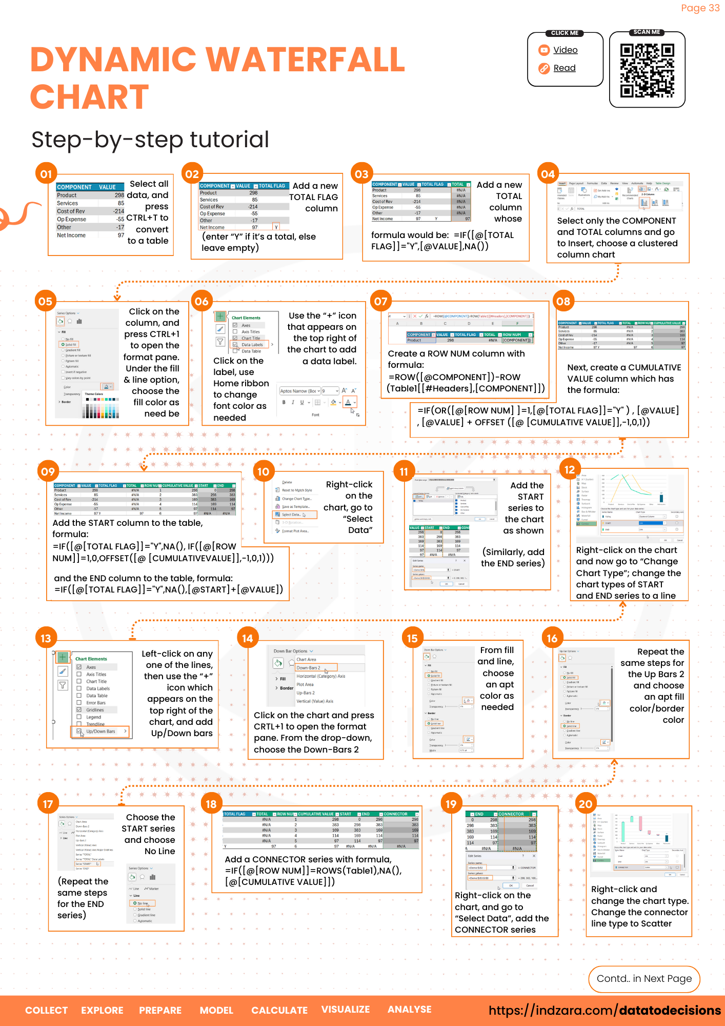
Step 01: Setup the table data
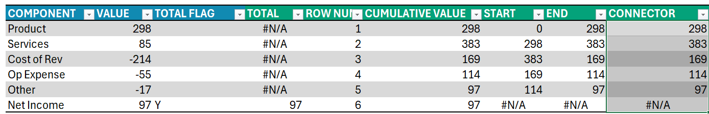
i. Consider sample data as shown below:
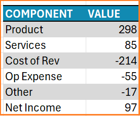
Select all this data, and press CTRL+1 to convert this to a table.
ii. Now, add a new TOTAL FLAG column that will be used to identify whether a particular value is a total or not.
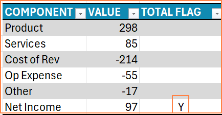
This column does not have any formulas, just enter “Y” in the cell against the values that are to be considered as totals. In the first scenario where we display components of a total, only the last column has the total value.
Step 02: Create the total column
Next, we’ll create a TOTAL series which will be plotted on the chart. Here we’ll include a formula only to return values where the corresponding TOTAL FLAG is “Y” else return nothing.
The formula would be:
=IF([@[TOTAL FLAG]]="Y",[@VALUE],NA())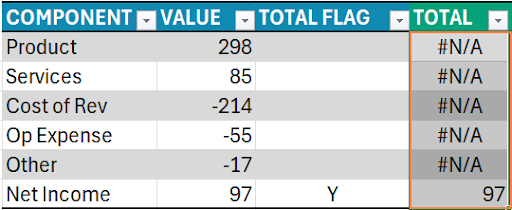
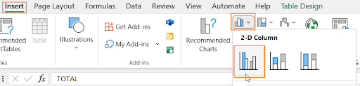
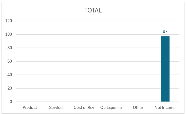
With this data, we’ll create a chart – select only the COMPONENT and TOTAL columns and go to Insert, choose a clustered column chart.
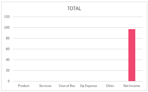
This creates a chart as shown below
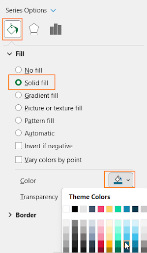
i. Click on the column, and press CTRL+1 to open the format pane. Under the fill & line option, choose the fill color to suit your needs.
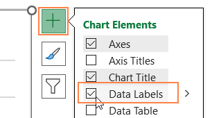
ii. Again, click on the column and use the “+” icon that appears on the top right of the chart to add data label.

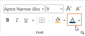
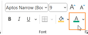
iii. Click on the label, go to the Home ribbon, and change the font color of the label as needed.
With this, adding the Total part of the chart is done.
Step 03 a: Create START & END columns to the table
The focus is on creating the green/red columns which are the components. For this, we need to add additional columns to our data.
i. Firstly, we need to create a column to capture the row number.
To make this dynamic, we’ll use a formula.
=ROW([@COMPONENT])-ROW(Table1[[#Headers],[COMPONENT]])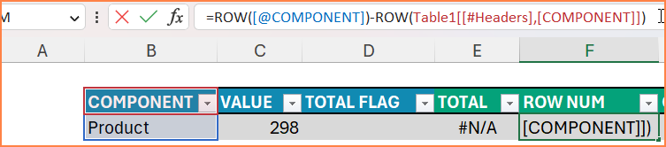
This formula retrieves the row numbers, sequentially from inside the table.
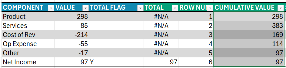
ii. The next column is the CUMULATIVE VALUE, each cell in this column will contain the cumulative values of the current cell plus the ones above it. This total value is used for building our connector lines of the chart.
The logic for this formula is:
If the current cell is the first row or a total, return the same value, else return the value plus the previous cumulative total value
=IF(OR([@[ROW NUM]]=1,[@[TOTAL FLAG]]="Y") , [@VALUE] , [@VALUE] + OFFSET ([@[CUMULATIVE VALUE]],-1,0,1))We get the previous cumulative total using a simple OFFSET function which is used to offset the number of rows we need (to get the prior values). The function syntax for OFFSET is:
=OFFSET (reference,rows-to-move,cols-to-move,[rows-to-return],[cols-to-return])With this, the table looks like this:
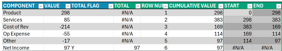
iii. For this part, we’ll look at the calculations required for the starting and ending points of each column in the waterfall chart.
In all the charts we’ve created above, notice that the green columns start below and the red columns start from above and end down. Let’s add two columns, START and END for these.
START: The logic for this column is,
- For the total record, we do not need any columns created i.e. NA() (since we’ve already created the totals columns in step 2)
- If the corresponding row is the first row, then we start at 0
- If it’s any other row, we start from where the previous row ended i.e the previous row’s cumulative total (using the OFFSET function)
As a formula, this would be:
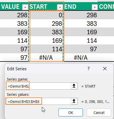
=IF([@[TOTAL FLAG]]="Y",NA(),IF([@[ROW NUM]]=1,0,OFFSET([@[CUMULATIVE VALUE]],-1,0,1)))END:
- For the total record, we do not need any columns created i.e. NA() (since we’ve already created the totals columns in step 2)
- Any other row, this will be the sum of the start plus the value
As a formula, this would be:
=IF([@[TOTAL FLAG]]="Y",NA(),[@START]+[@VALUE])With this, the table looks like this:
Step 03 b: Add these new columns to the chart
Let us add the calculated columns created in the previous step to the chart now.
i. Right-click on the chart, go to “Select Data”

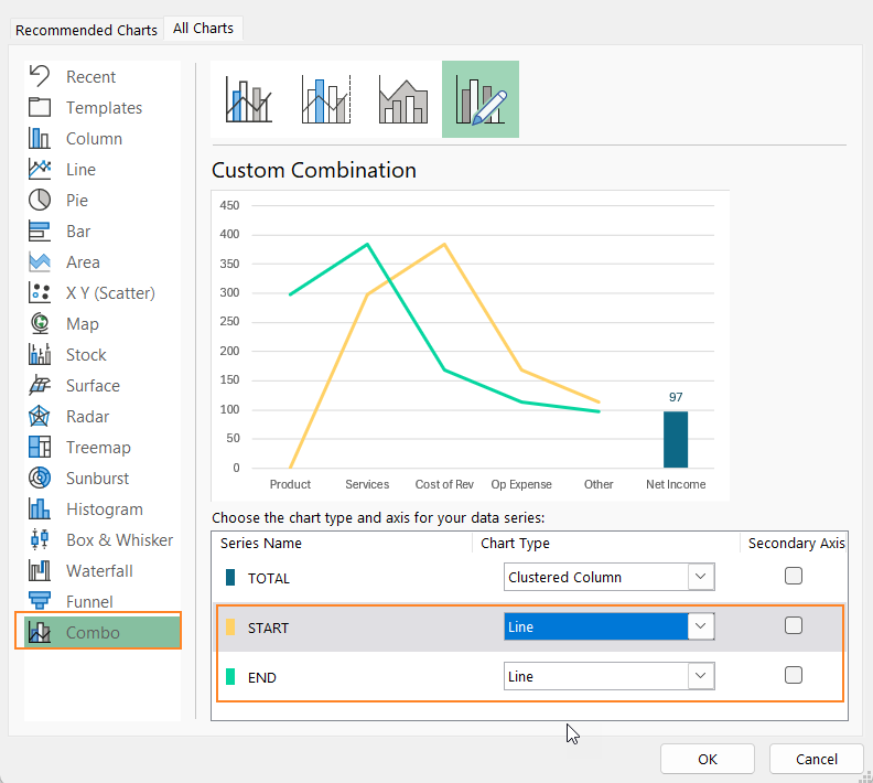
ii. Add the START and END series to the chart as shown:
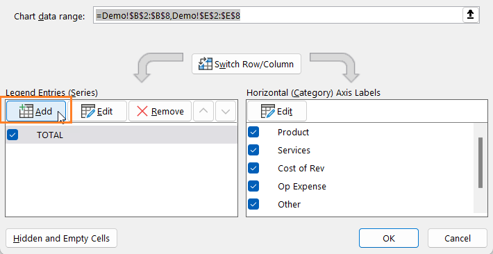
Add the START series first:
Then, add the correct horizontal axis:
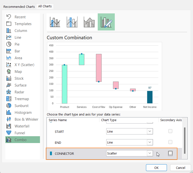
Similarly, add the END series too. With this, the modified chart looks something like this:
Right-click on the chart and now go to “Change Chart Type”. Here, change the chart types of START and END series to a line as shown below:
Now, do a single left-click on any one of the lines, then use the “+” icon which appears on the top right of the chart and add Up/Down bars.
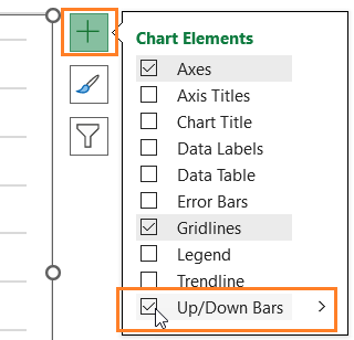
This creates the bars needed but requires formatting:
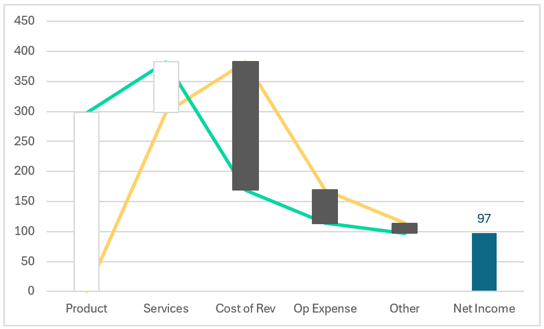
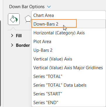
Click on the chart and press CRTL+1 to open the format pane. From the drop-down here, choose the Down-Bars 2 and Up-Bars 2 to format these bars, as explained in this step.
i. Choose the down bars
ii. From fill and line, choose an apt color as needed:
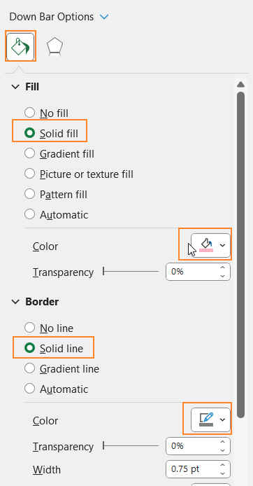
iii. Repeat the same steps for the up bars and choose an apt fill color/border color.

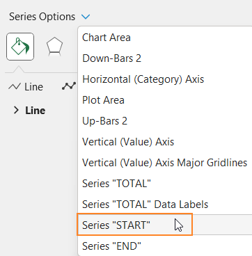
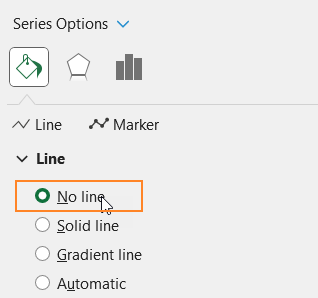
iv. Since we only need the bars, from the format pane drop-down, choose the START and END series and choose No Line.
Repeat the same steps for the END series as well. With this, the chart looks like this:
Step 04 a: Create the connecting lines: adding a new column
It’s time to create the connector lines in our waterfall chart. For this, we’ll include a new calculated column.
We achieve this by using the concept of error bars. The logic here is that, only in the last row, we do not need any connector lines from there; for all the other rows this is equal to the corresponding cumulative value.
=IF([@[ROW NUM]]=ROWS(Table1),NA(),[@[CUMULATIVE VALUE]])Here, the formula first checks if the row is the last row of the table, in which case the formula returns nothing, else the cumulative value.
Now, it’s time to add this CONNECTOR series to the chart (similar to the step 04)
i. Right-click on the chart, and go to “Select Data”. Add this series.

ii. Right-click and change the chart type. Change the connector line type to Scatter as shown:
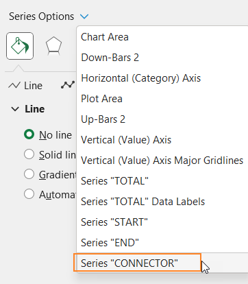
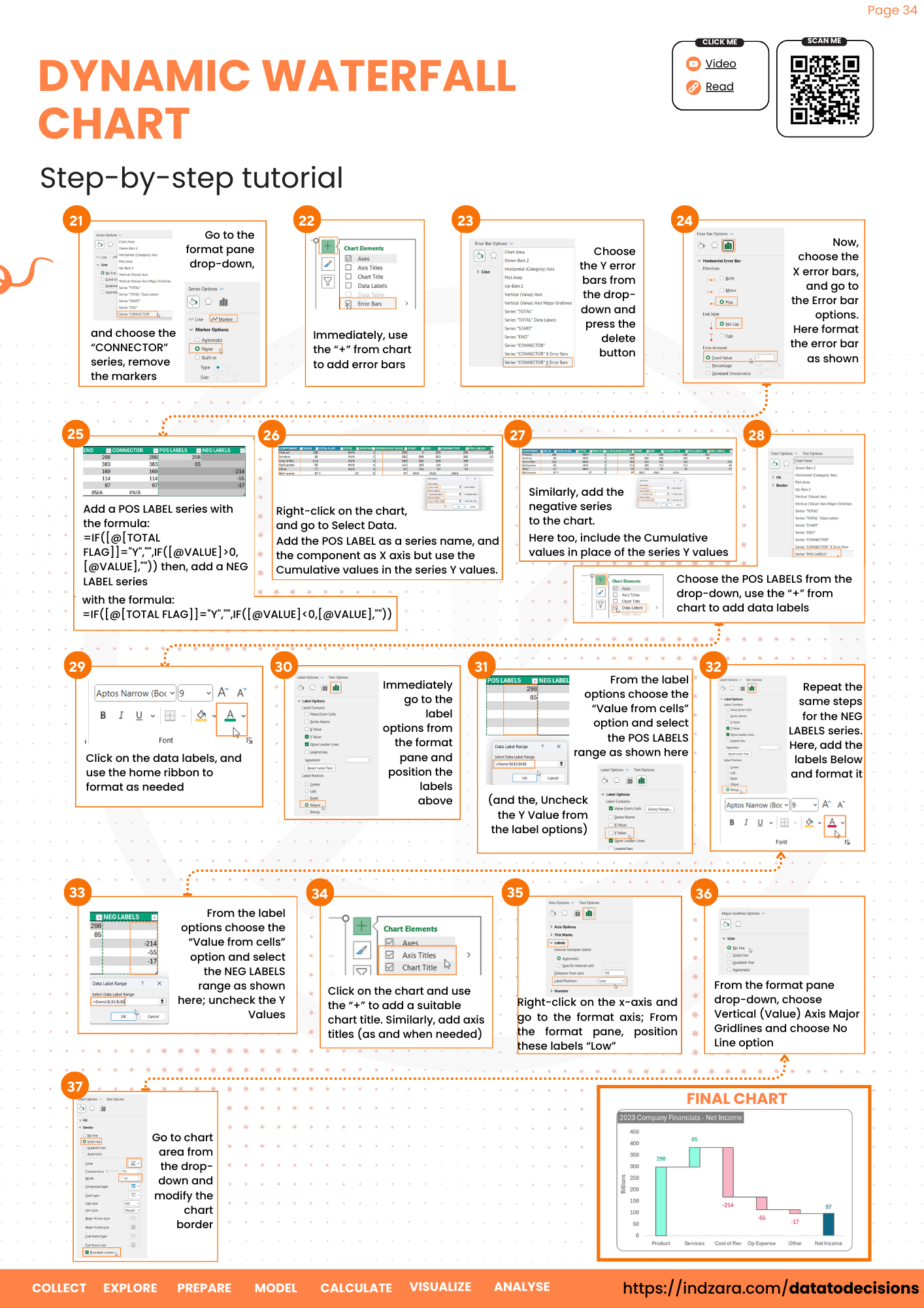
iii. Go to the format pane drop-down, and choose the “CONNECTOR” series, remove the markers:
iv. Immediately, use the “+” from chart to add error bars.
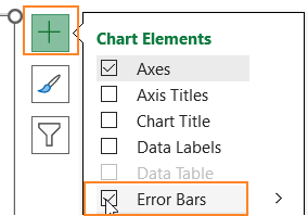
With this, the chart looks something like this, with error bars on both the X and Y axis.
Step 04 b: Create the connecting lines: format the error bars
Time to format the error bars from the previous step to create the connector lines for the waterfall chart.
i. Choose the Y error bars from the drop-down and press the delete button.

ii. Now, choose the X error bars, and go to the Erro bar options. Here format, the error bar as shown:
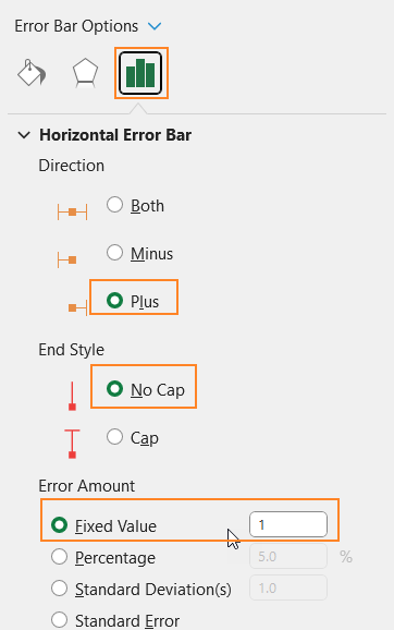
With this, the connector lines to the chart is added:

Note: Ensure that the connector lines and the column borders are all of the same width and color.
Step 05 a: Create the Positive & Negative labels columns
This step walks you through the process of adding data labels to the chart. We’ll add two more calculated (formula-based columns) to add the positive and negative labels.
Though this can be done by adding just a single column, our aim is to create a waterfall chart that is dynamic and more flexible, with positive and negative labels differing in fonts and colors.
POS LABELS:
If the value is not the total and is greater than 0, that is considered a positive label.
=IF([@[TOTAL FLAG]]="Y","",IF([@VALUE]>0,[@VALUE],""))NEG LABELS:
Similar to positive labels, if the value is not total AND less than 0, we consider that as a negative label.
=IF([@[TOTAL FLAG]]="Y","",IF([@VALUE]<0,[@VALUE],""))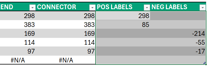
Step 05 b: Add the labels to the chart
To add these labels to the chart:
i. Right-click on the chart, and go to Select Data.
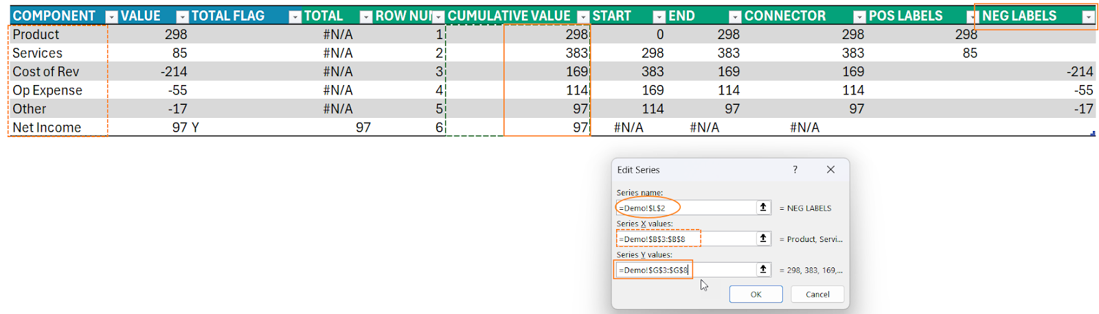
ii. Add the POS LABEL as a series name, and the component as X axis but use the Cumulative values in the series Y values.
We do this to position the positive labels above each column (as that is the desired output for the waterfall chart we are after)
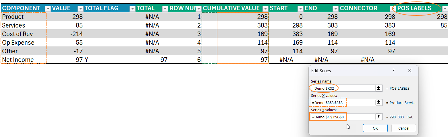
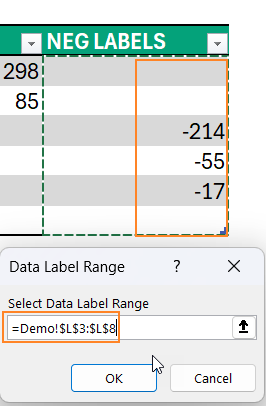
iii. Similarly, add the negative series to the chart. Here too, include the Cumulative values in the place of the series Y values.
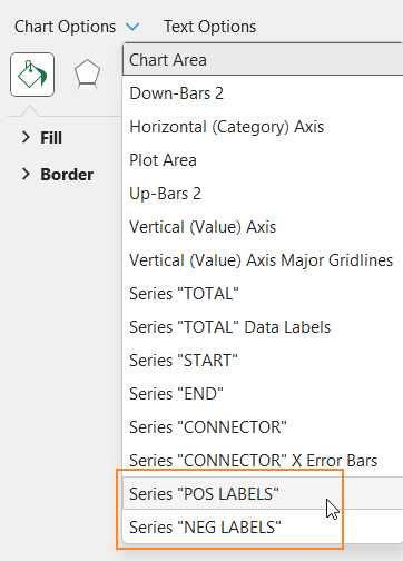
With this step, it may seem like nothing has changed in the chart. Use the format pane to check if the pos and neg label series are added.
Let’s now add these values as labels to the chart
i. Choose the POS LABELS from the drop-down, use the “+” from chart to add data labels.
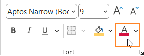
ii. Click on the data labels, and use the home ribbon to format as needed.
iii. Immediately go to the label options from the format pane and position the labels above.

iv. And, as seen from the previous step, we have added the cumulative values as labels but we need the values from the POS LABELS series as the labels.
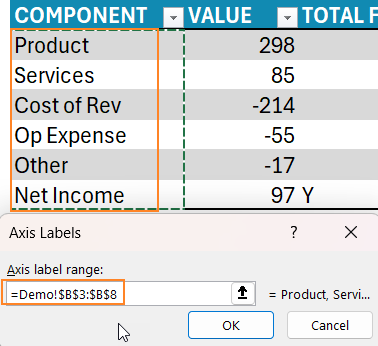
To do this, from the label options choose the “Value from cells” option and select the POS LABELS range as shown here:
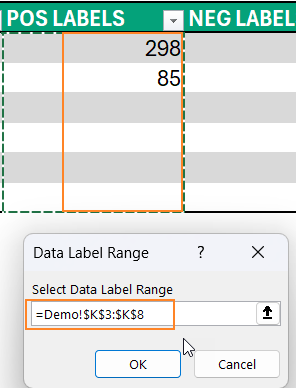
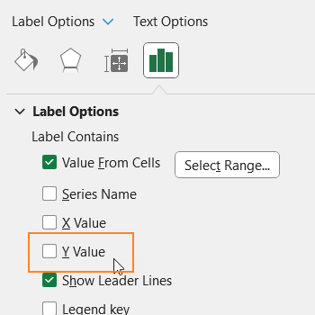
Uncheck the Y Value from the label options
v. Repeat the same steps for adding the negative labels.: choose the NEG LABELS series from the drop-down, use “+” to add labels.
vi. Click on labels, use the Home ribbon to format and
Use label options to position these labels below:
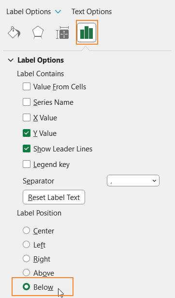
vii. from the label options choose the “Value from cells” option and select the NEG LABELS range as shown here; uncheck the Y Values
Step 06: Format the chart
Our waterfall chart is almost ready, it is time for some final formatting:
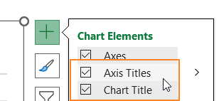
i. Click on the chart and use the “+” to add a suitable chart title. Similarly, add axis titles (here click and delete the X-axis title to allow more space for the chart.
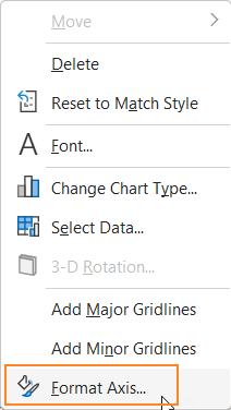
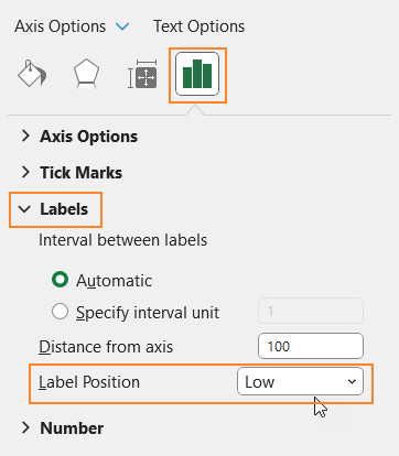
ii. Right-click on the x-axis and go to the format axis.
From the format pane, position these labels “Low”. This way, when we add negative values to the data, the label always remains at the bottom of the chart.
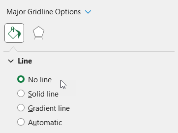
iii. From the format pane drop-down, choose Vertical (Value) Axis Major Gridlines and choose No Line option.
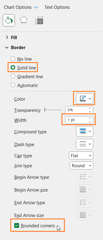
iv. Now, go to chart area from the drop-down and modify the chart border as shown:
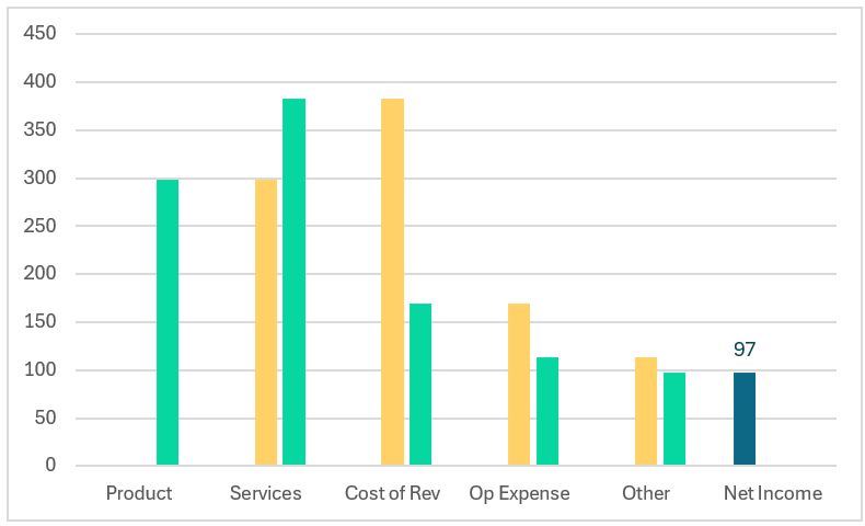
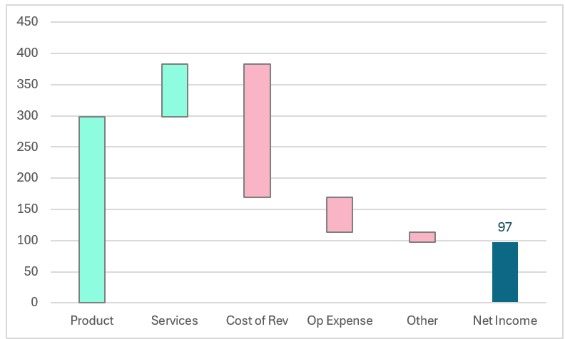
With this, the dynamic waterfall chart is ready. Modify the data to have either multiple subtotals or negative totals and see that the chart dynamically gets updated.
Check our Data to Decisions page for more amazing tutorials to make Excel eaeasy and fun to work with!
Check our 2-page, downloadable illustrative guide explaining all the steps for a quick reference.
To get our FREE downloadable Illustrative Guide for about 32 unique Column Charts, enter your email here!


