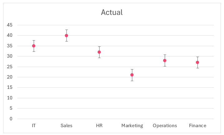
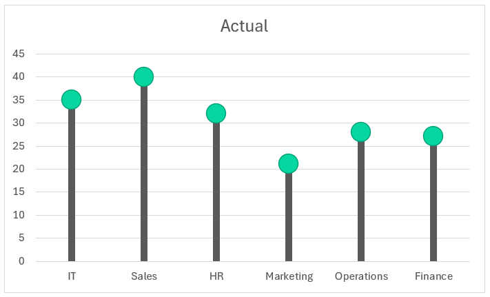
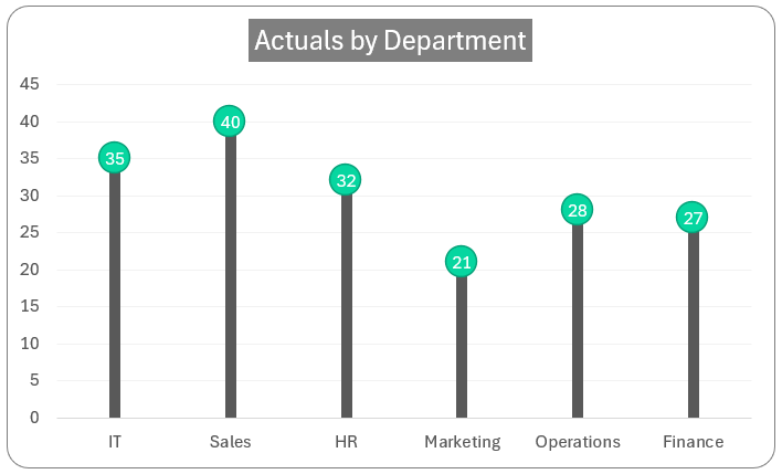
Get ready to bring life to your boring dashboards and reports by adding a unique visual! In our “Data to Decisions” series, this blog shows us the simplest method to create a lollipop chart, as shown here:
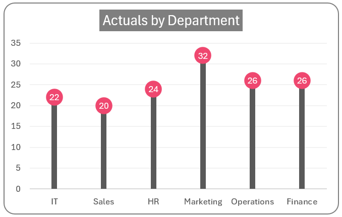
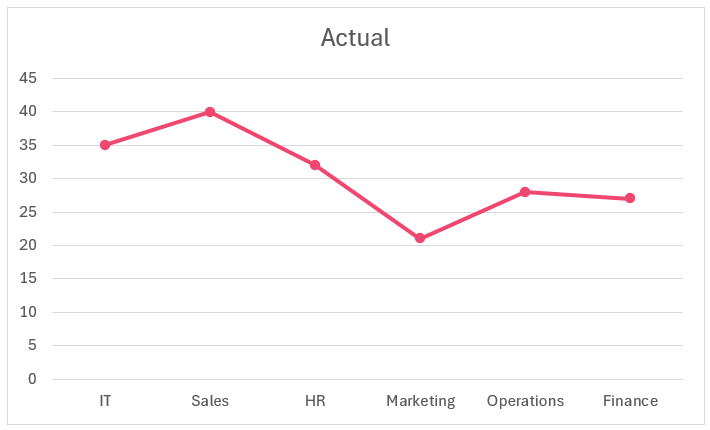
This chart shows the actual metrics by department, something we can achieve using a regular column chart as shown:
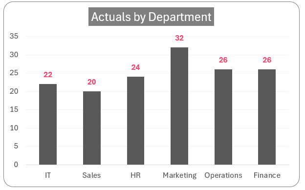
The only difference between these two charts is the aesthetic value the lollipop chart adds to your report. You might encounter situations where using a customized chart like the lollipop chart is useful.
We’ll be using a LINE chart to get this visual. So, let’s see how to build this in Excel!
Ready to save time on your next presentation? Explore our Data Visualization Toolkit featuring multiple pre-designed charts, ready to use in Excel. Buy now, create charts instantly, and save time! Click here to visit the product page.
Please check our dedicated YouTube video explaining how to create a lollipop chart here:
The following are the steps we’d follow in creating this chart:
- Insert a line with markers chart
- Format the data series
- Add error bars
- Format the error bars
- Modify the error line & marker
- Format the lollipop chart
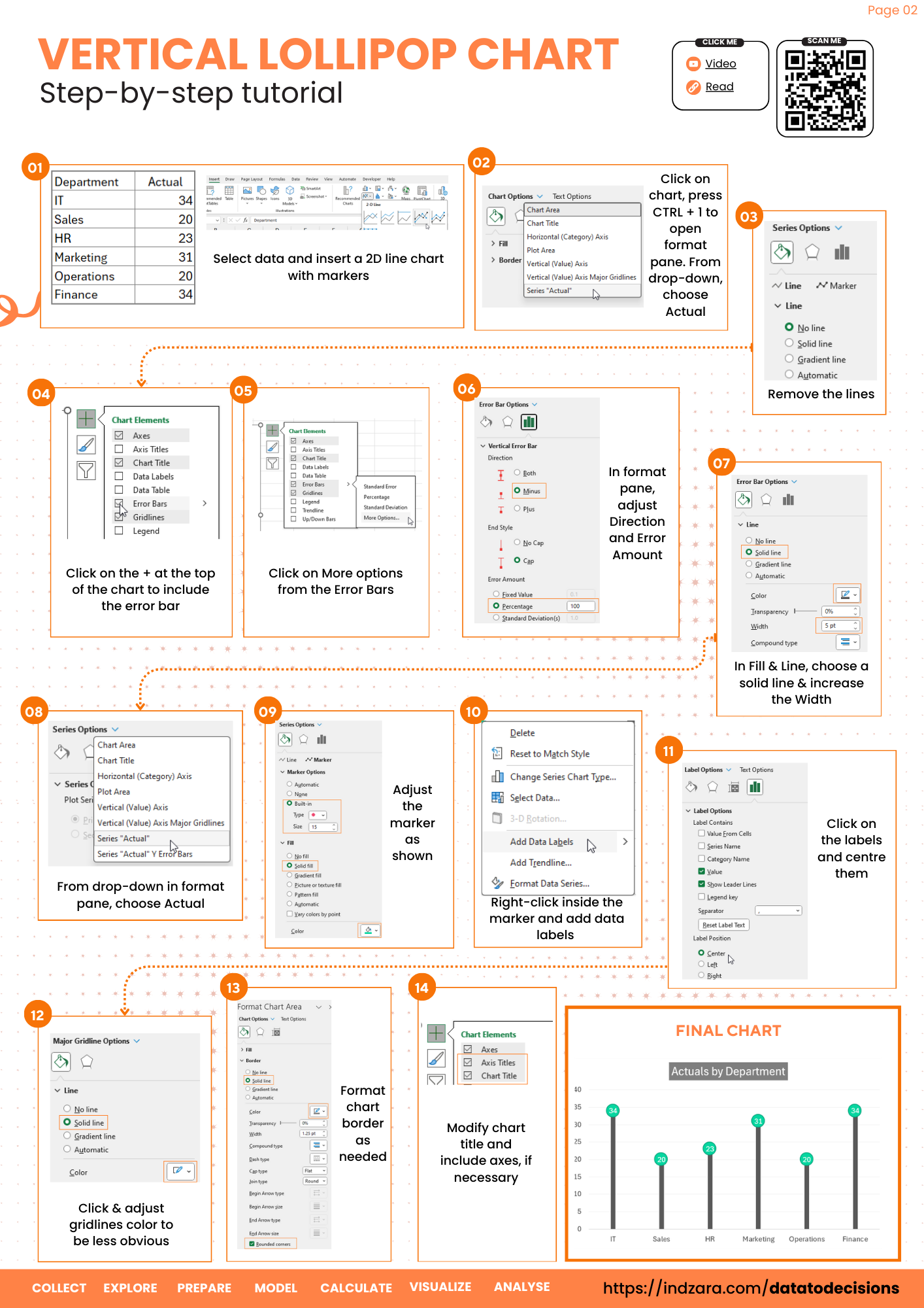
Step 01: Insert a line with markers chart
Consider the sample data as shown here:
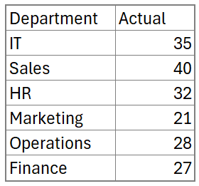
Select all the data and insert a 2-D Line chart with markers as shown here:
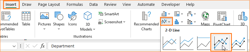
Excel generates a line chart for our data as shown:
This might look different on your machine, based on the theme chosen.
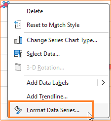
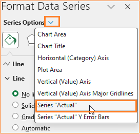
Step 02: Format the data series
We’ll work on how to modify this chart. Right-click on the chart and format data series:
This opens up the format pane where we’ll remove the line.
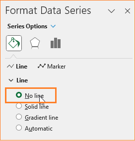
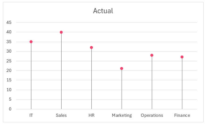
This leaves us with only markers in the chart, as shown here:

Step 03: Add error bars
Click anywhere on the chart, that displays a “+” sign and that include an Error bar:
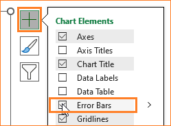
This adds a default error line as shown below:
We’ll format this error line to get the stem for our lollipop.
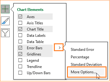
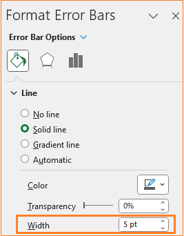
Step 04: Format the error bars
Click on more options in the error bars:
We’ll tweak the error line as shown to get the stem:
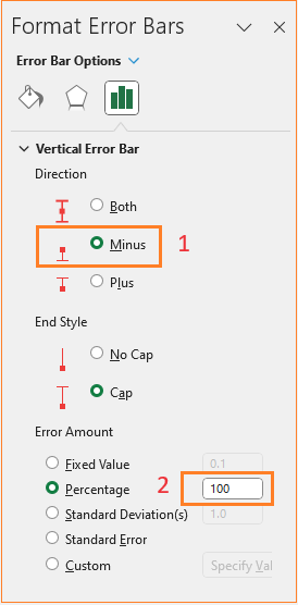
This drops the error bar all the way down (100) the horizontal line and choosing minus means the downward line.
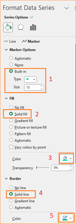
Step 05: Modify the error line & marker
Increase the stem width by going to the Fill & Line as shown:
Similarly, adjust the marker as well. To choose the marker, you can select from the drop-down list as shown here:
Here, we’ll adjust the marker width and color and border color, here we have chosen green (apply these formatting as per your requirement):
With this, our chart looks something like this:
Step 06: Format the lollipop chart
To make our chart visually better, take advantage of the numerous formatting options available in Excel.
i. Add data labels by right-clicking on the markers:
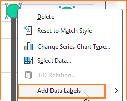
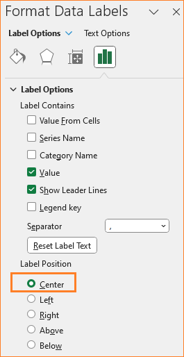
Adjust the label position by clicking on the label and editing the same in the format pane:
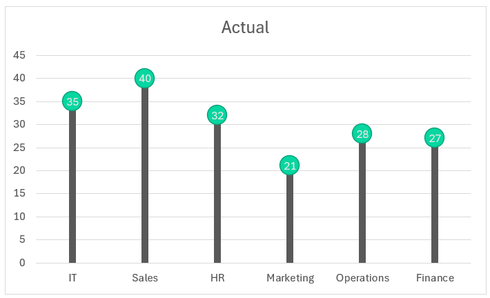
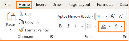
You can modify the color by formatting the same in the home ribbon, with these steps our chart looks like this:
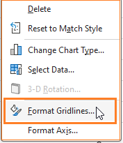
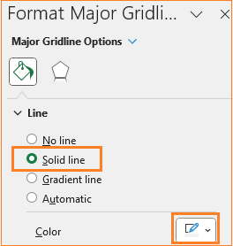
ii. Adjust the gridlines to make it less obviously visible. . Right-click the gridlines and open the format pane:
Modify the color to a lighter grey to make it less prominent:
iii. Give the chart a suitable, understandable title, say ”Actuals by Department” and format the color and background of the title in the ribbon on top:
iv. We can add axis labels if and when necessary. In our case these are self-explanatory, hence we are skipping them.
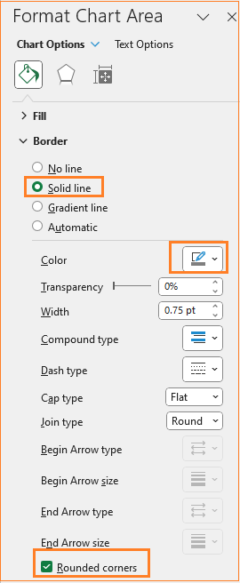
v. As a final step, adjust the chart border’s color and make it rounded. (All of these formatting are optional and can be modified based on the need at hand)
Our final lollipop chart is ready as a cool visual addition to your reports!
Check our 1-page, downloadable illustrative guide explaining all the steps for a quick reference.
If you have any feedback or suggestions, please post them in the comments below.


