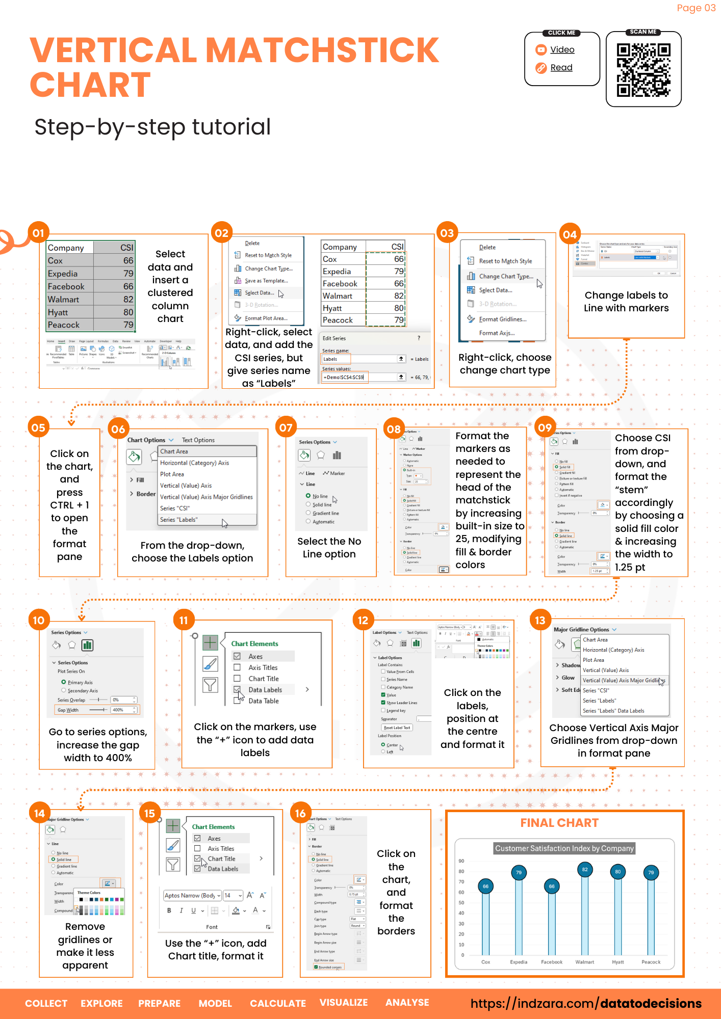
Discover the elegance of simplicity with this Data to Decisions blog on creating a Matchstick Chart in Excel. This tutorial simplifies turning your data into clear, minimalist visuals that speak volumes and serve as a unique addition to your dashboards. This is an ideal replacement for traditional column charts to represent your metrics.
Ready to save time on your next presentation? Explore our Data Visualization Toolkit featuring multiple pre-designed charts, ready to use in Excel. Buy now, create charts instantly, and save time! Click here to visit the product page.
Check the steps involved in creating this chart in our YouTube video:
Building this in Microsoft Excel takes just a few minutes, let’s see how!
Step 01:
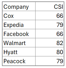
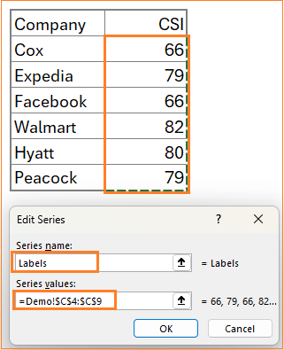
The sample data used in this blog is of customer satisfaction index of companies, as shown below (source: https://theacsi.org/the-acsi-difference/top-10-acsi-companies/).
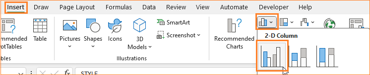
Select all the data and insert a 2D clustered column chart.
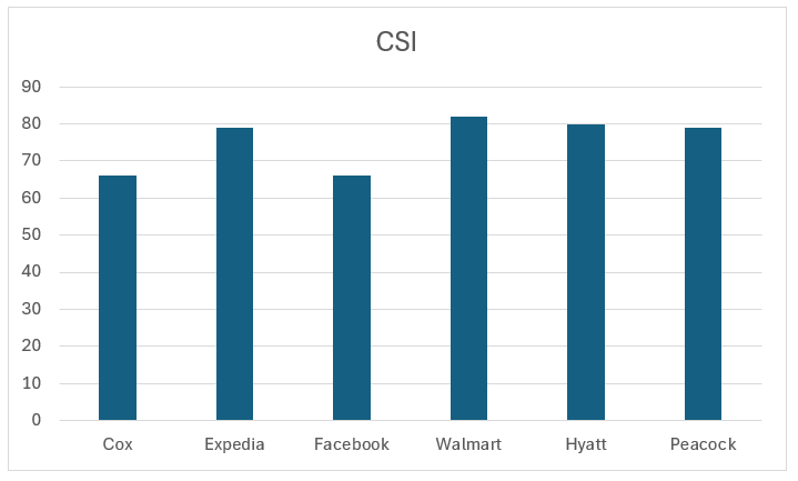
With this, Excel inserts a default column chart based on the data.
Step 02:
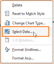
Right-click on the chart and go to Select Data. This opens a pop-up to add a new series.
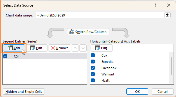
Here, add the same CSI data as a new series and name it as Labels as shown:
Excel adds this as a clustered column to the existing chart.
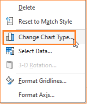
Step 03:
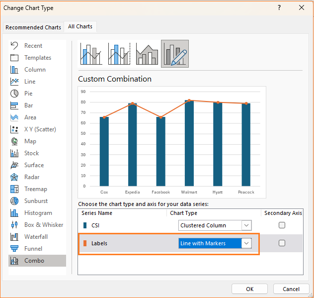
To get the desired matchstick design, we need to modify the labels series. To do this, right-click on the chart and select Change Chart Type.
In the dialog box that appears, change the Labels chart type to Line with Markers.
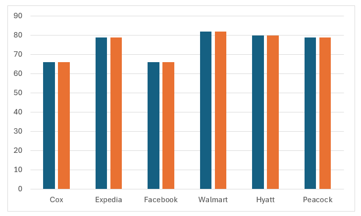
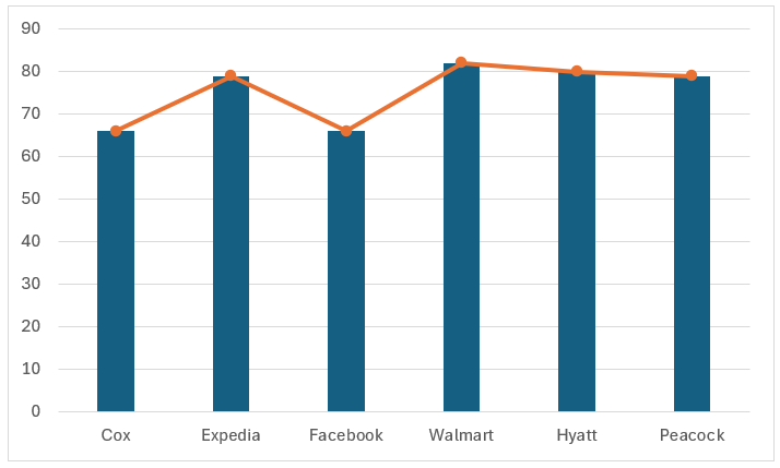
At the end of this step, our chart looks as below:
Step 04:
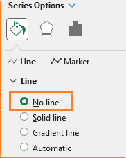
i. Click on the line, and press CTRL + 1 to open the format pane to the right. From here, in the Fill & Line, remove the line.
ii. In the Marker options, use a built-in marker type with a higher size, also include fill color, a darker and thicker border to resemble the head of a matchstick.
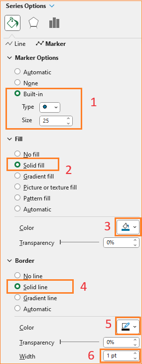
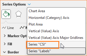
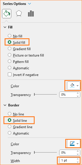
iii. From the series option in the format pane, choose the CSI series (the column series).
In here, choose a lighter blue fill color, with a darker border and the same width as that of the marker from the previous step. (Choose colors to address the narrative you are building with your visual).
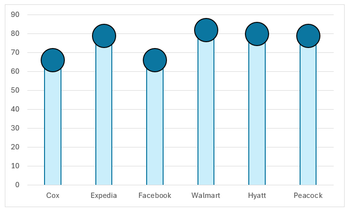
At the end of this step, the matchstick chart looks like this:
Step 05:
Now, click on the markers, and from the “+” icon on the top of the chart, insert data labels.
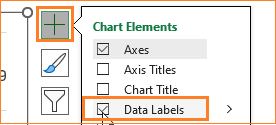
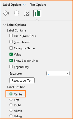
Click on the labels and position them on the center from the format pane as shown below:
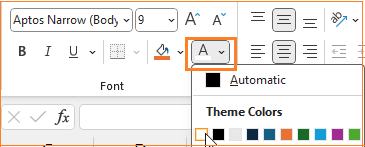
Since the marker is of a darker color, modify the color of the labels to ensure they are visible to the audience.
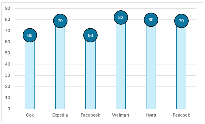
At this point, our chart looks as shown below:
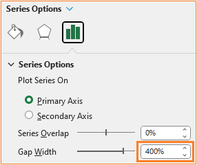
Step 06:
To get the matchstick effect, we need to adjust the width of the columns and make them narrower. To do this, click on the columns and in the format pane adjust the gap width to 400% ( the higher the width, the narrower the columns get).
Step 07:
If you’ve been following our blogs, it’s time to format the chart on the whole to get a visually appealing chart.
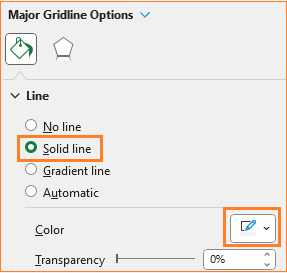
i. Click on the gridlines and give a lighter color to make them less prominent, using the format pane, as shown:
ii. Click on the chart and from the “+” icon, add a Chart title.
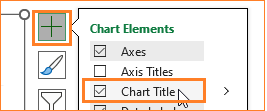
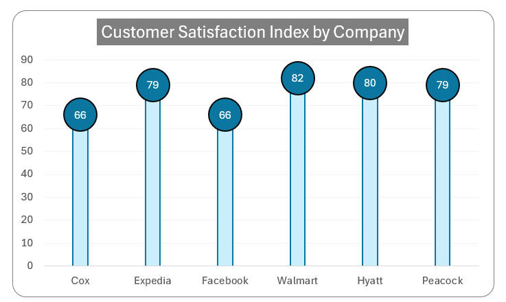
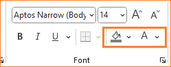
Add a suitable title to the chart that, in a glance will explain the key takeaway of your visual. Here, let’s add “Customer Satisfaction Index by Company” as the title and format the color and background from the Home ribbon.
iii. If needed, add axes labels to denote clearly what each axis represents. In our case, the chart title conveys the same, hence do not clutter the chart with additional details.
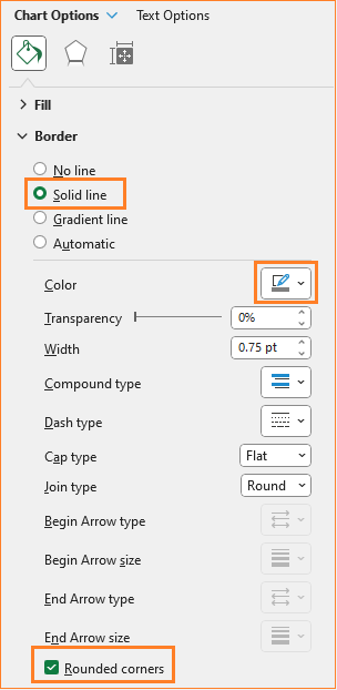
iv. Click on the chart, format the border and its color as shown:
With these simple steps, our matchstick chart is ready to be a unique part of your reports or dashboards!
Check our 1-page, downloadable illustrative guide explaining all the steps for a quick reference.
Check our quick 1-minute video explaining only the steps involved in creating the matchstick chart.
To explore our fast-growing collection of free Excel tutorials covering a wide array of topics, please visit https://indzara.com/datatodecisions/
If you have any feedback or suggestions, please post them in the comments below.


