Bar charts visually compare items or categories over time by displaying their values as bars. This post guides you through creating a bar chart with multiple series in Excel.
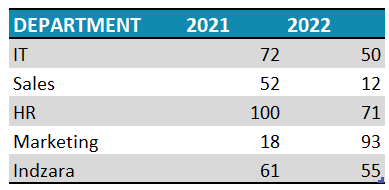
Consider a scenario where you have data of a certain metric across departments AND across years (series) as shown here:
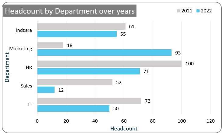
This can be easily represented, visually in a column chart with multiple series that look like this:
Please note: These charts are recommended for data with only a few series.
Ready to save time on your next presentation? Explore our Data Visualization Toolkit featuring multiple pre-designed charts, ready to use in Excel. Buy now, create charts instantly, and save time! Click here to visit the product page.
Step 01: Create Chart
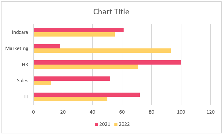
Select all data and go to Insert, choose a 2D Clustered Bar chart, as shown:

With this, a default bar chart for these two series gets inserted.
Step 02: Format the Chart
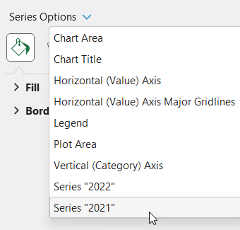
i. Click anywhere on the chart, and press CTRL+1 to open the format pane.
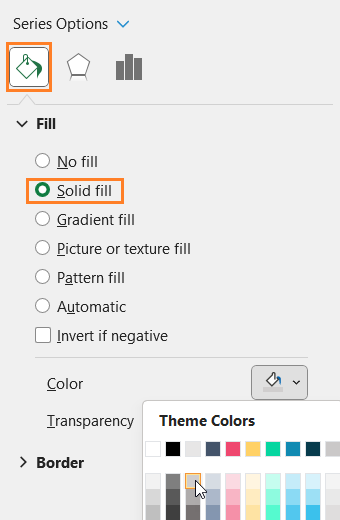
ii. Let’s format the series now, from the drop-down in the format pane, choose the “2021” series
iii. Go to the Fill & Line, format the fill color as needed
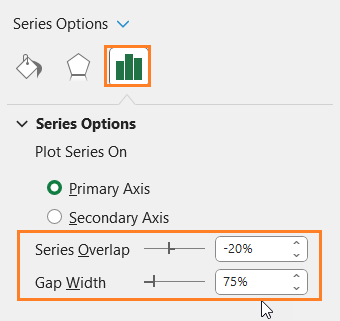
iv. From the series option, we’ll adjust the series overlap and gap width to create a visually appealing chart.
The gap width is the space between different categories or sets of bars and series overlap determines how much bars within the same category overlap each other.
For this chart, we’ll modify these as follows:
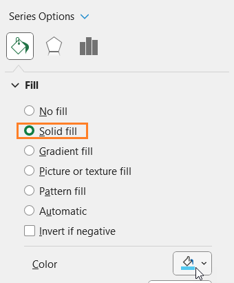
v. Now, choose the other series “2022” from the drop-down and modify the fill color as needed
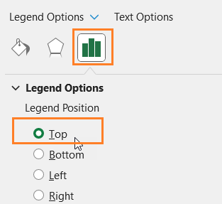
vi. Click on the legends and from Legend Options, reposition them on top.
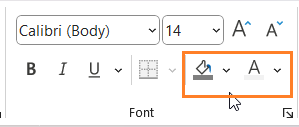
vii. Add a suitable chart title and format it using the Home Ribbon as shown:
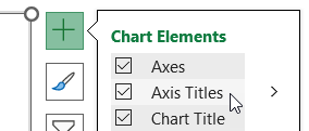
viii. Click on chart, use the “+” that appear on chart to add suitable axis titles, format them if need be
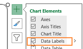
xi. Again, use the “+” to add data labels to the chart
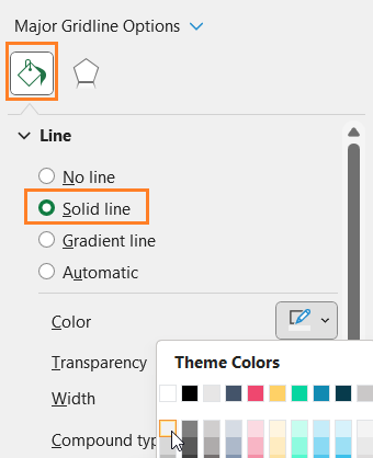
viii. Again, from the drop-down choose the “Horizontal (Value) Axis Major Gridlines” and
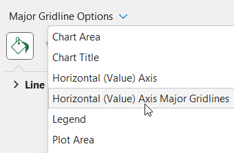
modify the line color to make it less apparent.
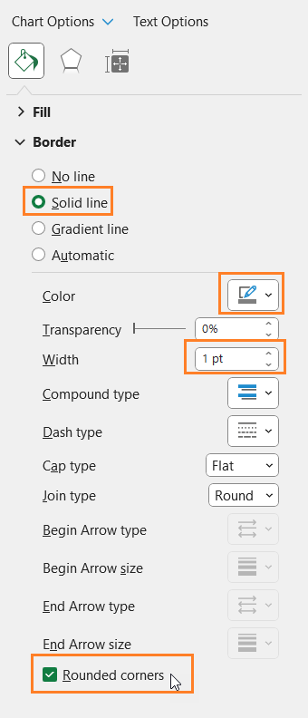
xi. Click on the chart and format the chart borders as shown:
With this, your bar chart for multiple series is ready to be added to your reports and dashboards.


