Pareto charts are a powerful tool for visualizing the most significant factors in a dataset. They help identify the “vital few” factors that have the most impact, allowing you to focus your efforts where they matter most.

The Pareto principle, or the 80/20 rule, is often illustrated using a Pareto chart. It suggests that roughly 80% of effects come from 20% of causes.
This type of analysis is commonly used in quality control and business to prioritize problem-solving efforts.
In this blog post, we’ll walk you through the steps to create a Pareto chart in Excel, using the sample chart shown below.
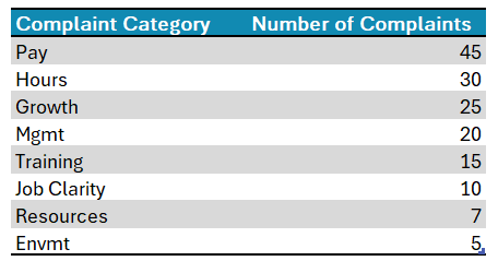
The above data is a compilation of employee complaints in the workplace.
Ready to save time on your next presentation? Explore our Data Visualization Toolkit featuring multiple pre-designed charts, ready to use in Excel. Buy now, create charts instantly, and save time! Click here to visit the product page.
Step 01: Create the chart
Select all the data and under Insert, choose the Pareto chart.
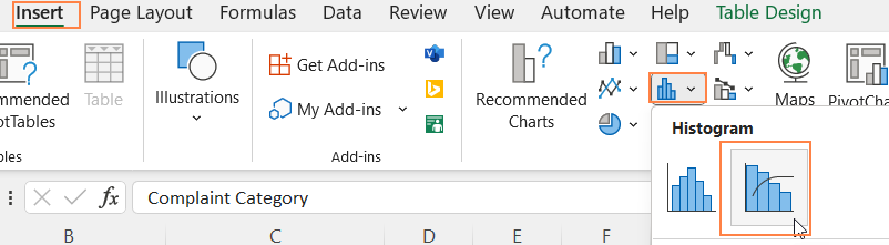
This inserts a Pareto chart based on the data.
Step 02: Format the chart
Excel gives several formatting options to obtain a visually appealing chart. Let us apply a few of them to our Pareto chart.
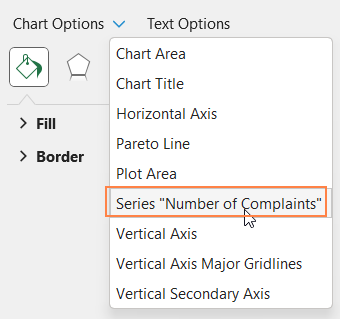
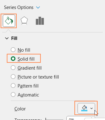
i. Click on the chart and press CTRL+1 to open the format pane.
ii. From the drop-down, choose the series of data as shown:
iii. Under the fill & line, choose a suitable fill color to go with the theme of your report or presentation.
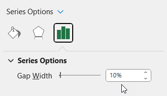
iv. Now, under the series option, increase the gap width slightly to introduce gaps between columns (this is optional)
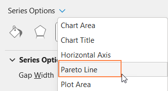
v. From the drop-down, choose the Pareto Line
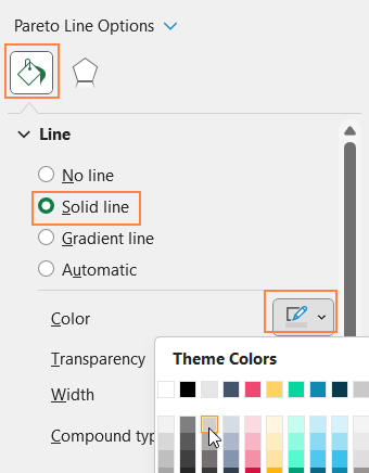
vi. Under the fill & line, format the Pareto line as needed
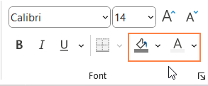
vii. Add a suitable chart title and format it using the options available in the Home ribbon.
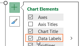
viii. Click on the chart, and use the “+” on the top-right to add data labels, you can format them with options in the home ribbon.
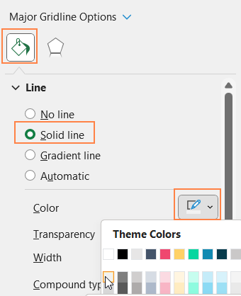
ix. From the drop-down, choose the “Vertical Axis Major Gridlines and format them with a lighter color.
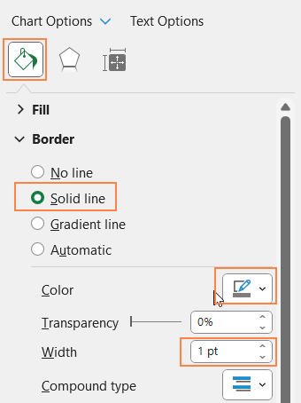
x. Click on the chart, and modify the chart border as shown here:
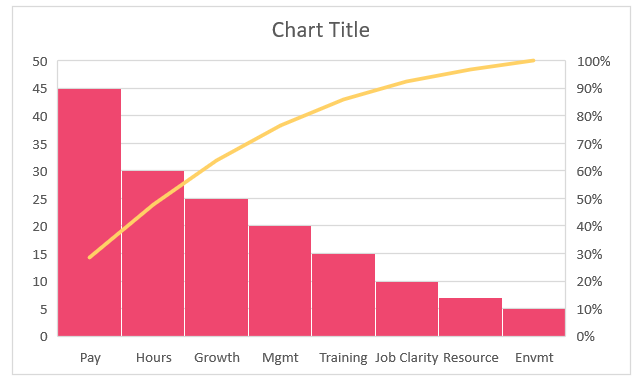
With this, your formatted Pareto chart should look like this:


