A Progress Tracker Column Chart is a great tool for quickly visualizing progress where actuals are compared to goals as a percentage value.
That is, if the goal is to reach 500,00 in sales where the actual is 250,000 then we can say that 50% of the target is achieved.
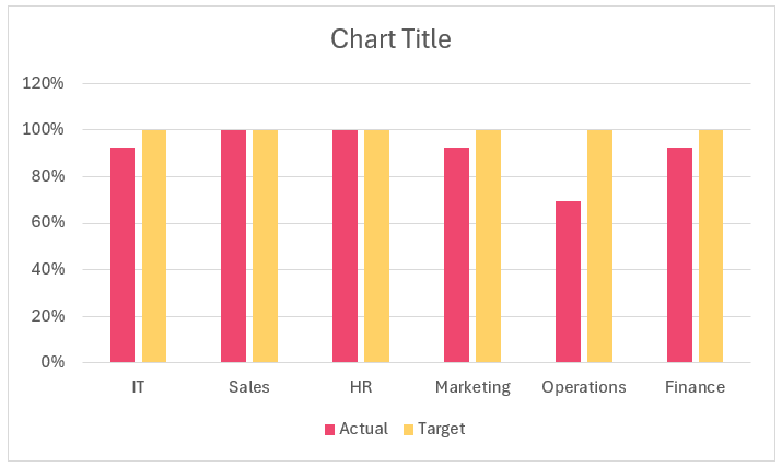
A sample progress chart in Excel is shown here:
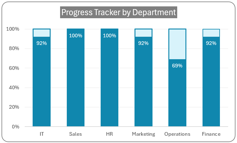 Progress Tracker Column Chart
Please note that these charts are created only when the maximum achievable goal is 100% — for example, on-time delivery rate (It can never be more than 100%).
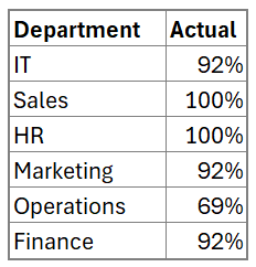
To build this chart, consider sample data of departments and their actual progress in percentages as shown:
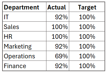
Since we know that the targets are 100% (as this chart can be built in only such scenarios), add another column of data representing the target values as shown:
With this data, let’s build our progress tracker in Excel!
Ready to save time on your next presentation? Explore our Data Visualization Toolkit featuring multiple pre-designed charts, ready to use in Excel. Buy now, create charts instantly, and save time! Click here to visit the product page.
Please check our dedicated YouTube video explaining how to create this Progress Tracker column chart here:
The following are the steps we’d follow in creating this chart:
- Insert a clustered column chart
- Adjust series overlap
- Format the series colors
- Format target borders & add labels
- Modify the axis bounds & units
- Apply standard chart formatting
Step 01: Insert a clustered column chart
Select all the data. (1) go to Insert ribbon and (2) Insert a 2D column chart.
This creates a column chart as shown below with two columns per department representing the actuals and the targets (the colors of the chart may vary based on the Theme of Excel on your machine).
Step 02: Adjust series overlap
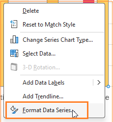
Choose any of the series, and right-click to format the series:
To make this a progress tracker, we need to overlap the two columns corresponding to the two series of data. To do this, adjust the Series Overlap to 100% as shown:
After this step, our chart looks like this:
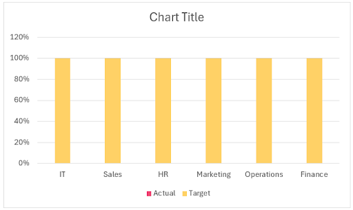
The problem here is because of the order of the series of data we have, firstly the actual and then the targets we can only see the target values of 100% in our charts.
This can be changed easily by changing the order in which the two series are added to this column chart. Right-click on the chart, and go to Select Data as shown:
This opens a dialog box where we can see the order of the series. The lower series is to one closer on screen, hence takes precedence. In our case, we need the actuals to be lower.
![]()
Once this change is done, the actuals come to the front as shown:
This opens the formatting pane, where modify the fill color to a lighter shade:
![]()
After this, click on the Actual series and change the color to a darker shade of blue.
![]()
With this, our chart is:
![]()
Step 04: Format target borders & add labels
To make this a progress chart, we’ll apply the same color used for the Actual, to be border color for the Target series and increase the border width considerably as shown here:
![]()
At this stage, this is our chart:
![]()
Our progress tracker is taking shape, let’s add labels to the Actual series by (1) right-clicking on the actual series and (2) adding data labels:
![]()
This, by default, adds the data labels to the top, modify this by clicking on the labels, and in the format pane choose Inside End:
Adjust the Font color and size to fit within the column and be seen clearly by editing them on the Home ribbon. With this, our chart looks like this:
![]()
Step 05: Modify the axis bounds & units
Let’s now modify the axis bounds for the vertical axis to a minimum of 0.0 and a maximum of 1.1. To do this, click on the axis, and in the format pane and edit the bounds:
![]()
Since, we are measuring progress in this chart, it is essential to start the lower bounds from 0. Moreover, as mentioned earlier, the maximum target value is 100%. Therefore, to provide the columns with additional space, we set the upper bound to 1.1.
Now, set the Major units to 0.2 as shown:
![]()
This value of 0.2 means that the vertical axis shows labels at every 20%, starting from 0%. The maximum bound of 1.1 (i.e. 110%) doesn’t show up because of this setting of 0.2.
Step 06: Apply standard chart formatting
Let us apply some standard formatting to make our progress tracker more visually appealing.
i. Remove the legend by clicking on them and clicking delete as they are of less value to this chart.
ii. Edit the gridlines by right-clicking on them and modifying the color to a lighter shade to make them less prominent.
![]()
![]()
iii. Modify the chart title and include a suitable one. This can be formatted to look more appealing. At this stage, our chart is:
![]()
Note: Since the title explains what the chart shows, we recommend avoiding the inclusion of axes titles in such cases.
iv. Adjust the chart border’s color and make it rounded. (You can modify all of these formats based on the need at hand)
That’s it! With six simple steps, our progress tracker column chart is ready!
Check our 1-page, downloadable illustrative guide explaining all the steps for a quick reference.
If you have any feedback or suggestions, please post them in the comments below.


