This post is all about creating a progress tracker that can show the actual values against multiple target bins – a visual that can help your audience visualize the progress made easily against the bins under which the target is split.
Check our previous post on creating a progress tracker against a maximum achievable goal of 100%.
Ready to save time on your next presentation? Explore our Data Visualization Toolkit featuring multiple pre-designed charts, ready to use in Excel. Buy now, create charts instantly, and save time! Click here to visit the product page.
We have a dedicated YouTube video explaining the steps involved in creating this chart, check it here:
This amazing visual can be created using Microsoft Excel in under a few minutes, let’s get started!
Step 01:
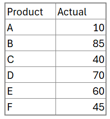
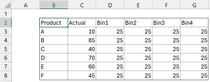
The sample data used in our example here is a list of products and their actual progress values, as shown below:
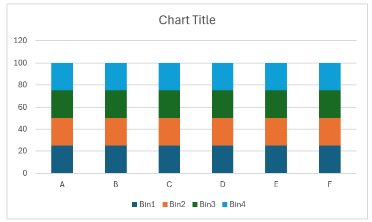
The first step here is to create the bins: we’ll create four bins of equal size of 25 each.
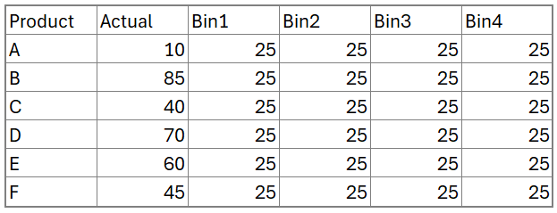
Note: Select all the cells you need to populate, enter 25 in the first cell, and press CTRL + ENTER. This populates all the necessary cells in a single keystroke.
Step 02:
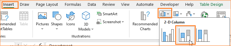
Now, select the Product series, all four bins, and insert a stacked column chart.
Excel creates a default stacked column chart by product as shown below:
Step 03:
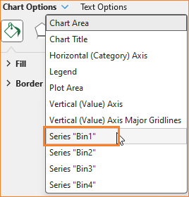
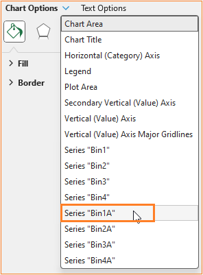
Click on the chart and press CTRL + 1 to open the format pane to the right where we’ll do some formatting of the bins.
From the chart options drop-down choose the first bin, Bin1.
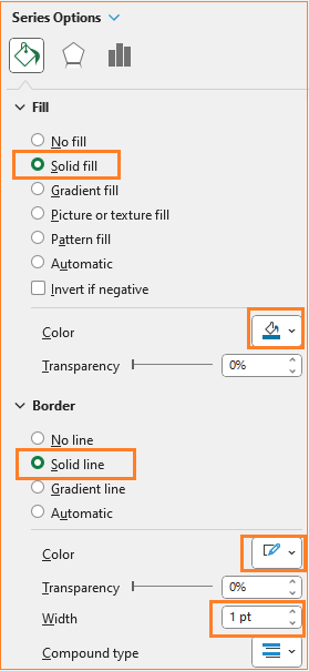
In the Fill & Line option, change the fill color to a lighter blue, and most importantly, choose a solid border color of white and increase the width to 1 pt.
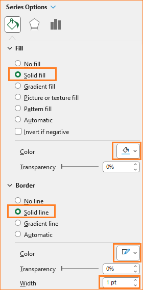
Here, the border color is white as the chart background is white, choose the same color as that of your chart background. This is to bring forth the bins effect we aim to create in this chart.
Similarly, choose the other three bins and apply the same formatting.
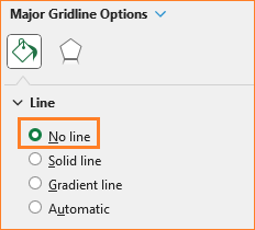
Click on the gridlines and in the format pane, choose No line option.
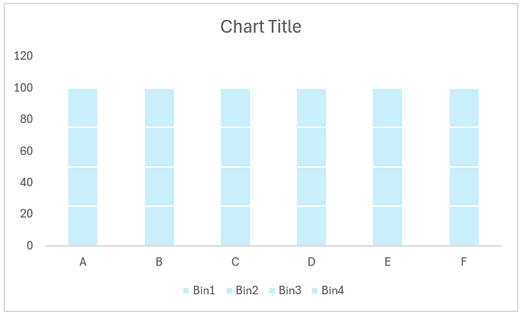
At the end of this step, the chart should look like this:
Step 04:
The bins are ready, time to add the actual series to make this a progress tracker chart. To do this, we’ll add four more series to the data:
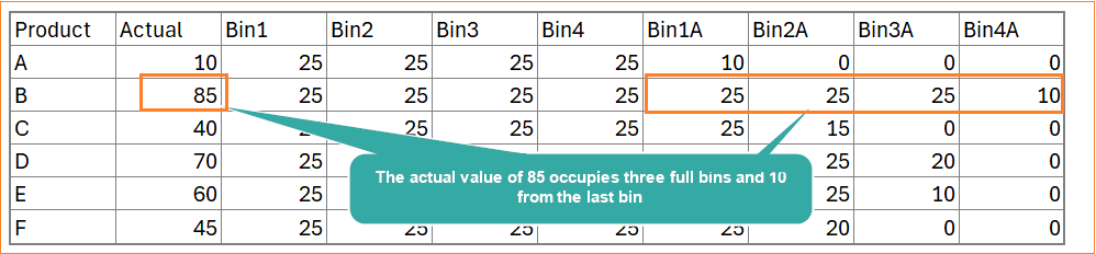
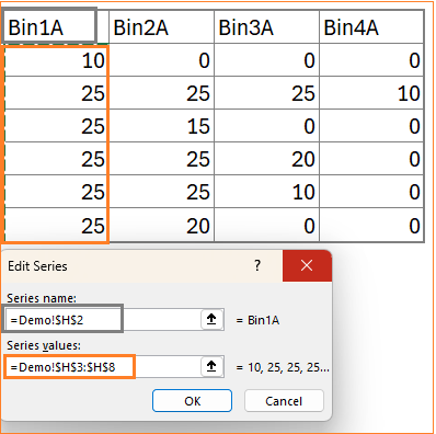
Before this, consider the sample data and their cell references here:
- Bin1A: This is the minimum of the actual and the size of the 1st bin. The formula in cell H3 will be:
=MIN(C3,D3)- Bin2A: This is the minimum of the actual minus the first bin that’s filled already (H3) and the size of the 1st bin. The formula in cell I3 will be:
=MIN(C3-H3,E3)- Bin3A: This will be the minimum of actual minus the first two bins that are allocated and the size of 3rd bin. The formula in cell J3 will be:
=MIN(C3-H3-I3,F3)- Bin4A: Similarly, this will be the minimum of actual minus the first three allocated and the size of the 4th bin. The formula in cell K3 will be:
=MIN(C3-H3-I3-J3,G3)Drag the formula to populate all the necessary cells. With this addition, the data will be:
Step 05:
It’s time to add these series to the chart. Right-click on the chart and go to Select Data.
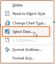
In the pop-up, choose Add:
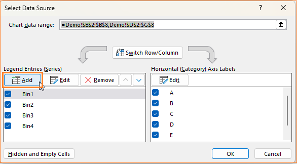
Add the Bin1A series, as shown:
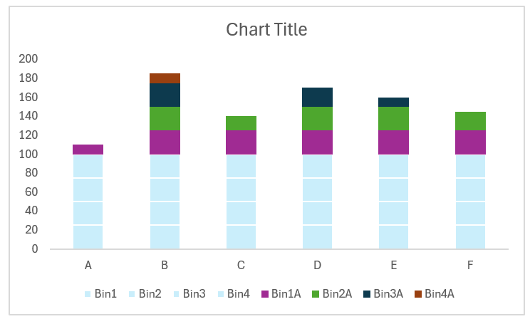
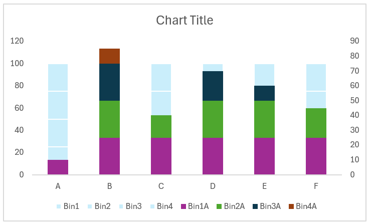
Similarly, add the other three series to the chart. At the end of this step, the chart looks as below:
Step 06:
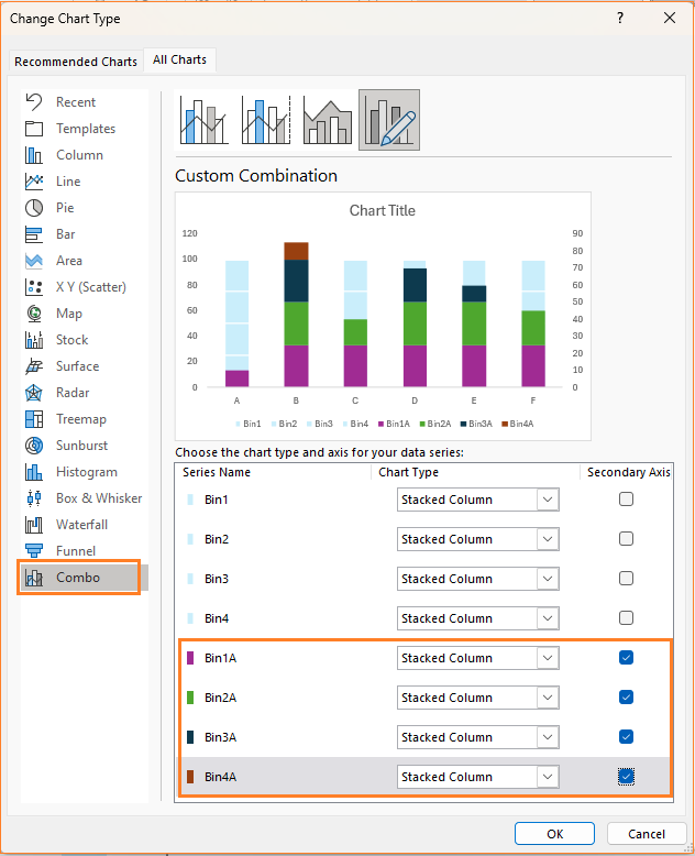
To modify this chart, right-click and go to Change chart type.
![]()
In the dialog box, go to combo and ensure the following: The bins, Bin1 to 4 are to be Stacked columns in the primary axis where whereas the bins 1A to 4A are to be Stacked columns in the secondary axis.
With this, the chart is modified and looks as sown below:
Step 07:
Time to format the chart to get the desired progress tracker.
i. Choose the Bin1A from the series options.
Modify the fill color to a darker blue, importantly, ensure the border is a solid line of white color and 1 pt width.
ii. Repeat the same steps for all the other three bins: Bin2A to 4A.
iii. Click on the legend and press the delete key, similarly delete the secondary axis as these do not contribute anything to the end chart.
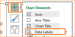
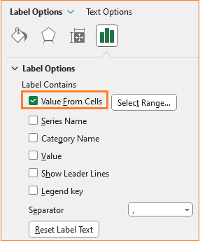
iv. To add data labels, choose the Bin1A and from the “+” icon on top of the chart, add data labels.
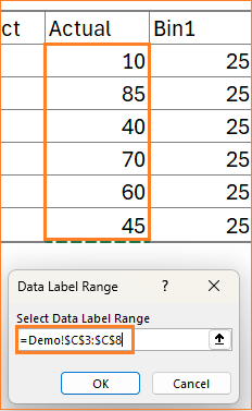
v. This adds the Bin1A values as the labels, whereas we want the actual values to be the labels. To get this, click on the labels and form the label options, uncheck all others and choose only “Value from cells” option.
This opens a pop-up from where you can choose the actual value range as labels.
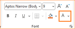
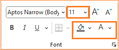
Modify the label color to white from the home ribbon.
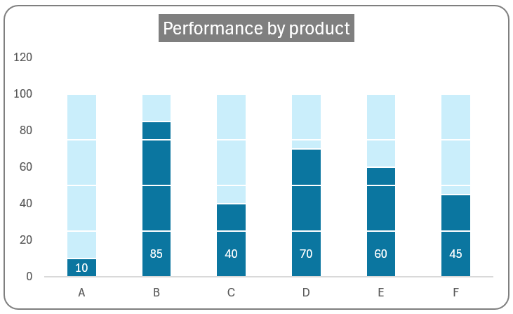
vi. Add a title that explains the crux of the chart, say “Performance by Product” and format the same using the Home ribbon.
Add axes titles, if necessary. Here the title is explanatory enough to understand what this chart is all about.
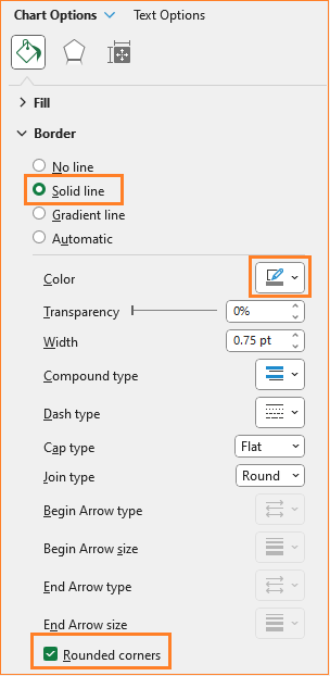
vii. Click on the chart, and format the border and its color as shown:
With just seven simple steps, the progress tracker chart is ready to be a part of your reports.
Check our 1-page, downloadable illustrative guide explaining all the steps for a quick reference.
To explore our fast-growing collection of free Excel tutorials covering a wide array of topics, please visit https://indzara.com/datatodecisions/
If you have any feedback or suggestions, please post them in the comments below.


