Let’s create a scatter plot of two series with the data (sourced online) as given below:
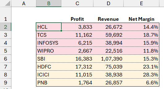
Please note that the Net Margin % is calculated here by dividing the profit by revenue. This sample data is taken from an online website.
What is a scatter plot?
A scatter plot allows us to visualize and understand the relationship between two numeric variables. In our case, we need to analyze the relationship between the revenue and net margin percentage of these tech and banking companies.
Step 01:
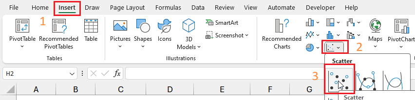
Click anywhere outside of the table and (1) go to Insert (2) Select the Scatter plot as shown here:
This will create a scatter plot that is empty as we haven’t connected any data yet.
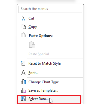
Step 02:
Now right-click anywhere inside the empty chart and Select Data:
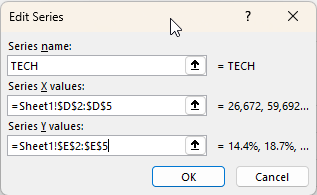
Now, we’ll start adding data (Legend Entries) to our chart by clicking on Add.
- Assign the name as “TECH” (assign a name that suits your needs).
- Series X values will be the revenue data of only the Tech companies
- The Y values will be our Net Margin %.
This selection will look something like this:
Click OK to close selection, this will generate a scatter plot for a single series of data:
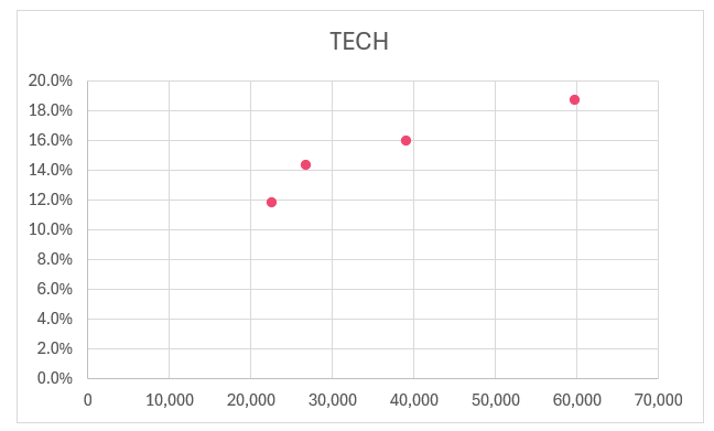
Similarly, bring in the BANK series data as well:
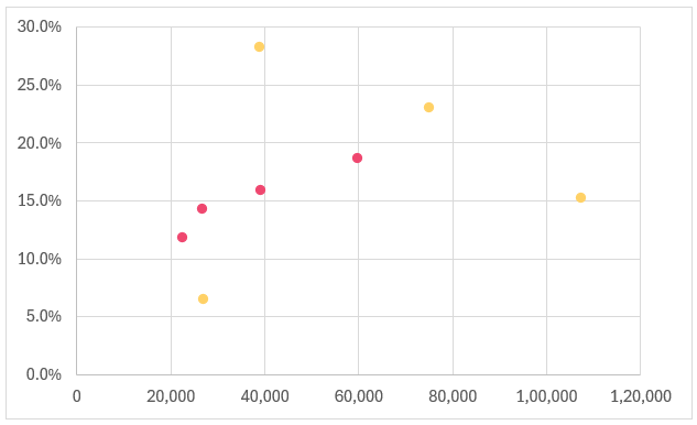
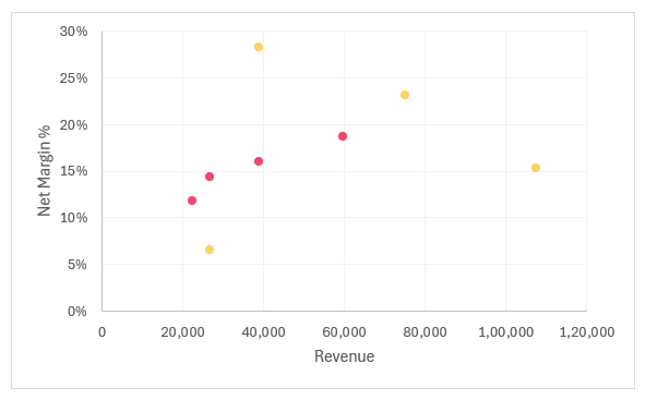
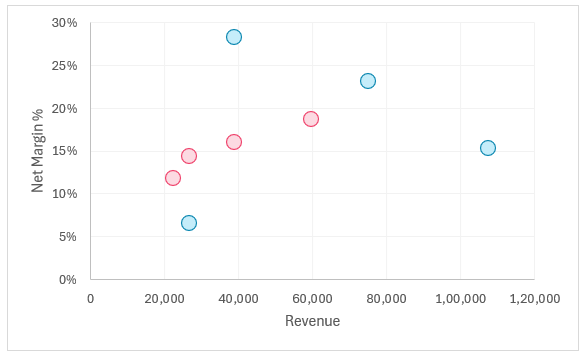
With this step, our scatter plot is ready for some formatting and analysis:
Step 03:
Let us format our scatter plot, firstly by including axis titles. This can be done in multiple ways one of which is:
Click on the chart and a + symbol will appear on the top right corner for formatting the chart elements.
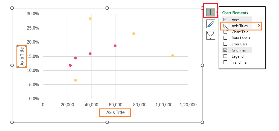
We’ll call the X-axis Revenue and Y-axis Net Margin %.
Step 04:
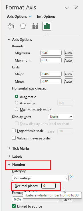
We’ll format the Y-axis by removing the decimal values. Right-click on the axis and go to “Format Axis”:
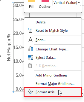
This opens a right-side pane where the chart elements can be formatted. We’ll go to the Number formatting and modify the Decimal places to be 0:
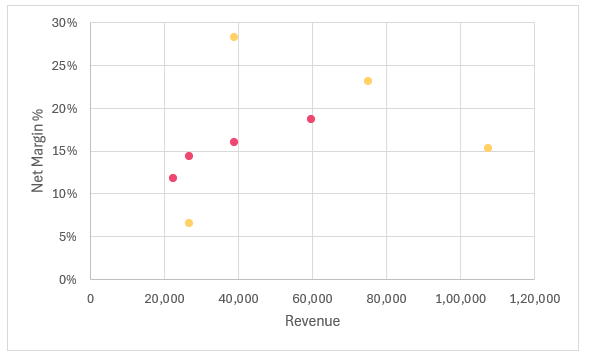
Our chart looks like this:
Step 05:
For formatting the grid lines, similar to step 03, click on the grid lines and then on the + from the top right:
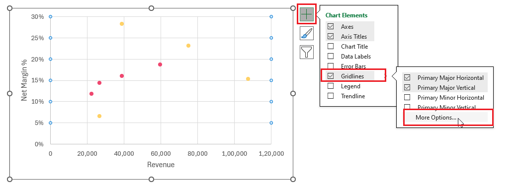
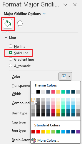
The aim here is to have the grid lines but for them to be barely visible for which we’ll modify the Fill & Line option as shown to choose a lighter color:
Similar to this, format the vertical axis grid lines as well. With these modifications, our chart is:
Step 06:
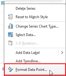
Let’s now format the data points. Select any data point, right-click, and go to the Format Data Series option:
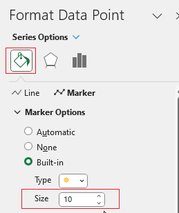
Go to Fill & Line and go to the “Marker” section to change the size of the marker.
Excel has multiple options to do this by choosing the size and/or the shape of the markers. We’ll increase the size to 10:
We’ll also adjust the fill color and border color:
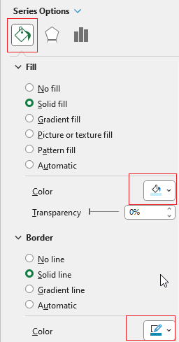
Please change/adjust these formatting options to suit your needs.
Similarly, we’ll change the marker settings for the other series as well. With these changes, our chart will be:
Step 07:
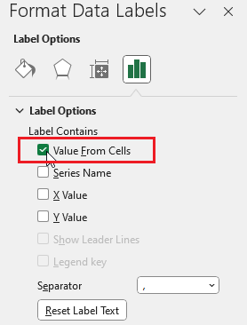
Let us now include data labels. click on the + and include Data Labels.
By default Excel includes labels:
We are interested in getting the company names here, click on the labels go to the side panel and (1) from Label Options (2) choose Value from Cells and uncheck the others
Choose the range of names these data points correspond to:
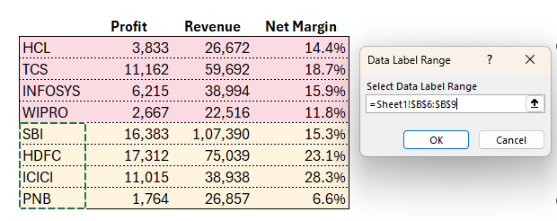
Repeat the same steps for the Tech series as well.
Step 08:
Let’s include a legend to understand the series easily when multiple series are present and also a chart title that will be appropriate. (similar to the previous steps, click on the chart and the + icon)
Once we position the legends and include the title our final scatter plot is ready for some cool interpretations!
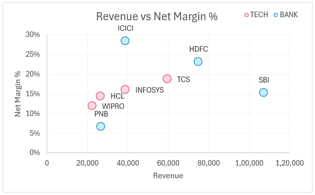
What does this scatter plot tell us about our data?
A scatter plot allows us to visualize and understand the relationship between two numeric variables.
From our scatter plot, when the revenue increases we need to understand how the net margin behaves. Does it increase or decrease?
In Excel, we can add a trend line by clicking on any data point. Let’s create one for the bank series:
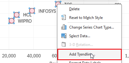
We’ll include one based on the linear regression model.
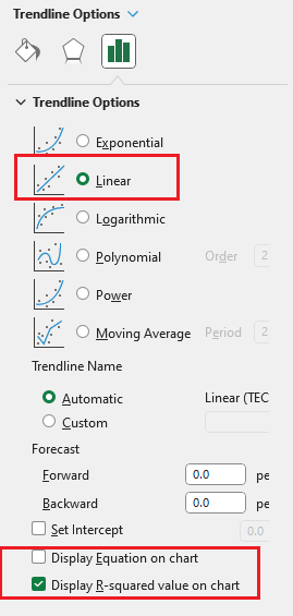
We’ll look at the R-squared value generated:
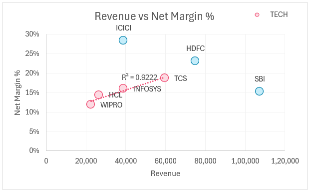
We can see that 92% of the relationship between these two variables is explained with a linear equation or model.
Similarly, we’ll get a R-squared value for the bank series as 0.0104
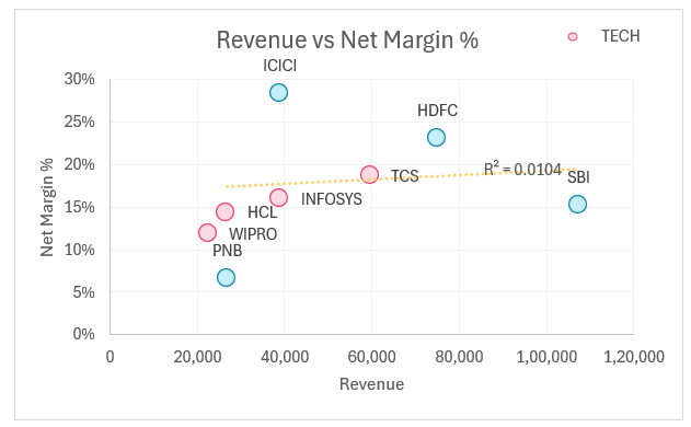
This tells us that by a linear model, we cannot explain the relationship between the two variables.
But in the Tech series, we can say that as revenue increases, the net margin % also increases.
What if we remove the PNB data point from the Bank series? This seems to look like an outlier to the series. Let’s check what happens when we exclude the PNB data point and then get a trendline.
To remove the data, edit the data series.
Our revised R squared is 0.9788
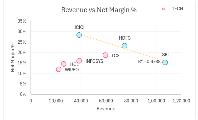
But the trendline is in the opposite direction meaning that as revenue increases, the net profit % is decreasing (an inverse relationship).
To summarize with a scatter plot we can easily analyze the following:
- Visualize a specific data point along two numeric variables
- Visualize the relationship between data points in a single series
- Visualize differences between multiple series
- Identify potential clusters in the data points
Ready to save time on your next presentation? Explore our Data Visualization Toolkit featuring multiple pre-designed charts, ready to use in Excel. Buy now, create charts instantly, and save time! Click here to visit the product page.


