Creating a line chart in Excel is a straightforward process that can transform your data into a visual representation of trends and patterns over time.
Whether you’re tracking sales figures, monitoring project progress, or analyzing performance data across periods, a line chart can make complex information more accessible and easier to understand.
In this guide, we’ll walk you through the steps to create a simple line chart in Excel, and also some common formatting elements that can make your visual, truly stand out.
Ready to save time on your next presentation? Explore our Data Visualization Toolkit featuring multiple pre-designed charts, ready to use in Excel. Buy now, create charts instantly, and save time! Click here to visit the product page.
Step 01: Create the line chart
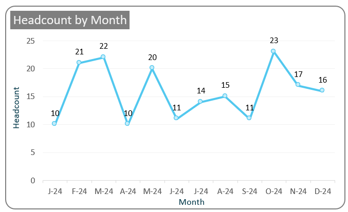
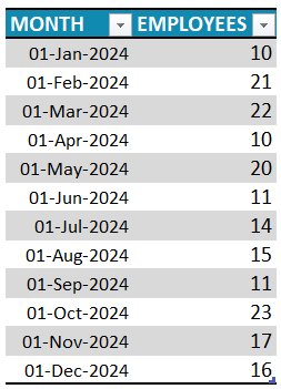
For this exercise, let us take sample data of employee count captured across months for a year.
Select all data and from the Insert tab, insert a line with markers chart.
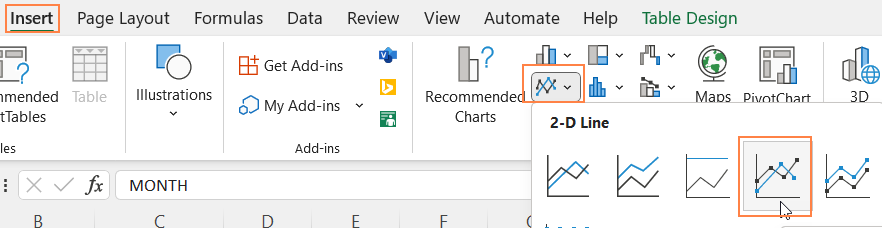
This inserts a line chart based on our data.
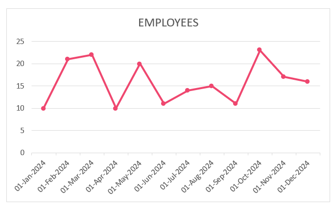
Please note that the colors may vary based on the theme of your Excel workbook.
Step 02: Format the X-axis
To make a chart stand out, it is key to format it and make it more easily readable to the end audience. With Excel, this is all the more easy with several formatting choices available!
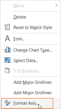
Firstly, let us format the horizontal axis.
i. Right-click on the X-axis and go to Format Axis
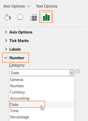
ii. This opens the format pane to the right. From under the Axis Options, go to Number and choose “Date” as the category.
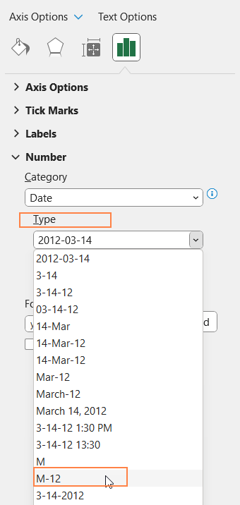
iii. Now, to make the X-axis less crowded, we need to make the axis values shorter and at the same time, quickly understandable.
For this, under the Number Type, choose a suitable option, as shown:
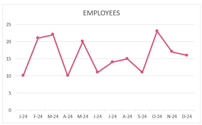
With this, our chart with the modified horizontal axis looks like this:
Step 03: Format the chart
Now, we’ll shift focus to formatting the chart.
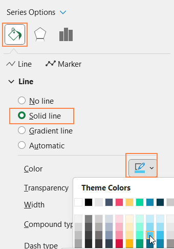
i. Click on the line, press CTRL+1 to open format pane.
ii. Under the fill & line, modify the line color as needed.
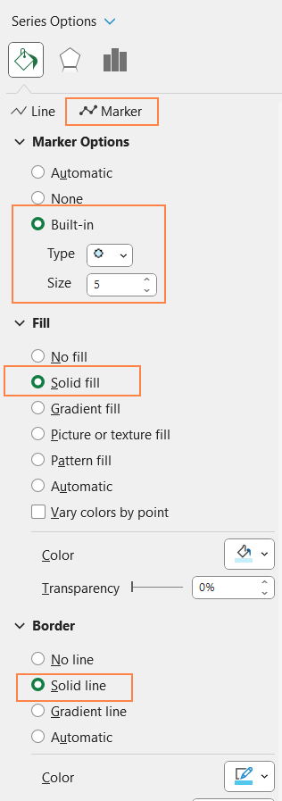
iii. Go to Marker options, and modify the marker color as needed.
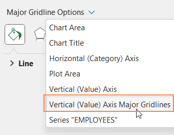
iv. From the drop-down, choose the “Vertical (Value) axis Major Gridlines”
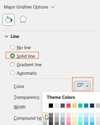
and make the gridlines less apparent
v. Add a suitable chart title, use the Home Ribbon to format it
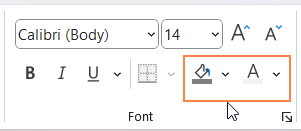
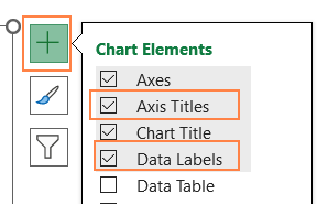
vi. Click on the chart and use the “+” that appears on top of the chart to add Axis Titles. Format it if needed using the home ribbon. Similarly, add data labels too.
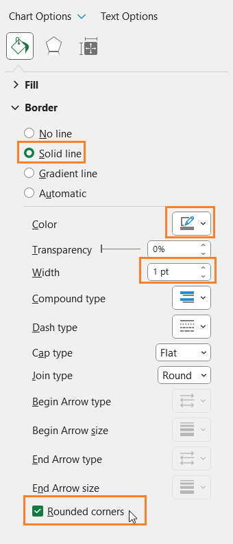
vii. Click on the chart, and modify the chart border as shown:
With this our simple line chart is created – all that’s needed is just a few minutes.


