Elevate your data presentation with dynamic visuals that turn simple data into compelling visuals that quickly grab the attention of your audience. In this post from the Data to Decisions series, we’ll break down the steps to create an engaging Slider Chart in Excel. This chart is effective when you have actual values against a set target or a benchmark, where the target value is the same across your categories.
We’ll also look at creating the different flavors of this chart by making slight modifications.

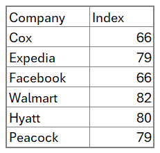
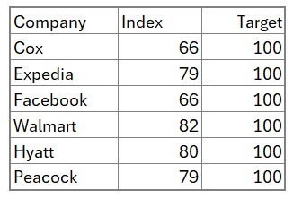
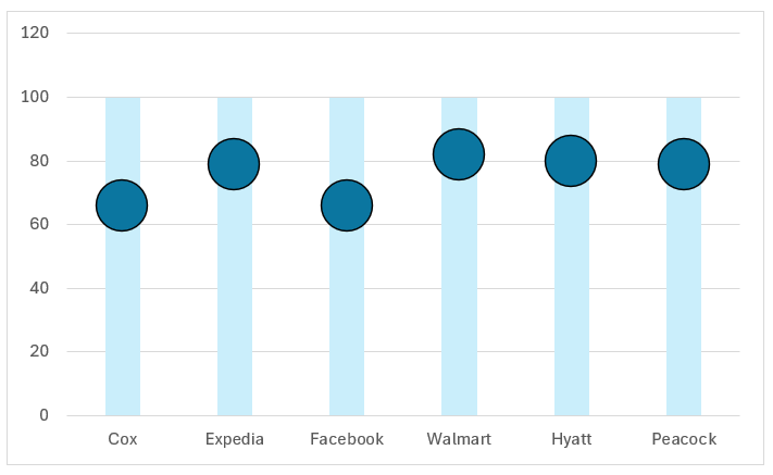
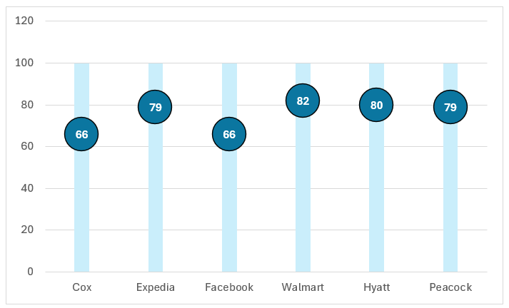
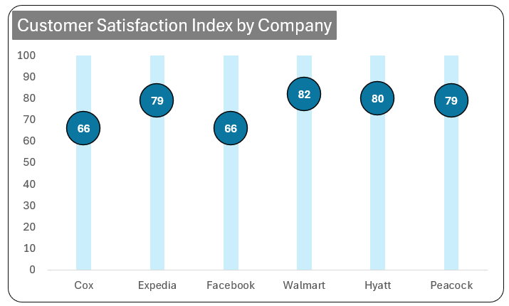
The sample data used for this chart is the American Customer Satisfaction Index scores for companies, as shown below (source: https://theacsi.org/the-acsi-difference/top-10-acsi-companies/)

With this data, let’s get right in and create the Slider chart!
Ready to save time on your next presentation? Explore our Data Visualization Toolkit featuring multiple pre-designed charts, ready to use in Excel. Buy now, create charts instantly, and save time! Click here to visit the product page.
Note: In our data, the benchmark (or the Target) is 100 for the satisfaction scores.
In case, you have multiple target values, then to use this technique to create a slider chart, first convert your data into a percentage of the target. This way the target value is all converted to 100%, an example where such scenarios can occur would be with sales data by different regions.
Check the detailed explanation to create this chart in our YouTube video:
Chart Style – I
Step 01:
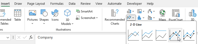
Select all the data, and insert a Line chart with markers.
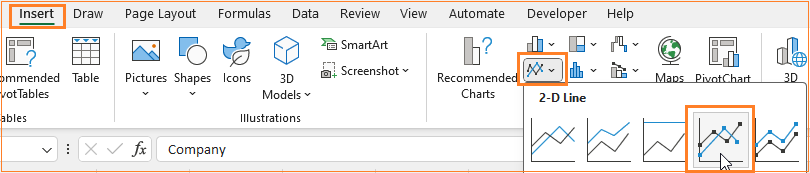
With this, Excel inserts a default line chart with the given data.

Step 02:
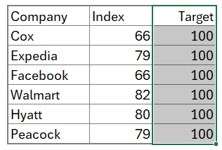
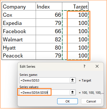
To create the slider, add a column called “Target”, which in our case has 100 as the value (the value is the target value in your dataset)
Step 03:
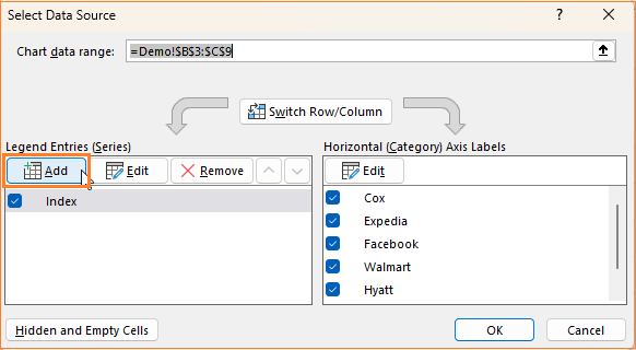
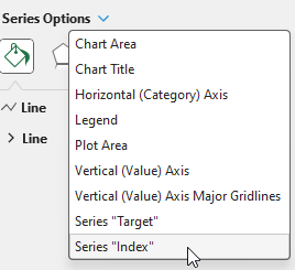
To add this new series to your data, right-click inside the chart and click on Select Data.

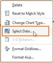
With this, a pop-up window will appear from where we’ll add the new Target series.

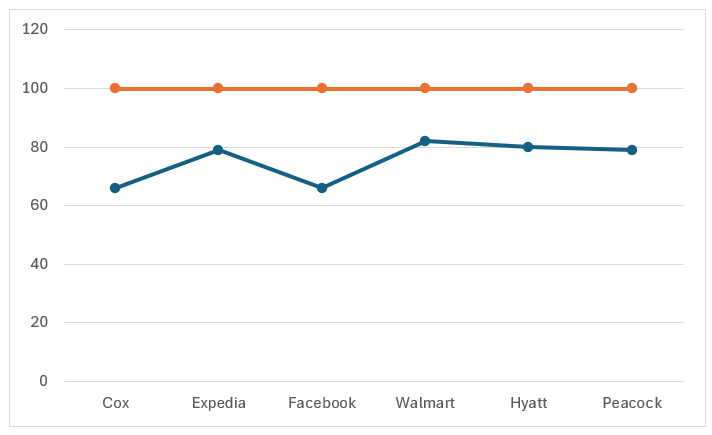
With this addition, Excel adds this new series as a line within our existing chart.

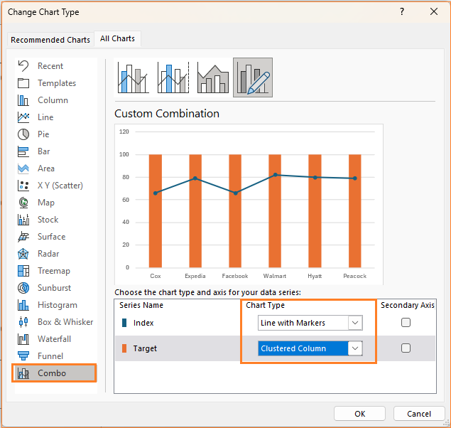
Step 04:
For the slider effect, right-click inside the chart and click on Change chart type.

In the dialog box that appears, in the Combo option, ensure that the Index (that is, Actual) series is a Line with Markers but the Target series is a Clustered column chart type as shown below:
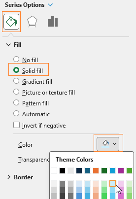
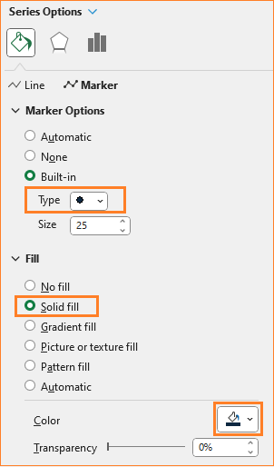
Step 05:
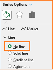
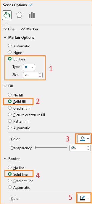
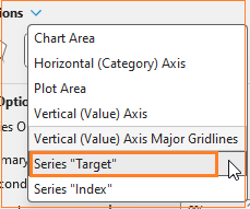
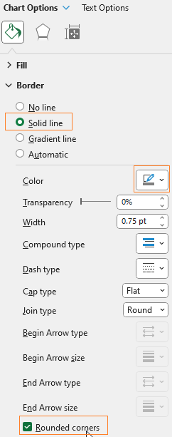
Let us format the target series, to open the formatting pane, click anywhere on the chart and press CRTL + 1.
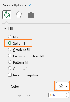
i. From the resulting chart, click on the target columns, and in the Fill & Line option, change the fill color to a lighter shade of blue (choose color according to your preference).

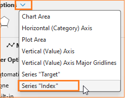
ii. Now, from the drop-down in the format pane, choose the Index series to format.
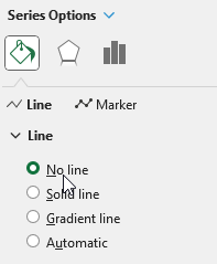
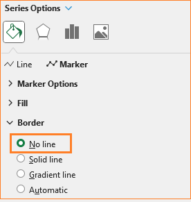
iii. Here, for the slider, we do not need the line, hence make the line a no fill
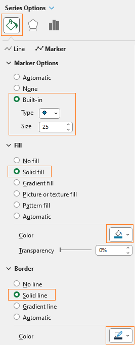
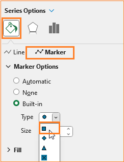
iv. Now,open the Marker, and here, adjust the marker options, the fill and border color as shown:
With this, our chart looks like this:

Step 06:
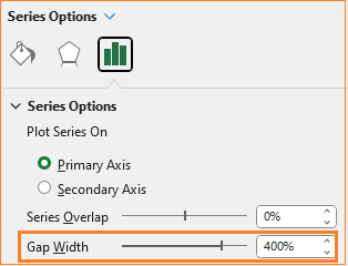
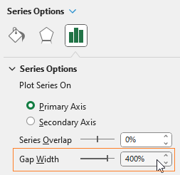
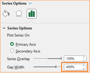
In the chart from the previous step, we need to narrow the column width to bring the slider-like effect. To do this, from the format pane, select the Target series.

Adjust the gap width to 400%, as shown below.
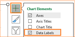
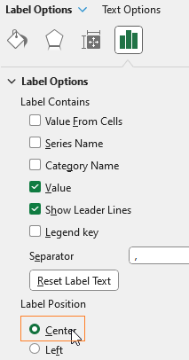
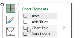
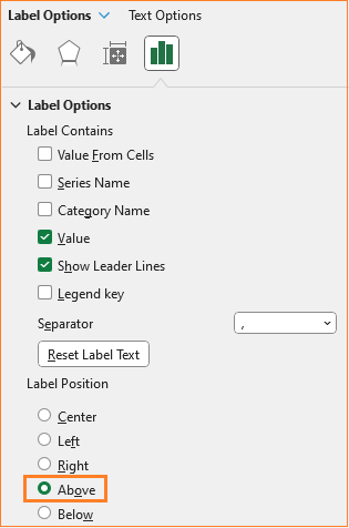
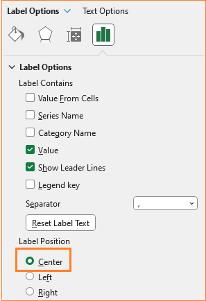
Now, click on the Index series, and from the “+” icon that appears on the top-right corner of the chart, add data labels.
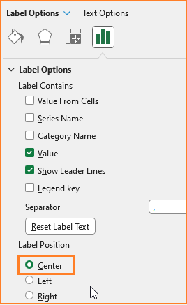
Format the position of the label to be at the centre of the marker as shown:
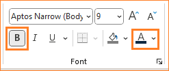
Since the marker is filled with a darker color, adjust the label to have a lighter color from the Home ribbon. (Please note that these formatting changes are done to ensure that the labels are clearly visible to the viewer, if you have a lighter color marker fill, you can skip this).
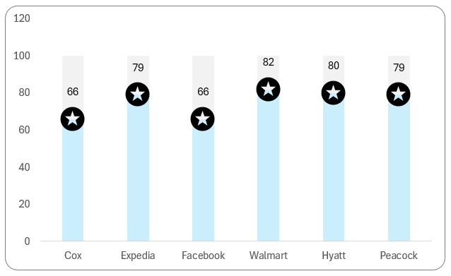
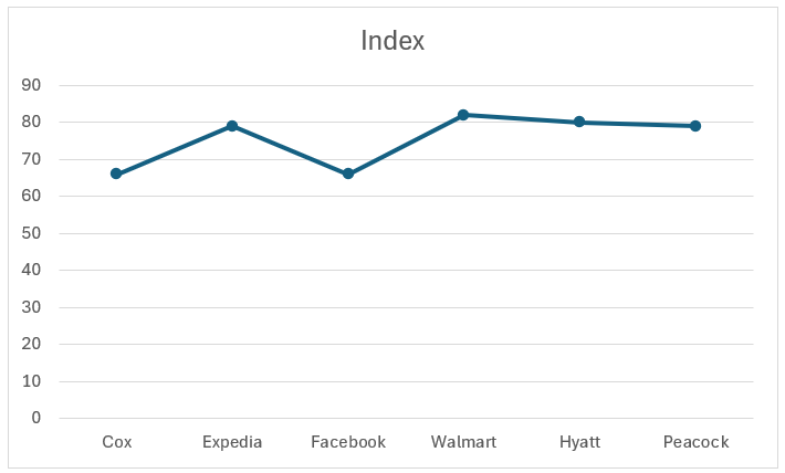
At the end of this stage, our slider chart looks something like this:

Step 07:
Our chart is definitely taking shape now! If you’ve been following our blogs, it’s time to do the standard formatting to make the final chart visually pleasing.
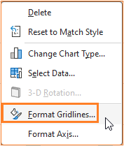
i. Since this is a slider chart, gridlines are not necessary here. To remove them, right-click on the lines, go to the Format gridlines option, and remove the line.

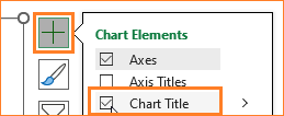

ii. Similarly, add a suitable chart title, one that clearly explains what your visual is all about.
Here, we’ll add the title as “Customer Satisfaction Index by Company”, format, and position the same as needed.

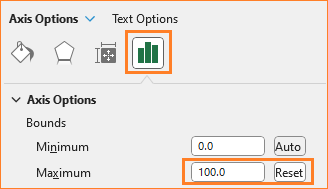
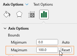
iii. Click and modify the Y-axis bonus to a maximum of 100 as shown:
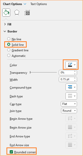
iv. Finally, add a border to the chart by clicking on the chart and formatting the same in the format pane.
That’s it! With just 7 simple steps our Slider chart is ready to be a part of your presentations or reports!
Check our 1-page, downloadable illustrative guide explaining all the steps for a quick reference.
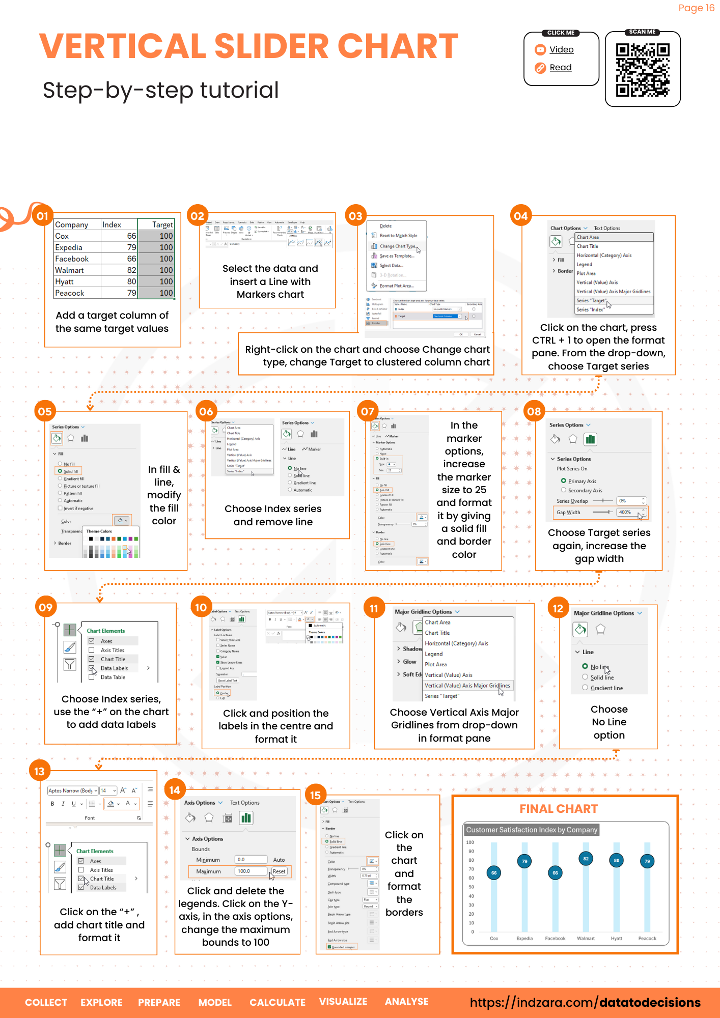
Chart Style – II
Just by modifying the marker options, we can get a different slider chart.
To get this, from the format pane, select the Index series.


In the marker option, change the type to a square.

That’s it! A different slider chart is ready!


Chart Style – III
i. Another variation is where you can choose a picture as your marker.
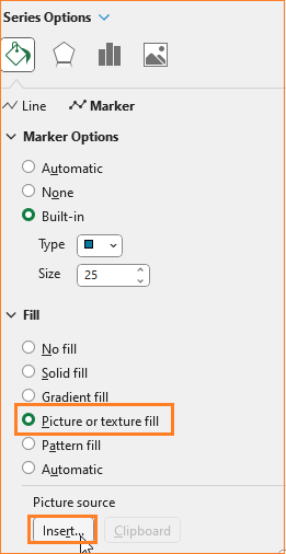
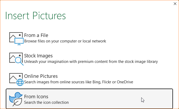
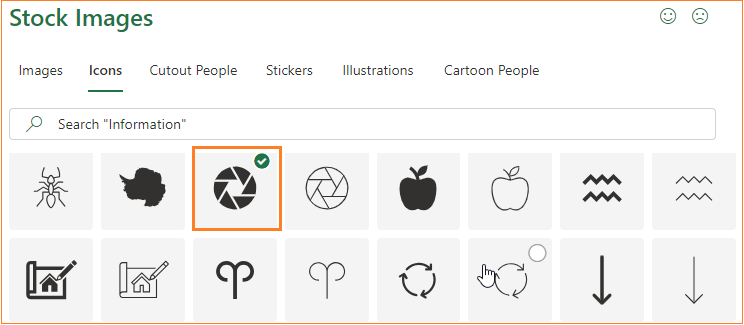
ii. This opens a pop-up, from where you can choose a picture. We’ll choose one from the icons.

iii. Choose any icon (or image) that suits the narrative you want to build with this slider chart.
iv. Once an image is inserted, remove the marker borders.

v. Click on the data labels, that are currently inside the image and move them to the top from the format pane as shown:

Format the color of the label to make it clearly visible in the slicer.
A third variation of the slider chart is ready!


Chart Style – IV
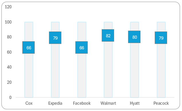
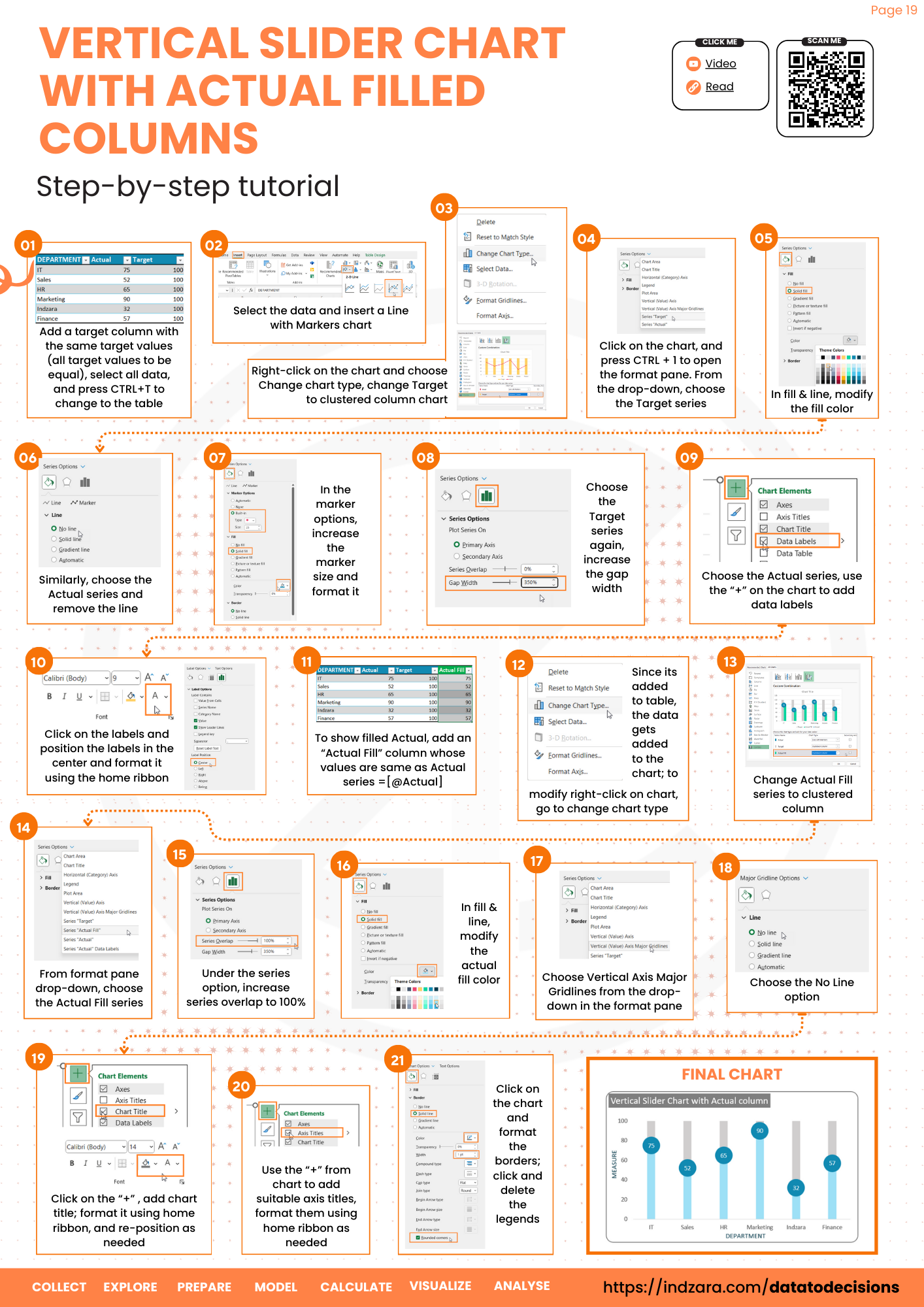
Let’s now create a variation of the slider chart where the fill is visible with a different color.
To create this, make a copy of the previous style (CTRL + C) and paste it (CTRL + V) within the same sheet.
i. Choose the Target series from the format pane and change the fill color to a lighter shade of grey.
ii. Now choose the Index series, and change the marker style to that of a circle (as in style I).

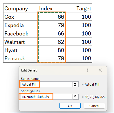
iii. Add a new series to the chart, right-click on the chart, go to Select Data which opens a pop-up, and select Add as shown here:

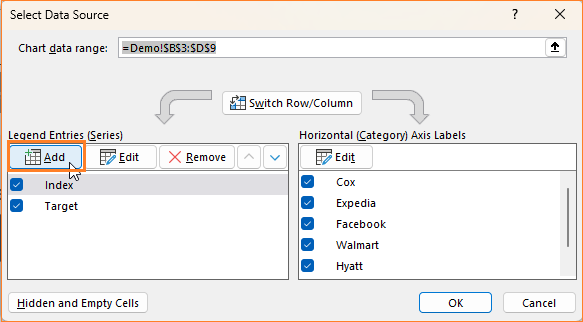


iv. The new series (call it Actual Fill) is our actual values, we’ll add this to bring the fill color to the slider.
With this addition, the chart gets modified slightly:


v. To get the desired result, right-click on the chart and go to Change chart type.

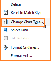
Here, modify the Actual Fill series to a clustered column chart type.
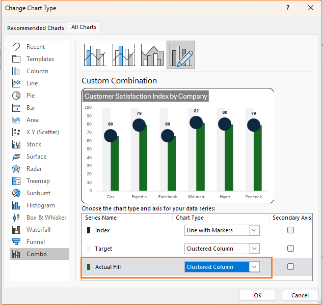

Ensure that the Index series remains a Line with Marker type and the Target remains a Clustered Column.
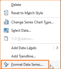
vi. Right-click on the Actual Fill series and format data series.

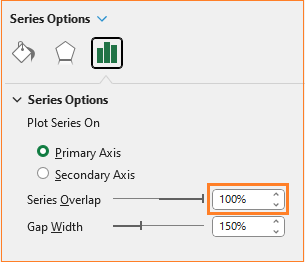
vii. Adjust the series overlap to 100%
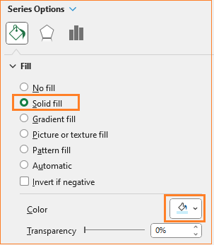
viii. In the Fill & Line, modify the fill color to blue (or any color based on the theme of your report/dashboard).
ix. Click on the labels and move them to the centre as shown:

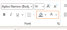
Modify the label color from the home ribbon to ensure this is visible on a darker slider.
x. The last step here, is to adjust the width of the columns to get the slider effect. To achieve this click on the Actual fill series (the blue columns) and increase the gap width to 400%

With this, our fourth variation of the slider chart is ready to be included in your reports!

Check our 1-page, downloadable illustrative guide explaining all the steps for a quick reference.
For a quick tutorial on the steps to follow for this chart, check our 1-minute video:
To explore our fast-growing collection of free Excel tutorials covering a wide array of topics, please visit https://indzara.com/datatodecisions/
If you have any feedback or suggestions, please post them in the comments below


