This post teaches you the simplest method to create a small multiple-column chart, also known as a trellis chart or panel chart, which allows you to compare multiple categories of data side-by-side using similar scales and axes. They are handy for showing variations across different subgroups within your data.
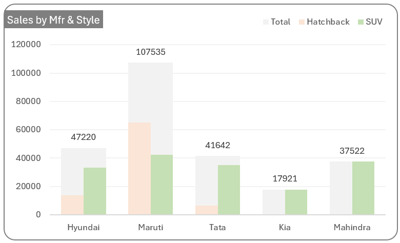
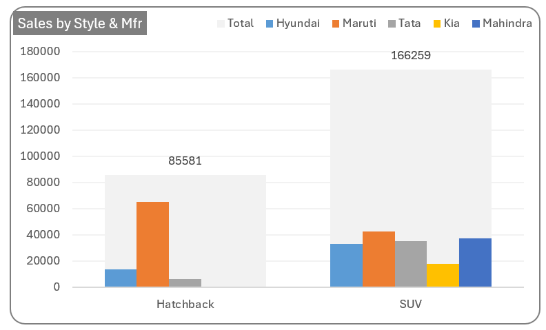
To understand this better, let’s look at the following small multiple chart which gives sales figures based on style and manufacturer:
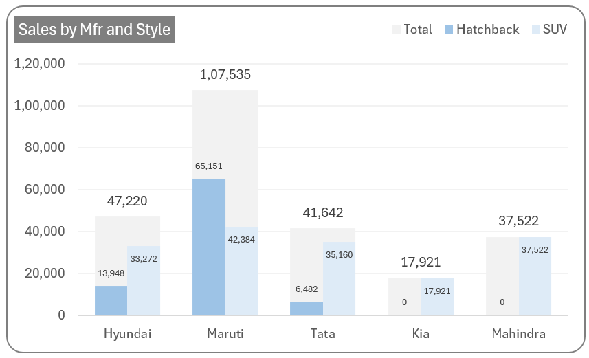
The key here is that the figures per manufacturer are shown against each style as a small multiple to the total sales.
While the same can be viewed using a stacked column chart, processing and analyzing the differences when data is stacked upon the other is difficult. Whereas, columns beginning with the same baseline make it easy for human brains to compare and analyze the differences.
Ready to save time on your next presentation? Explore our Data Visualization Toolkit featuring multiple pre-designed charts, ready to use in Excel. Buy now, create charts instantly, and save time! Click here to visit the product page.
This article helps you build this great visual in no time, from scratch. Let’s get to the steps involved.
We have a dedicated video on our YouTube channel explaining these steps in details:
The following are the steps we’d follow in creating this chart:
- Understand the data
- Insert a clustered column chart
- Modify the series chart type
- Re-arrange total series
- Modify gap width of series to get the trellis shape
- Format the series colors
- Format the chart
Style I
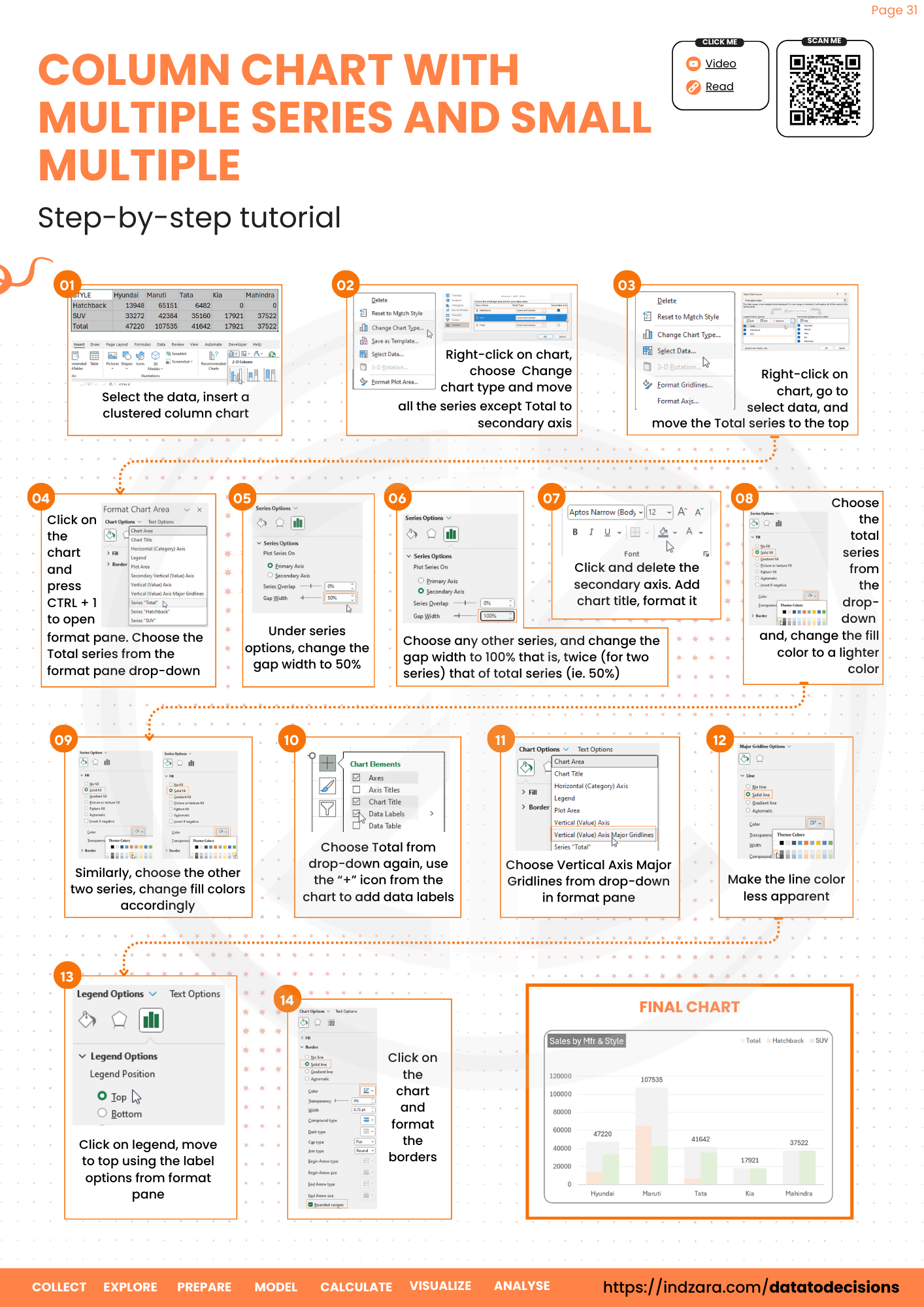
Step 01: Understand the data
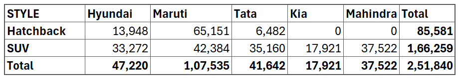
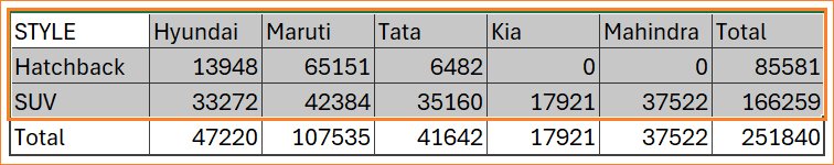
The sample data set of sales figures used here consists of the style and manufacturer details along with the totals as shown here:
Two types of trellis charts can be built using this data, one based on totals by manufacturer and totals by the style of the vehicle.
First, let us build a small multiple-column chart based on the manufacturer.
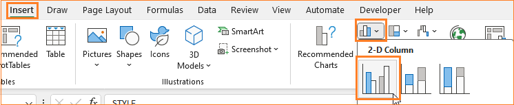
Step 02: Insert a clustered column chart
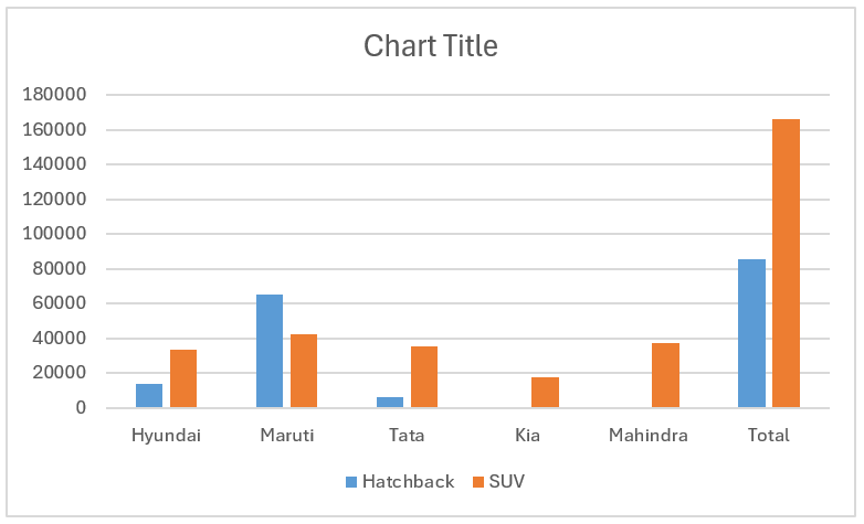
For this, select the data only with the totals by the manufacturer as shown below, and insert a clustered column chart.
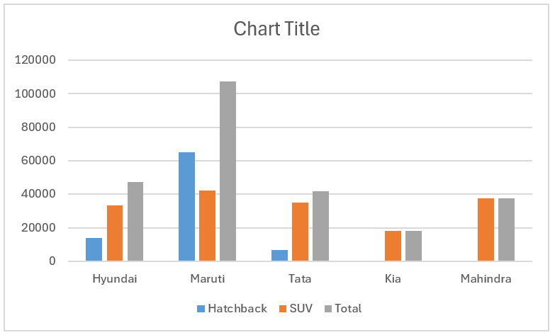
With this, Excel inserts a clustered column chart based on the data that is, each row is created as a cluster here.
Step 03: Modify the series chart type
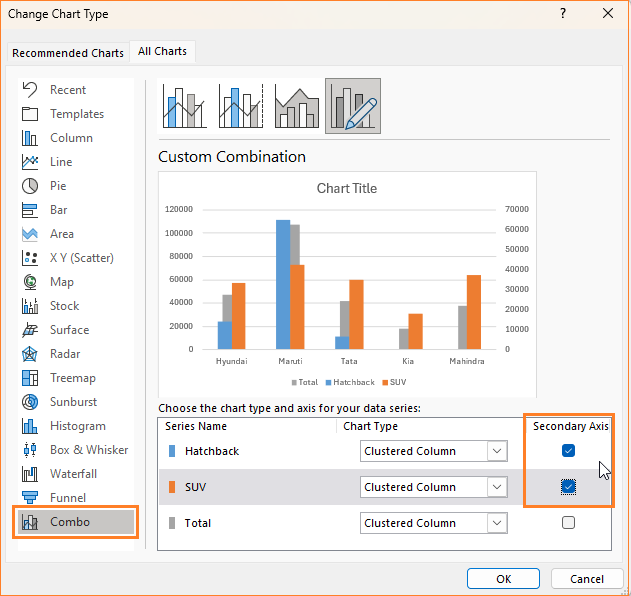
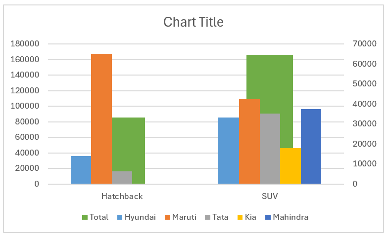
To get the small multiple chart, we’ll work on the chart from the previous step. Firstly, keep only the Total series in the primary axis by moving the other two to the secondary axis.
Note: In case, you have more than two series, move all the series except the total to the secondary axis.
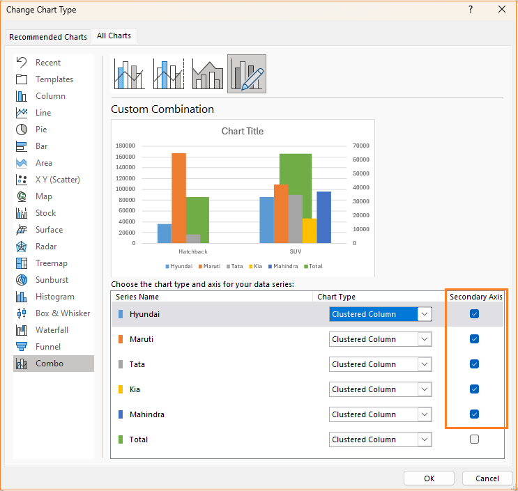
To do this, right-click on the chart and select “Change chart type”.
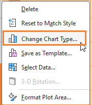
This opens up a dialog box, go to Combo, and shift the series to the secondary axis while ensuring that the chart type stays as a clustered column for all series.
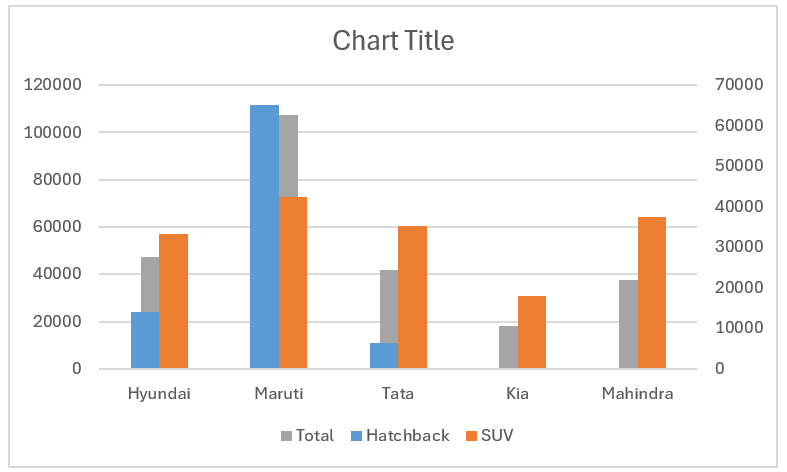
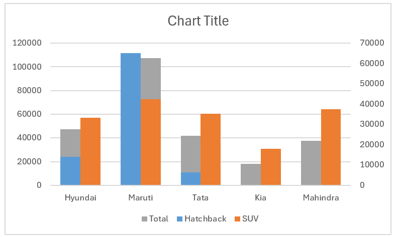
With this change, our chart is as shown below.
Step 04: Re-arrange total series
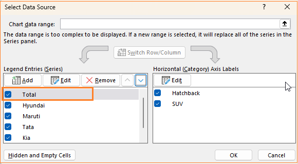
To get a trellis chart, we’ll move the total series behind the other series. To do this, go to Select Data and ensure that the total series is at the top.
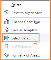
Excel considers the series that is at the top to be at the background of a chart.
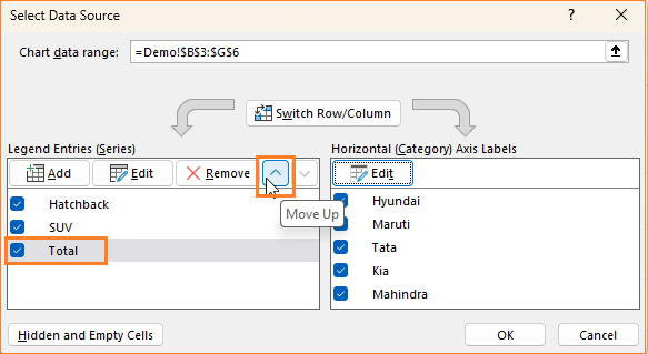
Like the below image, ensure total series stays on top.
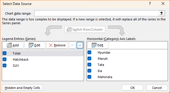
Once this is done, there will not be much change to the chart.
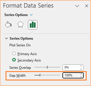
Step 05: Modify the gap width of series to get the trellis shape
This is the key step to build the small multiple chart. We’ll break this step further for easier understanding.
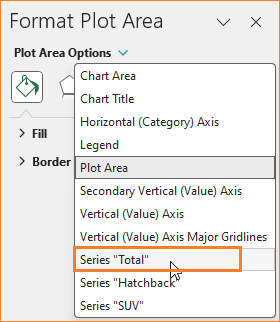
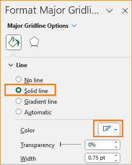
i. Open the format pane, to do this, click anywhere on the chart and press CTRL + 1. This opens the format pane to the right of the Excel spreadsheet.
ii. Choose the total series from the pane.
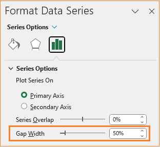
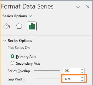
iii. Adjust the gap width to 50%
iv. Now choose any of the other series, in our case, either Hatchback or SUV (as you did in step ii)
v. Here adjust the gap width to 100%
Note:
Why 100%?
To ensure that the total series is behind exactly the TWO series of data we have, we’ll use TWO times the gap width of the total series (i.e. 50%).
The number of series you have, multiply the same with the gap width of the total series (i.e. if there are three styles of vehicle, the gap width for each series will be three times 50%)
After this step, our chart looks something like this:
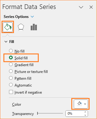
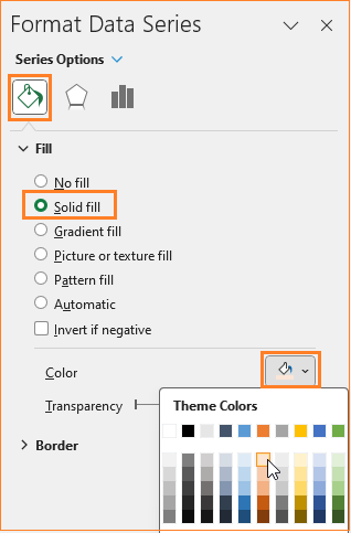
Step 06: Format the series colors
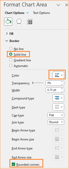
Delete the secondary axis by clicking on it and pressing the delete key. After this, let’s apply some formatting to get a visually appealing chart.
i. Click on the total series and in the format pane, apply a lighter color:
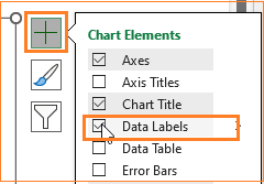
After this, click on the “+” sign on the chart and include the data labels as well.
ii. Similarly, choose the Hatchback series and apply a suitable color.
iii. Repeat the same step for the SUV series as well and apply a different color.
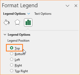
Step 07: Format the chart
Let us continue with the formatting of our chart:
i. Click on the legend, move it to the top from the format pane, and adjust the position:
ii. Add a suitable title, say “Sales by Mfg & Style” and format the same as well.
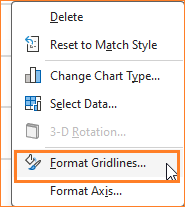
iii. Now the gridlines, ensure to have them but not so evidently overpowering chart by modifying the line color.
iv. As a final step of formatting, change the chart border by clicking on the chart and modifying the following in the format pane:
It is recommended not to add the data labels for all the series unless it is necessary as it would clutter the chart.
With this step, our final small multiple column chart is ready!
Check our 1-page, downloadable illustrative guide explaining all the steps for a quick reference.
Style II
Let us now build another flavor of this chart, by the style of the car. The steps are similar except for one key change, which will be discussed in the steps below.
1. Select the data including the totals by style as shown:
Similar to the previous chart creation, include a clustered column chart.
This inserts a column chart based on the data.
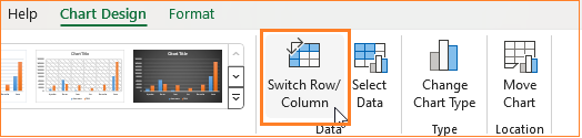
2. We can see that similar to the previous chart, this also has the manufacturers in the X-axis. This can be changed just one click: select the chart and in the Chart Design pane, click on “Switch Row/Column”.
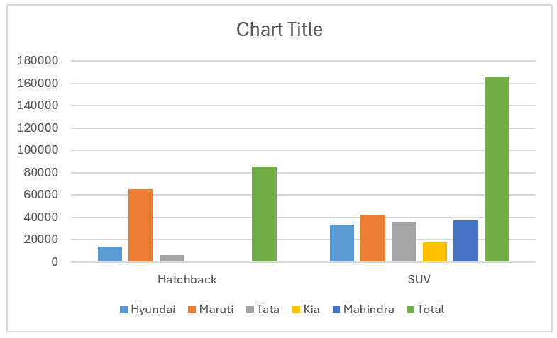
Our modified chart now has the styles in the horizontal axis.
3. Move all the series except the total to the secondary axis.
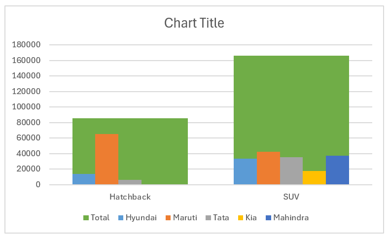
The chart after this step is:
4. Make sure that the total series is in the background.
5. To make this a trellis or panel chart, we need to adjust the gap width. Here, if the total series has a gap width of say 40%, each of the other series should have a gap width of FIVE times of 40% i.e. 200%.
The total series gap width will be:
The other series gap width will be:
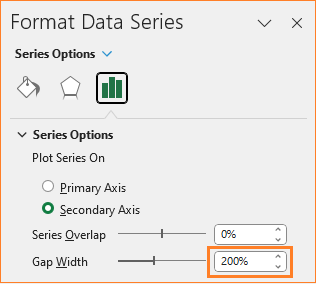
Once this is done, delete the secondary axis.
At this stage, the chart is:
6. Now, similar to the previous chart creation steps, format the colors of the series and the chart. Add a suitable title and position the legends as needed.
The final chart is:
If you have any feedback or suggestions, please post them in the comments below.


