A stacked bar chart is a valuable visualization tool used to display and compare the parts of a whole across different categories. Each bar represents a total value, divided into segments that show sub-category data. This makes it useful for comparing overall totals of different categories and understanding how individual sub-categories contribute to the whole.
For instance, in sales data, a stacked bar chart can illustrate total sales per quarter with segments for each product line, providing a clear view of how each product contributes to the overall sales.
Stacked bar charts also aid in proportional and distribution analysis, trend analysis, and comparison across categories. They help visualize how different sub-categories proportionally contribute to the total, revealing patterns.
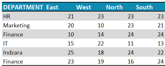
Let’s look at the steps required to create a simple stacked bar chart in Excel. Consider a sample data as shown:
Ready to save time on your next presentation? Explore our Data Visualization Toolkit featuring multiple pre-designed charts, ready to use in Excel. Buy now, create charts instantly, and save time! Click here to visit the product page.
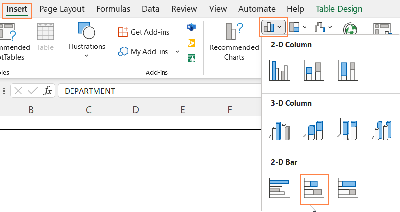
Step 01:
Select all data and insert a stacked bar chart.
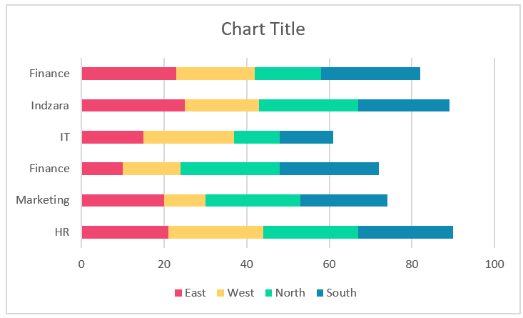
This creates a stacked bar chart as shown:
Step 02:
It’s now time to format this chart to make it visually appealing. We do this by using the various formatting options available in Excel.
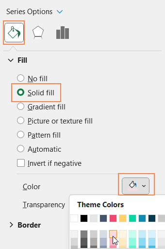
i. Click on the chart, and press CTRL+1 to open the format pane.
ii. From the drop-down, choose one of the series and format the fill color as shown.
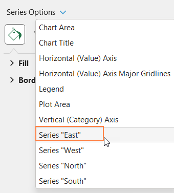
Repeat the same steps for all series (as need be)
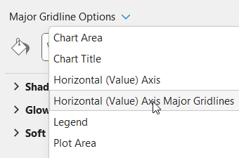
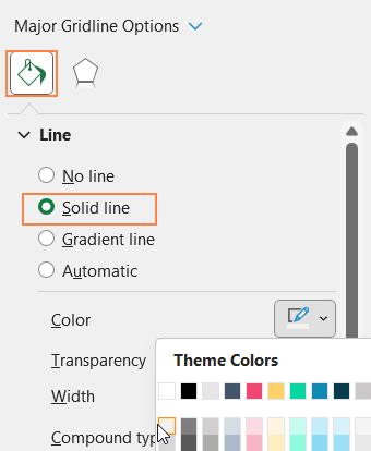
iii. From the drop-down, choose the “Horizontal (Value) Axis Major Gridlines” and format it to make this less apparent.
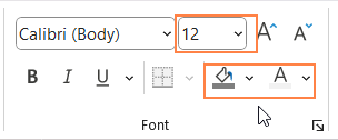
iv. Now, add a suitable chart title and format it with options available in the Home Ribbon.
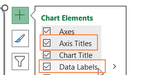
v. Click on the chart and use the “+” icon to add data labels, format the labels if needed
vi, Similarly, add the axis titles too.
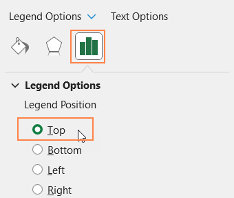
vii. Click on the legend, use the format pane legend options to reposition them to top.
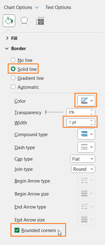
viii. Click on the chart, go to Chart Area from the format pane, and format the chart border as shown.
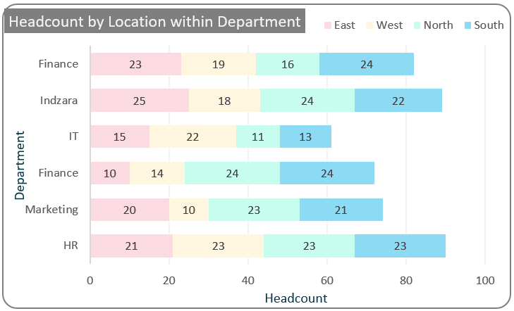
With this, the simple stacked bar chart looks something like this: