Unlock the power of interactive data visualization in our Data to Decisions series with this post on creating a Stacked Column Chart with a Slider in Excel.
This easy-to-follow blog will guide you through the steps required to create this chart where the actuals of a metric can be compared against targets that are represented as a range of values.
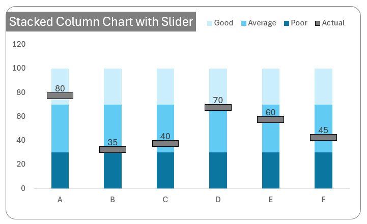
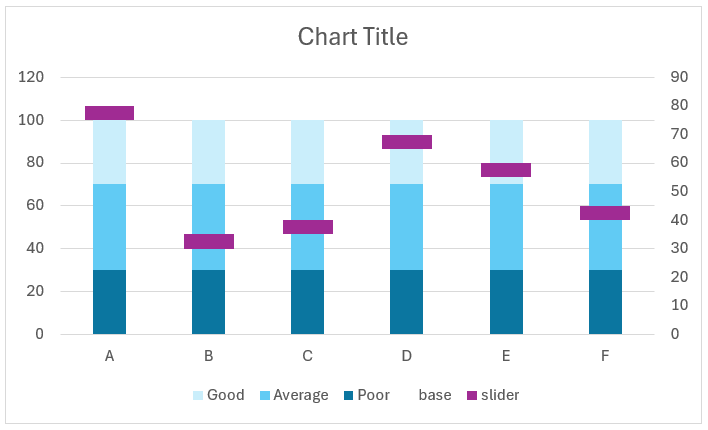
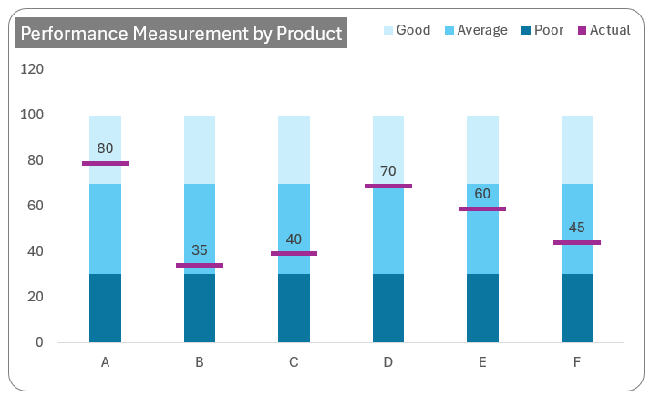
The above chart represents the product performance of multiple products which are measured based on three ranges – good, average, and poor. With this chart, a quick analysis can be made, say for product A that the actual value (as represented by the slider) is 80, which falls under the “good” performance range.
This amazing visual can be created using Microsoft Excel in under a few minutes, let’s get started!
Ready to save time on your next presentation? Explore our Data Visualization Toolkit featuring multiple pre-designed charts, ready to use in Excel. Buy now, create charts instantly, and save time! Click here to visit the product page.
We have a dedicated YouTube video explaining the steps involved in creating this chart, check it here:
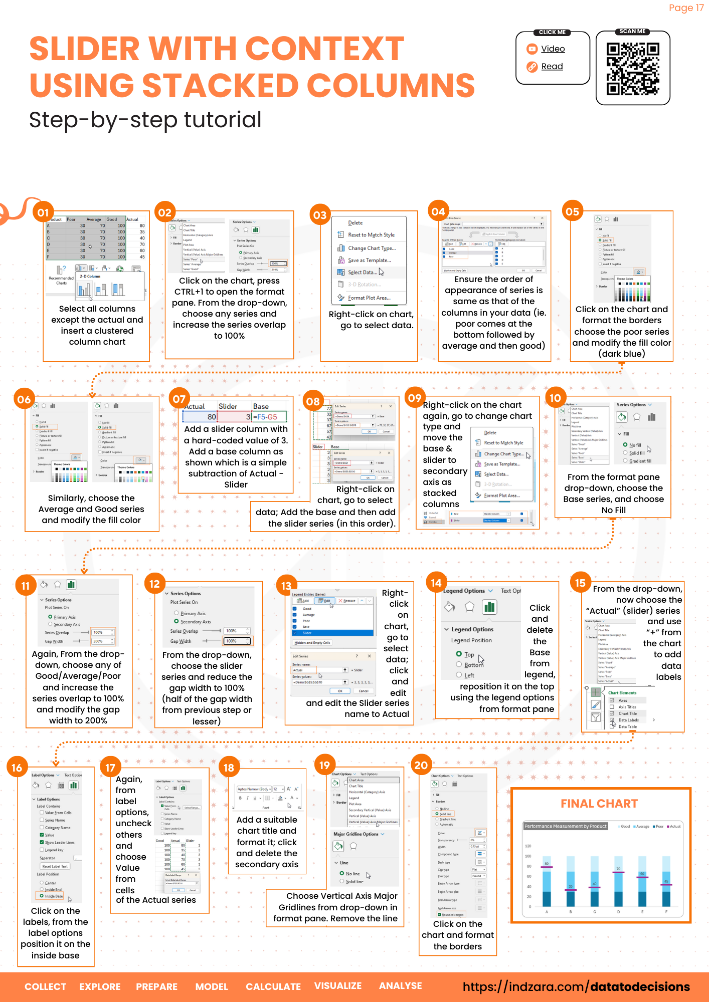
Step 01:
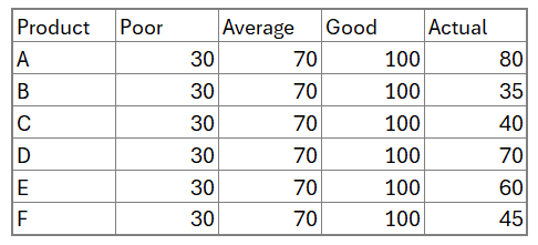
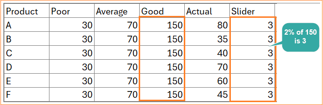
Consider the sample data of products, their performance range values with the actual values as shown:
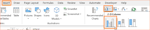
Select only the Product, Poor, Average, and Good columns and insert a clustered column chart.
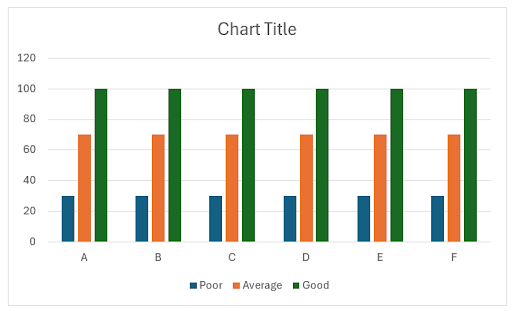
With the data, Excel creates a default clustered column chart as shown (the colors may vary depending on the theme of Excel you use).
Step 02:
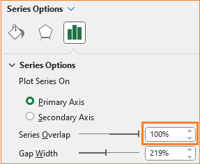
Right-click on any of the columns and select Format Data Series, which opens up the format pane to the right.
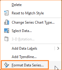
In the format pane, adjust the series overlap to 100% which overlaps all three series.
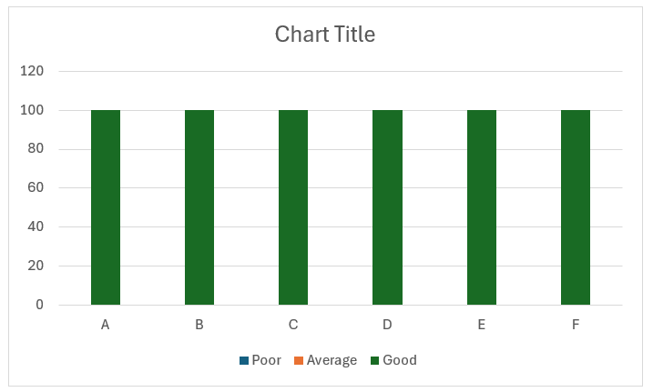
The resulting chart should look like this:
Step 03:
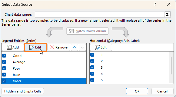
From the chart from the previous step, only the “Good” series was visible, this can be modified to ensure that all the series are visible. Right-click on the chart and click on Select Data which opens a pop-up.
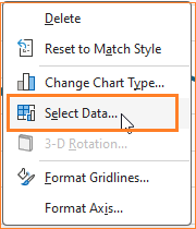
Here, modify the series order to match that of your data i.e. the poor series should be at the bottom followed by the average and the good on top.
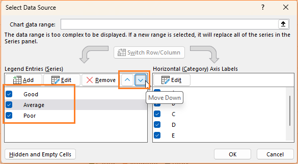
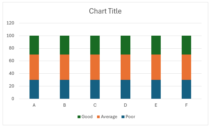
Based on the number of series you have, move and order them according to the order of increasing magnitude from bottom to top. With this change, our chart looks something like this:
Step 04:
Let’s now modify the series colors. Click on the poor series, from the Fill & Line option in the format pane change the color to a darker shade of blue.
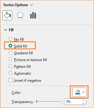
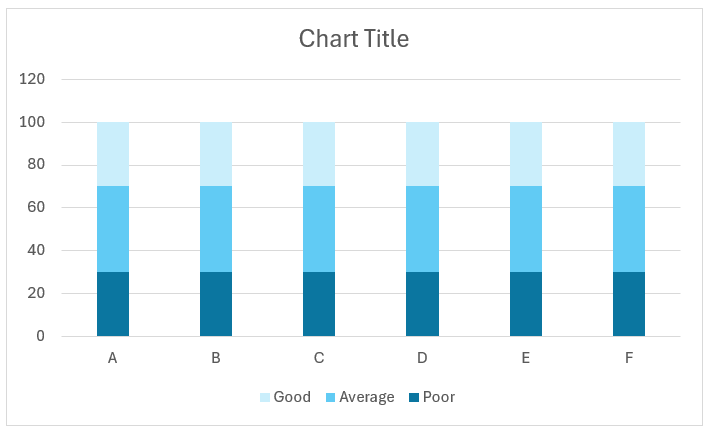
Similarly, change the colors of the other two series to lighter shades of blue. At the end of this step, our chart looks like this:
Step 05:
Let’s now add the slider to this stacked column chart. For this, we’ll use two additional columns: a base column (which will be invisible) and a slider (which will be on top of the invisible base column).
The Slider: This denotes the size of the slider, for now, let’s hardcode this value as 5.
The base: This is for the invisible column which is the Actual-Slider values
=F5-G5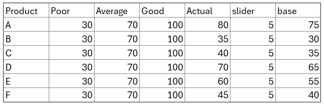
Drag a formula to the cells below to populate the same.
Step 06:
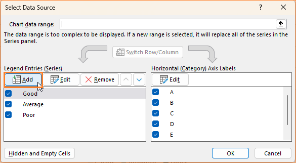
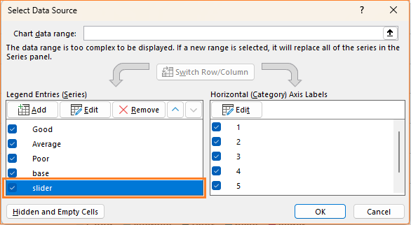
To add these series, right-click on the chart and go to Select Data.
In the pop-up, click on add, to add the new series.
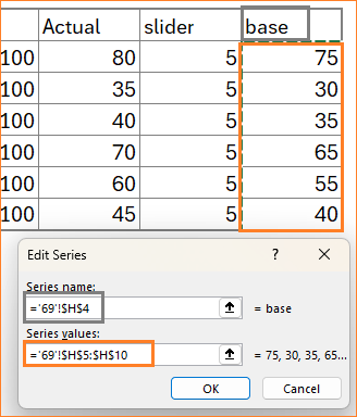
Add the base series first as shown:
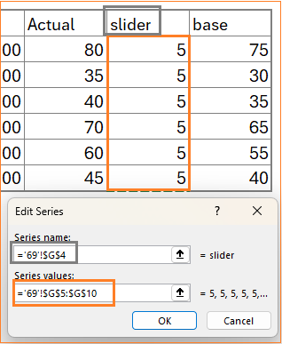
Similarly, add the slider series as well.
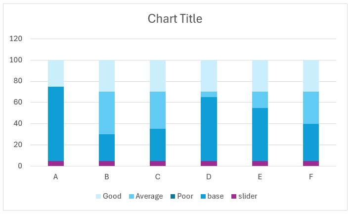
Importantly, ensure that the slider series is at the bottom of all the series as shown:
With this addition, our chart gets modified as shown below:
Step 07:
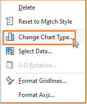
To get the desired slider, we’ll now modify the chart type. Right-click on the chart and go to Change Chart Type.
In the dialog box that opens up, ensure that both the base and slider columns are in the secondary axis as stacked column charts and the remaining series as a clustered column in the primary axis.
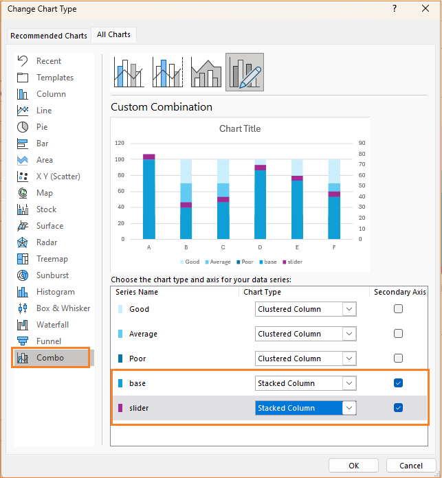
This change modifies our chart as shown here:
Let’s fix this to get the desired slider chart.
Step 08:
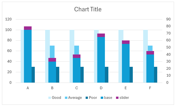
i. First, let us make the base invisible: click on the base column, and in Fill & Line choose No fill.
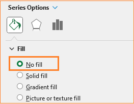
If you are unable to click and choose a series, always use the drop-down from the format pane to navigate between them.
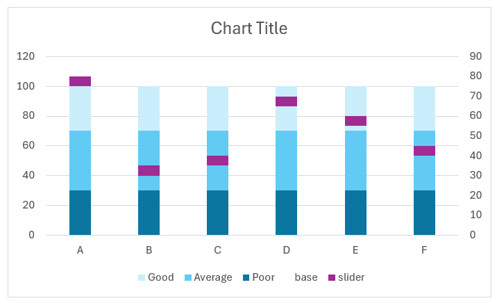
ii. The modifications done in step 7 have changed the series overlap of the good, average, and poor series. Choose any of these series and adjust the series overlap to 100%.
With this, we are nearing our desired chart style:
Step 09:
The slider has to protrude out of the columns to give the “slider” effect. This, in Excel charts, can be controlled by the gap width.
Use the format pane, choose either of the first three series, and modify the gap width to 200%.
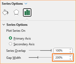
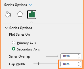
Choose the slider series and adjust the gap width to half of the above i.e. 100%
This modification gives us the sliders that protrude out of the columns, as shown here:
Note: The gap width controls the slider length (that comes out on either side of the columns) whereas the value of the slider series (one that is hardcoded to 5 in step 05) decides how tall the slider needs to be. Adjust these values accordingly.
Let us modify the slider series values to a formula to ensure that it stays dynamic. To do this, we’ll use the maximum value of the highest series (in this case “good”) and get a percentage of this say 2%, i.e.:
=MAX($E$5:$E$10)*0.02where E5 to E10 has the good series data
Test this by modifying the good series data:
Step 10:
Time for some final chart formatting to get a visually appealing chart.
i. Click on the “Base” in the legend and delete the same as it adds no value to the chart.
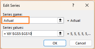
To modify the name Slider on the legend, right-click and go to Select data.
Here, edit the slider series and name it as “Actual” or what the slider in your case denotes.
Move and position the legend on top.
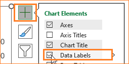
ii. Click on the slider and from the “+” on top of the chart, add data labels.
Click and position the labels on the inside base using the format pane.
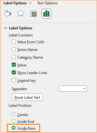
Notice that the labels denote the slider values but we need the values to reflect the Actual values as labels.
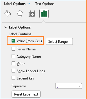
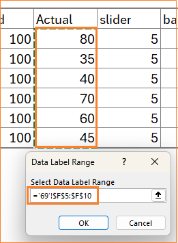
iii. This can be easily modified using the format option available in Excel. Click on the labels and from the label options choose “Value from cells” and uncheck the other options.
In the pop-up that opens, choose the actual series values.
iv. Click on the secondary axis and press the delete key to delete the same.
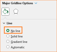
v. Click on the gridlines and choose the No line option.
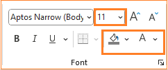
vi. Add a title that explains the crux of the chart, say “Performance Measurement by Product” and format the same using the Home ribbon.
Add axes titles, if necessary.
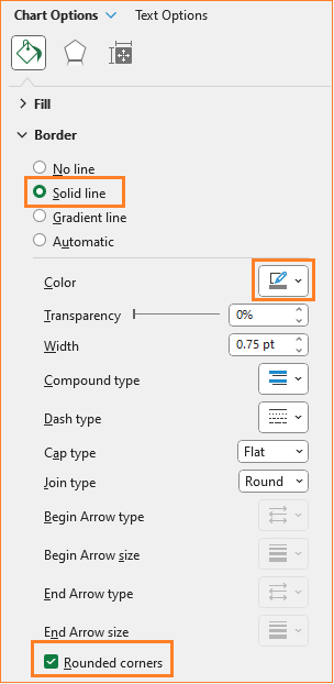
vii. Click on the chart, and format the border and its color as shown:
With this, our Stacked column chart with slider is ready!
Check our 1-page, downloadable illustrative guide explaining all the steps for a quick reference.
To explore our fast-growing collection of free Excel tutorials covering a wide array of topics, please visit https://indzara.com/datatodecisions/
If you have any feedback or suggestions, please post them in the comments below.


