Welcome to the Data to Decisions series, where we empower you with the skills to turn raw data into insightful visuals.
In this blog, we’ll walk you through the process of building a stock price history chart in Microsoft Excel, one that is interactive and dynamic in nature. To analyze markets, mastering the art of charting stock prices is a crucial skill, with Excel and this tutorial, all that you need is a few minutes to build this amazing, stock chart!
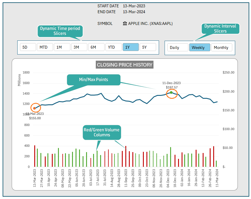
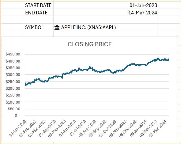
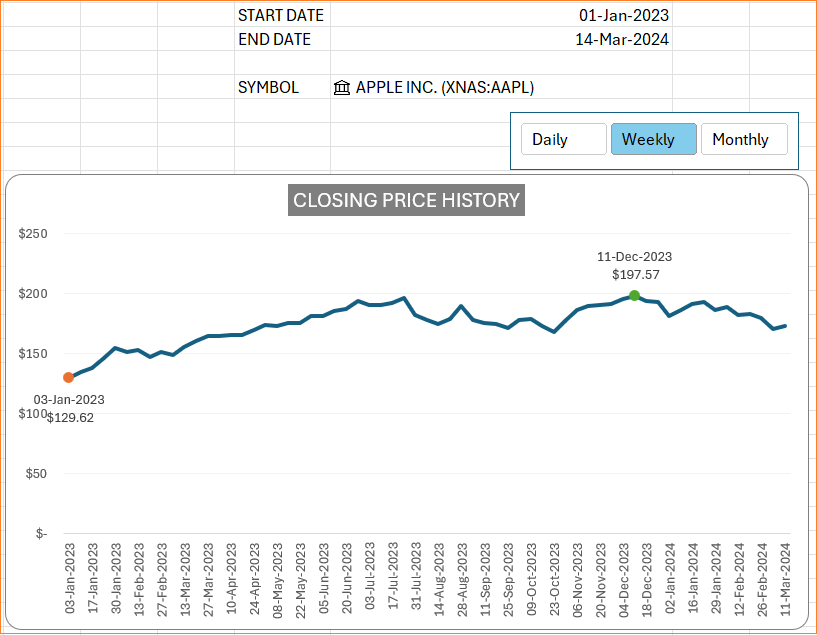
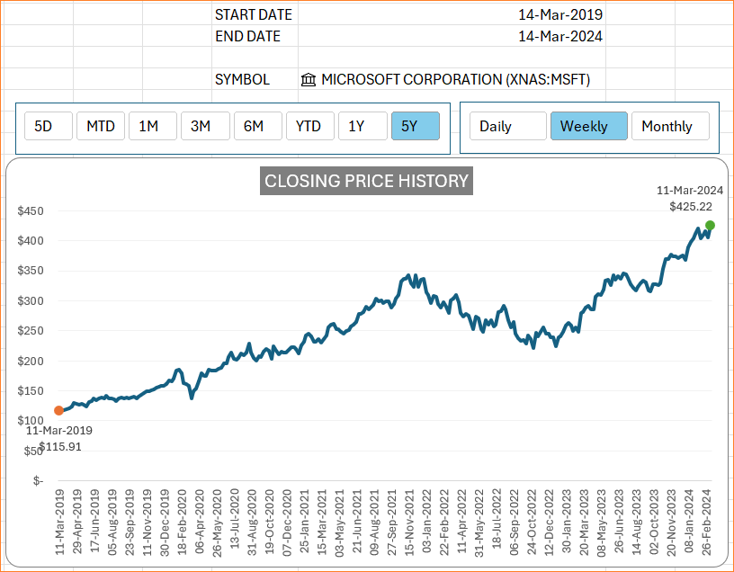
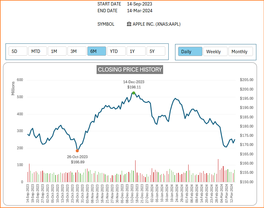
By the end of this post, you’ll be able to create a detailed and dynamic stock price history chart like the one featured above displaying Min/Max points, with slicers of dynamic intervals and historic periods, and the red and green volume columns.
Let’s get started!!
Before we get into the steps involved in creating this stock price chart, please note that the chart pulls stock data from Microsoft Servers, and to be able to achieve this, you’ll need a Microsoft 365 subscription.
Step 01:
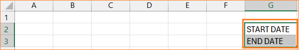
Begin by entering “START DATE” and “END DATE” in cells G2 and G3 of a blank Excel workbook.
The end date will be today since we’ll use this chart to pull historical data until the current date. So, the formula in cell H3 will be
=TODAY()For the start date, let us take the same as the 1st of January, 2024. With these, the cells H2 and H3 will be:
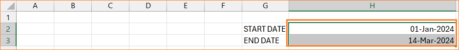
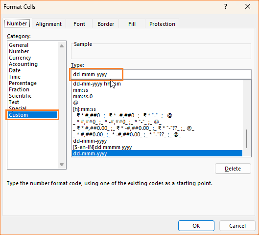
If the date is not displayed in this format for you, please select the necessary cells, press CTRL+1 to open format pane from where you can modify the format to a “dd-mmm-yyyy” format.
Step 02:
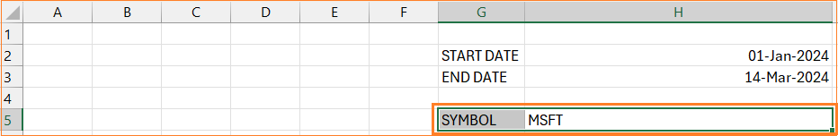
The next input needed is the stock symbol for which the prices will be fetched. Enter “SYMBOL” in cell G5 and for this example, consider extracting the prices of Microsoft Corp., the stock ticker symbol for this is “MSFT” which goes in cell H5, as shown below.
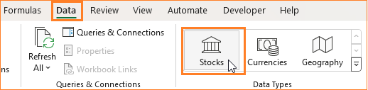
Once entering the data, we need to change the data type of MSFT to a stock data type for Excel to recognize this as a stock ticker. To do this, click on MSFT, and in the Data ribbon, choose the Stocks data type.
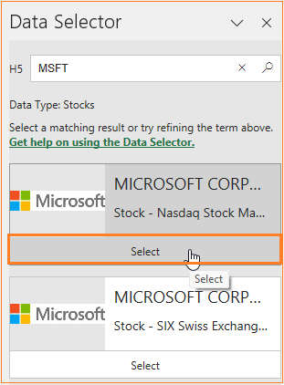
This prompts Excel to ask which “MSFT” as a stock are you referring to in a Data Selector Pane that opens to the right. Choose the stock that corresponds to the ticker, in this case Microsoft Corp as shown below.
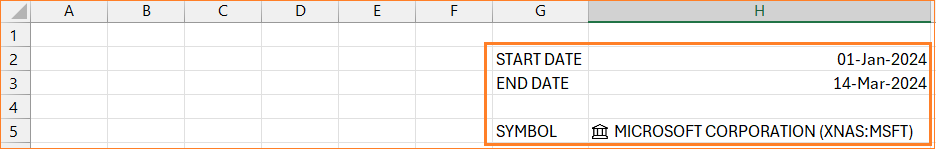
After selecting the stock, the inputs cell should appear something like this:
Check our free Excel template, the Stock Lookup in Excel to
Step 03:
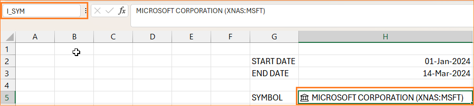
Before we get into the next steps, click on the cell with the stock ticker symbol, i.e.H5, and assign a name for the same as “I_SYM”. Do this by using the name box at the top left corner, as shown:
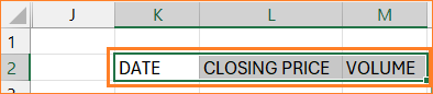
To get the stock history prices, we’d need additional columns as shown below:
To get these historical attributes of stock, we use the STOCKHISTORY function in Excel.
The syntax for this function is:

Ticker symbol: the stock symbol we need to retrieve the prices for (here, I_SYM)
Start and end dates: in cells H2 and H3 respectively.
Interval: 0 – daily; 1 – weekly; 2 – monthly
Headers: 0 – no headers; 1 – basic headers
Properties are the attributes that need to be retrieved,
0 – Date
1 – Close
2 – Open
3 – High
4 – Low
5 – Volume
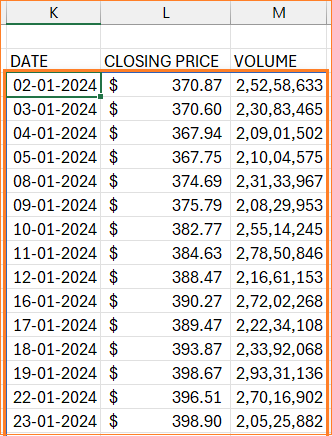
With this, our formula to extract the date, closing price and volume for a daily interval would be:
=STOCKHISTORY(I_SYM,H2,H3,0,0,0,1,5)With this, the retrieved information would be:
For ease of use and understanding the dates, select all the column K, press CTRL+1 to open the formatting dialog box. Here, change the date format to “dd-mmm-yyyy”.
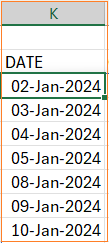
With this, the date format gets changed as below:
Try changing the start date in the input cell, H2. Two key points are to be noted here:
- Even though the intervals are daily, the dates do not show all consecutive days. Meaning, that the days when the stock market is closed will be skipped.
- With every change in dates, the rows of data that gets displayed are dynamic.
To make the final chart adapt to the dynamic nature of the data, create named ranges for each of the Date, Closing Price, and Volume.
The names can be assigned by:
- Go to the Formulas tab, and click on Define Name which opens a dialog box.
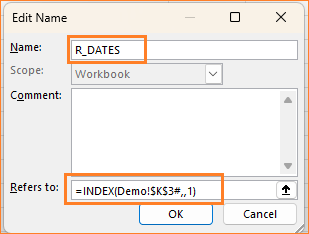
- Here, use an INDEX formula to refer to the first cell of Dates column i.e. K3 and use “#” to ensure this is dynamic.
=INDEX(Demo!$K$3#,,1)- Assign a name, say “R_DATES”.
Repeat the same steps for the Closing Price column. Assign a name as “R_PRICE” and here, point the INDEX function to the second column in the third argument.
=INDEX(Demo!$K$3#,,2)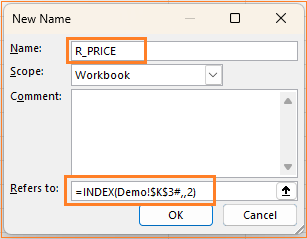
Step 04:
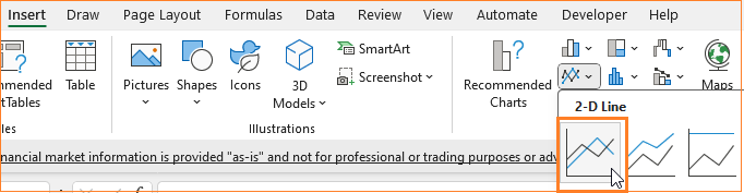
With these preparatory steps, its time to create the stock price chart. Click on a blank cell, go to the Insert tab and choose a Line chart.
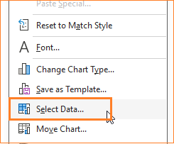
This creates an empty chart. Time to add our data: right-click on the chart and choose Select data.
This opens a pop-up to add our series.
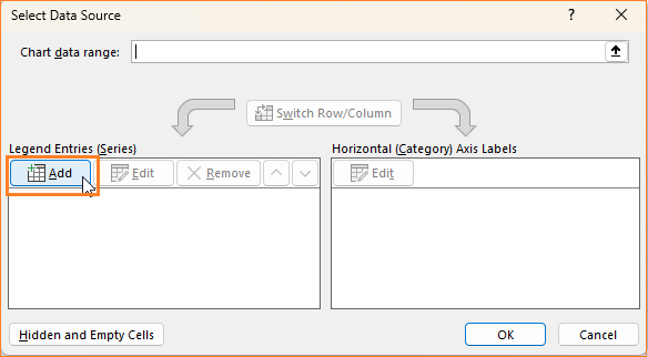
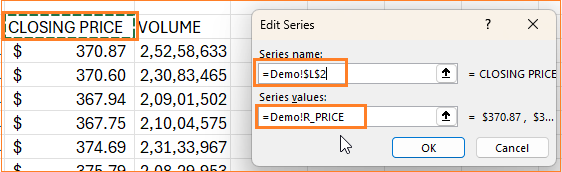
Firstly, we’ll add the Closing Price data, the series name is “Closing Price” or yo can choose the cell L2 which has this header.
For the series values, since we need the chart to be dynamic, we’ll use the R_PRICE named range created. Make sure to add the sheet name followed by an ! before the named range, as shown in the image below:
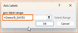
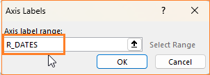
For the X-axis, the label range values are that of the Dates column, hence we’ll use the named range R_DATES, as shown here:
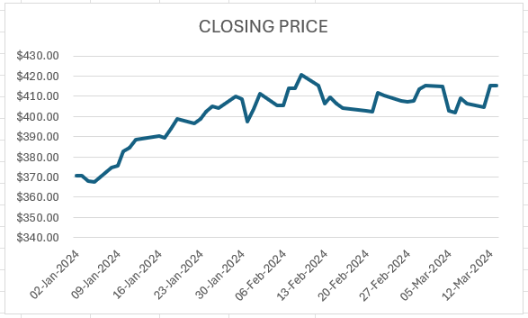
After this input, the populated chart looks as shown below:
Try modifying the starting date to 1-Jan-23 and any other ticker symbol, the chart should fetch and populate accordingly.
Step 05:
Now, let’s format this chart before we proceed further.
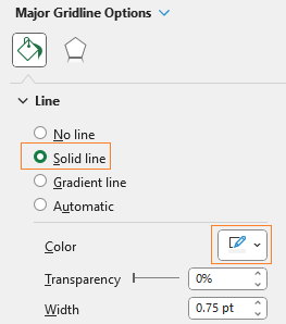
- Right-click on the gridlines, go to format gridlines and choose a line color to make this less apparent.
- Change the chart title to suit our analysis, and format it as well.
- Click on chart, modify the chart border.
Step 06:
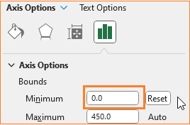
Let’s now format the axis. To do this, right-click on the Y-axis, choose Format axis.
Reset the minimum to 0. Change the decimal point to 0

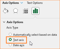
Now, right-click on the X-axis, choose the format axis as above, and modify this to a text axis.
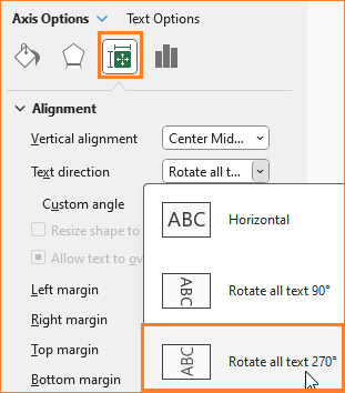
In the Size & Properties option, align the x-axis text as shown below:
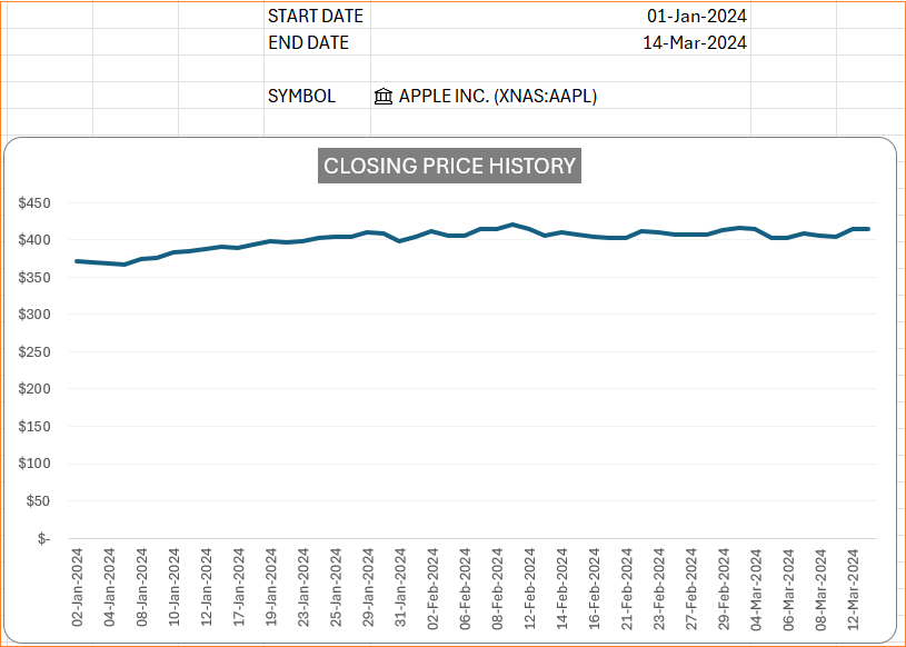
With these changes, at the end of this step, our chart looks as below:
Step 07:
Let’s now shift our focus to creating interactive slicers of intervals and periods for our stock price chart. To do this, open a new sheet in the same Excel workbook.
It is advisable to keep a helper sheet to contain information that need not be present on the sheet where you have the chart but are useful in your chart creation process.
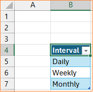
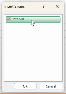
Add the three intervals: Daily, Weekly, and Monthly and select all press CTRL + T to make them as a table as shown here below:
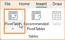
Now, with any cell inside the table selected, go to the insert tab and insert a Pivot Table.
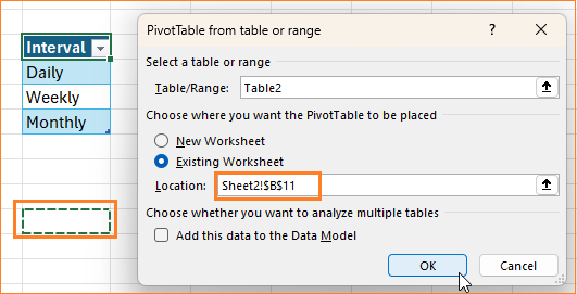
This opens a pop-up, insert the pivot table within the same sheet in another location.
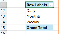
Drag the Intervals as Pivot Rows.
After this, select anywhere inside the pivot table, and from Insert ribbon, add a slicer as shown:
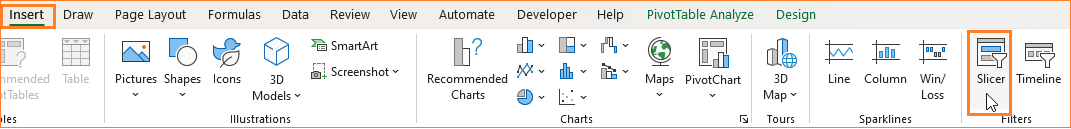
With this, an interval slicer gets added.
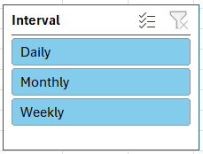
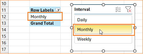
When any interval is clicked, the pivot table automatically displays only the chosen value in cell B12.
Step 08:
The value from B12 now should correspond to one of the numbers: 0 – daily; 1 – weekly; 2 – monthly. To get this, we’ll use a SWITCH function, the syntax for which is:
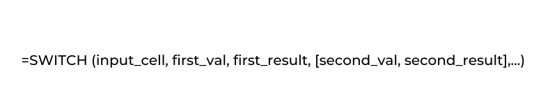
In our case, depending on the value of B12, the formula in cell B9 would be:
=SWITCH(B12,"Daily",0,"Weekly",1,"Monthly",2)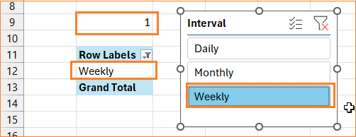
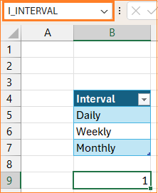
Similar to Step 03, let’s name this cell B9 which has the interval value “I_INTERVAL”.
Step 09:
It’s time to move our slicer to the sheet where we have our chart. Click on the slicer and do a simple cut (CTRL+X) and paste (CTRL+V).
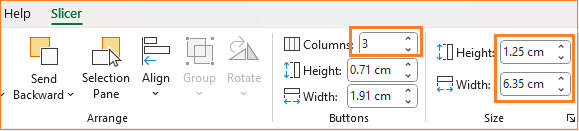
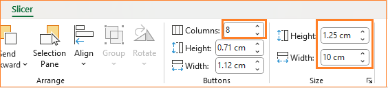
Here, click on the slicer, and in the “Slicer” ribbon, change to 3 columns and resize to be on top of your chart.
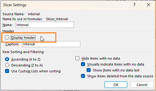
Now, click on the slicer settings from top left
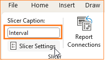
and from the pop-up that opens up, un-check the Display Header:
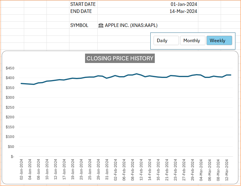
After this step, your chart and slicer should look like this:
Step 10:
It’s time to connect the slicer to the chart, to make this interactive. In our previous step, step 08, we’ve created a named range I_INTERVAL to denote the interval being chosen. This, we’ll replace in our original STOCKHISTORY formula (from step 03).
=STOCKHISTORY(I_SYM,H2,H3,I_INTERVAL,0,0,1,5)Once this change is made, check the slicer to see the chart change based on the interval chosen.
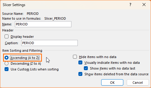
To ensure that the slicer has an order of appearance like, Daily, Weekly and then Monthly, there a few quick steps that needs to be followed.
- Go to the sheet where the Interval table is present (refer step 07), select all the values and go to File -> Options
- In the dialog box that opens up, go to Advanced and Edit Custom List, as shown:
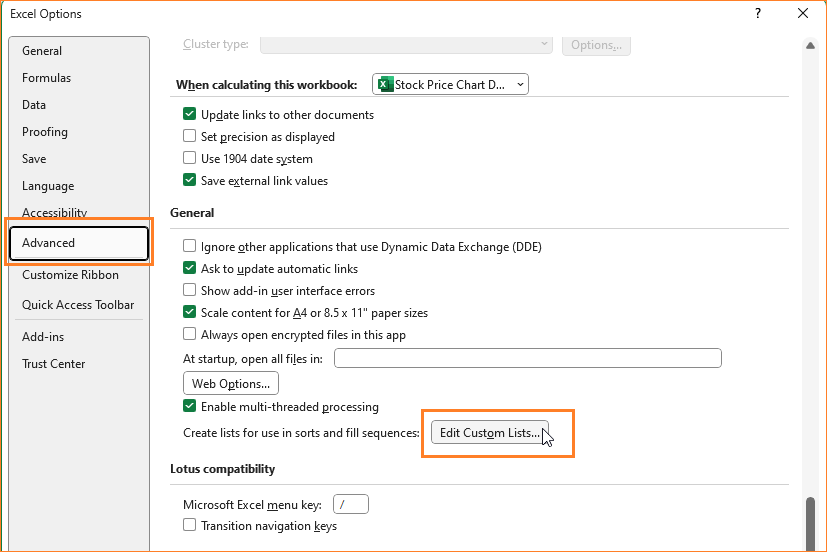
- This opens a pop-up from where you can import the list from the table as shown:
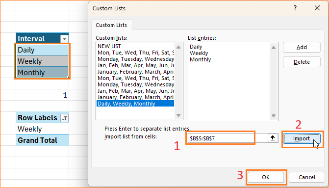
- Click OK in the Excel options dialog box, then go to chart to check if the order has changed.
- If not, then click on the chart and open slicer settings from the top-left (refer to step 09) and change the order to descending and then back again to ascending.
Descending:
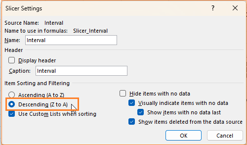
Ascending:

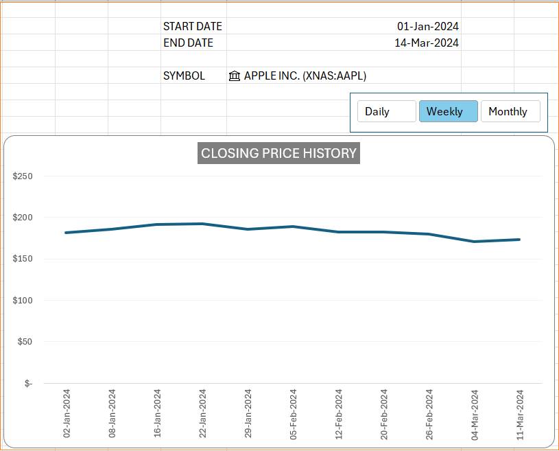
With this, our ordered slicer looks as below, which when changed, automatically changes the chart based on the chosen interval.
Step 11:
In this and the following steps, our focus in on displaying the Min/Max price points on the line chart.
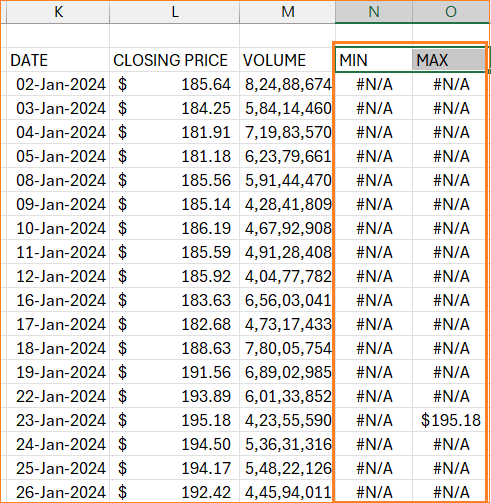
To do this, we need to add additional columns to the data.
The MIN, ideally should be the minimum value of the price from our price column (R_PRICE). The formula for the same will be:
=IF(R_PRICE=MIN(R_PRICE),R_PRICE,NA())In the same way, the MAX will be the maximum value of the price from our price column (R_PRICE). The formula for the same will be:
=IF(R_PRICE=MAX(R_PRICE),R_PRICE,NA())With these additional columns, our new data would be:
Step 12:
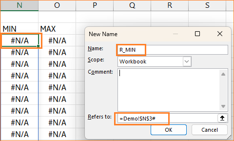
Since with the remaining columns, the MIN/MAX are dynamic, we’ll assign named ranges for these as well. Do so by clicking on the first cell of Min value, N3 and go to Formulas -> Define Name.
Here, to make the rows dynamic, include a # at the end of the cell reference and assign a name, say R_MIN.
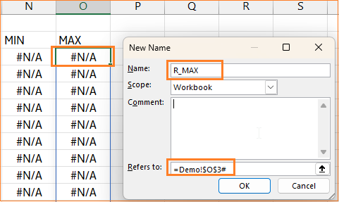
Similarly, assign a name to the Max series, R_MAX as shown below:
Step 13:
Now,let’s add these newly created series to the chart. Right-click on the chart and select data. From the dialog box that appears, add a new series as shown below:
Edit the horizontal axis as well:
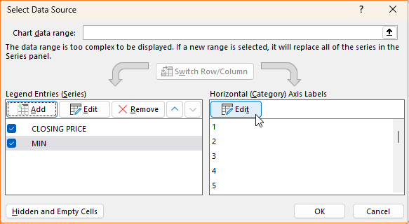
Here, since the horizontal axis is dates, use the R_DATES named range created for the same.
Once this is done, the data select dialog box should look like this:
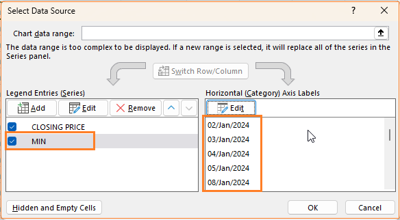
In the same way, add the MAX series as well and edit the horizontal axis too.
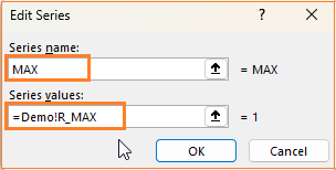
Note: Here, in my Excel, Demo is the sheet where my chart and its data are present. Use your sheet name followed by a “!” accordingly. To correctly add this, click on any blank cell and delete till the “!” and then add your named range.
Step 14:
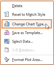
As a next step, right-click on the chart and go to Change chart type.
In combo, modify the chart type as shown below:
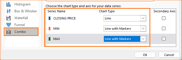
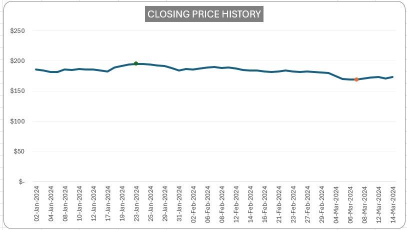
With this change, our chart with min/max points takes shape and looks as below:
Step 15:
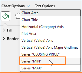
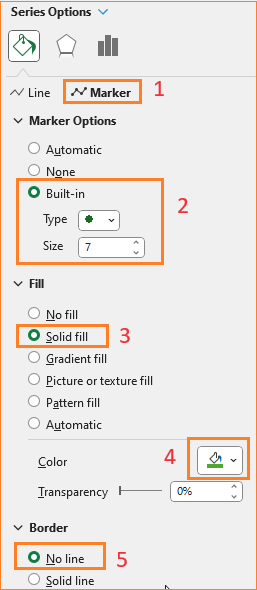
To make this into a desired format, click on the chart and press CTRL+1 to open the format pane.
- In the drop-down, choose the MIN series.
- In fill & line, choose No Line option.
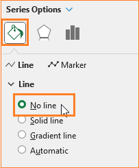
- In the Marker options, choose a built-in circle style marker and increase the size, assign a suitable color to depict a min value.

Repeat the same steps for the “Max” series by choosing it from the format pane drop-down. Edit the markers accordingly.
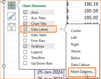
Step 16:
After adding and formatting the min/max points, let us now add labels to this. From the drop-down choose the Min series and from the “+” icon on chart add data labels and go to More options:
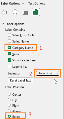
Here, include the categories as well to be displayed in a new line and since this is a Min point, position the label below.
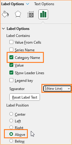
Now, choose the Max series, add the data labels and position them above with the category name.
Try changing the dates, and the intervals and see the chart dynamically update with min/max points.
Step 17:
Till now, we have created the price history chart, and added the interactive, dynamic interval slicer and the min/max points.
In the next few steps, let us create the interactive time period slicer to choose the look-back period for your chart.
Let’s get to the helper sheet (refer step 07) where we’ve created a pivot table. Here, add the necessary time period data and covert the same into a table (CTRL+T).
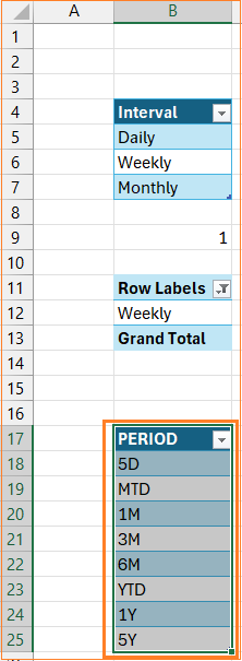
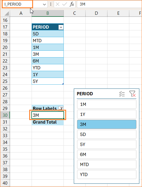
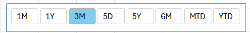
Here the periods are: five days (5D), month-to-date (MTD), one month (1M), three months (3M), six months (6M), year-to-date (YTD), 1 year (1Y) and 5 years (5Y).
Step 18:
Similar to Step 07, create a pivot table for this period data in the same sheet.
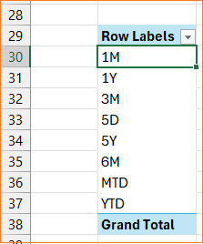
Click inside the pivot table, from Insert -> add Slicer.
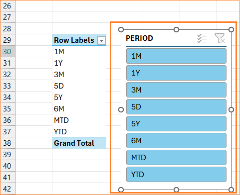
Based on the Slicer selection cell B30 records the same. Assign a name to the same as “I_PERIOD”
Based on the period selection, the starting date needs to be changed accordingly for our chart to use.
For each of the 5D, MTD, 1M etc let us see how to use some Excel functions to achieve it.
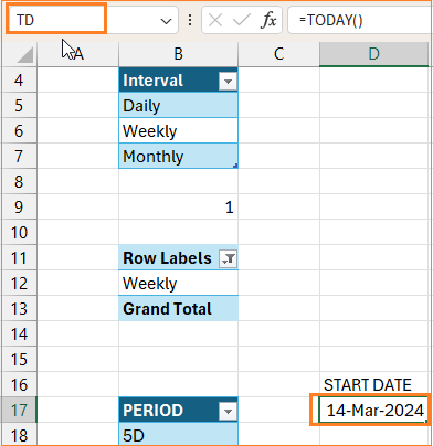
First, enter the current date (=TODAY()) and assign a name to this as “TD”.
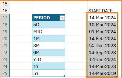
The start date for each of the period can be achieved as follows:
- 5D: This will be today minus four days, in cell D18 the formula would be
=TD-4- MTD: Use EOMONTH to get the end of previous month and add 1 to get to the next date i.e. the beginning of the current month, in cell D19 the formula would be
=EOMONTH(TD,-1)+1- 1M: Use EDATE to go back exactly 1 month from today i.e TD, in cell D20 the formula would be
=EDATE(TD,-1)- 3M: Similar to 1M, use EDATE and go back three months, in cell D21 the formula would be
=EDATE(TD,-3)- 6M: Same as 1M and 3M, use EDATE, in cell D22 the formula would be
=EDATE(TD,-6)- YTD: Use a combination of DATE and YEAR functions to get the first date of the current year, in cell D23 the formula would be
=DATE(YEAR(TD),1,1)- 1Y: Here, we’ll use EDATE to go back 12 months, in cell D24 the formula would be
=EDATE(TD,-12)- 5Y: Similar to above, go back 60 months using EDATE to represent 5 years
=EDATE(TD,-60)With these formulas, the corresponding start dates for the various periods are as shown:
Step 19:
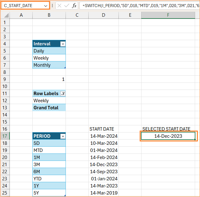
With the list of potential start dates, let us use the SWITCH function and the I_PERIOD assigned name to get the date corresponding to the period slicer selection.
That is based on the selection from I_PERIOD, the SWITCH function needs to return the corresponding start date value. (Refer to the syntax for SWITCH in step 08).
In cell F17, the formula would be:
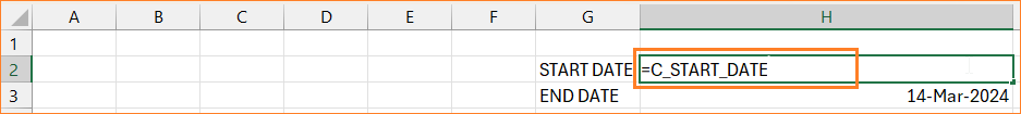
=SWITCH(I_PERIOD,"5D",D18,"MTD",D19,"1M",D20,"3M",D21,"6M",D22,"YTD",D23,"1Y",D24,"5Y",D25,D22)Let’s assign this date a name, say “C_START_DATE” before we proceed to tie this to our chart.
Step 20:
Go back to the sheet where we have the chart, and change the Start date (which we have manually entered so far) to =C_START_DATE.
Cut the period slicer (CTRL+X, from the helper sheet) and paste it (CTRL+V) into the sheet with the chart. Similar to step 09, let us format the slicer to be more visually appealing.
Also, remove the slicer header (refer step 09) and position it on top of the chart as needed.
Now, similar to changing the order of the appearance of slicer items in the interval slicer in step 10, we’ll do the same and get a custom list for the period slicer. Follow the steps in the step 10 for the Period table data and include a custom list as shown:
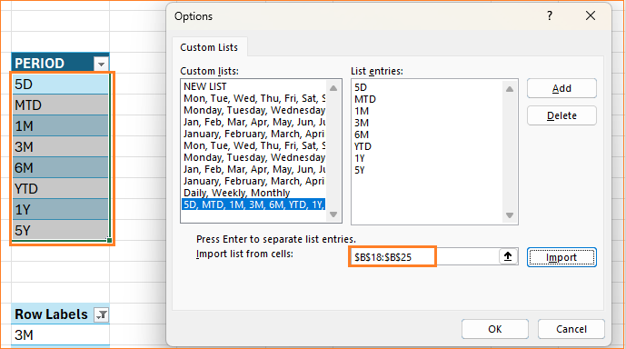
If the slicer is not changed to the right order, go to slicer settings, and change the sorting order to descending and back to ascending order.
Test with a new stock symbol and apply the interval and the period slicer to get the chart updated accordingly. By the end of this step, your chart should look something like this:
Step 21:
In the final leg of building our interactive and dynamic Stock Price History chart, the next few steps will focus on building the volume bars in the chart. We’ll have additional columns for the green and red volume columns.
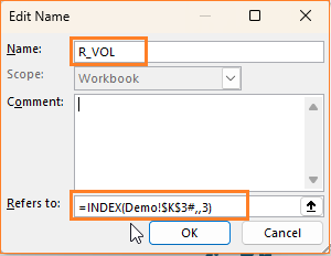
Since we’ll use the Volume column here, let us assign a name for this (as we did earlier for dynamic arrays, refer step 03). Please note that the Date, Closing price, and Volume data come from a single formula from cell K3. So, click on K3, and in the Formula ribbon, go to Define Name and assign R_VOL to the volume column.
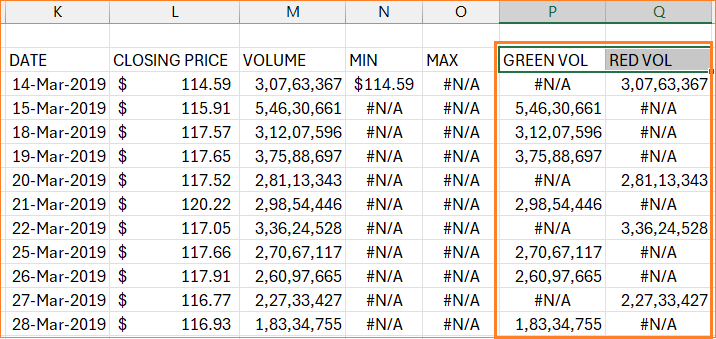
Now the formula for the GREEN VOL column should check the current row’s price and if it is greater than that of the previous row’s then this comes under green volume otherwise, we’ll return an NA.
=IF(R_PRICE>OFFSET(R_PRICE,-1,0,ROWS(R_PRICE)),R_VOL,NA())Similarly, if the price is less than the previous price, we get the RED VOL.
=IF(R_PRICE<OFFSET(R_PRICE,-1,0,ROWS(R_PRICE)),R_VOL,NA())With these addition, our data looks like this:
Step 22:
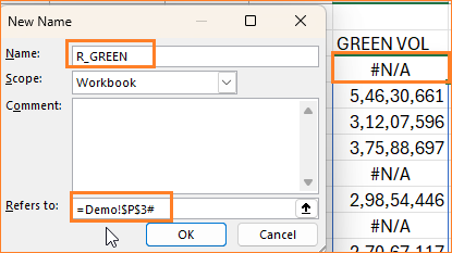
Before adding these new columns to our chart, let us assign them names. Similar to the previous steps, go the Formulas and add a new name. For Green vol, assign “R_GREEN” and
For red vol column assign the name as “R_RED”.
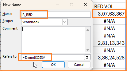
Ensure that the “#” follows the cell to make this dynamic.
Step 23:
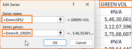
Time to add these to our chart, right-click on the chart and go to select data. Add the green vol series and ensure the series value refers to the named range created. (refer step 14)
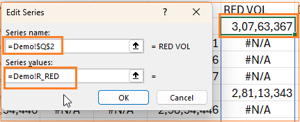
Similarly, add the red vol column.
Adding these series would have altered the appearance of the chart. To get the desired chart style, right-click and go to Change chart type.
In combo, ensure the chart types are as shown below:

Step 24:
Click on chart and press CTRL+1 to open format pane. From drop-down choose Green Vol column (refer step 15) and modify the column color.
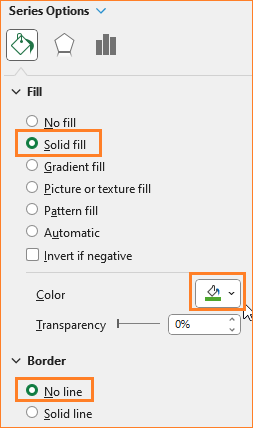
Similarly, do the same for the red vol column.
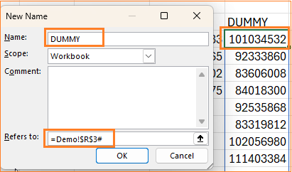
To ensure the columns are not very tall, for our final chart, we’ll add a DUMMY series to make them shorter. The value in this is, say four times the volume (to get a larger value).
=R_VOL*4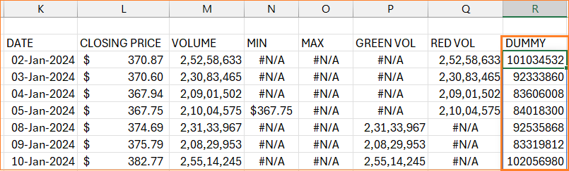
Similar to all other columns, assign a name:
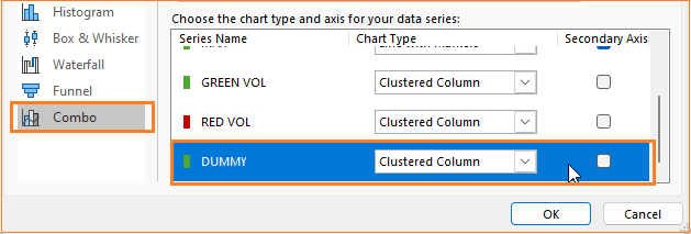
Similar to our previous steps, add the DUMMY series to the chart (right-click on chart , go to select data and add the series).
Right-click on chart and choose change chart type and while other series remain the same, ensure DUMMY series is a clustered column in primary axis.
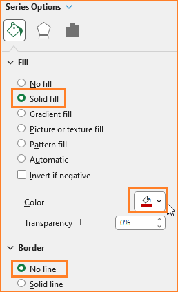
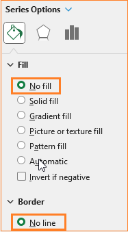
In format pane, remove fill and line for this dummy series.
Step 25:
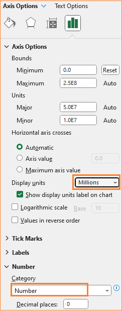
As some final formatting, right-click on Y-axis and choose Format Axis to change the category to number and the display units in millions for a cleaner chart.
With this, our final dynamic and interactive Stock History Price chart is ready for your use!
Check Indzara’s free, downloadable Stock Price chart template that has all these steps already created for you, with a ready-to-use chart!
Also, check our collection of Stock Market templates in Microsoft Excel from simple stock charts, screeners, to market analysis & watchers and technical indicators.
If you have any feedback or suggestions, please post them in the comments below.


