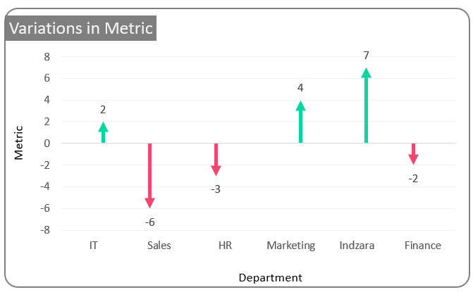
Looking to visualize variations in your data but do not want to use a simple column chart, then this is the chart for you.
With simple modifications to the column chart and by effectively using the error bars this chart can be built within minutes.
Ready to save time on your next presentation? Explore our Data Visualization Toolkit featuring multiple pre-designed charts, ready to use in Excel. Buy now, create charts instantly, and save time! Click here to visit the product page.
Step 01: The Data
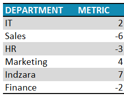
Consider a sample data of a metric across various departments.
i. Select all your data and press CTRL+T to create a table.
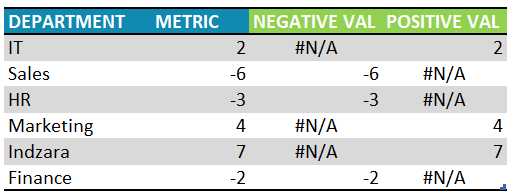
ii. We need to create two new columns that would be capture the positive and negative values seperately.
The formula for the same would be:
i. For NEGATIVE VAL: =IF([@METRIC]<0,[@METRIC],NA())
ii. For POSITIVE VAL: =IF([@METRIC]>=0,[@METRIC],NA())
With this, your new data would be:
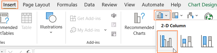
Step 02: Create the chart
i. Choose the category (department), the NEGATIVE VAL, and the POSITIVE VAL series. Insert a clustered column chart.
With this, the chart created looks as below:
Note: The colors may vary based on the theme of your Excel file.
Step 03: Add error bars
To create the arrows, we’ll use the Error bars option.
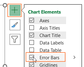
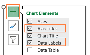
i. Click on the chart and use the “+” icon on top of the chart to insert error bars for each column.
ii. Now, right-click on the POSITIVE VAL columns and go to format data series
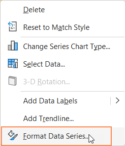
This opens the format pane to the right.
iii. Under Fill & line, choose no fill as we do not need the columns to be visible
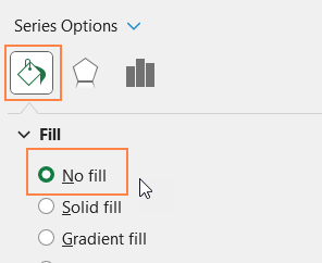
Similarly, choose the NEGATIVE VAL series and follow the same steps to remove the fill.
Step 04: Format the error bars
In this step, we’ll format the error bars to achieve the desired arrow shape.
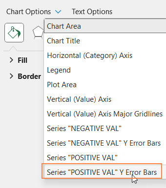
i. From the drop-down, choose the “POSITIVE VAL” Y Error Bars
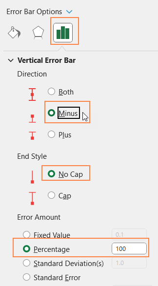
ii. Under error options, format the error bars’ direction, style and amount as shown below:
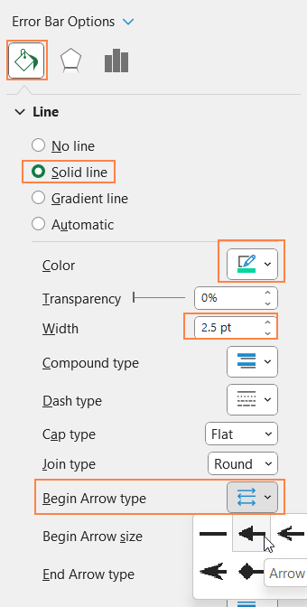
iii. Go to Fill & Line, and modify the error line to get a thicker arrow. For the arrow head, modify the Begin Arrow Type, as shown below:
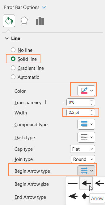
Repeat the exact same steps after choosing the “NEGATIVE VAL” Y Error Bars.
Modify the line color to represent negative values accordingly.
With this, your chart should look like this:
Step 05: Format the chart
Let us now shift our focus on formatting the chart, as a whole to get a visually appealing chart.
i. Add a suitable chart title, use the Home Ribbon to format it; click and delete the legends
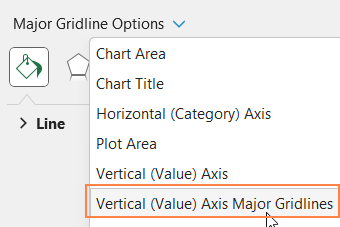
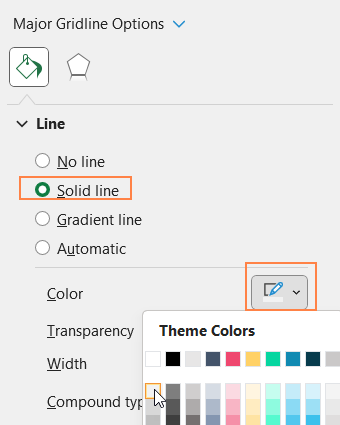
ii. From the drop-down, choose the “Vertical (Value) axis Major Gridlines”
and make the gridlines less apparent
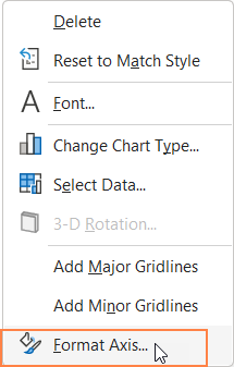
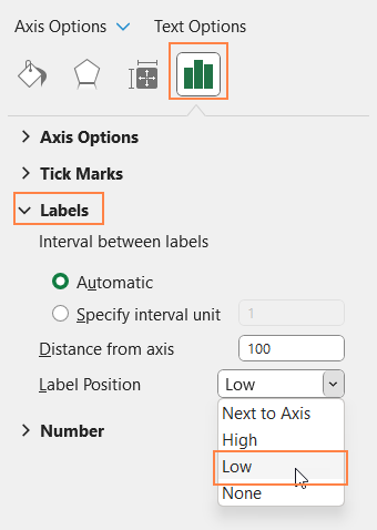
iii. Right-click on the horizontal axis and go to format axis.
In the Axis options, position labels on the “lower” end as shown:
iv. Click on the chart and use the “+” that appears on top of the chart to add Axis Titles. Format it if needed using the home ribbon. Similarly, add data labels too.
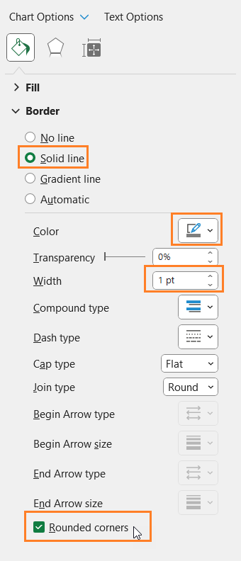
v. Click on the chart and format the chart border as shown:
With this, the vertical arrow chart is ready!


