Dot plots are a special type of chart built using a combination of column and scatter plots in Microsoft Excel.

This plot represents the categories in the X axis and each value under these categories as dots. This type of chart can be used for distribution analysis where you can easily see the spread and concentration of the data points under each category.
Creation of this chart requires just a few steps, let’s get started.
Ready to save time on your next presentation? Explore our Data Visualization Toolkit featuring multiple pre-designed charts, ready to use in Excel. Buy now, create charts instantly, and save time! Click here to visit the product page.
Step 01:
Consider a sample data of skill assessment scores of different skills as shown:

Firstly, select all data and press CTRL+T to convert to a table.
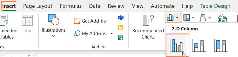
i. Choose just the headers and the first row of data and insert a clustered column chart.
This creates a simple clustered column chart, click on the chart and use the Chart Design tab on top, and click on Switch Row/Column
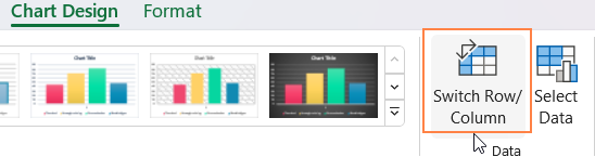
This step is performed to get all the necessary categories to the X-axis. With this, our chart looks like this:

Step 02:
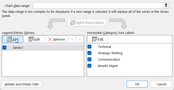
Right-click on the chart and go to Select Data.
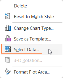
In the pop-up that opens up, choose Edit.
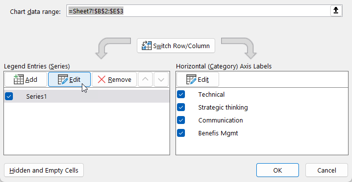
Here, delete the series value present and enter zeroes equal to the number of categories in your data (here we have 4, hence I entered 0,0,0,0)
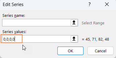
This removes the data present and gives us with only the category names in the X axis upon which the chart can be built.

Step 03:
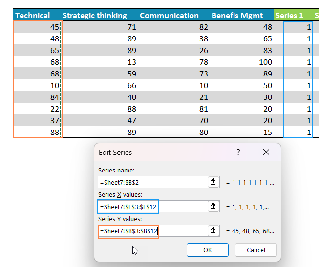
Now, add additional columns to your data equal to the number of series (headers) present in your actual data. Enter all 1s in the first column, 2s in the second, and so on.

Step 04:
Let’s now add data to our chart.
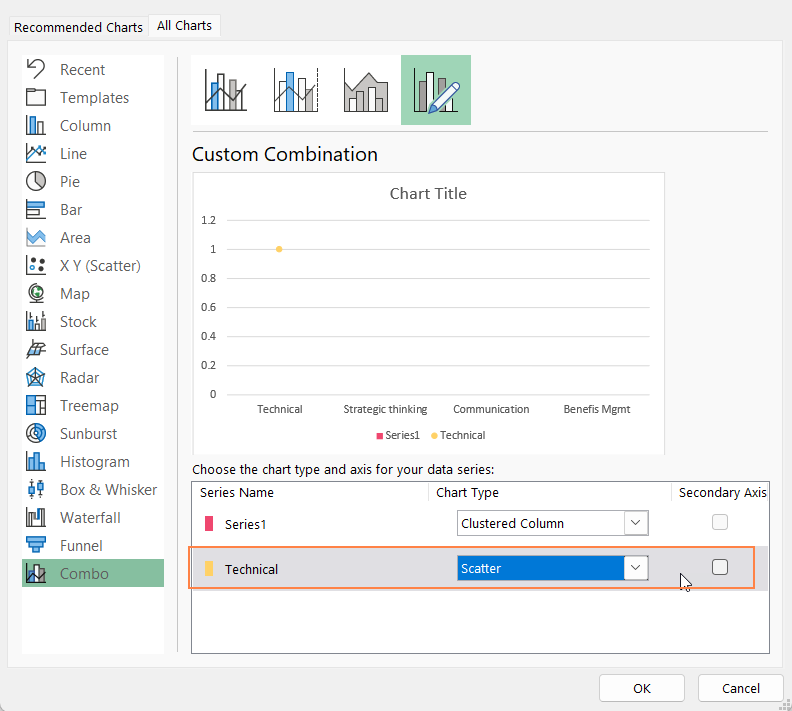
i. Right-click on the chart, go to Select Data; add a new series.
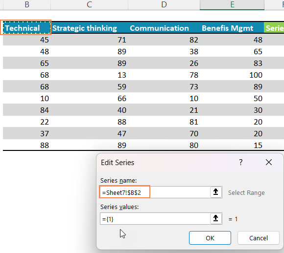
ii. Here, choose the first header from your actual data and the value as 1.
iii. Right-click on the column created and go to Change Series Chart Type
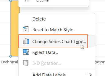
iv. In the pop-up that opens up, change the chart type to a Scatter plot
v. Right-click on Scatterplot point; Click Select Data
vi. In the pop-up, choose “Technical” series and click on “Edit”
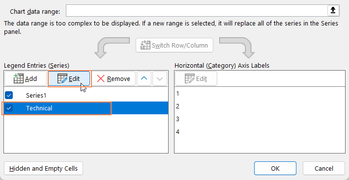
vii. Select the series X values as 1s and the Y values as the values from the first series, i.e. “Technical” series
With this, the vertical dot plot for the first series is inserted.

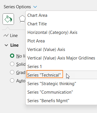
Repeat the same steps for the other series as well.
With this, the dot plot should look as below:

Step 05:
Let us apply some standard chart formatting here.
i. Click on the chart, press CTRL+1 to open the format pane. From the drop-down choose any series.
In fill & line, under Maker Options, format the dots as need be.

Repeat the same for the other series.
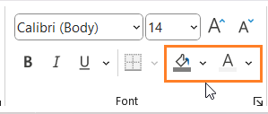
ii. Add a suitable chart tile, and format it using the home ribbon.
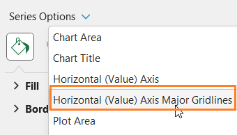
iii. From the drop-down, choose the “Vertical Axis Major Gridlines and format them with a lighter color.
iv. Click on this chart, and format the chart border as shown:

With this, our vertical dot plot is ready!


