Waterfall charts are a staple in the world of financial and business analysis, offering a structured visual representation of your data. These charts are particularly useful when you want to display how a metric or a key value has moved from one point to another, and what has contributed to the change (which can be either positive or negative).
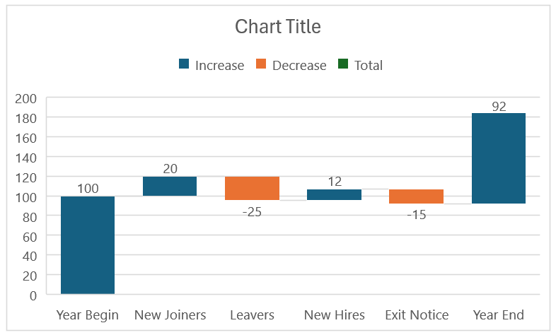
Consider a sample waterfall chart as shown below.
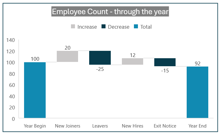
The above chart shows how the employee count has changed from the beginning to the end of a year and what has contributed to the this change, in both positive and negative way.
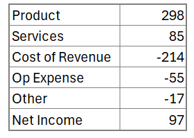
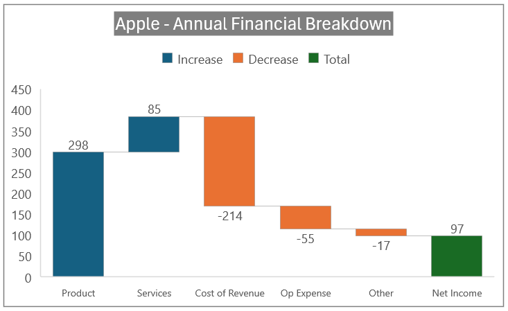
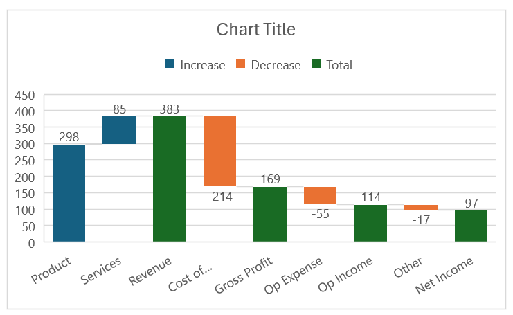
Consider another waterfall chart of financial statement as shown:
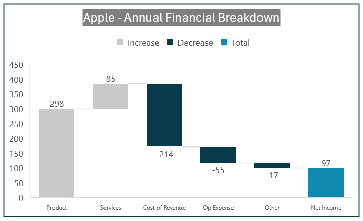
Here, with the waterfall chart one can see that there are multiple positive and negative changes that contribute to the final net income for Apple Inc. at the end.
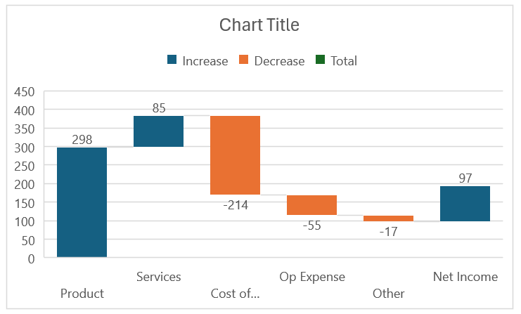
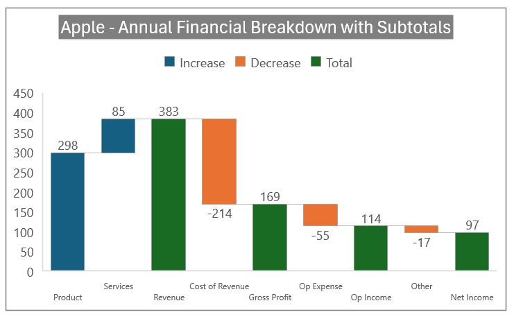
Yet another example usecase is shared here:
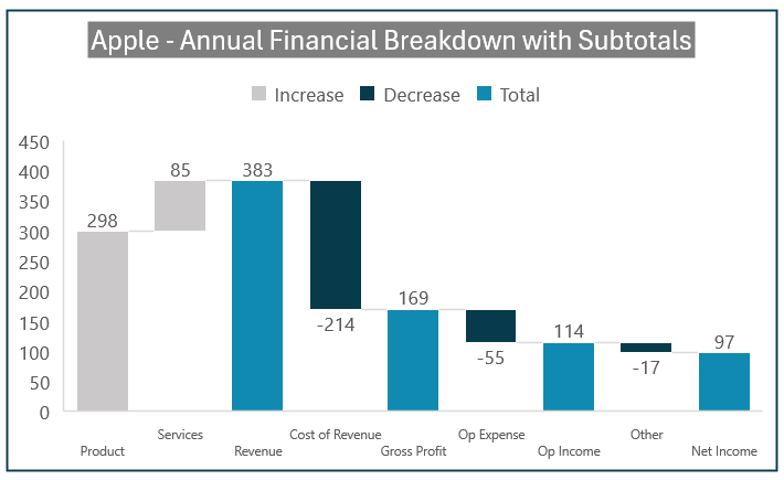
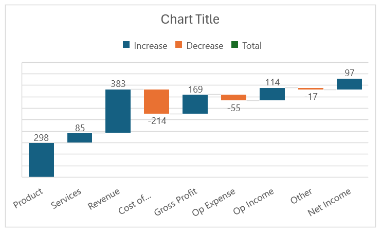
This chart shows the intermediate subtotals where we can observe that, product and services revenue add up to the revenue total of 383 billions. From this, a negative Cost of Revenue gets subtracted to bring us the Gross Profit and so on till the Net Income stands at 97 billions.
Ready to save time on your next presentation? Explore our Data Visualization Toolkit featuring multiple pre-designed charts, ready to use in Excel. Buy now, create charts instantly, and save time! Click here to visit the product page.
We have a dedicated YouTube video explaining the steps involved in creating this chart, check it here:
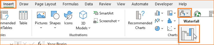
This visual can be created using Microsoft Excel quickly, let’s see the steps!
Chart – I
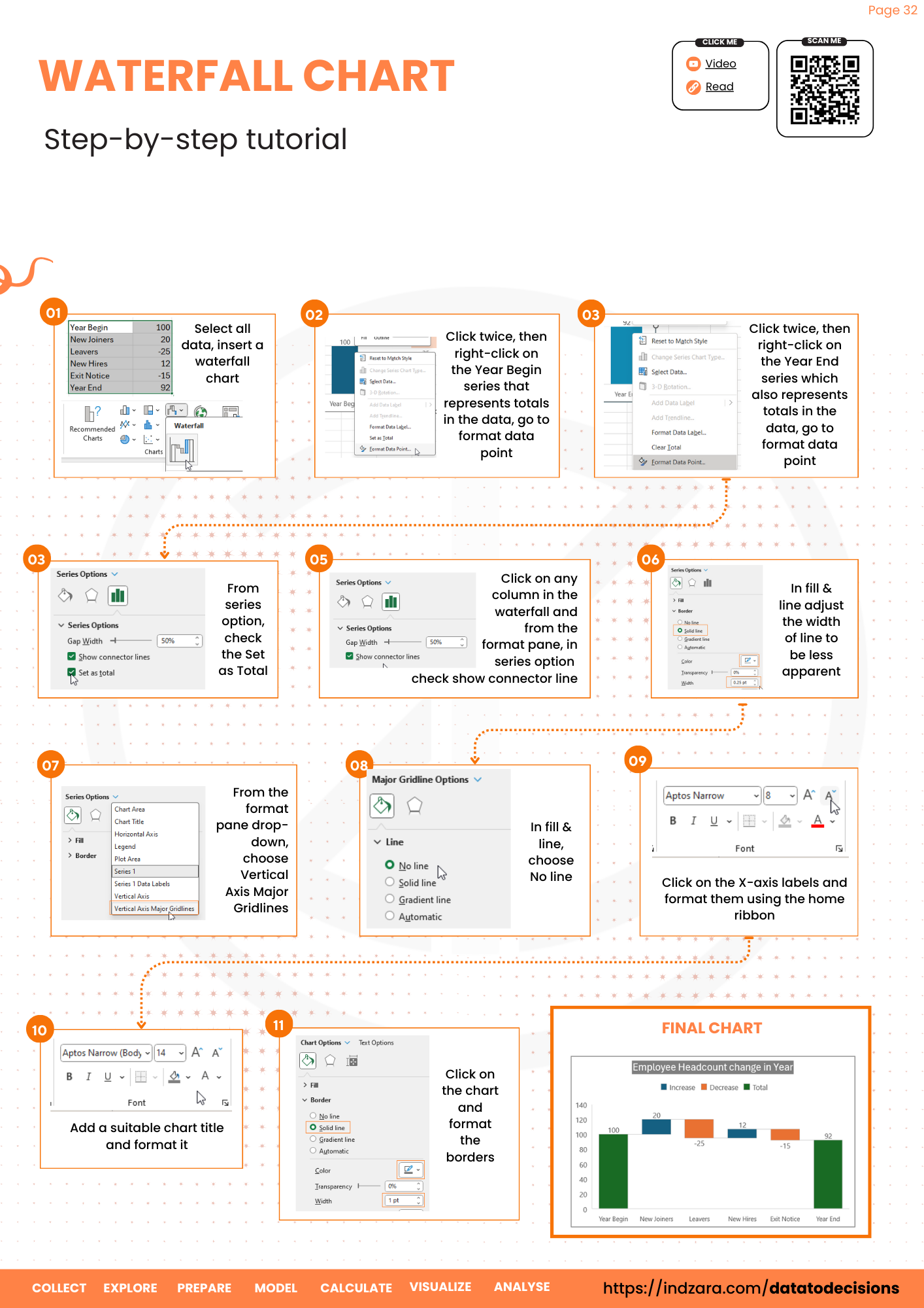
Step 01:
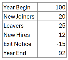
Consider the sample data of employee count from the beginning of the year to the along with the changes expected to the end of year headcount.
Select all the data and insert a Waterfall chart.
Excel inserts a default Waterfall chart based on the data.
Step 02:
Excel provides limited formatting options with respect to the Waterfall charts.
i. Click on the chart and using the “Paint Brush” icon to the top right, choose a color theme that suits your narrative of the chart.
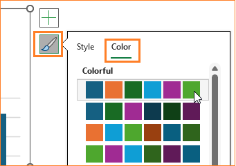
Note that the themes here depend on the Excel theme you have chosen.
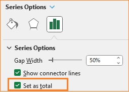
ii. Now, we need to ensure that the year beginning count and the year end count are represented as totals in the chart.
To do this, double-click on the particular Year Begin dat apoint and right-click to open the format options for that data point.
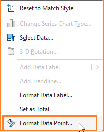
This opens the format pane, from where you can check the Set as total box.

Repeat the same for the Year End data point as well.
With this, the resulting chart is:

Step 03:
Click on any data point and ensure that the connector lines are visible under the series option:
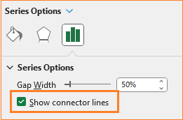
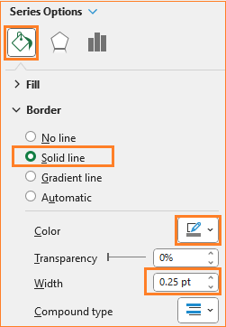
Now, go to the fill & line option to modify the line color and width as shown:

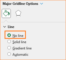
Lastly, click on the gridlines and remove them in the format pane:

With this, our waterfall chart looks something like this:
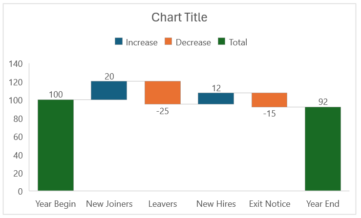
With the connector lines, the way to interpret this to see where there has been an increase and where there’s a decrease till the point where the cumulative total is reached.
Step 04:
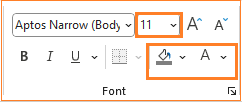
Click on the X-axis and format the size from the home ribbon. Add a title that simply summarizes the chart, say “ Employee Headcount Change in Year” and format the same using the home ribbon, as well.
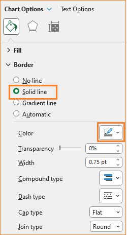
Click on the chart, and format the border and its color as shown:
At this, the Waterfall chart is ready!
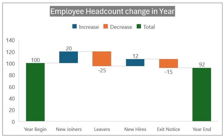
Chart – II
For the next chart, the sample data is the revenue data (in billions) from Apple Inc.
Similar to the chart above, select all the data and insert a waterfall chart. Excel, by default inserts one based on the data given.
The key difference here is that there is no total value in the beginning, but present only at the end.
i. Click on the Net income point, format the data point and check the Set as Total. (as seen in Step 02 from the previous chart style).

ii. Here too, click on the gridlines and remove them.
iii. Adjust the connector line color and width:
iv. Include a suitable title and format the chart as a whole to get the final chart!
The key take away here is that this waterfall chart depicts the breakdown of one metric and its components.
Chart – III
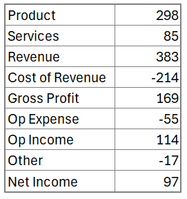
Now, consider a sample data where there are sub-total components, as shown:
Similar to the previous two styles, select the whole data and insert a waterfall chart.
The default chart Excel inserts looks like this:
Here, we have to manually change the data points that are considered totals. You know the drill by now, double click on a particular data point and right-click to format it, check the Set as total option.
Do this for Revenue, Gross profit, Op income and the Net income. With this our chart looks as shown below:
Adjust the horizontal axis size, remove gridlines and formatthe connector lines color. Here too, add a suitable title and format the chart, similar to the previous two styles.
With this, the waterfall chart that displays the subtotals clearly is ready!
Check our 1-page, downloadable illustrative guide explaining all the steps for a quick reference.
Waterfall charts are effective in communicating how large the contributors are and are these negative or positive contributors.
To explore our fast-growing collection of free Excel tutorials covering a wide array of topics, please visit https://indzara.com/datatodecisions/
If you have any feedback or suggestions, please post them in the comments below.


