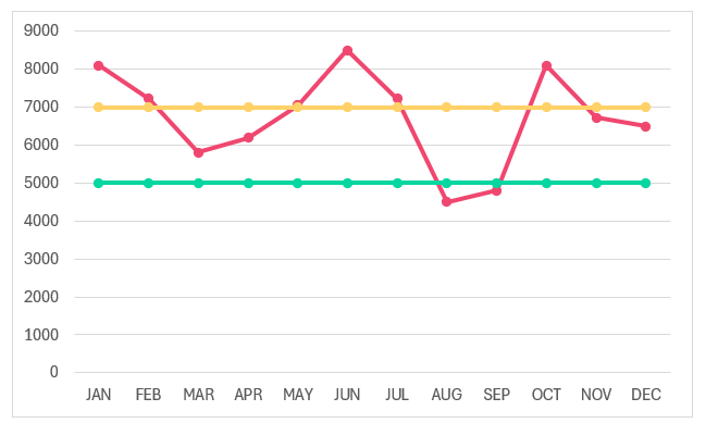
Consider a scenario where within a line chart you need to highlight values that are above or below a threshold value. This article teaches you how to create such a line chart with custom highlights (as shown in a sample screenshot below) in a few easy-to-follow steps.

Let’s get started!
Ready to save time on your next presentation? Explore our Data Visualization Toolkit featuring multiple pre-designed charts, ready to use in Excel. Buy now, create charts instantly, and save time! Click here to visit the product page.
We have created a dedicated YouTube video explaining how to create ta line chart with custom markers, check it out:
The following are the steps we’d follow in creating this chart:
- Insert a Line Chart with Markers
- Add additional columns to the data
- Add new series to the chart
- Format the chart
- Add columns to highlight above/below targets
- Add Above/Below series to chart
Step 01: Insert a Line chart with markers
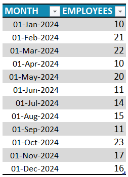
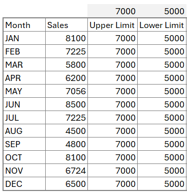
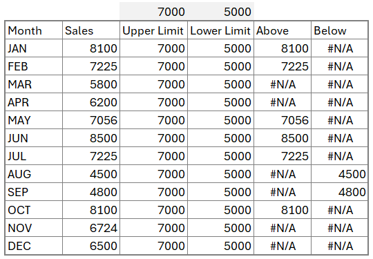
Consider a sample data of monthly sales figures:
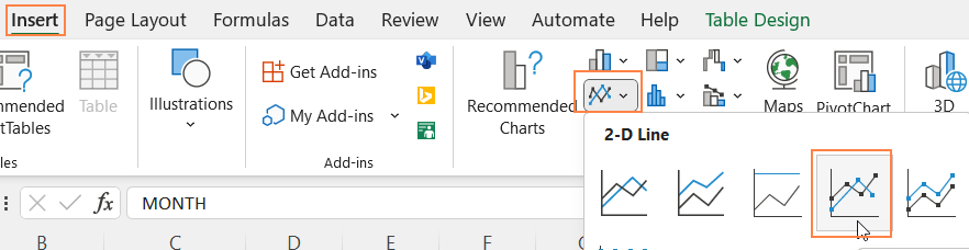
Select the whole data and (1) go to Insert and (2) Select a Line chart with markers:
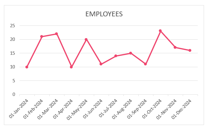
This creates a simple line chart:
Step 02: Add additional columns to the data
The aim is to highlight the markers that are above/below a target value. For this, we’ll need to add an additional series of data.
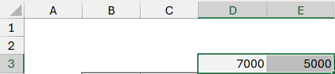
Say the upper and lower target values are in cells D3 and E3 respectively:
Let’s include an Upper Limit column next to the Sales column. This column simply contains the upper limit value (which is in cell D3)
=$D$3Similarly, add another column for Lower Limit, and the values in this would be the lower limit value (which is in cell E3)
=$E$3With these new columns, our data would be:
Step 03: Add new series to the chart
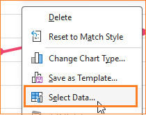
Let’s include these new series of data in our line chart. Right Click anywhere in the chart and click on Select data:
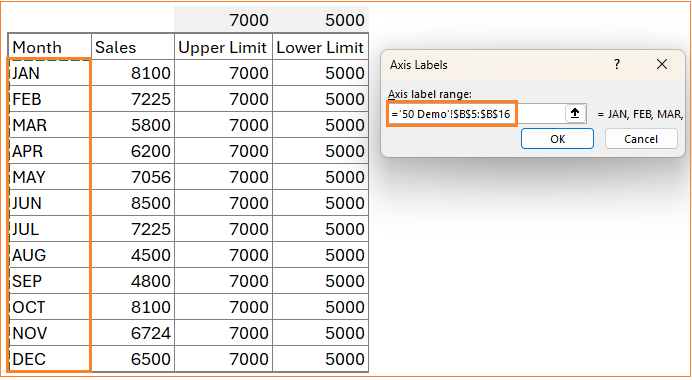
Add a new series to include the Upper Limit and include the Month column as the horizontal axis as shown:

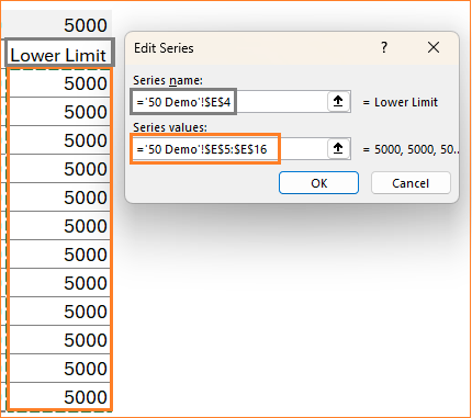
Similarly, include the Lower Limit series and the month column as the corresponding horizontal axis:
With this step, our chart looks something like this:
Step 04: Format the chart
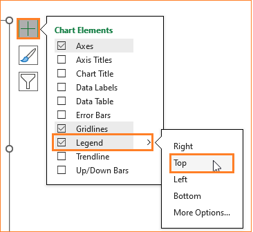
i. Let us format this line chart, firstly to identify the lines better, include a legend. Click anywhere on the chart for a “+” sign to appear, there are several chart formatting options.
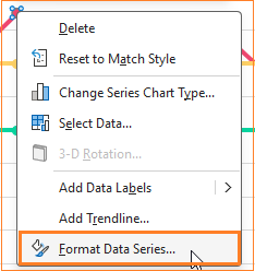
ii. Click on the Sales series and Format Data Series to format the sales line:
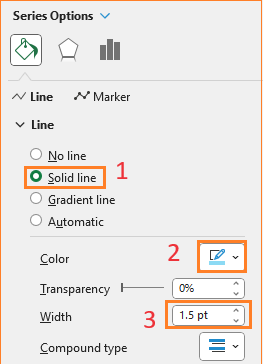
Format the line color and the width in the Fill & Line as shown:
To format the Markers, click on the MArker option and format the fill and border colors:
Explore the multiple formatting options available for charts in Excel and apply those that suit your requirements.
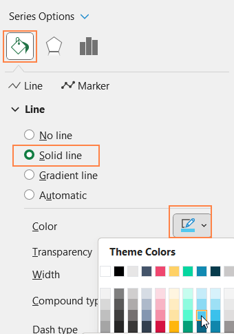
iii. The upper and lower limits are needed as a reference to denote the change in the label highlights, so format the lines with reduced width and dashed.

Since these are for reference only, remove the markers:
Similarly, format the lower limit series as well. With this, our chart looks something like this:
iv. Make the gridlines less obvious by changing the color to a lighter one (you can also remove them altogether). To get this, right-click on the guidelines and go to the Format Gridlines option.
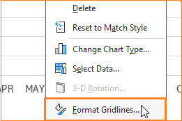
This opens up a format pane to the right, where you can change the grid line color accordingly.
v. We’ll also include a rounded border for the chart: click on the chart, under Chart Options, Fill & Line:
At the end of this step, the chart will look something like this:

Step 05: Add columns to highlight above/below targets
To highlight points above or below the limit values, we need to add new series to the chart. Let’s create these as additional columns.
First to highlight the points above the upper value, include a Above column that contains the following formula:
=IF(C5>=D5,C5,NA())This formula checks the data point and returns the value only if it is above or equal to the upper limit value.
Similarly, add a Below column with the following formula which checks and returns values only if they are lesser than the lower limit:
=IF(C5<E5,C5,NA())With this, our new data will be:
Click and drag the formula to the required cells to populate the formula.
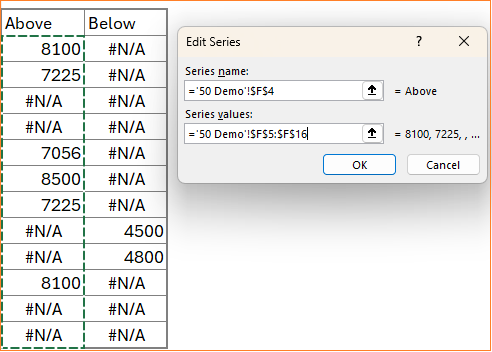
Step 06: Add Above/Below series to chart
Let us add these new series to our chart, right-click on the chart, and select data to do this.
Similar to Step 03, add the Above and Below as series and Month as the category axis:
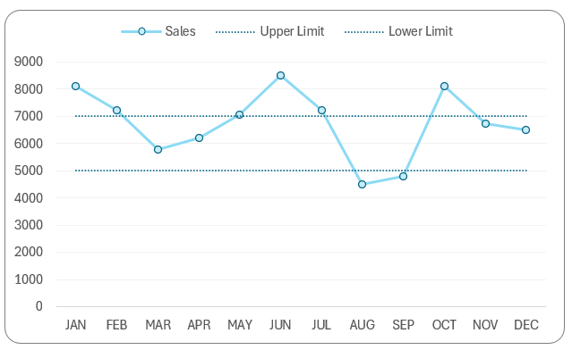
This creates a chart that looks something like this:
Step 07: Format the Above/Below series
Let’s format this chart now. In the format pane, go to the “Above Series”.
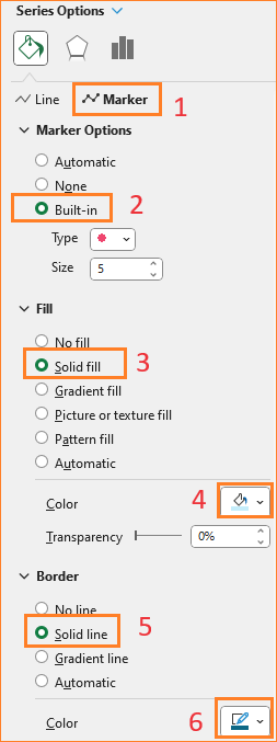
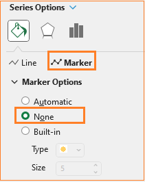
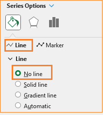
We do not need a line but just the marker that needs to be formatted to highlight only the values above the target.
Remove the line:
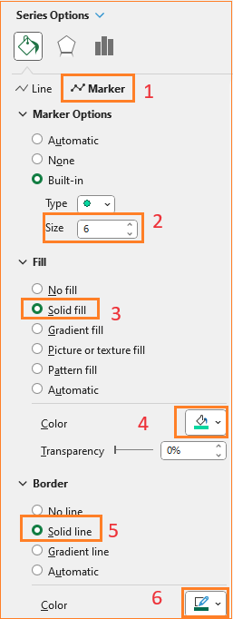
In the Markers:
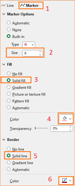
Similarly, format the Below series with suitable formatting options by removing the line and adjusting the marker settings.
That’s it!
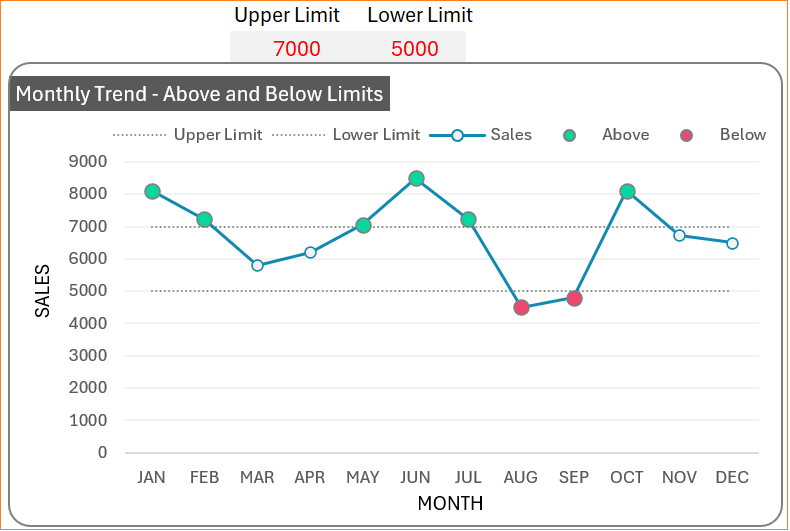
Our line chart that dynamically highlights the values above or below the lower and upper values respectively is ready.
If you have any feedback or suggestions, please post them in the comments below.


