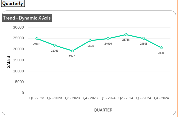
Consider the chart of sales trends by month as shown below where the X-axis can either denote Quarterly or Monthly data.
This can be built in Excel with simple steps, let’s get started!
Ready to save time on your next presentation? Explore our Data Visualization Toolkit featuring multiple pre-designed charts, ready to use in Excel. Buy now, create charts instantly, and save time! Click here to visit the product page.
We have created a YouTube video explaining these charts in detail, check it out!
The following are the steps we’d follow in creating this chart:
- Understand the data
- Include “Labels” column to chart
- Assign named ranges
- Insert a line with markers chart
- Format the chart
Step 01: Understand the data
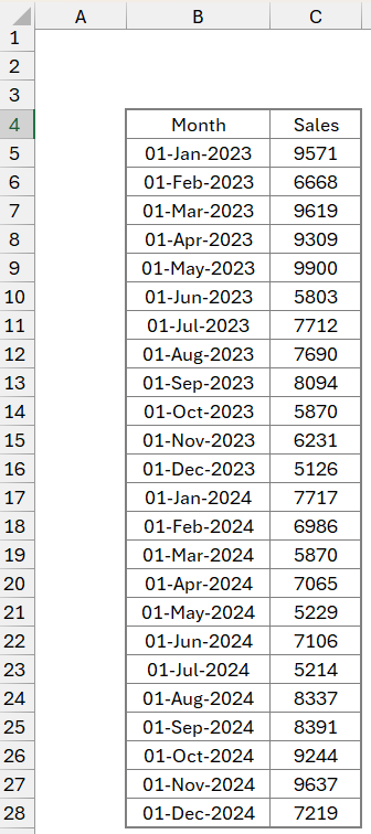
Consider a sample sales data by month as shown:
Since our chart’s horizontal axis will be based on a user selection, include a drop-down to choose either Quarterly or Monthly in cell E3 as shown:
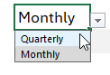
To insert a drop-down, go to the Data tab, choose Data Validation, and insert a list of the values needed.
Step 02: Include “Labels” column to chart
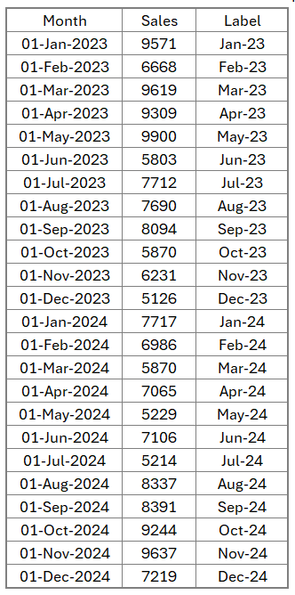
Let us include an additional column (Labels) to have labels which will be our horizontal axis labels based on the drop-down selection.
Our formula to obtain these labels will be:
=IF($E$3="Quarterly","Q" & ROUNDUP(MONTH(B5)/3,0)& " - "&YEAR(B5),TEXT(B5,"MMM-YY"))What does this formula do?
Note: Cell B5 onwards has the input month data
* Check if the input in cell E3 (the drop-down) is Quarterly or Monthly using an IF function.
* First, if it’s Quarterly we’ll require the label to have the format
“Q”-” the quarter number” – “year”
This is obtained using the ROUNDUP and MONTH functions:
“Q” & ROUNDUP(MONTH(B5)/3,0)& ” – “&YEAR(B5)
where the MONTH is used to return the month as a number from 1 to 12 (Jan through Dec), we’ll divide by 3 to get quarters, and ROUNDUP is used to round the decimals based on the second argument (in this case 0).
* If the selection is Monthly, then we’ll use a TEXT function, which returns numbers or dates in the required format based on the second argument, to get only the year:
TEXT(B5,”MMM-YY”)
With this, our new column, that will dynamically update based on selection will be:
With this data and the control from the drop-down, we have to arrive at the X-axis which will be done using a formula. Based on this, the Y-axis values can also be arrived at using some simple Excel functions.
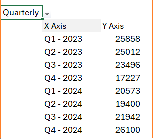
For the X-axis, use UNIQUE to get either the month or quarter as shown:
=UNIQUE(D5:D28) // cells D5 to D28 contain the labels we created.
For the Y-axis, which has to change according to the X-axis, we’ll use the SUMIF function to return sales data based on the Quarter or Month:
=SUMIF($D$5:$D$28,F5#,$C$5:$C$28)The syntax for SUMIF is:
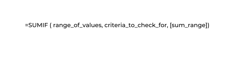
Here, our range is the labels column, the criteria will be the X-axis we just created (F5) and the sum range will be the Sales column.
Note: To make our formula dynamic based on the input range, include a “#” after the X-axis cell range, hence the second argument in the formula is F5#.
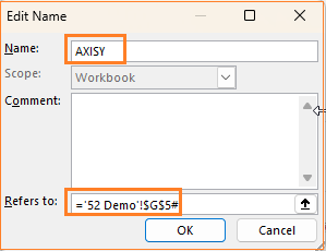
Step 03: Assign named ranges
Our data for chart creation is ready, as shown:
Please check our previous article on creating and formatting line charts where the steps to come here are explained in detail.
Since our data is dynamic, we have to assign names to these before building our chart.
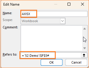
Select the cell with our X-axis data ie. F5 and go to Formulas and Define Name and
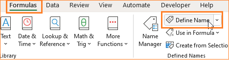
assign a name, say, AXISX:
Similarly, let’s call the Y-axis as AXISY:
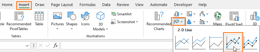
Step 04: Insert a line with markers chart
With these named ranges, we’ll create our line chart. Click anywhere outside the data and insert a 2D line chart with markers.
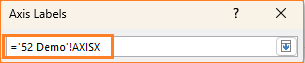
This creates an empty chart, right-click anywhere inside the chart and click on Select Data to add series and the horizontal axis as shown:
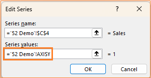
Ensure to modify the series values to include the named ranges we’ve created for each axis.
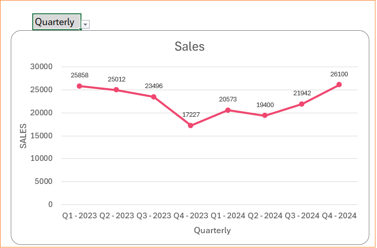
With this our dynamic, interactive line chart gets created:

Change the drop-down input to see that the X-axis will automatically change based on the input chosen.
Step 05: Format the chart
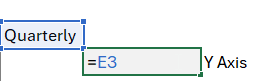
Let’s do some formatting on our chart, say since this is a dynamic chart let us modify the X-axis name based on the drop-down cell.
Modify the X-axis header cell (cell F4) like this:
Now, include axis titles as shown:
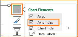
For the Y-axis change the title to SALES and the X-axis can be dynamic by pointing it to refer to the column header from our data = F4.
We can include data labels, modify the gridlines, and much more with the formatting options available in Excel, check our article on creating line charts with multiple series for the same.
Our final chart is ready for analysis!
If you have any feedback or suggestions, please post them in the comments below.


