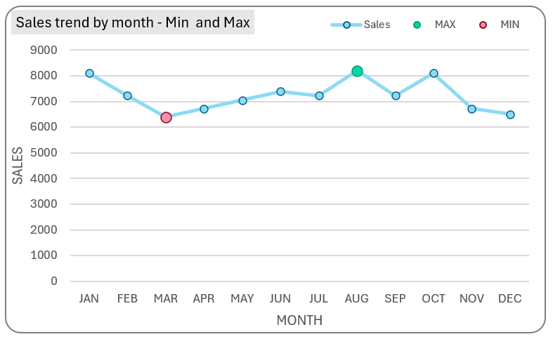
Learn to create a simple line chart with highlighted maximum and minimum points, as shown here.
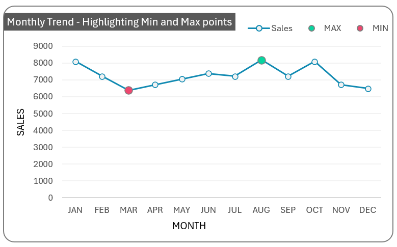
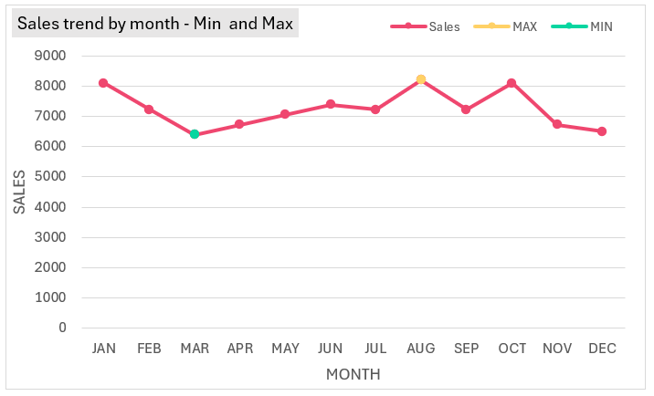
This line chart shows the monthly trends of sales data with max and min points highlighted for emphasis.
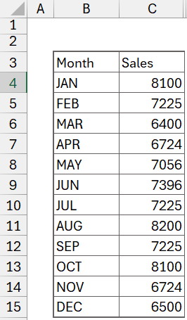
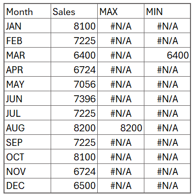
To do this, let us take a sample sales data as shown below:
Ready to save time on your next presentation? Explore our Data Visualization Toolkit featuring multiple pre-designed charts, ready to use in Excel. Buy now, create charts instantly, and save time! Click here to visit the product page.
Check our dedicated video explaining these steps in detail:
The following are the steps we’d follow in creating this chart:
- Insert a Line Chart with Markers
- Add additional columns to the data
- Add new data to the chart
- Format the chart
- Format the max/min points
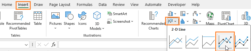
Step 01: Insert a Line chart with markers
Select the whole data and (1) go to Insert and (2) Select a Line chart with markers:
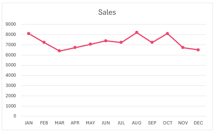
This creates a simple line chart:
Step 02: Add additional columns to the data
Our process involves adding series to this chart, specific to the minimum and maximum values.
To do this, add additional columns to the data to extract these Min and Max values.
First, to get the maximum value, use an IF function as shown below:
=IF(C4=MAX($C$4:$C$15),C4,NA())This fetches only the maximum value in the dataset and all other values as #N/A.
Similarly, to get the minimum value use an IF function:
=IF(C4=MIN($C$4:$C$15),C4,NA())Note: Drag the formula to all the necessary cells to update.
With this our additional MAX and MIN columns of data are ready.
Step 03: Add new data to the chart
Our additional series is ready, let’s add this to our existing chart. Right-click on the chart and Select Data to add this.
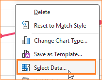
Add a New series, the Max as shown here along with the horizontal axis as the Months.
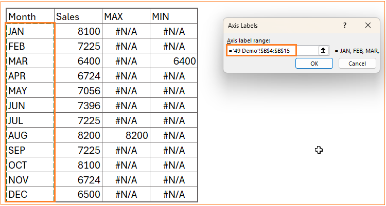
Similarly, add the Min series:
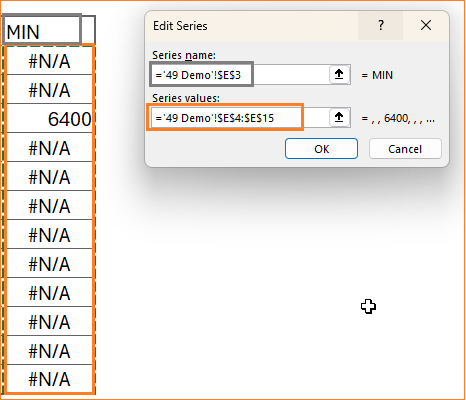
With this, our modified line chart will look like this:
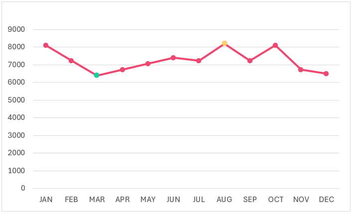
This chart is dynamic to changes in the data, try modifying the min/max values to see the chart getting updated automatically.
Step 04: Format the chart
A key part of creating a chart is to make it visually readable and appealing. Let’s apply some formatting to our chart to achieve this.
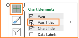
i. Include a chart title. To get this, click anywhere on the chart and then the “+” icon that appears in the top right corner.
Add a suitable name that explains the chart.
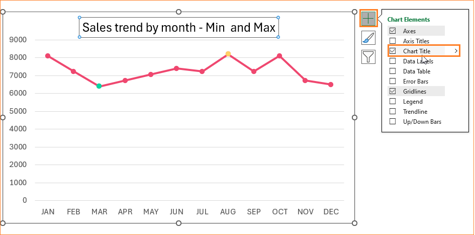
You can also format the chart title’s size, color, etc. as needed.
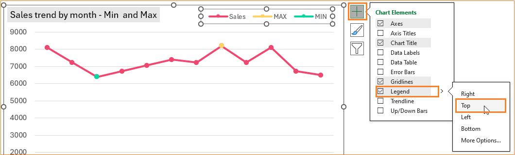
ii. Let’ ‘s add a legend to our chart to understand the series.
Move it to the top to accommodate more space in the chart.
iii. Include axis titles in our chart and give appropriate names: MONTH and SALES to the X and Y Axes respectively.
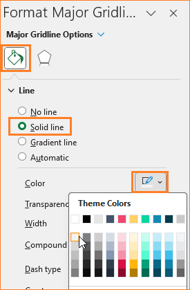
iv. Make the gridlines less obvious by changing the color to a lighter one (you can also remove them altogether). To get this, right-click on the guidelines and go to the Format Gridlines option.
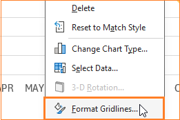
This opens up a format pane to the right, where you can change the grid line color accordingly.
At this stage, our chart looks something like this:
Step 05: Format the max/min points
Since we do not want the maximum and minimum series as a line but as points, we’ll have to format these series as well.
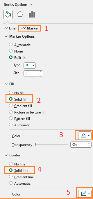
i. This can be achieved by formatting the “Markers” in these series. Click on the max series, go to the format pane, and modify the size of the marker, its fill, and border color as shown (these styling options can be modified per your requirement):
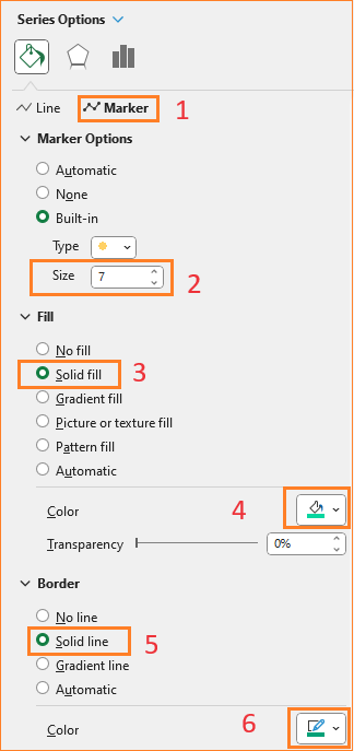
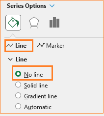
Since, this is only a point, in the Line formatting, change to No Line:
ii. In the same way, format the MIN series:
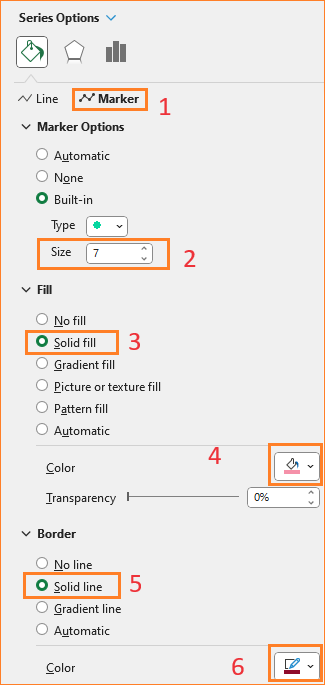
Here too, remove the line in the Line formatting since we require only the point.
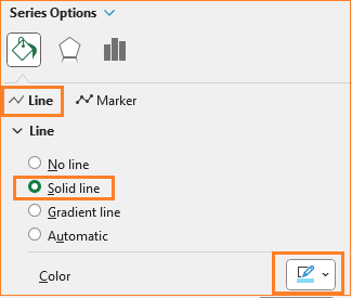
iii. Let’s format the sales series as well for better readability. Click on the Sales series and in the format pane:
Start by changing the color of the Line
We’ll also modify the markers for this series, to distinguish them from the Max/Min series: modify the fill and border color alone:
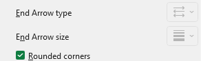
iv. We’ll also include a rounded border for the chart: click on the chart, under Chart Options, Fill & Line:
At this, we have the line chart with highlighted minimum and maximum ready for analysis:
Test the dynamic nature of this chart by modifying the minimum and maximum in your sample data.
This method of adding a series and including a formula to bring in specific data points can be extended to multiple scenarios where specific points are to be highlighted.
If you have any feedback or suggestions, please post them in the comments below.


