This article walks you through simple steps to create a dynamic, interactive line chart that can highlight only one chosen series at a time. (A sample screenshot attached)
Ready to save time on your next presentation? Explore our Data Visualization Toolkit featuring multiple pre-designed charts, ready to use in Excel. Buy now, create charts instantly, and save time! Click here to visit the product page.
Let’s get started!
Check our YouTube video on this here:
The following are the steps we’d follow in creating this chart:
- Insert a 2D line chart
- Add a drop-down to choose series
- Format the chart
- Add highlight series to the chart
- Format the highlight line
- Format the highlighted series legend
Step 01: Insert a 2D line chart
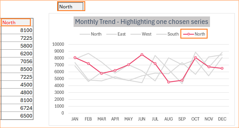
To build this chart, consider sample sales data across months for a year for four different regions.
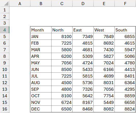
Select all the data, and insert a 2D line chart:
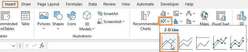
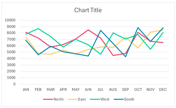
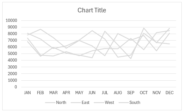
This creates a 2D line chart with multiple lines like this:
Step 02: Add a drop-down to choose series
To highlight a user-chosen series, we need to add another series (one that’s chosen) and a drop-down for the input.
Let the additional series be called Highlighted. In an empty cell (say cell I2), include a drop-down as shown:
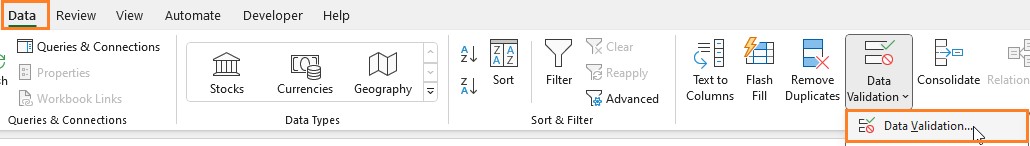
Choose a list and the source will be the column headers in our data:
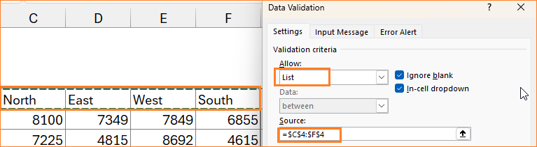
Highlight the input cell to differentiate easily and the created drop-down looks like this:

In our highlighted column, based on the input from the drop-down, the values from the corresponding series have to be updated.
This can be easily achieved by using a simple SWITCH function.
=SWITCH($I$2,"North",C5,"East",D5,"West",E5,"South",F5)This creates our additional series:
Drag the formula to all the required cells to populate the same.
Step 03: Format the chart
Let’s format our existing chart before adding the additional series created in the previous step.
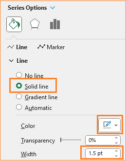
Open the format pane and do the following for each of the series:
To make the lines lighter in comparison to the highlighted series that we’ll include in the next step, format the four series with a lighter color and lesser width as shown:
Apply the same steps for all four series, this our chart looks like this:
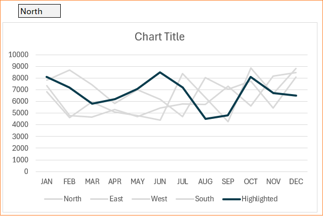
Step 04: Add highlight series to the chart
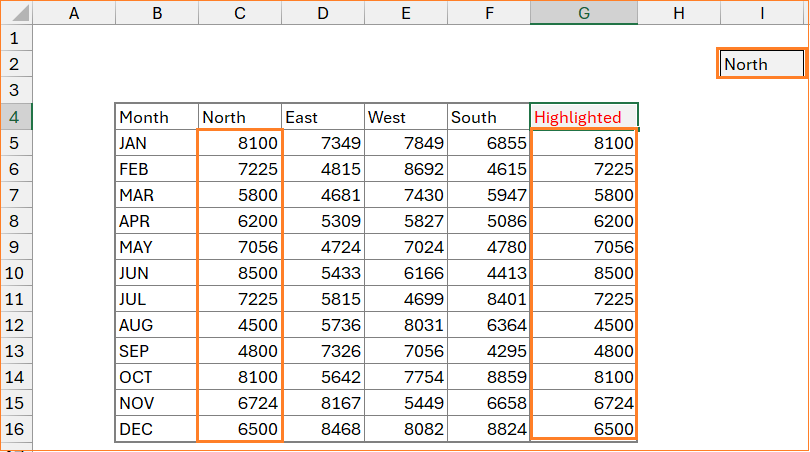
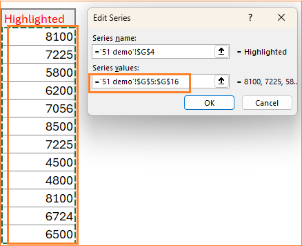
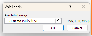
It’s time to include our highlighted series. (1) Right-click on the chart, (2) go to Select data and add the series and the horizontal axis as shown below:
With this, our chart with the additional highlighted series looks like this:
Step 05: Format the highlight line
Format this new series to achieve the desired chart. Since this is a highlight, let’s modify the color accordingly.
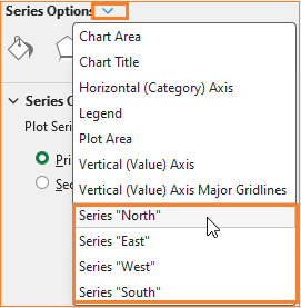
(To open the format pane, right-click on the series and click Format Data Series)
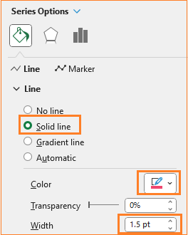
To differentiate this further, add markers as shown below:
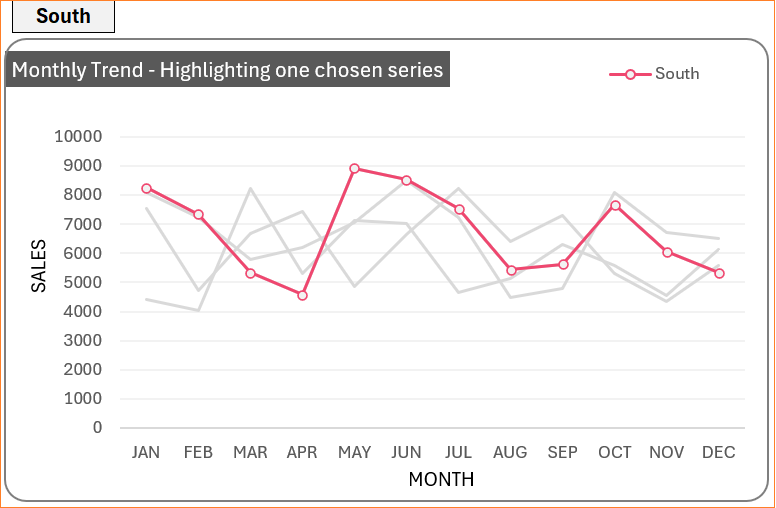
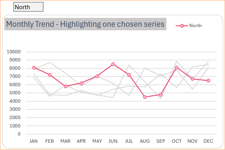
With this, our interactive line chart with highlights looks as shown below:
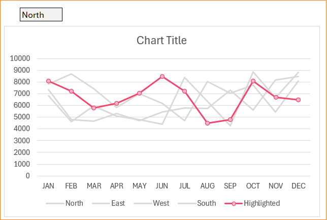
With a change in the drop-down, the chart highlights the chosen series only.
Step 06: Format the highlighted series legend
Lastly, let’s move the legend to the top and make it dynamic, to do this let’s understand that the value “Highlighted” is chosen from the headers of our data. Modifying this to point to the drop-down will ensure that the legend is also updated automatically.
So in cell G4, instead of “Highlighted”, include
=I2 (to point to drop-down).
With this, our chart is almost ready:
Since the focus is only on the highlighted line, remove all other legends by clicking on them individually and deleting them. With this, we have our interactive line chart with one highlighted line ready for analysis and as a great addition to your dashboards.
Do check our blog on creating multiple series line chart with detailed explanations of various chart formatting options.
If you have any feedback or suggestions, please post them in the comments below.


