What is a line chart?
A line chart is a type of chart used to display information as a series of data points called ‘markers’ connected by straight lines.
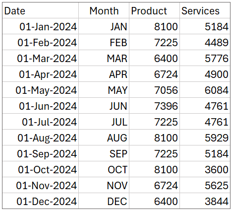
To build a line chart with multiple series, let’s take sample data of revenue by products and services for a year as shown:
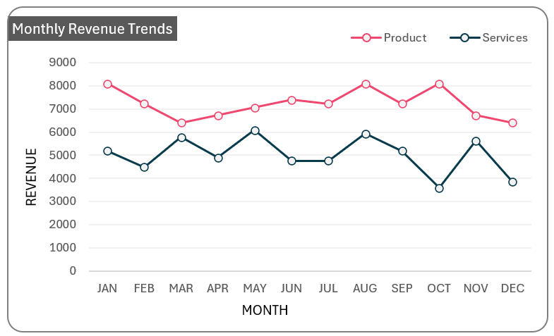
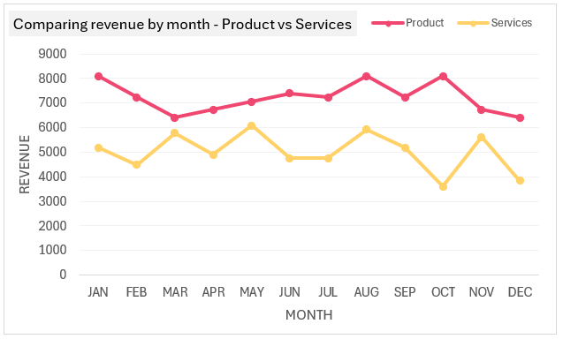
With this data, a line chart (as shown below) can show us how these revenues have trended over the months.
Ready to save time on your next presentation? Explore our Data Visualization Toolkit featuring multiple pre-designed charts, ready to use in Excel. Buy now, create charts instantly, and save time! Click here to visit the product page.
Check our detailed video here:
Let’s build our simple line chart for multiple series!
The following are the steps we’d follow in creating this chart:
- Insert a Line Chart with Markers
- Format the chart – Title & Legends
- Format the chart – Axes titles, gridlines & axis bounds
- Format the lines
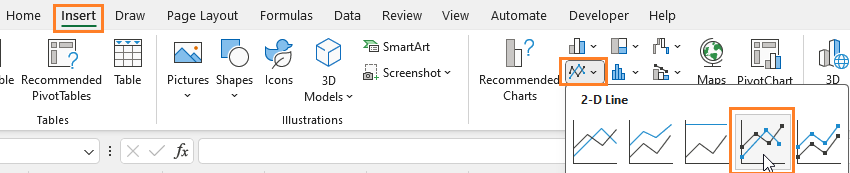
Step 01: Insert a Line Chart with Markers
For now, consider using the Month, Product, and Servies columns only. To insert a chart, click anywhere outside the data (1) Go to Insert and (2) Select a 2D Line Chart with Markers as shown:
This creates an empty chart (since we haven’t added any data yet).
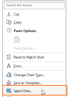
To add data, right-click anywhere inside the empty chart and Select Data.
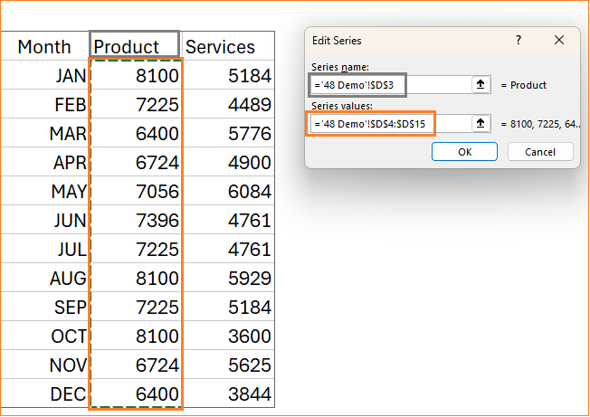
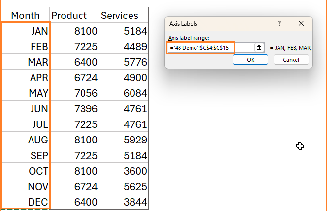
This prompts us to add the series, include the Product data with the horizontal axis as the month column:
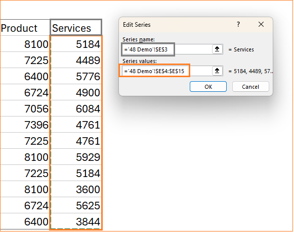
Similarly for the Services data, include the series and the axis labels:
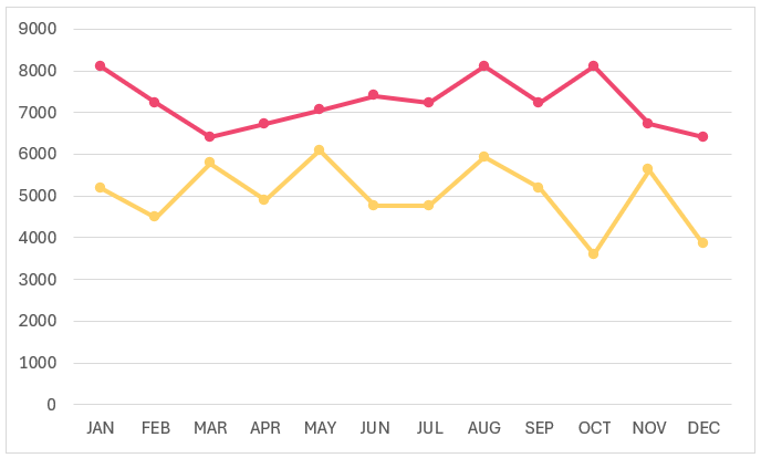
With this, our basic line chart with two series gets created.
Step 02a: Format the chart – Title & Legends
The key to presenting a great visualization is dependent on the formatting that’s applied to make it visually appealing. With our line chart from step 01, let’s look at some formatting options and how to apply them.
Click anywhere on the chart and a “+” symbol appears in the top right corner, this shows a lot of formatting options that can be applied.
i. First, let’s include a chart title as “Comparing revenue by month – Product vs Services“:
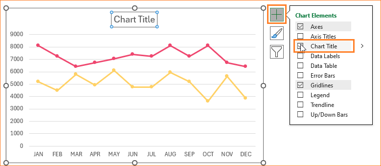
Note: The title can be formatted to the required size, color, or background as needed.
ii. Since we have two series, it is ideal to include a legend to identify them.
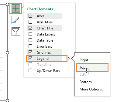
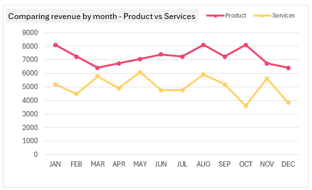
To gain more area for the chart, position the legends to the top (similar to the title, we can adjust the size, fonts, etc., of the legend as well). With these changes, this is our chart at this stage:
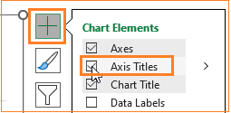
Step 02b: Format the chart – Axes titles, gridlines & axis bounds
i. For better interpretation, include the X and Y axes and assign proper names to these.
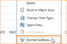
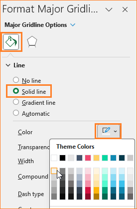
ii. Make the gridlines less obvious by changing the color to a lighter one (you can also remove them altogether). To get this, right-click on the guidelines and go to the Format Gridlines option.
This opens up a format pane to the right, where you can change the grid line color accordingly.
Note:
While using line charts, it is recommended to ensure the Y-Axis minimum value is at zero. To do this, right-click on the Y axis and go to Format Axis to open the formatting pane.
By default, Excel gets the minimum and maximum bounds from the data used in the chart.
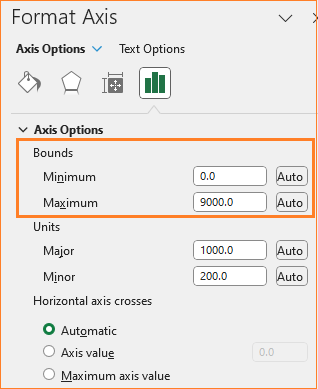
Modify the minimum value by hardcoding zero.
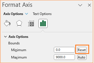
Now, how do you identify the difference if the value is already set to zero by Excel?
Once after hardcoding the value, next to the value, the “Auto” option changes to “Reset” as shown here:
After hardcoding the value, check the same by modifying the values in your sample data.
This is our line chart at this stage:
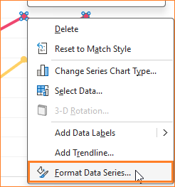
Step 03: Format the lines
i. Let’s get to the line formatting options.
Right-click on one series, and go to Format Data Series.
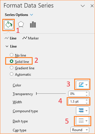
In the format pane, go to the Fill & Line option to format the lines: let’s make this a solid line and change the line color, width, and the Dash type as shown below: (there are numerous ways to do this, explore the format pane to identify what works for you)
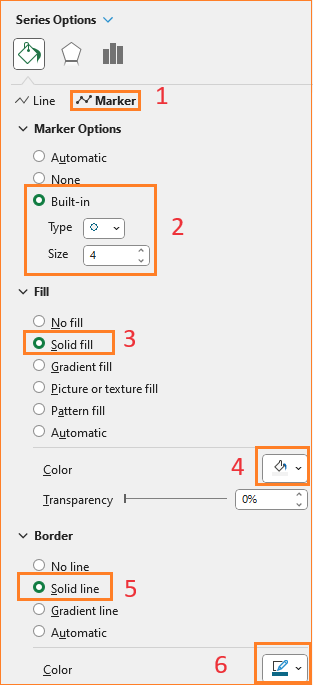
ii. This formats the line, for the marker, click on the Makrer option in Fill & Line. This opens up a host of options to modify the marker shape, size, color, fill, border, etc.
Let’s modify the size, color fill, and border.
In the same way, let’s format the second series keeping the line as a solid line instead of a dashed line.
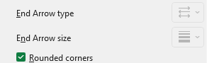
iii. We’ll also include a rounded border for the chart: click on the chart, under chart Options, Fill & Line:
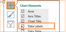
iv. Lastly, include data labels, you know the drill, click on the chart and the “+” to include them.
Adjust the font size and color to your liking.
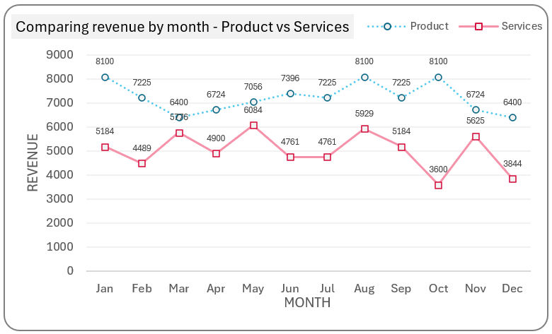
After this, the formatted multiple-series line chart looks like this:
At the beginning of the article, we had another date column in the sample data that we haven’t used in our analysis here.
If we consider that date column as our X-axis, the chart will be:
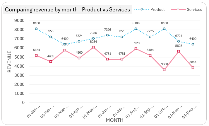
This shows that Excel automatically identifies this as Dates which is a continuous series of data. That is, the line chart will automatically adjust to plot from January through December irrespective of the order of input.
Step 06: Recommendations
A recommendation with multiple-series line charts is to have distinct colors with different line shades (solid, dotted, dashed, etc.) and different marker options. This way the chart is easy to read and interpret.
It is not recommend using shades of the same color for multiple series line chart, as this makes the chart unreadable with too many lines in almost similar colors.
Similarly, With data labels, with too many data points, adding labels will make the chart difficult to read.
Do check our video on creating multiple series line chart with detailed explanations on various chart formatting options.
If you have any feedback or suggestions, please post them in the comments below.


