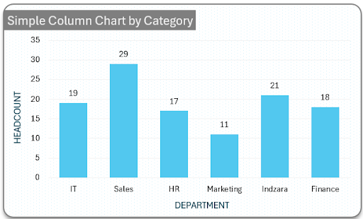
The key use of a column chart is to show comparisons among different items, or over time. Each column represents a different item or category, and the column’s height shows the item’s value or size (measure). It’s a visual way to see differences or changes easily.
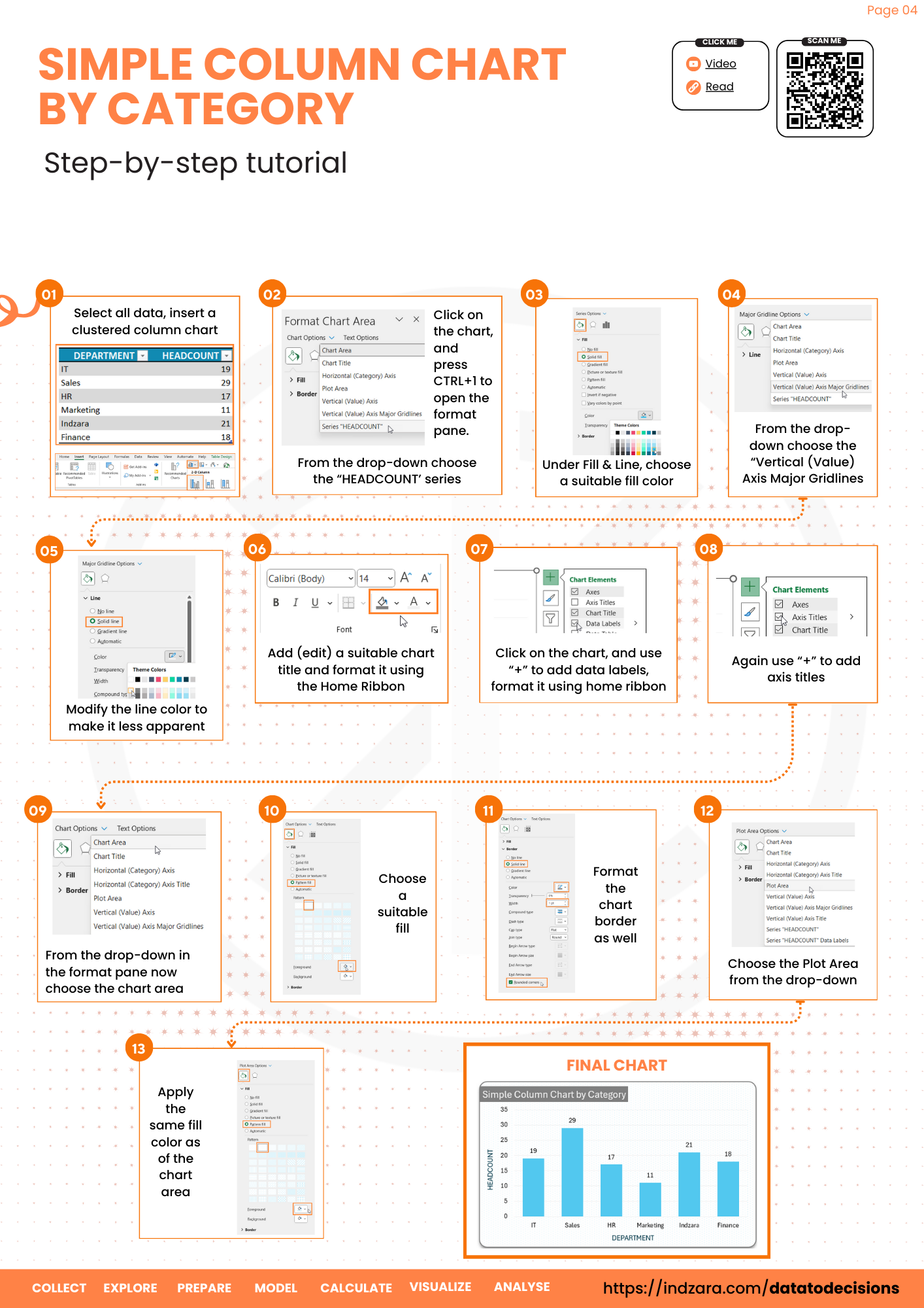
This post shows the simple steps required to create a column chart for categorical data. Consider a sample dataset of multiple departments in an organization with the respective headcount as shown:
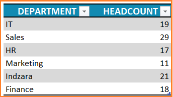

This data, when represented using a column chart is a quick and easy way to identify which column or department has the highest headcount rather than looking at the data as it is.


Ready to save time on your next presentation? Explore our Data Visualization Toolkit featuring multiple pre-designed charts, ready to use in Excel. Buy now, create charts instantly, and save time! Click here to visit the product page.
Let’s learn the steps required to build a column chart and apply some simple formatting steps to make this an effective visual.
Ready to save time on your next presentation? Explore our Data Visualization Toolkit featuring multiple pre-designed charts, ready to use in Excel. Buy now, create charts instantly, and save time! Click here to visit the product page.
Step 01: Create Chart
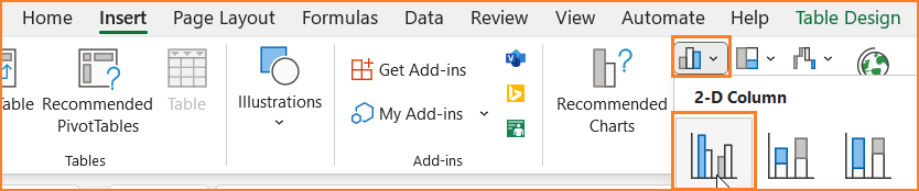
Select the data (both the category series and the value series) and go to Insert, then insert a Clustered Column Chart.
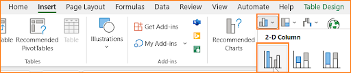
This inserts a simple column chart as shown:


Please note that the colors may vary based on the theme of colors in your Excel sheet.
Step 02: Formatting the Column Chart
While the previous step creates a column chart, let us look at some of the formatting that is available in Excel for a visually appealing and effective chart.
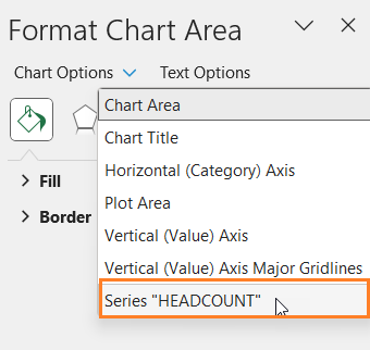
i. Click anywhere on the chart, and press CTRL+1 to open the format pane.
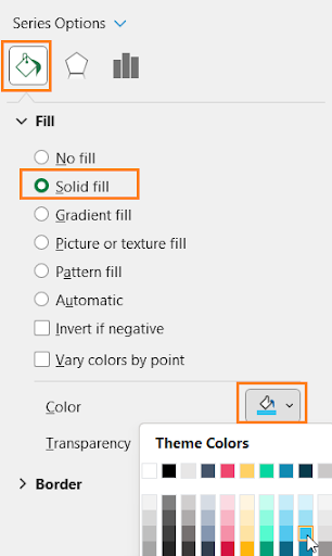
ii. Here, from the drop-down choose the “HEADCOUNT’ series.

iii. Under Fill & Line, choose a fill color for the columns to match the report where this chart might go.

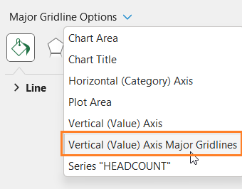
iv. Again, from the drop-down choose the “Vertical (Value) Axis Major Gridlines” and modify the line color to make it less apparent.

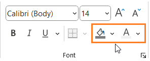
v. Add a suitable chart title and format it using the Home Ribbon as shown:

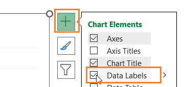
vi. Click on the chart, and use “+” to add data labels and format it using the Home Ribbon.

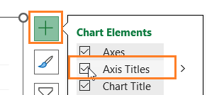
vii. Again, click on the “+” to add the Axis titles, add suitable titles (as and if needed). Format them if needed using the options in the Home Ribbon.

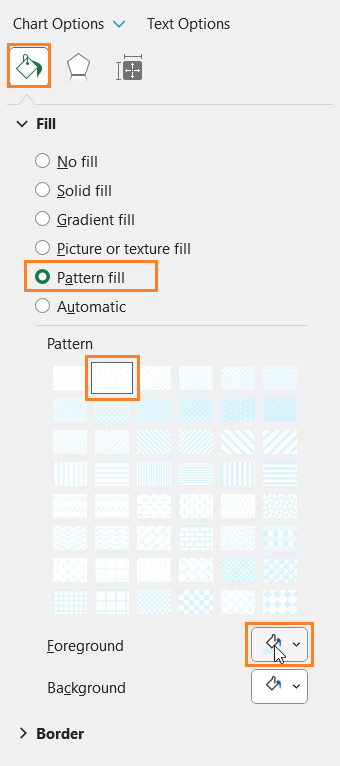
viii. From the drop-down in the format pane now choose the chart area. Now, choose a suitable fill, here I have chosen a pattern fill with a color that goes with my theme and one that doesn’t overpower the chart.

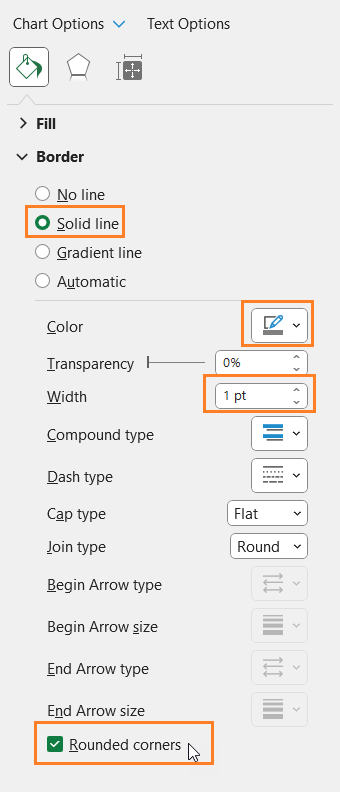
Also, format the chart border as shown:

ix. Choose the Plot Area from the drop-down and apply the same fill color as in the previous step.

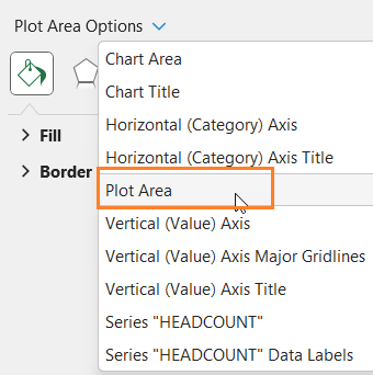
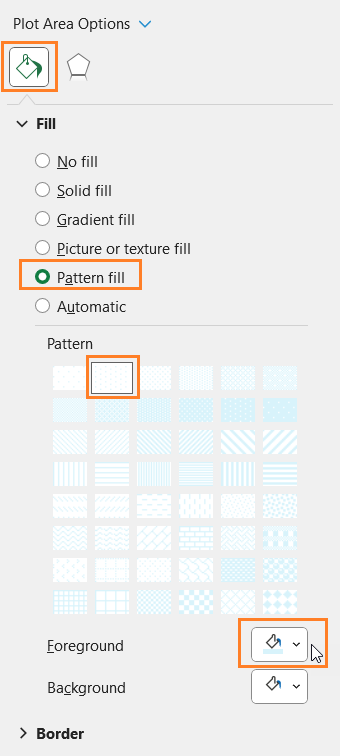

Please note that this is a design preference, you can choose to apply chart and plot area colors as per your preference.
With this, your simple column chart for categorical data is ready to be added to your reports or presentations and for further analysis.
Check our 1-page, downloadable illustrative guide explaining all the steps for a quick reference.
If you have any feedback or suggestions, please post them in the comments below.


