The primary purpose of a column chart is to illustrate comparisons between various items (categories) or across different periods. This visual representation facilitates a quick comparison of the metrics across time.
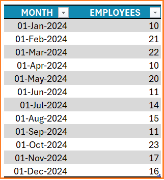
Consider a sample dataset of the headcount of an organization by month for the year 2024 as shown:

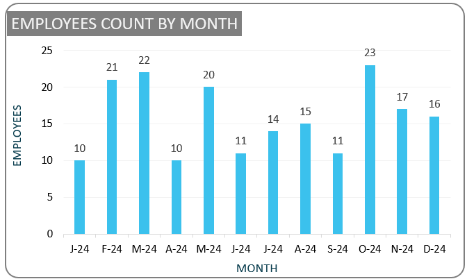
When this data is visualized using a simple column chart, it becomes easier to identify any pattern or trend across months when used in the analysis.
Ready to save time on your next presentation? Explore our Data Visualization Toolkit featuring multiple pre-designed charts, ready to use in Excel. Buy now, create charts instantly, and save time! Click here to visit the product page.
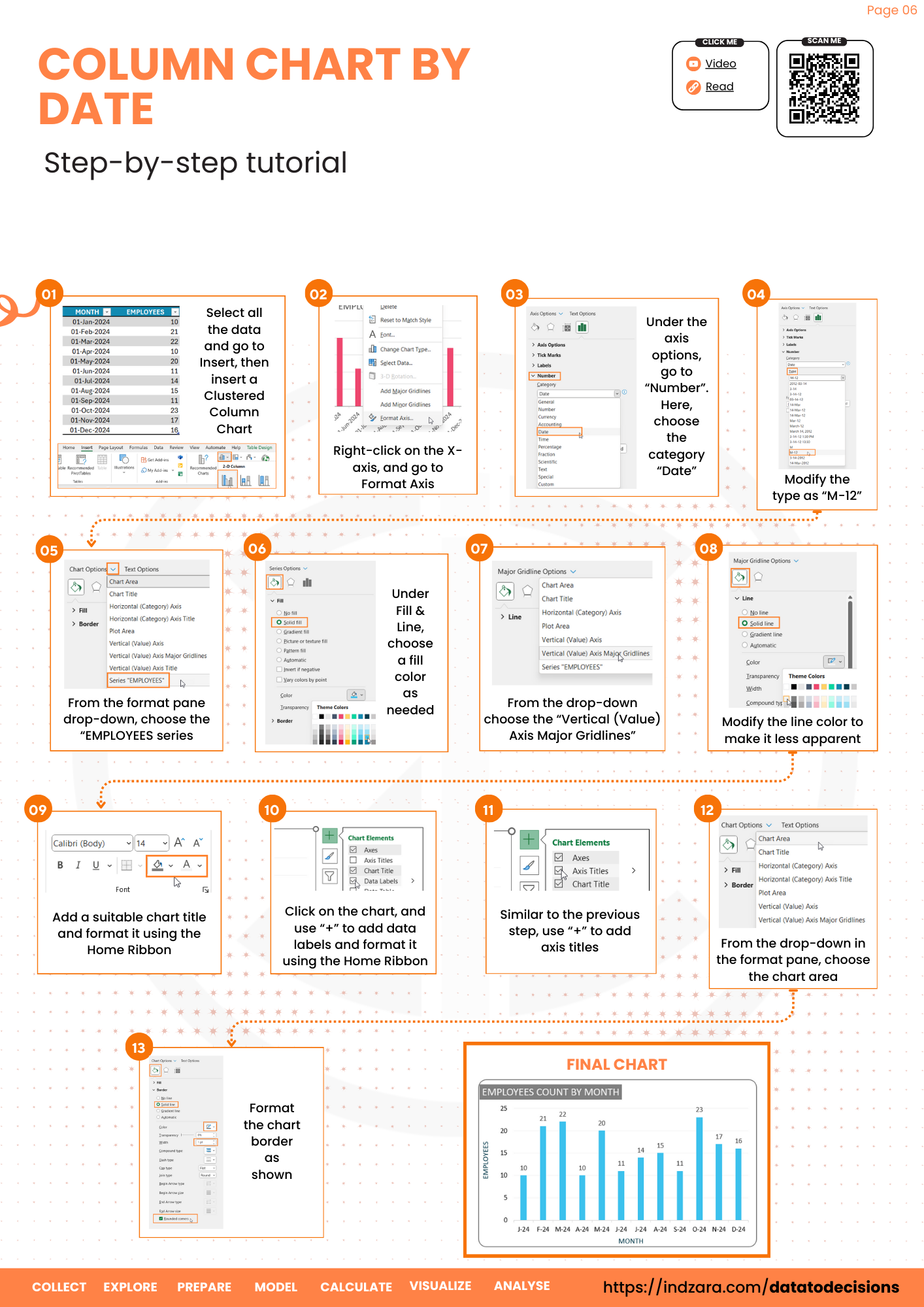
Step 01: Create Chart
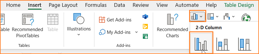
Select the data (both the time series and the value) and go to Insert, then insert a Clustered Column Chart.

This inserts a simple column chart as shown:
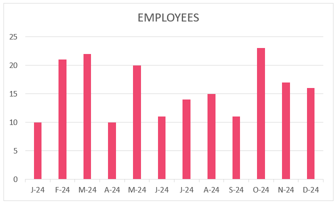

Please note that the colors may vary based on the theme of colors in your Excel sheet.
Step 02: Format the Horizontal Axis
While the previous step creates a column chart, let us look at some of the formatting that is available in Excel for a visually appealing and effective chart.
Let’s first look at the various options available for formatting the X-axis in Excel.
Say, for a chart that shows all 12 months of a year, I prefer the axis labels not to occupy much space while being rightly identifiable. This can be done easily in Excel:
i. Right-click on the X-axis, and go to Format Axis.

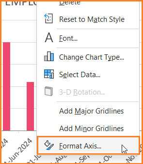
ii. Under the axis options, go to “Number”. Here, choose the category “Date”
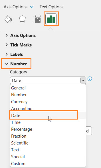
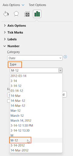

and the Type as follows:

This modifies the X-axis as shown below, we can notice that the labels do not occupy much space on the chart as a whole.


Step 03: Format the Column Chart
Now, let’s shift our focus to format the chart as a whole.
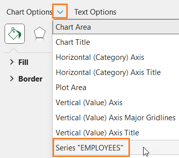
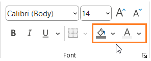
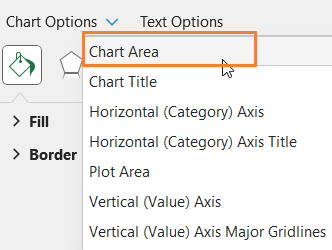
i. From the format pane drop-down to the right, choose the “EMPLOYEES series.

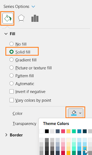
ii. Under Fill & Line, choose a fill color for the columns to match the report where this chart might go.

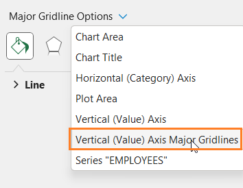
iii. Again, from the drop-down choose the “Vertical (Value) Axis Major Gridlines” and modify the line color to make it less apparent.

iv. Add a suitable chart title and format it using the Home Ribbon as shown:

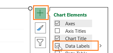
v. Click on the chart, and use “+” to add data labels and format it using the Home Ribbon.

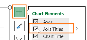
vi. Again, click on the “+” to add the Axis titles, add suitable titles (as and if needed). Format them if needed using the options in the Home Ribbon.

vii. From the drop-down in the format pane now choose the chart area

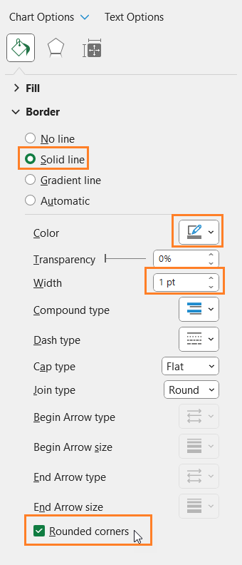
viii. Format the chart border as shown:

With this, your simple column chart for time series data is ready to be added to your reports or presentations and for further analysis.

Check our 1-page, downloadable illustrative guide explaining all the steps for a quick reference.
If you have any feedback or suggestions, please post them in the comments below.


