Sales Report Excel Template – Top 10 & Bottom 10 Products by Sales
This Sales Report Excel template is designed to help identify the best and worst performing products easily. Enter your sales data and instantly identify the top selling products. Compare Week over Week, Month over Month and Year over Year.
If you are a business owner, you can find which products are selling the most (Top 10 products) so that you can continue to have more of them in stock and promote them. By knowing which products are in the ‘Bottom 10’, you can either stop purchasing more of them or find innovative ways to promote them to your customers.
If you are a data analyst in a company, it is quite likely that you have had the need to analyze product sales from this perspective. Just download this template, paste your data and see the top 10 and bottom products by sales instantly.
FEATURES OF SALES REPORT
- Automated report with a lot of customization options
- Easy to use – Just 2 quick steps to enter data
- Customize date parameters (Month, Week, Day, Custom) of the report
- Compare a period’s sales versus previous period or previous year or custom dates
- Choose to sort by Sales, Change in Sales Amount or % Change in Sales
- Control the thresholds for alerts
DOWNLOAD SALES REPORT
VIDEO DEMO
HOW TO ENTER DATA IN SALES REPORT TEMPLATE
With all the templates published on indzara.com, the goal is to have a simple and effective solution to a problem. Keeping up with the same theme, this template is very simple to use. Just 2 steps.
STEP 1: Enter a list of products in HOME sheet. (If you are new to Excel tables, please see article on how to enter data in Excel tables).
STEP 2: Enter Sales data in SALES_DATA sheet.
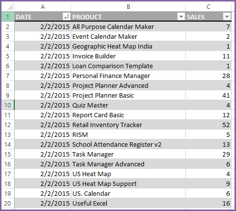
There are only three columns of data. DATE of sale, PRODUCT sold and Quantity or Amount of SALES. You can just paste this data (in the same order of columns).
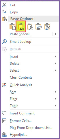
Tip: Generally, it is recommended to paste special as values.
Click on cell A2. Right Click and choose the Values shortcut.
That’s it. We are ready to see the report. How easy is that? 🙂
The report is a single page but it is packed with options to customize.
On the left of the sheet, we have user control options. There are three components (Date parameters, Sort Metric and Thresholds).
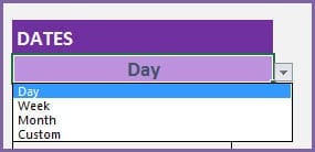
CHOOSE DATE PARAMETERS
First is the ‘Date Parameters’. Using the date parameters, we can inform the template for the date range for which we want to see the sales report for. We can choose to view from a Monthly/Weekly/Daily perspective or choose Custom to enter custom dates.
Let’s look at each of the options.
Day
When we choose Day, we see the following options for date parameters.
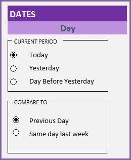
We can choose Today or Yesterday or Day Before Yesterday. The template will then calculate the sales for that specific day. It can automatically determine today’s date from our computers and use in calculations.
We can also set comparison periods. In this template, we can not only calculate sales for a specific date range, we can also compare with another period easily. For example, we can compare today’s sales with ‘Previous Day’ or ‘Same Day Last week’. You may have seen something similar in Google Analytics.
It is better to compare this Monday’s sales with Last Monday’s, instead of Sunday (as sales patterns for most businesses vary over the weekend).
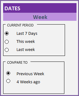
Week
When we choose Week, we have the options for ‘Last 7 days’, ‘This Week’ or ‘Last week’. We can set comparison period as ‘Previous Week’ or ‘4 Weeks ago’.
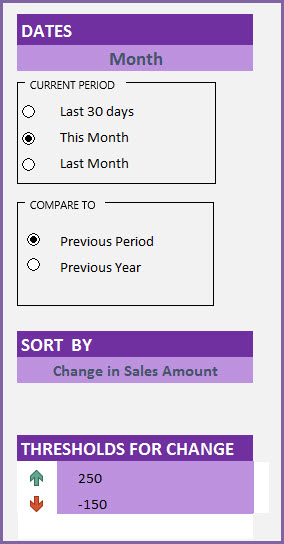
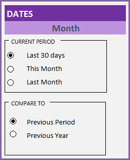
Month
Month option works similar to Week. If we choose Month, we have the options for ‘Last 30 days’, ‘This Month’ or ‘Last Month’. We can set comparison period as ‘Previous Week’ or ‘4 Weeks ago’.
Custom
We also have the option of ‘Custom’ where we can enter any date range for current period and any date range for Comparison period.
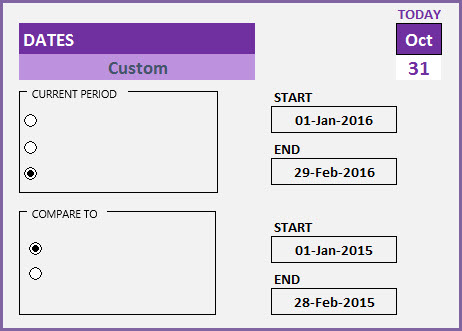
We can use this to do Year over Year, or Quarter over Quarter comparison.
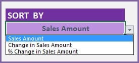
CHOOSE METRIC
After we set the ‘Date Parameters’, we can decide which sales metric we want to use on the report. The three options are ‘Sales Amount’, ‘Change in Sales Amount’ and ‘% Change in Sales Amount’.
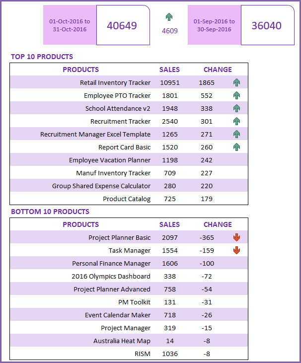
METRIC 1: SALES AMOUNT
When we choose Sales Amount, the report would appear like this.
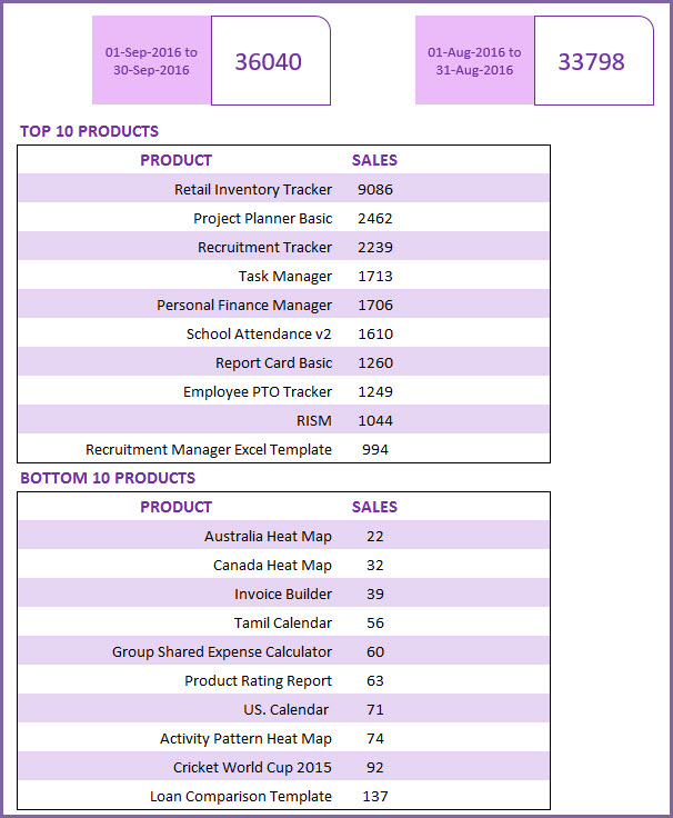
The header section has the total sales for the current period and comparison period.
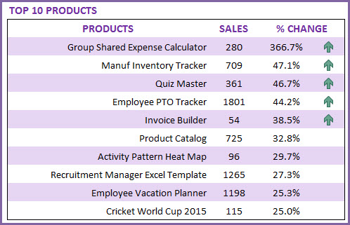
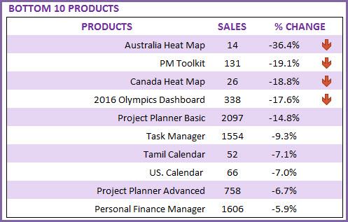
The Top 10 Products table will list the top 10 products by Sales in the Current period. Comparison period does not matter in this setting. Similarly, the bottom 10 products table will list the products with the least sales amount.
METRIC 2: CHANGE IN SALES AMOUNT
If we choose metric as ‘Change in Sales Amount’, the report will show the products which had the top 10 sales increases from the comparison period to the current period, and the top 10 sales declines.
We can also set thresholds for change.
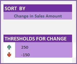
In the image above, we have set thresholds of 250 and -150. Let’s see how it works.
In the report, the Top 10 Products table shows the products which had the top 10 sales increases from the comparison period to the current period.
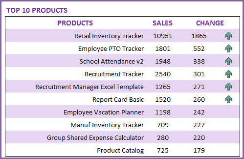
The top 10 products with increases in sales by 250 or greater display a green upward arrow.
The Bottom 10 Products table shows the products which had the lowest sales increases (or highest declines) from the comparison period to the current period.
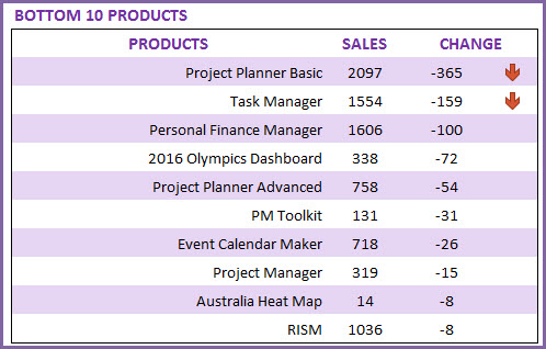
Products with decline in sales amount of 150 or greater will have a red downward arrow.
METRIC 3: % CHANGE IN SALES AMOUNT
Similarly, we can also use a metric of ‘% Change in Sales Amount’.
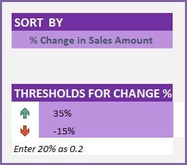
Now, when we set thresholds, we have to enter % values and we do that by entering decimal values. For example, we can enter 20% as 0.2 and -15% as -0.15.
In the report, the Top 10 Products table shows the products which had the top 10 sales increases (as %) from the comparison period to the current period.
The products with increases in sales by 35% or greater display a green upward arrow.
The Bottom 10 Products table shows the 10 products which had the lowest sales increases (as %) from the comparison period to the current period.
The products with decline in sales by 15% or greater display a red downward arrow.
HOW TO EXTEND THE SALES REPORT TEMPLATE
How to expand to more than 100 products
There is no limit on size of the sales data set. The larger the data set, when we change the settings, Excel might think for a few seconds before refreshing the report.
However, the template is set up to handle 100 products in order to keep the file small and fast. If you have more than 100 products, you can follow the steps below.
Right Click on any sheet name and choose Unhide.
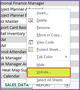
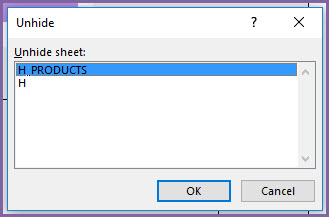
Choose H_PRODUCTS sheet to unhide.
Now in the H_PRODUCTS sheet, go to cell E102.
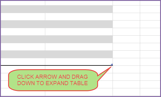
- First, click outside the table. For example, click in cell F105.
- Then, click the little arrow in cell E102 and drag down to expand the table to more products (as many as you need).
- The report will now reflect more than 100 products. Easy.
CHANGING TODAY
The template calculates TODAY’s date using a formula and then uses that date in calculations such as ‘Today’, ‘This Week’, ‘Last 7 Days’, ‘Last Week’, ‘Last 30 Days’, ‘This Month’ and ‘Last Month’.
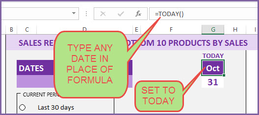
If there is a need to create a report that is a snapshot of the past (how the report would have looked if we had exported on any date in the past), we can easily do that by replacing the formula with a specific date.
PRINT OR EXPORT
You can print the report sheet or export to PDF using Excel’s standard settings.
CHANGE CONDITIONAL FORMATTING
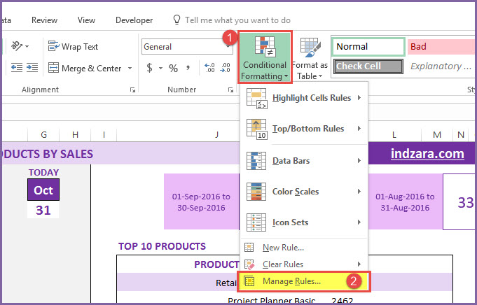
If you prefer to change the arrow styles or colors, it is easy to do.
First, click on Conditional Formatting in the Home ribbon and select ‘Manage Rules’.
Then, select ‘This Worksheet’ from the drop down menu so that we can see all the rules applied.
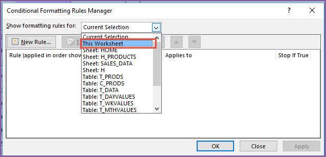
Now, scroll down and see the last rule where we have applied the arrows/icons.

When we click on the rule and then click on Edit rule, we see the following window.
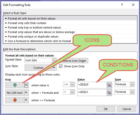
We can change the icons by clicking on the arrow next to the icon.
Once you choose the icon you prefer, just click on OK in the dialog boxes that appear. This is how you can modify the icons.
Related Free Excel Templates
Recommended Templates
-
 Bar Chart Excel Template$10
 -
Column Chart Excel Template$10
-
HR KPI Scorecard & Dashboard$50
-
 Gantt Chart Maker Excel TemplateOriginal price was: $25.$20Current price is: $20.


17 Comments
hello sir can we see customize the top 10 and bottom 10 list to say about top and bottom 50? thank you.
Hello
You have to unhide “H” sheet and extend the formula for the top & bottom 10 to next 40 rows.
Best regards
Would you please help to get the”HOW TO ENTER DATA IN SALES REPORT” full video.
Thanks for your message.
A video demonstration is available for the template at https://indzara.com/2016/10/sales-report-excel-template-top-10-bottom-10-products-sales/. Please visit the video demo section.
Best wishes
Here we can see only the step-1 but there is no options to see the other steps.
Thanks.
Hello
Please review the complete article at https://indzara.com/2016/10/sales-report-excel-template-top-10-bottom-10-products-sales/. It has the instructions to use this template.
Best wishes
hi,
entered the data as mentioned but the sales amount does not appear in Report ,
Hello
The template is designed to compare monthly sales with respect to a period chosen. Please ensure to enter the dates properly.
In case it does not work, please send the file to contact@indzara.com
Best wishes
Hi, If I want to change top 10 to top 20 and bottom 10 to bottom 20, how can I do that?
Thank you
Hello
You have to unhide “H” sheet and extend the formula for the top & bottom 10 to next 10 rows.
Best regards
Hello Sir,
Thanks for the wonderful video. Its very helpful for sales department.
Am Unable to download this video from the link.
Can i have this link on my E-mail id.
Regards,
Nitu
You are welcome. You can watch the video online here or on YouTube channel. Thanks.Best wishes.
Hi, how did you make the radio buttons text change whenever you chose from the dropdown list (I-DATETYPE)?
please kindly may you share me with password for this template.
Please use indzara as password. Thanks. Best wishes.
Can you tell me how to customize this temple for top 10 sales rep and products.
The template is designed to rank only one dimension (products or sales reps or any one thing). I will build templates that will handle multiple dimensions in the future. Please stay connected to this site. Thanks. Best wishes.